You know your landing page sucks, right? That’s why you’re reading this.
But why? Are you a talentless hack, have no staff to help you, or are you hindered by I.T. to make the pages you want? Either way, these 4 things to avoid should help you improve your conversion rates:
1. Stop Using Copious Monotonous Text Please
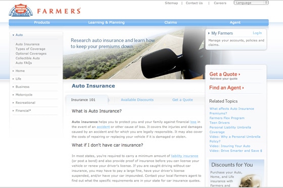
Providing too much text on a product or lead gen landing page can overwhelm or even intimidate visitors, causing them to miss your central sales message and abandon ship. Thanks Steve Krug.
The above landing page is lengthy (we even cut it off), it wouldn’t be so bad if they’d broken it up a bit (chunking) with some images or video, but paragraph after paragraph just doesn’t lend itself to conversion.
The content may be useful, but less reliance on text and some more visually pleasing elements would help this page, a lot. Yes, it’s true that long-form sales pages work – but mainly for spammy infomercial related products (Slap Chop, hello!).
Having said that, there is a movement towards long landing pages that using internal “smooth scrolling” navigation (as opposed to multiple pages) that are working too.
2. Use Epic Headlines – Think Front Page of a Newspaper
Never assume a visitor will take the time to read your page then make a determination about what you’re offering.
Bold, descriptive headlines should be one of the first things a visitor sees.
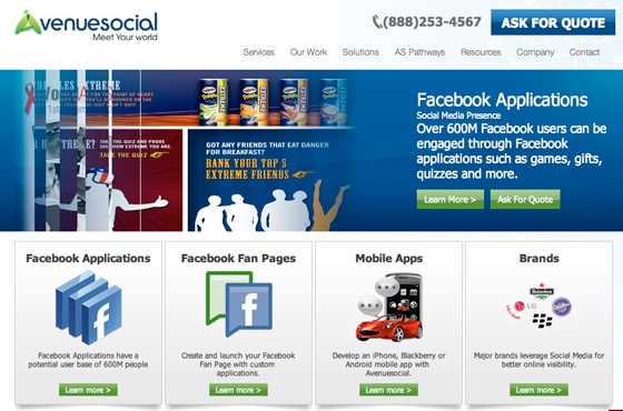
Fail. This site has an eye-catching layout, and looking at the page as a whole, the graphics and color scheme indicate they offer a product that is related to Facebook.
So, why the fail? Their headline, “Facebook Applications,” is a little vague and not descriptive enough. Visitors are required to do the work of reading all the subtext to decipher the product that is offered by the company.
Headlines should be:
- Clearly visible. It should be one of the first things a visitor encounters
- Concise. It should be easily remembered and repeated
- Focused. Your headline should focus on the benefit of your product or service, it should immediately tell your story to the customer
3. Every Page Needs a CTA
I don’t care what your page is about. If you don’t have a CTA somewhere that can lead to an increase in one of your KPI’s (your bottom line for example) – then you’re doing it wrong.
TIP: Once a week, pick a page on your site and add a CTA – send it to a targeted landing page with a clear purpose and see if you can get 1 extra signup a week. The difference will be huge if you keep optimizing your site like this.
About CTA’s
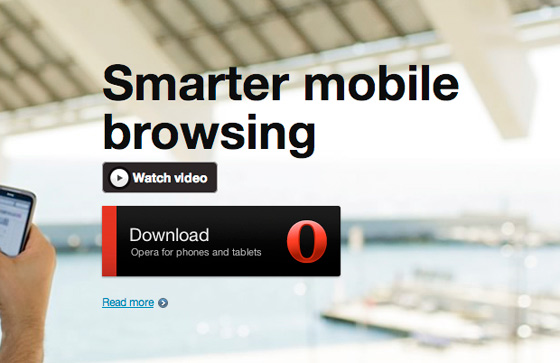
All call to action buttons should aim to have a visitor perform a certain activity and the verbiage, style of buttons and layout should all work to encourage them to take that action. It should be clearly indicated on the button: buy, sign up, download, install, try, experience, etc.
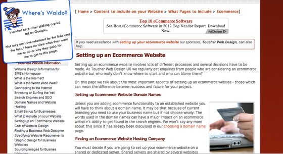
The size of call to action buttons is also significant. Too large, and your button will overpower everything around it (editor’s note: this can be okay – test it). Too small and the content on the page will hide the button and cause visitors to play where’s waldo with your landing page.
Call to Action Buttons should:
- Use simple and direct phrasing that generates a sense of urgency
- Use contrast in placement, font and color to draw the eye
- Multiple CTA’s Should generally be avoided. But if you have a long page, be sure to repeat it throughout the page. And if you must have more than one – make it a phone number.
- Include descriptive words icons or images, that tell the visitor the benefit or result of the action
4. Got Proof? Then Use it!
A marketer who ignores the influence of social networks, recommendations and testimonials, does their landing page a disservice. The landing page needs to be more than just an advertisement. It should offer proof of current users who vouch for the product.
Proof allows one to establish credibility and visitors to build trust in your offer, don’t miss out on that opportunity.
Ways to incorporate social proof and build trust:
- Display social network widgets or member statistics (“1500 new members this week”)
- Incorporate logos from customers
- Feature media badges and logos (“as featured on…” or “seen in…”)
- Highlight customer reviews or testimonials
- Provide free white papers or case studies
- Prominently display guarantees, warrantees and relevant policies
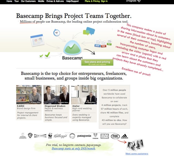
The landing page above highlights social proof of the product’s success. “Millions of people use Basecamp” It immediately makes the user feel like tons of really important people and businesses trust this company, perhaps they should too.
Here are a few examples of landing pages that are done well, to get your juices flowing as you jump in and create a healthier landing page.
If you have examples of great landing pages or epic fails, share them in the comments below.
