
One of the first things you learn as a marketer is how important it is to get to know your target customer. Understanding what makes your prospects tick allows you to create targeted offers that will resonate with them.
But it doesn’t stop there.
Every single landing page element has to be created with your “ideal customer” in mind.
If you fail to do that – if your headlines are borrowed or your images generic – then you’ll wind up with a landing page that addresses everyone but appeals to no one.
In our latest episode of Page Fights, regular judges Oli Gardner and Peep Laja and guest judge Michael Aagaard of ContentVerve tore apart 10 user-submitted landing pages for your benefit. In the process, they identified several consequences of failing to keep your target customer top-of-mind.
You can watch the full episode here:
In the meantime, we’ve distilled the key takeaways so you can start applying the judges’ advice to your pages today. Here are five questions you should ask yourself to ensure that every element on your landing page is created with your prospects in mind.
1. Does your image show your product in context?
When you’re in a pinch, buying stock images for your landing pages may seem like a good idea, but it’s unlikely that they’ll resonate with your target audience in a meaningful way.
Although the judges liked the overall design of iTeleCenter’s landing page, Peep thought the stock image felt dated and failed to communicate any information or value.
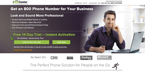
To show give more context, Peep suggested using images of real people using your products and service. Showing context of use helps increase the clarity and persuasiveness of your offer.
Similarly, Oli found that My Pension Choices’ hero shot conjured up thoughts of dry-cleaning and laundry more than customized pension planning – which hurt the page’s clarity:
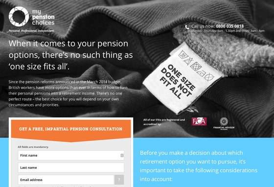
When you’re selecting an image for your landing page, ask yourself: Does it communicate the specifics of my offer?
Bonus tip:
Michael explained that a good test for determining if you have the right images on your landing page is to remove the copy and ask yourself, “Can I still understand what my landing page is about without the text?”If you can’t, you may need to revisit your images and select one that thoroughly conveys your value proposition.
2. Does your headline motivate prospects to take action?
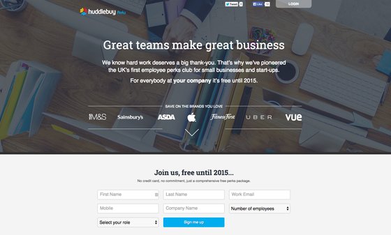
Peep thought Huddlebuy Perks’ landing page was clean, but Oli took issue with its headline – he awarded it the 2014 Generic Business Statement Award for being so bland:
Similarly, Colameco’s headline for its high-protein pancakes doesn’t exactly make you want to break out the pancake griddle.
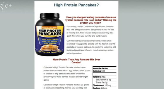
Michael explained that your headline is often the first thing your prospect will read on your landing page – so it has to tell the visitor exactly what the product does.
There’s no room for clever puns or ambiguity.
If prospects aren’t clear about what your landing page is offering, then they’re not going to be motivated to keep reading – and they’re certainly not going to be motivated to convert.
Bonus tip:
The judges shared some quick tips about how to make your headlines more actionable:
- Peep suggests clearly defining your unique value proposition in your headline to remove ambiguity.
- In the same vein, Michael suggests being as succinct as possible about what your service does.
- If your headline can be applied to another landing page and still make sense, then it’s probably not specific enough to your landing page.
3. Does your overall page design feel trustworthy?
People judge websites and landing pages at the blink of an eye.
If your landing page’s design feels outdated or haphazardly thrown together, then it’s likely that it will feel less credible in the minds of your prospects.
Take Litening Software’s page for example:
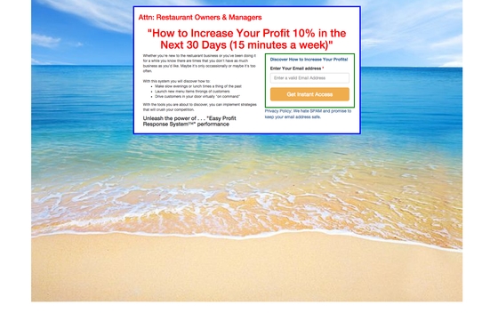
Peep and Oli wondered why the background of this page was of a beach when the software is for restaurant owners. They explained that having a landing page design that is is irrelevant to your audience tells them that you don’t really understand them.
And it can make your page feel untrustworthy.
For Peep, the design wasn’t the only aspect of this page that hurt its credibility. He also thought these elements felt inauthentic and salesy:
- The spammy-sounding copy (phrases like, “easy profit response system” are jargonistic)
- The unrealistic guarantee in the headline (“10% profit increase for only 15 minutes a week” feels a little hard to believe)
- The red headline, reminiscent of high-pressure sales pages with lots of yellow highlighting
Bonus tip:
To ensure a trustworthy landing page, Oli recommended avoiding the word “spam” – especially in proximity to your CTA button.As Oli explained, the word “spam” conjures up unpleasant associations and creates a negative psychological feeling for prospects that makes them less likely to convert.
Michael agreed: “I’ve run a lot of tests on this, and every time you put ‘spam’ next to an email field, it makes people think: ‘Whoa, are they going to spam me?’”
4. Are you explaining what differentiates you from the competition?
Talking about the benefits of your offer on your landing page isn’t enough. We all understand the importance of a powerful UVP – but you need to make sure it’s clearly communicated to landing page visitors.
Take Equafy’s landing page for example:
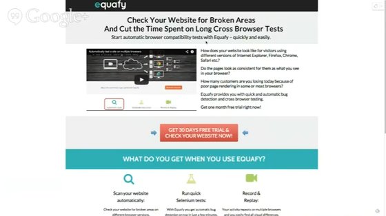
Equafy’s headline spoke to some of the benefits of the product – but it didn’t spell out what distinguished them from the competition.
As the judges point out, the headline focuses on the benefits of fixing broken links and saving time, but the lack of differentiation fails to help the prospect make a decision about purchasing.
But a powerful unique value proposition that explains why your product is better than your competitor’s isn’t enough. Michael explained that commonly, UVPs are buried in the body copy instead of being placed front and center, where they should be.
5. Are you clearly explaining what prospects are opting in for?
No matter the goal of your landing page – whether a free trial, webinar sign-up or offer for free consultation – you need to be clear about what a prospect will get by filling out your form.
Have a look at SeniorQuote’s landing page for instance:
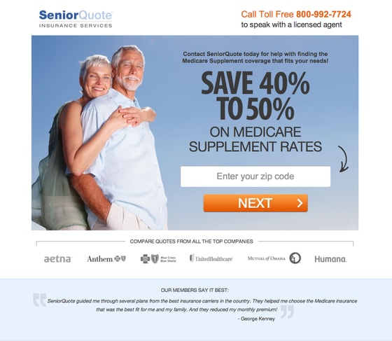
The upper right-hand corner invites prospects to call SeniorQuote’s toll-free number to speak with a “licensed agent,” but as Peep pointed out, the invitation lacks context:
“If you want people to call you, you need to add more context. What are we going to be talking about? How are you going to help me?”
In other words, your landing page needs to explain exactly what people get by filling out your form.
For example, in the case of a free consultation, Michael noted you should explain:
- How long will the consultation take
- What kind of commitment is required
- When and where the consultation will take place (Over Skype? In person?)
There are so many questions your prospects could be asking when they land on your page – to manage their doubt, you need to dig as deep as you can and provide as much context as possible.
Michael put it simply:
“Opt-in forms are two-way conversations. Your prospects are giving up a lot of personal information – you’ve got to let them know what they’re getting in return.”
With clear descriptions and parameters about what your prospects can expect, it’s likely your conversion rates will improve.
How to get to know your customers
As marketers, we often do our target market research at a distance. We think we know our prospects, but we never really talk to them.
The result? Our landing page conversion rates suffer because our messaging isn’t resonating with our audience.
You need to know your prospect so well that you can answer the questions that pop into their heads – before they have a chance to ask them.
And as Oli pointed out, that’s where qualitative research comes in. The judges shared some quick tips about you can get to know your customers better so you can start running A/B tests to optimize your landing pages for conversion:
- Have users interact with your site and call out what they’re doing with user testing.
- Use onsite surveys like Qualaroo to ask, “What’s holding you back from completing this call to action?”
- Use post-conversion surveys to ask newly-converted customers what reservations they had and why they decided to go ahead and purchase
- Conduct basic phone interviews to dig deep into your prospects’ minds
- Leverage services such as UsabilityHub that allow you to submit your landing page for critique to get unbiased feedback about how effective your images, copy, and overall site is to the average user.
Alternatively, if you’ve got the nerve, submit your landing page for brutal critique on the next episode of Page Fights.
Good luck!
![]()

