
Take a look to your left. Now look to your right. The people on either side of you look different, sound different, and, presumably, they like different things than you do. We’re all a little different from each other.
But despite our many differences, everyone reacts to certain stimuli the same way. When it’s bright, we squint our eyes. When there’s a sudden loud noise, we get startled. And when there’s a bright red spot on a red carpet, we notice it.
When it comes to landing pages, we can count on most people to react a certain way to the experiences we design for them. Great campaigns are built around solid user experiences that can be created with just a few simple guidelines.
Stef Miller is a Marketing Manager at UserTesting, and she’s involved in analyzing user data to find out how to create better user experiences for the people you’re trying to convert. Because better experiences = more conversions.
In Stef’s Unwebinar, The 7 Deadly Sins of Landing Page Usability, she broke down some common UX mistakes that marketers make on landing pages, and gave us some great usability solutions to remedy those mistakes. Let’s take a look.
1. Avoid distractions!
A landing page has one job — to give people what they were promised in the ad that got them there. You want your landing page visitors to have just one task on your page: to convert. Make it easy for them to do that.
From a usability standpoint, distractions are a major killer of conversions, and chief among these distractions is the navigation bar.
Stef used an example from Marin Software to demonstrate the point. What you may notice first about the image below is that this is not a landing page. It’s a page that is supposed to convert leads, but it’s just a page on their site. A page on a website isn’t a landing page just because you send people there from an ad.
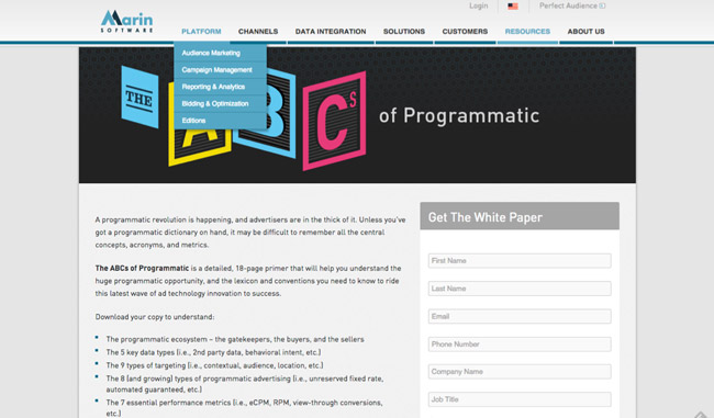
If you give your users the chance wander away from the page that has the form, that’s exactly what they’ll do. People are curious. And now you’ve lost your lead.
One other thing that you want to avoid on your landing page: multiple CTAs that have different purposes. Stef pointed out how this page by Pantheon has three (THREE!) different CTAs on the page.
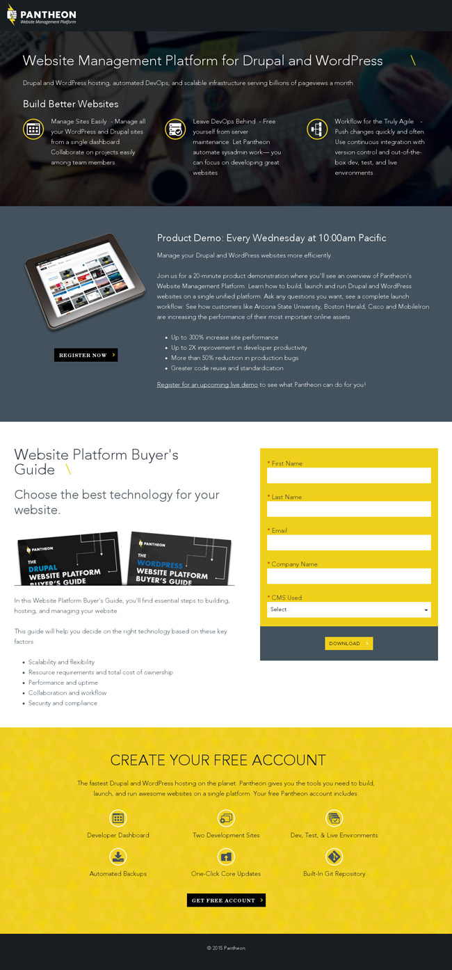
By offering too many choices, you may end up with your visitor taking no action whatsoever.
Let us never forget the sagacious landing page mantra of our co-founder, Oli Gardner:
“One Page. One Purpose. Period.”
That’s definitive, folks.
2. Make sure your links and CTAs are recognizable
How many times have you been on a page where you wanted to perform a certain task (buy an item, sign up for something, etc), but could not figure out how to do it? What do you do when it takes too long to figure it out? That’s right. You leave.
Pages like the one below are a usability nightmare. What are you supposed to do here? Which button are you supposed to click? Are they all even buttons?
The CTA button on your landing page should be instantly recognizable. AND, it should tell your visitors what they’re going to get when they click. Stef shared some of her favorite examples of this very thing done well:

You’ll notice two things about these CTA buttons. First, they’re easy to spot. Second, you know why you should click those buttons. By doing these two things, you’re creating a user experience that makes it easy for your visitors to convert.
3. Keep your design simple
If you’re designing your page so that it looks super cool, but says nothing about your product or brand, you might as well not have bothered. Designers can often be tempted to go to certain extremes on landing pages. But remember, you’re not trying to impress visitors with your design skills — you’re trying to convert them.
Stef showed several examples of landing pages that go to design extremes, including ones with animation, distracting graphics, and the one below from a company called Threadless.
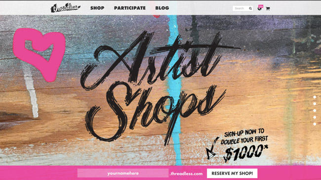
They’ve done a pretty decent job of pointing out the CTA, but they haven’t given you a reason to take any action. There’s nothing on this page about who the company is, what they sell, or precisely what you’re going to get by giving them your email address.
There’s no need to show off your design skills — simply make a page that helps people take action.
4. Create user-friendly forms
The form is the part of your landing page where you collect information about your leads. You’ll use that information to nurture those leads. It is very, very valuable real estate. Every field on your form is currency. As Stef says:
Your leads are only as good as the information you get from them.
The form is an experience of its own and should be treated with great reverence. Stef had several tips for getting the most out of forms.
She used the example below to demonstrate how forms can provide something of value while also using a contextual call to action to give people a reason to click. KISSmetrics is asking for quite a bit of information from prospects who visit that page, but they’re also providing a great deal of value in exchange.
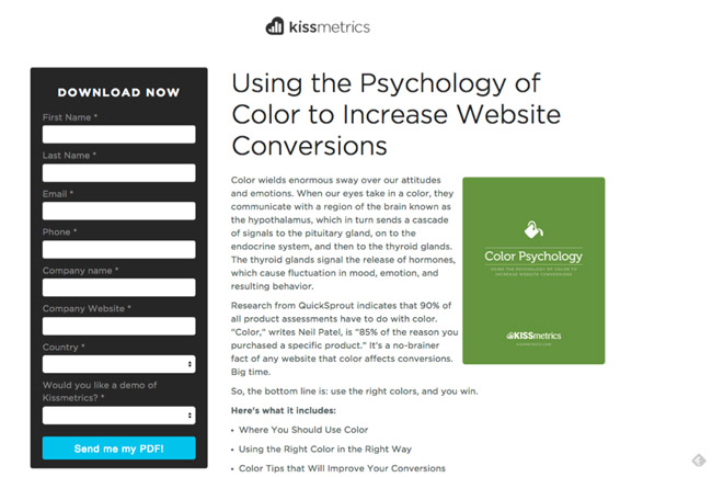
The CTA button is easy to spot, and lets visitors know exactly what they’re going to get when they enter their information. They have promised information about the psychology of color, and within that context, the CTA button allows prospects to get the PDF. Super simple.
When dealing with mobile forms, it’s important to remember that there is an added layer of friction that you’re working against. You’ll have to do everything you can to make filling out that form with a mobile keyboard as easy as it possibly can be.
Stef didn’t hesitate to remind us that it’s important to test your forms to find out what works best for you. Don’t forget to make forms simple to fill out, and continue testing to find out which version of your form gets your prospects to respond by providing you with their information.
5. Get serious about landing page copy
The copy on your landing page is what will explain to your visitors what your company and product is all about. It should convey that you have something that they want. Stef had a few really great tips on how you can create effective copy.
Avoid jargon — don’t get too gimmicky
Phrases like “A seamless synergy of bleeding-edge technology combined with enterprise crystallization for an integrated marketing solution” might sound really smart to you, but it doesn’t tell anybody anything. Stef reminded us to use simple words that describe what you are offering to your landing page visitors. Stay away from jargon and be direct in your copy.
Read it out loud first
Reading your copy out loud to someone else will help you figure out if you’ve successfully gotten your message across. If you read your headline, bullet points and your CTA to someone and they still don’t understand what you’re offering, then it’s time to start over.
Get feedback
Stef recommends asking no fewer than three other people to read your copy before publishing your landing page copy. If two heads are better than one, then three will definitely help you get closer to publishing copy that converts.
Once again, it all comes down to testing. Create a few different versions of your landing page copy and test them to see which one works best. This is super easy to do with landing page software like Unbounce – here’s how.
6. Ensure your landing page message matches your ad
Message match is what reassures a landing page visitor that they’re going to get what they wanted when they clicked on an ad. The experience needs to be consistent from ad to landing page in both message and design.
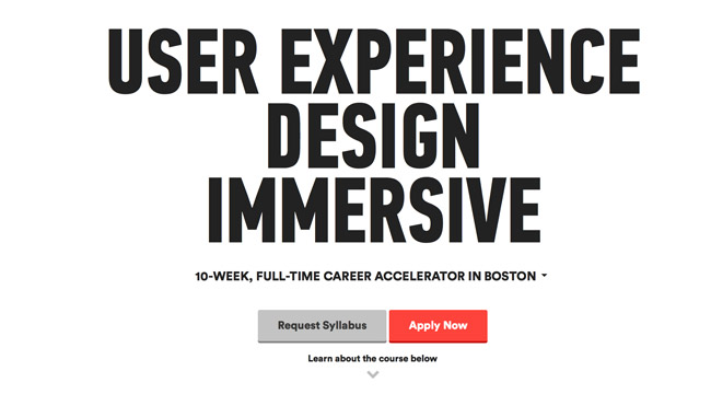
Stef used an example from a business called General Assembly to illustrate the concept of message match. The ad below promises information about a 10-week UX design course.

Clicking on Learn More brings visitors to the page shown below. Both the message and the design match what we saw in the ad, reassuring visitors that they’ve come to the right place.
The landing page is relevant to the ad, easy to understand and effective in its call to action. According to the Conversion Glossary definition of message match:
Strong message match increase conversions because it reassures people they’ve come to the right place.
Keeping your message coherent from one piece of a campaign to the next lets your visitors know that they’re getting what they wanted when they clicked, and keeps you from wasting money on people who click an ad and get confused when the message on page doesn’t follow. In other words, bad message match leads to bad user experiences – and a crappy conversion rate.
7. Create a great experience after the landing page
Stef reminded the Unwebinar listeners that once a user has filled out the form and clicked your CTA your job in creating a delightful user experience is not yet done:
Post conversion is often neglected in landing page experience… we often aren’t putting enough into what happens next.
To demonstrate how to create a great experience after that click, Stef uses this Mobify thank you page below as an example:
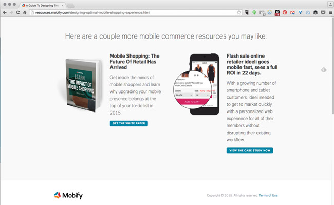
Saying thank you isn’t just polite; it’s part of a delightful user experience. It helps get your prospect to further interact with your brand and can lead to a secondary conversion.
On this page they’re giving you the opportunity to find out more about Mobify and offering some resources – a white paper and a case study – for folks who may be a little further down the funnel.
As Stef pointed out, this is an interesting way to gauge how far along in the funnel a person might be. It’s not just creating a great experience, it’s also helping Mobify understand their leads a little better so they can nurture them accordingly.
The best user experiences are developed through testing
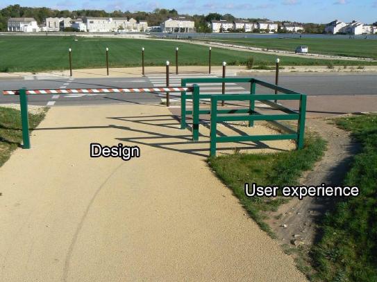
If you have a LinkedIn account, you have likely seen the image below. This picture succinctly sums up the difference between how things are often designed versus how people would prefer to experience them.
These seven tips are meant to be guidelines for creating better user experiences — no one can predict exactly how a group of people will react to a landing page, but if you follow these guidelines, you put yourself in a position to find out.
Stef concluded the webinar by reminding us that it’s never too early to get feedback on your landing pages. To create the best experience possible, you have to continue to test your copy and design and to optimize them based on the feedback you’re getting in the form of conversions. After all, if they’re not converting, they didn’t have a very good experience and if the experience sucks, they ain’t gonna convert.
You can more about landing page usability by checking out the free Unwebinar recording here.
