We are living in an age where capturing attention has become a rare – and powerful – commodity. Information left on its own tends to lack organization, which is why designing a landing page that efficiently and calmly directs attention to important content is crucial. Think of it as being lost in a jungle: in order to clear a path to safety, you need to pull out a machete and start hacking.
Instead of a webpage that confuses users by displaying everything at once, an attention-driven landing page design carves an instant visual path, directing them to 3 essential pieces of information.
At EyeQuant, we call these the 3W’s:
- What the page is about (your offer)
- Why it is important (your value proposition)
- Where a user should go next (your Call-to-Action)
Considerable scientific research has been conducted in recent years in order to precisely identify how visual attention is deployed and directed, and what designers can do to best direct a user through the conversion process on a website. EyeQuant built an artificial intelligence based on this research that predicts what changes need to be made to guide a user’s gaze to the 3W’s, and also brings a common language to design meetings, where everyone has an opinion.
In this blog post, we’ll draw on recent scientific research to introduce attention-driven design as an essential strategy for maintaining a balance between branding and content, with a good dose of helpful hints along the way.
The Office Analogy
Imagine this situation: A co-worker has asked you to find a document in their office while they’re out of town. You open the door to her office, fumble around for a lightswitch (which is hidden behind a coat-rack), and sigh in frustration: There are piles of paper everywhere, photographs and posters hang all over the brightly coloured walls, and knick-knacks cover any remaining surfaces.
There’s so much visual information to deal with that you have to find a place to sit for a moment to figure out where to start looking. Finally, after combing over the same spot for a few minutes, you spot the document – right in front of your eyes the entire time.
What is Visual Clutter?
Would it have been easier to find that important document if the office had been less chaotic?

‘Visual noise’ is a another way of describing ‘clutter’. Just like in a messy office, clutter/visual noise is toxic to a landing page’s usability.
Visual noise tends to come in two forms:
- Decoration: In an office, brightly-painted walls, plants, pictures, and mementos function as decoration, while on a landing page, decoration tends to come by way of branding, with logos, mascots, trust seals, and images.
- ‘Stuff’: Handwritten notes, stacks of magazines, and empty coffee cups make up the endless array of ‘stuff’ we tend to amass, but on a landing page, ‘stuff’ is akin to secondary offers, parallel ad campaigns, unrelated images, and design gimmicks.
A high-converting, user-friendly website doesn’t need to be uber minimal, though; branding is essential to a landing page’s performance. This includes putting users at ease, communicating to target audiences, and building a bridge between a brand’s offline and online personality. All the same, branding should never take center stage and crowd out the 3W’s.
How can you make sure that your brand identity isn’t distracting from your value proposition and call to action?
By implementing sound data on the science of attention into your workflow, that’s how.
Recent research at MIT suggests that a cluttered environment not only wreaks havoc on a landing page’s navigability but also on the user’s ability to recognize the 3W’s. According to the research, “Excess and/or disorganized display items can cause crowding, masking, decreased object recognition performance due to occlusion, and impaired visual search performance”.
Unsurprisingly, the study found that too much ‘variability’ in color, size, and texture creates a particularly cluttered environment: Constantly fluctuating colors and sizes create an atmosphere of unpredictability, confusing a user’s attention and ultimately driving them away.
Researchers at Caltech (and EyeQuant scientific board members) came to a similar conclusion with a study about brand awareness and consumer choices: In situations where a consumer is multi-tasking or under time constraints, researchers found that consumers are more likely to choose a brand that visually ‘pops out’ over one they would otherwise choose in terms of personal preference. Essentially, what you see is what you buy.
To better illustrate what this research suggests, let’s take a look at a few creative agency landing pages, with EyeQuant heat maps that illustrate their distribution of user attention:
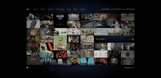
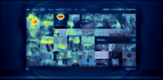
- Goodby Silverstein’s client work is crammed onto their page in no particular order, creating an objectiveless visual path for the user as seen in the attention heatmap. The navigation bar at the top of the page is the only way out of this visual maelstrom, but the type is too small to read, and garners little notice.
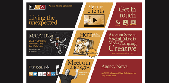
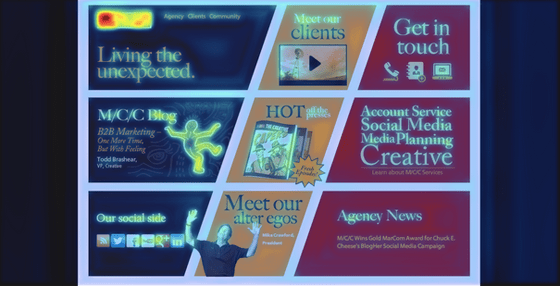
- MCC’s page seems less chaotic than Goodby Silverstein’s, but its color-coded organizational model is in fact arbitrary, and its varying type sizes are confusing. Take a look at the attention map: With no clear Call-to-Action or value proposition, the user flits all over the page with no real path guiding them to what they need to know.
Tips:
- Keep your landing page like you keep your office space: Organize content in terms of relevance with precise, intuitive categories – while making sure that the most important content (the 3W’s) stays close-at-hand at all times.
- Avoid variation in size, color, and texture. Think about predictability and consistency when organizing the information on your site; too much variability in your design is confusing for the user. Vibrant and bold color, size, and texture should be reserved for your 3W’s – everything else should be muted and uniform.
- Make sure that your 3W’s steal the spotlight by keeping branding to a minimum. Users aren’t coming to you to watch your latest ad, they just want to figure out what you do.

How to Turn a Design Meeting into a Picnic in the Park
Even with scientific data on your side, convincing your clients, your boss, and your team that attention-driven design is the right direction can be difficult: everyone has their own ideas.
In a study from 2006, researchers at the University of Copenhagen demonstrated that even a seasoned designer’s instincts can be fallible: During an eye-tracking study, designers could only predict about 46% of the elements users had seen on a webpage, while users themselves could only remember 70% of what they actually saw.
During a website’s redesign, making educated guesses is commonplace but often masks subjective bias – branding, creative, and analytics professionals all want to see their individual goals realized, sometimes at the expense of their colleagues’ own interests. As a result, many companies only begin testing a design once it has gone live. This strategy isn’t only counter-productive, it also wastes time and money, which is why objective, predictive insight is essential.
A study by MIT researchers suggests that a data-driven predictive tool is essential to creating an atmosphere of collaboration because it creates a common language across different fields. Simply put, when design intuition melds with data, intuition remains with the user, not in the design meeting.
Tips:
- Introduce a new member to your team: Her name is objective, scientific data.
- Pre-test, pre-test, pre-test: Before changes to your website go live, pre-test how well your 3W’s will stand out against the more decorative aspects of your landing page using EyeQuant.
You know yourself (and your clients’ needs): You’ve spent hours pouring over a landing page, you know everything there is to know about what it does and how it works. Unfortunately, 99% of the rest of the world don’t. This is why it’s important to keep the most important elements on your page unfettered by clutter and easy to see, so that when a user arrives at your page, they know (almost) as much as you do, why they should care, and how they can join in on what you have to offer.
So, how can you get started down the path to attention-driven landing page design? Not to worry, we’ve mapped out these steps for you:
- Start with a free EyeQuant test.
- Check for the 3W’s on your page – is this what your visitor sees first?
- Move stuff around, try things out, and conduct experiments using Unbounce to re-arrange and play with color and contrast!
- Compare your design tweaks using EyeQuant. Looking good? Implement with Unbounce, A/B test, rinse, repeat – and profit!
- Take your proposed changes and ideas to your next design meeting with a big smile on your face; you have neuroscience and artificial intelligence on your side.
