While we’d all like to think that we act based on reason and logic, the truth is that we have many cognitive biases that affect our decisions.
Back in 1974, psychologists Tversky and Kahneman were the first to theorize and research the anchoring effect: our tendency to rely too heavily on the first piece of information presented to us (the “anchor”) to make subsequent decisions.
Take the release of the original iPad for example. After Steve Jobs showed off the high-resolution screen and impressive features, he asked the audience how much they thought this “revolutionary” new device should cost.
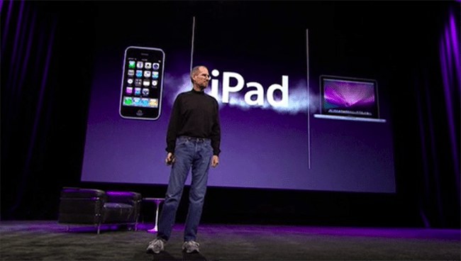
“What should we price it at?” asked Jobs. “If you listen to the pundits, we’re going to price it at under $1000, which is code for $999.”
He put a giant “$999” up on the screen and left it there for several minutes.
“I am thrilled to announce to you that the iPad pricing starts not at $999, but at just $499.” On-screen, the $999 price was crushed by a falling “$499.”
Bingo. Because of the anchoring effect, $499 is now considered “cheap.”
Understanding biases like anchoring helps us make sense of our personal decision making process, but it also helps us persuade our prospects and create more powerful landing pages.
Let’s dig into how brands and marketers are currently using anchoring – and how you can too.
Present the most expensive option first
As we saw in the Jobs example, when a higher price is presented first, it becomes the benchmark against which other prices are evaluated.
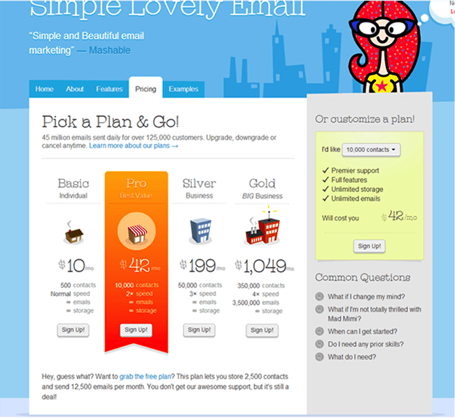
Joanna Wiebe of Copyhackers saw this first-hand when she ran an A/B test for her client’s pricing plans. The original page ordered the pricing from least expensive to most:
Whereas the variation presented it in reverse, starting with the most expensive on the left:
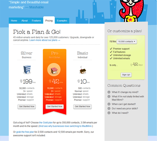
The verdict? The variation took the cake with a whopping 500% uplift in click throughs!
Because people read English from left to right, placing the highest price on the left ensured that people would see it first – making it the anchor against which to judge the price of the other plans. And that made the lower plan seem like that much more of a great deal.
The same effect can be achieved by comparing your pricing schemes to that of competitors. Consider this example by analytics tool Hotjar:
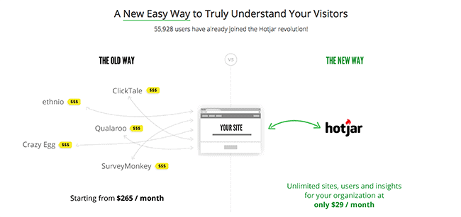
By showing potential customers how much they spend on a monthly basis for using a combination of tools ($265/month) versus how much they could be spending by using their all-in-one solution ($29/month), Hotjar positions itself as the product that offers the best value.
Use anchors to put things into perspective
So much of our decision making is governed by how information is presented. A $40 pricing plan might sound like a lot on its own, but using an anchor can help you put things into perspective for prospects.
Consider this campaign that agency Saatchi & Saatchi put together to collect donations and raise awareness for a worthy cause:

In this example, the image grabs your attention, stands out and makes the immediate connection between the amount we spend on luxury items versus the small amount it costs to donate.
By showing people the amount of money they spend on their luxury items (the higher price) right above the low cost of the donation, they created a campaign that begged the question: “How can you spend so much on fashion but not be bothered to donate?”
Since 50% of our brain’s capacity is geared towards vision, the images we perceive on a landing page affect our emotional state. Images can communicate an idea, thought or feeling much quicker than text and can be used brilliantly with price anchoring.
Beware of negative anchoring
Anchoring isn’t a magic bullet. Sometimes, displaying multiple elements on your page can create an unwanted anchoring effect.
Have a look at the way Buffer displays their pricing plans:
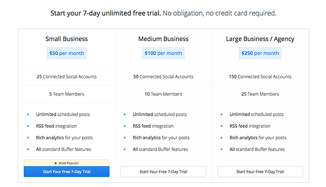
As we’ve already covered, they may want to consider leading with the most expensive plan, but beyond that lies a greater issue. Once you choose a monthly plan, a popup comes up summarizing the amount you’re going to pay.
Suddenly, it isn’t the (reasonable) monthly plan you chose but a yearly payment of $2250.
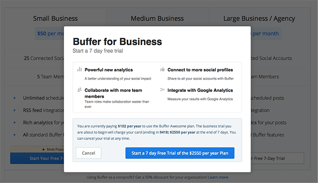
The initial piece of information I received was $50 per month, but I didn’t get any indication that I was going to be charged annually. The large amount that suddenly appears on my screen comes as a complete shock.
To avoid negative anchoring, Buffer should consider testing the annual price on the pricing page. Why not inform people of the monthly price as well as the summarized annual price? It’d also be a great opportunity to present a discount to those paying for a year upfront.
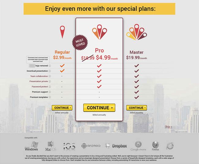
At the very least, Buffer could test including a note about the annual billing under the call to action button, as on this landing page:
Wrapping it up
There are many different cognitive biases that have an impact on our decision making and purchasing patterns, but few are as impactful as anchoring. When used properly, anchoring can bring you dramatic improvements in your conversion rate.
To use anchoring on your landing page, pay attention to the initial information a customer is presented with when they land on the page.
- First, set a goal. Which option do you want people to choose?
- Then set up an anchor. What will make your goal look like the best possible choice?
- Don’t forget to test, test, test. You want to be sure you’re not inadvertently creating a negative anchoring effect.
Over to you – do you use anchors on your landing pages? I’d love to hear about them in the comments.

