Today I’m going to present the first in a series of free landing page critiques. Our first example comes from language school LeTutor. My hope is that the simple process described below will be of benefit to others in a similar situation.
I’d like to thank LeTutor for agreeing to the public scrutiny of their landing page, which can be seen below.
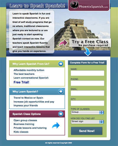
The Current Landing Page
The live version of the page can be found here: www.PhoenixSpanish.com.
At first glance this is a decent landing page, well structured with a balanced design and directional cues pointing towards the necessary page flow and Call to Action.
Objectives of the Landing Page
They are currently running a marketing campaign to capture new prospects for their Spanish lessons. The goal of the landing page is to have people that are interested in Spanish Lessons schedule an appointment for a free class.
Currently, an ad is being used on Facebook to drive traffic to the landing page.
Makeover Process
I’m going to take a simple 3-step approach to critiquing the landing page. If you have your own landing page, you can follow the same approach as a first pass investigation of its effectiveness.
- Establish Baseline Score: Using the interactive Conversion Marketing Scorecard, I will do a quick analysis of the page to see how well it scores. Points are awarded based on 40 simple questions related to landing page design standards.
- Analysis of Scorecard Results: I’ll take a quick informal run through each question from the Scorecard where the landing page received a negative response.
- Top 10 Improvements: Finally, I’ll provide a list of the 10 most important items to be addressed.
Step 1 – Baseline Score: 24/40
After running through the Conversion Marketing Scorecard, the Phoenix Spanish landing page got a score of 24/40. This places it in the average bracket, and shows that there is plenty of room for improvement.
Step 2 – Scorecard Analysis
The landing page failed in some way on 16 of the 40 questions. I’m going to run through these quite quickly to establish a basic level of understanding about why the page isn’t optimally designed. Each question is presented in the order it appears on the scorecard, along with a discussion of the issues.
Could a stranger understand the purpose in 5-10 seconds?
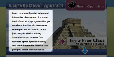
It’s easy to understand that it’s about learning Spanish, but it’s not entirely clear if it’s an online class or in a classroom. The reason for this initial confusion is the .com on the logo which reinforces the online nature, and the use of the word interactive in the opening paragraph. (Remember that I’m jumping to these conclusions in a very short period of time).
It also seems to be trying to differentiate from traditional classrooms – again making my question whether it’s in person or online.
I assume it’s in Phoenix, yet I’m asked for my city in the form which makes me wonder if I can take this class from other places (e.g. online). You may be targeting the Phoenix area only in your ads so this might not be such a issue.
Is it clear who your company is and what you do? (a logo and tagline)?
You only mention Phoenix Spanish as the company, yet the URL is for this page only – so I am unable to do any research if I so desire. The parent company LeTutor isn’t mentioned.
Are you using a relevant and original main image (photo, diagram etc.)?
The photo is of a Mayan temple (my assumption), which has a connection to Spanish culture, but it more indicative of travel rather than what your service is (language lessons).
Does your page message have the clarity of an elevator pitch?
The opening paragraph is difficult to read as it feels a little wordy and has a typo (which isn’t good for a language class) – “no where” should be “nowhere”. A good technique to test the effectiveness of your opening paragraph is to read it out loud. When I did this I found myself stopping and starting in an uncomfortable way.
Do you present a photo or graphic showing it in use?
The primary discussion at the top is about the classroom format, yet there is no photo showing this. I think a supplementary photo of a classroom scene would help clear up some of the confusion I had at the start.
Does your landing page explain how your product/service is unique (USP)?
In the opening paragraph you mention that your teachers speak Spanish fluently – this shouldn’t really need to be said – it might be better to focus on what makes them great teachers rather than stating something that is a necessity.
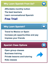
Your main area for uniqueness – answering the WHY – is the “Why Learn Spanish From Us?” section. Affordable monthly tuition is a good benefit – it might be worth testing actually showing a price here to back up your claim. The best teachers? (How are they the best?)
Learn conversational Spanish – this is a benefit of learning Spanish – but not learning Spanish from you – try to find phrases that explain why someone should choose your service.
Are you asking for any unnecessary information (be completely honest)?
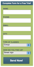
Which contact method do you have most success with? Do you absolutely need the phone number? The form isn’t massive but again, this would be a prime candidate for testing. Read our post on achieving the perfect lead generation form length.
Do you provide a safety net call to action? In case they care but not right now.
If you have an online brochure it might be a good takeaway for people who don’t want to sign up for a class without some further reading. A simple short PDF can make you appear professional and allows you to provide additional information without cluttering your landing page (and doesn’t require them to leave).
Do you provide examples of previous customers using or complimenting your product/service?
A testimonial to show why you are a good place to learn would be helpful.
Do you offer multiple contact methods (phone, email, live chat, Twitter)?
Adding a phone number would allow those more comfortable with the phone to contact you in their preferred way. Something to test.
Do you make it clear what the visitor will receive by clicking your CTA?
The primary call to action suggests taking a free class, then the form header says free trial which is more in line with a retail product than a class. The button uses a generic “send now” statement. None of these things actually explain what will happen when you complete the form.
Questions that this produces:
- Will someone be contacting me to book a class?
- Will I receive some more information?
- What happens when I click this button?
Does the design of your landing page match the visual style of your ad creative?
No, the ad used on Facebook (unavailable at this time) was an eye catching bright graphic in yellow and red with sombrero’s on it. Upon arrival at the landing page, the design, color palette and thematic representation have all changed quite dramatically.
Do you provide any privacy and or terms & conditions statement/link?
There is no mention of a privacy policy. You should be making it clear that the information taken will never be shared or misused in any way. This can be done by including a privacy policy link in the footer or beside the Email form field. A simpler method is to include a short statement near the submit button that states: “We will never share your information.”
Do you repeat part of your offer on your form button (if you have one)?
The button has a generic label on it and doesn’t reinforce the purpose of the offer at the last critical moment. Make sure the button describes what will happen when you click it.
Do you use contrasting colors to make the CTA pop out?
There are 2 main elements to consider here. The first is the “Try a Free Class” area – this does a decent job of attracting attention. The second is the form button. It’s the only clickable thing on the page (which is generally a good thing), however, it’s the same color as several other page elements (background, form header, why learn Spanish box, arrows etc).
Try using a color that’s completely different from the rest of the page. Blue is good as it implies the classic “link” behavior. However, the rest of the design holds it back in this case.
Are you including a trust indicator beside a form button? (padlock icon, link to privacy policy)
No. Mentioning the privacy policy (a simple statement will do as mentioned above) or a link to it would increase the sense of trust at the critical moment of conversion.
Top 10 Improvements
There are many things that can be done to make small incremental improvements to this landing page and deeper exploration of each of the 16 points above will be a beneficial task. For now, I’m going to highlight what I think are the 10 most critical changes.
1. Form Improvements
There are a number of small improvements you could make on the form area:

- Change the form title from “Complete Form for a Free Trial!” to something like: “Find Out About Our Free Classes”
- Add a short paragraph of explanatory text beneath the form title that spells out you can expect by submitting the form. e.g. We will contact you to discuss available class schedules.
- Denote required fields. If they are all required – state this in small text above the first field.
- If the dropdown list items are required fields, then add an item at the top of each list that says “Please Select” and give it a value of 0 to allow your form validation to prevent submission without a choice being made.
- Change the button text to reflect the action involved. e.g. “Request My Free Class”
- Add a privacy statement below the submit button.
- I didn’t receive a confirmation email after submitting the form. If at all possible, add this capability as it allows the visitor to feel confident that you have received their request. It’s also an important point of follow up where you can provide more details regarding your offer in a le
2. Answer the Question: “Is this right for me?”
If your classrooms are in Phoenix only, it would be good to clarify this somewhere on the page. I’ve just noticed that you state this in the HTML page title – “Spanish Classes in Phoenix, Arizona”. It would be good to offer this up as a secondary title somewhere on the page, to give visitors a quick sense of clarification. The logo isn’t enough in this instance, as I may be imagining it being an online course.
3. Make Interactive Areas More Obvious
The design of the landing page matches the LeTutor site nicely, but it is ok to forgo certain elements for the sake of a more obvious landing page experience. I would suggest leaving the background as it is (to reflect the brand palette), but perhaps adding some neutrality to the 3 boxes on the left hand side. By using a single color to represent these boxed elements, you are saying that they are related in some way (which they are).
One example direction (you should spend more time on this that I’m doing here), would be to do the following:
- Make the 3 left boxes all based on the green color.
- Make the form color based on the purple color which keeps the right hand column (from the logo to the form) visually connected.
- Use blue for the submit button only.
- Use a single color for all directional arrows – again perhaps purple to make the connection between action and the purple area of the page.
These are quick ideas that could help the focus of the page.
4. Simplify Primary Messaging

Break up the introductory paragraph into 2 shorter paragraphs, and test it by reading it out loud until it’s simple to verbalize. Try to focus on a single point (you have time for more detail in the bullet boxes below).

5. Use Bullets for Information Separation
You are almost doing this right now. The 3 boxes of information are indicative of bullet points. Adding some actual bullet images will improve clarity.
6. Enhance Directional Cues
You are doing a good job of directing people to the important part of the page. To improve it further, I would stick to one type of arrow. The small circular arrows look a little too much like buttons, whereas the curly arrows are clearly directional only (due to their flatness).
7. Contact Info
On the confirmation page (after submitting the form) you provide a contact phone number. I would suggest making this available on the landing page as well (in the footer would suffice).
Also, on the confirmation page, provide an email address to allow the visitor to follow up with you electronically.
8. Use of Photography
A classroom photo may have a greater impact as far as understanding of your offer is concerned. If you wanted to use a photo like the one you are currently, I’d suggest making it work as a smaller shot in the benefits area where you actually talk about being able to travel to Spanish speaking countries.
A classroom shot would also provide the missing sense of context and would remove any doubt that you are offering classes in “real” classrooms, and not online.
9. Sell Your USP
I would focus more on what makes you unique in the “Why Learn Spanish From Us?” section. What is it about your particular style of interactive lessons that is effective? What is the free trial? Is it a free 1hr lesson? Describe what people will get for free and why they should care about you vs. one of the other language schools in Phoenix.
10. Credibility & Testimonials
Education is based heavily on the credibility of the institution and it’s teachers. As such, I think you should leverage the LeTutor website more by mentioning the name (and website) in the footer.
I would also consider closing the page out with a real testimonial from a past or current student at your school. For best results, provide a testimonial from a person that’s in the same demographic as the people you are targeting on Facebook.
Conclusions
Despite a good first impression, you can see that there are a lot of factors to get right for an optimal landing page. It should be noted that making the changes I’ve pointed out isn’t the only key to success. What this will do is establish a landing page that more closely adheres to best practices – which is the launching point for a more thorough examination of conversion through testing and refinement.
To get started, fix as many of the noted issued, then go back through the Conversion Marketing Scorecard to see how it scores.
Good luck with your campaign and your conversions.
Cheers,

