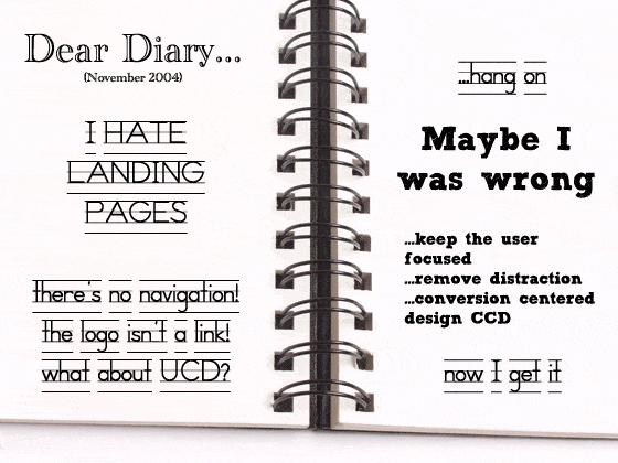
In November 2004 I had my first real encounter with marketing. It was a horrible experience.
At the time I came from the user experience (UX) crowd, indulging in usability, interaction design, information architecture and other such altruistic endeavours rooted in a desire to make the web work better for “the customer”. The marketing folks had an entirely different agenda with no real concern for anything but the bottom line. (Not wrong, just different from what I was used to).

We were discussing ideas for a new campaign and how to integrate it into the corporate website. They wanted to use a separate standalone “landing page“. I’d never heard the term before and started to gag when I heard the list of requirements.
What I hated about the “landing page”
The landing page was going to break rules I usually worked hard to uphold. From a user centered design (UCD) perspective, I was worried about three main things:

- No navigation: It struck me as being a tunnel-vision design tactic to try and trap the user on the page, not allowing them to determine their own experience.
- No link on the logo: This is a similar point and breaks a fundamental rule of facilitating simple transport to the homepage. Why make them type in the URL, or delete half of what’s in the address bar?
- Inaccessible: The design was almost completely image based, chopped into several large graphics and dumped on the page – rather than being a well constructed HTML page with accessible content (to readers and syndication) and good SEO value.
My thinking: This will just lead to annoyed visitors and lots of attention being paid to the back button.
Gather Round as I Admit to Being Wrong
 I don’t say “I’m wrong” all that often. Not because I’m a rancidly stubborn egomaniac. Rather because I just happen to be naturally good at stuff (#notmyfault). But in this instance I was completely wrong. Not with regard to my concerns, but with their relative importance. You need to use a different mindset when approaching design for conversion. Landing pages, as it turns out, are actually a pretty good idea.
Landing pages aren’t so bad
Positioned right in the middle of the sales funnel, landing pages play a critical binding role in the conversion experience of your visitors. They should be educational – to expand upon the ad message that brought them your way. They should offer value – if you’re giving something away, make it good. Trickery has no part to play in a real marketing campaign and you should aim to make your customer’s day a little better by providing a product or service with real and tangible benefits.
What I now like about landing pages
Over time I’ve come to understand the role landing pages (and marketing people) play in making a business successful, and I can honestly say that I like them both more than I used to. I won’t say “love”, because I’m reserving that for things like bonus cheques, girls, and wine from Argentina. What I will do is share a few key lesson I’ve learned.
Looking back at 2004 and my earlier issues, I came up with this new list:
-
- One thing at a time: While writing this post I got up from my laptop at least 30 times. Why? Because I have ADD and I’m easily bored. Guess what? So do/are your potential customers. It’s hard to dedicate your attention to something when there are so many distractions around you. Landing pages – when done right – have a single focused objective and they don’t let you wander off (because they remove the navigation and you can’t click on the logo).
- Designed for a specific purpose: Websites are designed to deal with multiple goals, maybe multiple personas, and they need to accommodate technical visitors such as search engines. Landing pages can be about nothing more than a single idea. A campaign should have a single measurable goal, and your landing page should be a selfish reflection of that.

- Creative freedom: Not being tethered to your company’s website guidelines gives you significantly wider creative latitude. Try a full-page background image with a button layered over the top. Switch to a black background to create a more intense mood than your corporate site. Push the boundaries in the name of conversion (but not at the expense of brand values). Test new or crazy ideas without having to design by committee. If you end up arguing direction in the boardroom, do an A/B test with each idea and prove which is best. Remove conjecture.
- Communication oriented: Yes it might be image heavy, but sometimes it’s better to have a compelling typographic treatment that communicates effectively, than having a page of dull 12pt Verdana text. Note: If you are doing paid search via Google AdWords or similar, then you need to pay closer attention to the actual HTML text content in order to maintain a good quality score. It’s not the be all and end all, but is something you should take into account. You may gain better placement and a lower cost per click (CPC) if you have bot-readable text that matches your ad.
- SEO is not always a factor*: Typically, a campaign specific landing page is designed to be withheld from the search engines to stop it interfering with your conversion stats (when running a PPC campaign for example). This allows you to focus on the purity of your message, as opposed to trying to insert keyword-rich phrases in your copy. *The exception is the type of single page website that uses a sales letter style template (with a ton of content), and is created to attract organic traffic.
At the end of the day, if you are connecting customers with valuable products and services, then conversion centered design is solving a user centered problem. And everybody wins.
What do you think about landing pages?
Share your opinions on landing pages as a concept, and why you love or hate them.

