
If a visitor to your landing page can’t figure out what you’re offering during the first 5 seconds, you’ve probably lost them. There’s simply too much to do online these days.
Some people say 8 seconds, some say that after 3 seconds the decision has been made. So for the sake of argument we’re going to stick in the middle and explore The 5 Second Rule as it applies landing pages.
Visiting the Best Websites of 2009 for 5 Seconds
For this series of posts we’re going to be taking a walk through Time Magazines “50 Best Sites of 2009”.
This week we are critiquing the following sites:
- Flickr
- California Coastline
- Delicious
- Metafilter
- Popurls
- Skype
- Boing Boing
- Academic Earth
- Open Table
Success Criteria
For each site we’ll apply the 5 second rule and score it according to 5 common criteria for successful landing pages:
- What is it about?: How obvious is the core brand message?
- Do I care?: Am I interested? Does it speak to me?
- Is it trustworthy?: Does the design make me feel comfortable? Do they appear professional?
- How do I participate?: What am I supposed to do first? Is the primary call to action presented in a clear manner?
- Is it newsworthy?: Given today’s social web economy, how likely am I to want to share my experience? Is this facilitated in any way?
These are intentionally quite generic first principles as we’re covering a lot of different types of site, and are looking at only one type of landing page – the homepage. It’s our belief that the best performing landing pages have a single goal and are designed for and focused on individual campaigns, as opposed to the homepage which tries to be everything to everyone.
But first…
What is the 5 Second Rule?
It depends on who you ask…
The 5 Second Rule Applied to Web Usability and Landing Page Design
In web circles it’s a type of usability test used to assess the impact and clarity of a web page. You show a test subject a web page for 5 seconds, then hide it and ask them what the purpose of the page was. It’s an effective way to gauge the focus of your landing pages.
It’s also the length of time society lets you scramble to reclaim food you dropped on the floor.
The 5 Second Rule According to Urban Dictionary
The rule by which one determines whether or not food is safe after falling onto the floor. That is, if you are able to retrieve said item within 5 seconds, it is not dirty and is safe to eat.
* Note: in fraternity houses, this rule is the 1.5 second rule. Rule is invalid in the restroom.
Person 1: Oh no, my chicken wing fell on the floor!
Person 2: 5 … 4 … 3 … 2 …
Person 1: Got it!
Person 2: 5-second rule. It’s yours, dude.
The 5 Second Rule on YouTube
[youtube]https://www.youtube.com/watch?v=IsYOGM7wyns&feature=fvw[/youtube]
The Best Websites of 2009 : 1-10
You’ll notice a lot of big and popular sites in the list as we progress, but for this test we’re going to try and be as brand unaware as possible, and focus on our criteria and what we see during those critical first 5 seconds. They appear in the order listed by Time Magazine – which doesn’t appear to be in any specific order. However, at the end of this 5-part series we’ll be able to rank them according to their landing-page-scorecard-awesomeness-factor, otherwise know in the biz as LPSAF (true story).
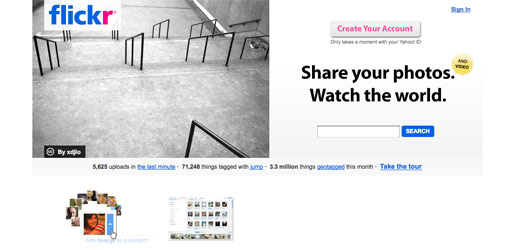
Site 1 – Flickr
| Criteria | Notes | Score |
| What is it about? | Flickr do a great job here. Using a big, bold and concise definition of their core purpose – front and center. | 10 |
| Do I care? | If I am like most of the modern world and own a camera of some sort and have friends then yes. They are very relevant. | 8 |
| Is it trustworthy? | The design is clean and professional which makes me believe they are a good company. They also have a Yahoo Id reference beneath the join button which gives them a lot of inherent trust points by association.With over 3 million items on their site, I know that others are participating which enhances my belief that they can be trusted. | 10 |
| How do I participate | Plenty of simple actions are presented that answer my initial questions. Can I look at other photos now without an account? Yes. Is there a prominent sign-up button? Yes. Are the core features presented in a simple way? Yes. Is there a simple way for me to find out more before I commit? Yes (the guided tour). | 10 |
| Is it newsworthy? | Photo sites are not uncommon, and I’m not sure right off the bat what makes this special (if it is). So I would say that the community aspect of it (Share Your Photos) will inherently mean that I will end up sharing it with my friends. But I might not immediately think to tell someone about the site. | 8 |
| Total | 92% |
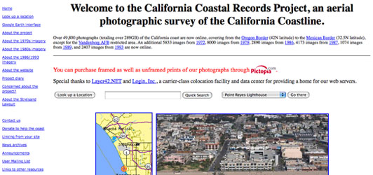
Site 2 – California Coastline
| Criteria | Notes | Score |
| What is it about? | This is very obvious from the large title at the top of the page. A simple concept communicated effectively. | 10 |
| Do I care? | As a photographer myself, I have an automatic level of interest in what it’s about and how they did it. But the photo presented on the homepage is random and as such the odds are it won’t always be anyting impressive. So while interesting, it’s not particularly exciting. The design is also very mid-90s and as such is a bit of a turn off. | 6 |
| Is it trustworthy? | They have a .org domain extension and over 7 million visitors (albeit shown with an archaic hit counter), so yes, it feels trustworthy. They are also not presenting any barriers to entry so I don’t have to be concerned about privacy. | 10 |
| How do I participate | I’m not 100% sure what they are saying I should do first. Should I be searching for a location to view it? The navigation on the left is very small and has a million things in it, so I don’t have a clear path to the best or most relevant content on the site. | 7 |
| Is it newsworthy? | If you have some kind of connection to California (friends, family, a previous vacation etc), then yes it could be the case that you’d want to find a location you are familiar with and see if it’s on there. HOwever, I can also do that with Google Maps & Google Earth, so the viral potential is limited. | 7 |
| Total | 80% |
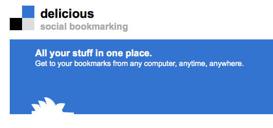
Site 3 – Delicious
| Criteria | Notes | Score |
| What is it about? | They make it obvious what the purpose of the site is. Off the bat I wouldn’t get why the bookmarks are social, but nonetheless I realize it’s a bookmarking site. However it’s not clear where the bookmarks are stored. Are they different from the ones in my browser? (I know they are, but for the uninitiated, it’s not made clear). The learn more link takes you to a page that explains it well, but the link was very small. | 8 |
| Do I care? | Knowing that it stores the bookmarks online, I can picture a use of the service. Aside from that though, it just looks like another site with a bunch of website or news listings. | 7 |
| Is it trustworthy? | It’s the biggest in the universe! And has a modern web 2.0 design. It’s also free to sign up and the form isn’t too long. So yes, I trust them. | 9 |
| How do I participate | There is a fairly strong call to search the bookmarks, and the bookmarks or sites on the homepage are organized by popularity or newness. Join and sign-up buttons are obvious. However the 5 slide header section feels wasted on poor communication. | 8 |
| Is it newsworthy? | Yes, I haven’t seen another site like this before. But I’m really not all that excited about it as my use of the service isn’t completely obvious. | 7 |
| Total | 78% |
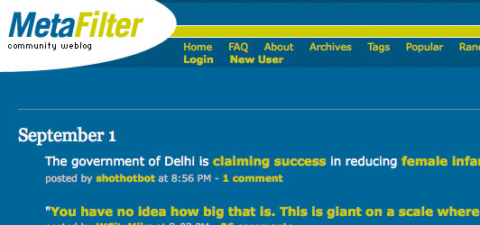
Site 4 – Metafilter
| Criteria | Notes | Score |
| What is it about? | I have no real clue what it’s about. Community weblog is the only descriptive element on the page. Which community? I’d like to see a clearer brand value message. After reading the about section it’s very obvious what it’s about. If they had put just one succinct statement on the homepage I would be more inclined to stick around. | 6 |
| Do I care? | There is so much text on the page that it’s hard to find a reason to hang around, so no, not really. | 4 |
| Is it trustworthy? | The design is poor, and I don’t get a sense of a large or modern company being behind it so I’m not really feeling like I’m in a place of particular value or professionalism. | 5 |
| How do I participate | No real sense of what I should do first. There is a tiny join link, but I’ve been given no reason or explanation of why to join. If there were a larger search box I might use that right away to see if the content is good and relevant to me). | 5 |
| Is it newsworthy? | I wouldn’t tell anyone about this site from my initial impressions. If they had a stronger value proposition and an obvious mechanism for sharing with someone it would get a higher score. | 2 |
| Total | 44% |
Site 5 – popurls
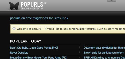
| Criteria | Notes | Score |
| What is it about? | Right away I can see that this is an aggregation of content from popular social media sites. | 10 |
| Do I care? | Very much so. Scrolling down the page, I see that it has content from everywhere, and I can imagine it being a great time-saving site to frequent or possibly use as my browser homepage. | 10 |
| Is it trustworthy? | As all it is doing is grabbing content from other sites, I have no reason not to trust them. And as the sites referenced are all familiar I have an inherent trust by association. I won’t be paying for a service so I’m confident that it’s a safe place to be. | 9 |
| How do I participate | I can browse, search or customize the content to make it more useful. That’s clear right away, and very simple to comprehend. | 9 |
| Is it newsworthy? | Yes. I would be an advocate of this site and would let others know about it. They also have a very simple and quick method of sharing the content with friends (I saw this when hovering over a link). | 10 |
| Total | 96% |
Site 6 – Twitter
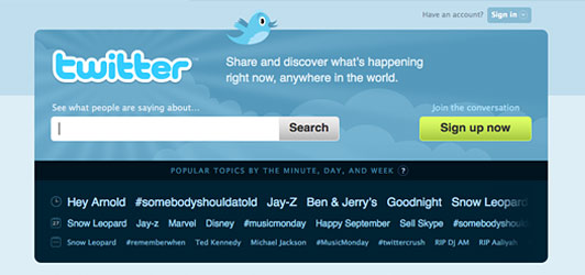
| Criteria | Notes | Score |
| What is it about? | They hint at what the site is about, and the homepage is very simple. The search lets me get into seeing what people are saying right away, but that makes me feel like the search is the core function rather than it’s use as personal comunication tool. | 7 |
| Do I care? | I’m not sold by any real value proposition at this point. But the sign up form is very short so I’d probably give it a go. Fortunately for Twitter, their brand is so pervasive that I am almost peer-pressured into caring. | 8 |
| Is it trustworthy? | The design is simple and clean, and there is the unavoidable brand reach that Twitter has obtained, so regardless of whether or not I know what it’s for, I have heard people talking about it, so I’m going to base my trust on word of mouth which is very strong. | 10 |
| How do I participate | The search box is big and obvious and the only other main things to do is sign up, so my options are clear. I would still like to be given some indication of the fact that my reason for being here is for micro-blogging. | 9 |
| Is it newsworthy? | Apparently so – as everyone else is talking about it. | 10 |
| Total | 88% |
Site 7 – Skype
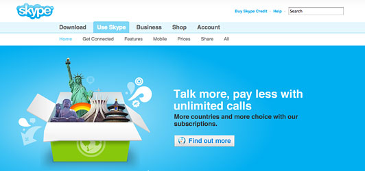
| Criteria | Notes | Score |
| What is it about? | Clearly about cheap phone calls, but it doesn’t seem to want to inform me that it’s done through a computer, so it could just be any telecom or phone card company. There are hints such as the “Mac OS X Version”, but it’s not clearly stated in a succinct manner. | 7 |
| Do I care? | I definitely care because it seems to be excellent value, and long-distance phone calls are a reality for most people. So I will at least click through to the “find out more” page which shows me the incredible prices. | 9 |
| Is it trustworthy? | The happy cloud design, bright colors, web 2.0 sensibilities and pro design put me in a good mood immediately. I’m starting to notice a common theme with designs that feature sky blue and white fluffy clouds. It is a very light and fuzzy feeling. Something to watch out for. | 9 |
| How do I participate | Clear navigation and a single main CTA to find out more is all I really need to know. I’m confident that if I click the “find Out More” button my questions will be answered. | 10 |
| Is it newsworthy? | Given the prices and the ability to call family in foreign countries for next to nothing, I would say this has massive sharing and viral potential. I would engage my family to sign up right away. | 10 |
| Total | 90% |
Site 8 – Boing Boing
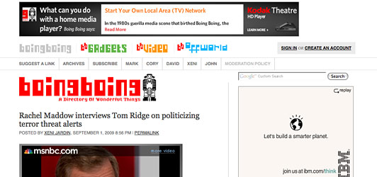
| Criteria | Notes | Score |
| What is it about? | My only real clue is the tagline – “A Directory of Wonderful Things”. Aside form that it looks and feels like a personal blog. From the navigation I can see it’s about gadgets and video and something else I can’t really figure out (due to the illegible font). | 6 |
| Do I care? | My interest would be highly dictated by the luck inherent in the first story having a headline of interest. Only 2 headlines appear above the fold on my very large monitor so the chances of my interest being tweaked is fairly limited. | 6 |
| Is it trustworthy? | I don’t feel particularly seduced by the design, and it just looks like a personal blog. As such it’s not something I’m going to be signing up for, making trust less of an issue. | 6 |
| How do I participate | I can sign up – but I don’t understand why I would want to – there’s no indication of what I get for an account on the sign-up page. Aside from that, all I would do is scroll down the page and perhaps navigate to a different section. This lack of direction is due to the unclear purpose of the site. | 6 |
| Is it newsworthy? | Potentially. Again it comes back to the top story of the moment. And really that may make the story newsworthy, but the site itself doesn’t do anything particularly original from a first glance. | 5 |
| Total | 58% |
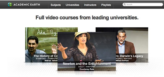
Site 9 – Academic Earth
| Criteria | Notes | Score |
| What is it about? | Aah, back to clarity. The purpose of the site is very clear within a second of arrival. | 10 |
| Do I care? | Even if I’m not in an academic space right now, there is a big appeal based on the fact that it’s offering full video courses from trusted sources. | 10 |
| Is it trustworthy? | The association with leading universities makes it feel very trustworthy. No concerns in that department. The Time.com logo at the bottom confirms it’s relevance and respect. | 10 |
| How do I participate | By clicking on one of the 3 featured videos, I was watching a 2hr lecture within seconds. No barriers to entry. Very impressive. A prominent search box lets me know that I can look for videos of more targeted interest. | 10 |
| Is it newsworthy? | Very much so. Everyone knows someone who is currently learning, studying or interested in great video content. I would share this and evangelize their service with confidence that it would reflect positively on me as a result. | 10 |
| Total | 100% |
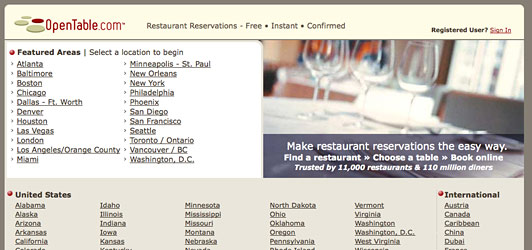
Site 10 – Open Table
| Criteria | Notes | Score |
| What is it about? | It seems fairly clear that it’s about restaurant reservations, but the design immediately smacks of a domain squatter that just farms out links, so I’m not confident right away if that is the core purpose of the site. | 7 |
| Do I care? | As a heavy internet user, I’m interested in the ability to book tables online, however, my lack of confidence in the site makes me wary. It’s worth noting though, that a typical use of this site may occur with a small group (or couple) at a computer, where several sets of eyes may hold the attention on the page longer. | 6 |
| Is it trustworthy? | Not at all. I’m fairly confident that I’d make the assumption that it’s a parked domain and just move on without really using the service. | 2 |
| How do I participate | The primary CTAs are buried in the design and don’t stand out to make me know immediately where I should begin. I would like to see a big bold button stating that I can book a table at one of thousands of restaurants right now. The info is there if you hunt, but it’s too text based to be noticeable at a glance. A large Google’esque search box with intelligent auto-complete would also be appreciated so that I can just begin typing the name or location of my favorite restaurant or city and start seeing results. | 4 |
| Is it newsworthy? | If I had been convinced to participate in a simpler manner it may very well be something I’d share. But given the feeling that I wouldn’t have hung around I’m going to have to go straight down the middle on this one. | 5 |
| Total | 48% |
Sites 1-10 Conclusions
There were a few surprises here. Large sites that have massive followings are breaking some fundamental rules (and are probably able to get away with it). However, what this shows is that even the best sites have room to improve their focus of their messaging so that they don’t lose valuable customers in those vital few first seconds. We can also see that certain sites such as OpenTable.com are really doing themselves a disservice.
Academic Earth was the runaway leader in terms of first impressions. You could learn a lot about communication and removing barriers to entry from their approach.
And Finally… 5 Reasons Why Your Homepage Won’t Make a Good Landing Page
- Landing pages should have a single focused message. Homepages tend to have all things for all people, acting like a portal to site exploration.
- A lack of connection to the upstream ad. Unless you have some very fancy back-end logic in place, it’s unlikely you’ll be able to ensure the messaging from a banner or paid text ad will be repeated on the homepage (especially when you are running multiple campaigns). This can make you look lazy and reduces momentum.
- Increased cost for PPC. Google will generally charge you less for a landing page that very closely mirrors the content of an AdWords ad. A homepage is way too general for tight coupling with your ad content.
- Losing your traffic to John Doe upstairs. In a large multi-channel organization, different business units will be responsible for separate areas of the site. While it’s great if a customer wanders off and converts somewhere on the site, I’m yet to meet a marketer that didn’t want to keep their traffic inside their own personal sphere of influence.
- Tracking issues. A single one-page landing page is easy to measure in terms of bounce rate and conversion rate. When you throw a homepage into the mix, your customers may wander aimlessly and still eventually end up in the desired place. If your analytics are good you’ll be fine, but the extra complexity makes it more, well, complex…
In Part 2…
Check back again next week for our critique of sites 11-20, including Google, Netflix, Amazon and YouTube.
Unbounce Challenge
Do you agree with our assessments? Do you have other sites you’d like to discuss?
Comment below with your ideas and questions.
What Next?
Follow Unbounce on Twitter | Download the Free “101 Landing Page Optimization Tips” White Paper
