You’re probably wondering why there’s a photo of a gymnast above. This is to illustrate one of the most important conversion element of lead gen pages – balance. Read on…
1. Finding the right balance – the size of the prize

One of the biggest factors in whether you’ll capture your lead is whether you are able to balance the size of the prize (what you’re giving away) with the perceived barrier to getting it. People are increasingly private on the internet and don’t want to give away their life story in text boxes just to get your 5 tips on building model railways.
This is where A/B testing can come in really handy. By changing the length and data requirements of your forms (and making them relevant to your giveaway) you can find your best converting page. For a more scary but very interesting test, consider not asking for anything! Just give it away for free – this is more useful when your intent is to virally spread content like an eBook (just make sure you include a statement in the book that says that people are free – and encouraged – to share it freely).
2. Landing page design is critical
Now I’m not saying “make it look beautiful” – although it never hurts to look professional. And yes, I know, I know, there are some really bad looking landing pages out there that convert really well. But that’s usually just because the sales copy is really well written. Anyway – we’re talking about lead gen so we’ll focus on the architectural design of an effective lead gen landing page.
The architecture of a great lead gen landing page

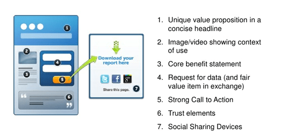
The diagram above shows the elements that you need to use on your pages to communicate to your customers what and why they should convert. 1 & 3 are the ones that you really want to spend about 50% of your time on – especially the headline. Your headline is your hook and the benefit statement(s) are what reel in your visitors. Joanna Weibe from CopyHackers is a great resource for this.
Next up, is your hero shot or the image/video that shows what you are offering. In order to make this effective you need to show context of use – what this means depends on what you are giving away. Here are a few examples:
- Selling a product: Show the product being used in real life (think Slap Chop) so that people can see it in action rather than just stare at a generic stock image.
- Selling a service: A quick product demo/walkthrough video will do wonders to increase engagement with your visitors and demonstrate how it can be used to bring value to them.
- Giving away a whitepaper or eBook: Here you need to use the “try before you buy” method and show a preview of the book. The first chapter, or just a really good few pages will suffice. It builds trust and lets people know what they are getting. Amazon perfected this with their “Look Inside” concept.
For social sharing (you want people to pass on your great offering right?) you need to place social widgets on your page – but not on the main page. This is lead gen and the primary focus isn’t sharing, it’s list building. So read on to the next point where I’ll explain where and why you should place your sharing tools on the confirmation page.
3. Post-Conversion Techniques for Social Sharing
As I mentioned above, there are places to put social sharing devices on your landing pages that don’t cause distraction and are more likely to be used by your new prospects. This one is simple. All lead generation landing pages should have a confirmation page that thanks the visitor and offers their download or further information. And most importantly for sharing, it’s where you place all of the “next steps you want them to complete while they are still a warm lead”.
Here are a few things you should consider putting on your confirmation pages (which can be a modal dialog or a new page – I personally prefer the modal dialog as it keeps the original page in the background and their thought process focused on the interaction they just had with you.
- Social sharing widgets: Add Twitter, Facebook, Google+, LinkedIn etc. buttons here to let people share the page with their networks – this can give you instant access to new potential customers.
- Social follow buttons: You can also ask people to follow you on those same networks so that they remain in your sphere of influence and can receive your future marketing messages.
- Give away an extra freebie: Chances are if you’re giving away an eBook, you have others too. So through an extra one is as a thank you.
- Newsletter signup: This is also a great place to ask them to sign up for your newsletter(s) – again, a preview link to a past version can improve conversions.
Conversion Tip: Don’t do all of these things at once – you don’t want your confirmation page to be unfocused, pick one or a couple of the ones that are most important to you and try them out – you can always switch it up at a later date.
For some examples of other lead gen pages – there are a couple here that do things well.
