
If you subscribe to any marketing blogs, then you’ve probably read tons of articles about common landing page conversion killers.
With mobile landing pages, many of the same best practices still apply. But a different device (and a different state of mind) introduces new barriers.
With a new set of constraints, your best bet is to get creative – and as we learned in the latest episode of Page Fights, there’s a lot you can do to make your mobile visitors less likely to bail.
Regular judges Oli Gardner and Peep Laja were joined by guest judge and user experience champion Craig Sullivan to drag 10 mobile landing pages through the mud for your benefit:
In the process, they named five common conversion barriers that demotivate mobile landing page visitors from taking action. Watch the full episode here, or read on for the distilled wisdom.
1. Your form is long and intimidating
When people land on your page, they shouldn’t feel a sense of dread wash over them.
Peep had problems with the clarity of the offer on Crystal Ball’s mobile landing page, but thought the length of the form was the real conversion killer. “You want me to type all of this on my phone?”
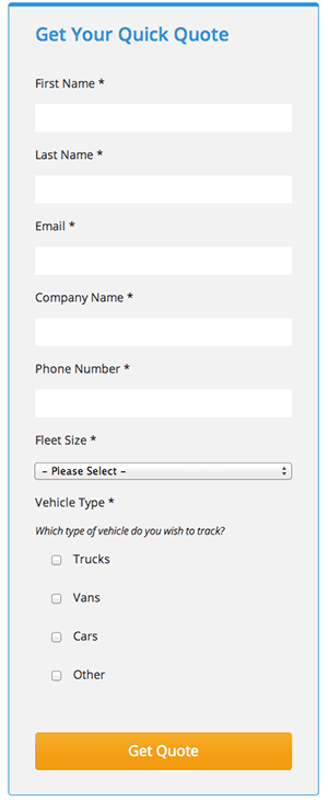
Craig agreed that the number of mandatory fields was excessive, given that you can follow up for most of that information later via a phone call.
Both judges recommended stripping down the number of (mandatory) fields to reduce friction – both perceived and physical:
The judges also touched on some other points for making form completion a little less daunting.
As Craig pointed out, some of the pages had glitchy form error messages that appeared further up on the page – out of the visitor’s viewport.
Given that people are filling out the form with their thumbs, errors are inevitable. The judges explained that you need to make error messages clear and even delightful to encourage prospects to try again.
Consider Creative Circle’s approach to the same problem. Their form wiggles upon error, giving prospects clear feedback that they need to try again.
2. Your CTAs are easy to overlook
Brace yourself for some advice from Captain Obvious…
Your button should look like a button. And it needs to contrast with your background.
These may seem like CRO potty training basics, but many of the mobile landing pages in this episode were guilty of these infractions:
Buttons should never be the same color as the background. A CRO Unicorn just died. :( #pagefights pic.twitter.com/Kckht92VNj
— James Svoboda (@Realicity) January 16, 2015
But the landing pages also fell into some other conversion-killing traps.
For example, as Oli pointed out, if you look at Ideal Shape Smoothie Recipes’ form in isolation, there’s nothing around it that explains what’s going on:

For someone who’s just skimming the page, a CTA like “Start blending” is pretty meaningless.
To avoid clarity problems like this, Oli explained that it’s important to design your form in isolation.
This is especially true on mobile, when prospects won’t necessarily see the page’s headline, benefits and CTA in the same viewport.
Form headlines and sub-headlines afford you the opportunity to remind prospects about your irresistible offer – and give them a final nudge toward the conversion goal.
Takeaway: “Your form should be able to stand in isolation” @oligardner #PageFights
— Sarah Lund (@LundSarah) January 16, 2015
3. You’re not using scroll cues
Requiring mobile visitors to scroll endlessly isn’t exactly a delightful experience.
As much as possible, you should condense the content of your mobile landing pages so it’s more digestible for users.
That said, your page is still likely to require a little bit of scrolling – and that’s fine – as long as you show prospects scroll cues to encourage them to keep reading.
That’s exactly where the judges thought Creative Circle’s mobile landing page fell short; there’s nothing in the main viewport to indicate that there’s more content below:
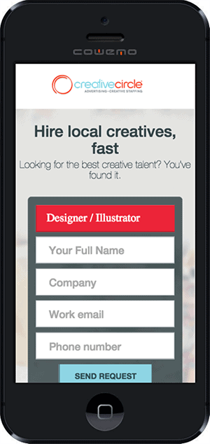
Whether an arrow or a sneak peek at the next section of the page, Craig recommended a hint of something to indicate that mobile users should continue to scroll.
Unsure if your cues are too subtle (or being noticed at all)? Craig recommended usability testing to be sure that your scroll cues are having the intended effect – and across a variety of devices.
4. You’re discriminating against people with fingers
Let’s say you did decide to scroll down on Creative Circle’s mobile landing page, in spite of the lack of scroll cues.
Do you think you might have a hard time scrolling down without accidentally clicking a form field or CTA button?
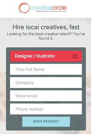
Oli certainly thought so – and suggested that not leaving enough space for fingers is likely to frustrate prospects.
As Craig explains in this Page Fights follow-up post:
If you put links, buttons, elements that are ‘clickable’ too close together on the page, you are discriminating against people with fingers.
If you want to avoid frustrating your mobile users, start running tests to make your mobile landing pages a little more finger-friendly:
Make a list of devices, test on them – watch for where fingers land to scroll the page (hopefully not in the middle of a form) #PageFights
— ChicagoBassEnsemble (@ChicagoBassEns) January 16, 2015
5. You’re evoking a negative emotional response
In an environment where prospects have notoriously short attention spans, your mobile landing page needs to make a good first impression.
At first glance, Peep thought Toolier’s mobile landing page was a little jarring:

Even without reading any of the copy, Peep thought the page was off to a bad start:
You lost me at the stock photo dude. Who wants to see an angry, fake white dude in a suit?
Sadly, the copy doesn’t do much to reverse this negative first impression. Peep was put off by the first paragraph on the page, which suggests that prospects are wasting time reading blogs and books.
“I’ve read lots of great posts,” Peep explained. “You’re disagreeing with my world view.”
The landing page is littered with negative phrasing and images, and as Craig explained, that sends a negative emotional message to prospects – which could inhibit them from converting.
To add insult to injury, have a look at this section of the landing page:
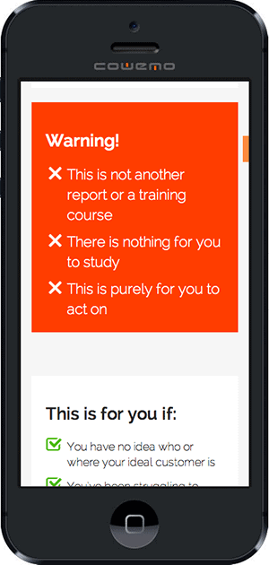
Sure, the red box catches your attention, but Craig wondered if it was the wrong type of attention. To him, it looks like a form error and makes him feel like he’s broken something on the page.
All in all, the judges agreed that the copy and images felt aggressive and weren’t likely to mirror the actual conversation that prospects are having in their heads.
Here’s how Craig put it:
The copy feels like megaphone marketing. You’re hammering stuff up the customer’s ass with a sledgehammer when you really need to be listening to them and crafting messaging accordingly.
The last thing you want to do is make prospects feel like you’re barking orders at them.
Stop. Listen to the words they use to describe their problems. Then swipe those words straight from the horse’s mouth.
Be rigorous with your testing
So how do you know if your copy is evoking an unintentional response?
How to tell if people are scrolling (or not)?
Put yourself in their shoes with user testing and rigorous device testing.
Craig explained that device testing isn’t just about pulling out your iPhone and double-checking that your images scale. Instead, here are the two steps he proposed:
- Understand your customer device mix. Draw up a list of which devices your prospects have. If you’re not sure about this, Peep suggested digging into your Google Analytics.He also emphasized that you need to ensure that you have a large enough sample size per device (in the ballpark of 300-500 conversions or more) before you draw any conclusions.
- Put yourself in their shoes and test. In order to really see things from the POV of your prospects, you need to replicate their experience as accurately as possible. Online emulators are a good start, but here are some resources Craig shared to help you conduct more accurate tests:
- Connect with 4G so you can get an accurate representation of load times.
- Visit open device labs in your area where you can pay by the hour to gain access to a variety of devices.
- Use remote control services such as AppThwack and Keynote DeviceAnywhere. These are services that give you access to real mobile devices on commercial phone networks that are actually physically located in racks all around the world.
The final option might seem like overkill, but as Craig explained, remote control services are the most accurate means of testing the mobile experience you’re creating for users.
They’re your best bet for creating delightful, bug-free experiences.
Put yourself in your prospects’ shoes
The only way to create delightful mobile experiences for users is to put yourself in their shoes.
Only then can you avoid silly display errors like this one:
For the love of God, can someone please tell this robot to stop messing with these logos. #pagefights pic.twitter.com/W864CRv9zF
— Dustin John Bromley (@DustinJBromley) January 16, 2015
And only then can you avoid more serious, device-specific glitches that are costing you money.
So before you launch your next landing page (whether it’s mobile or not), step back. Gather user feedback. Test rigorously and obsessively.
Or if you’re a masochist…
#PageFights We just like getting sworn at by @oligardner : )
— John Bonini (@Bonini84) January 16, 2015
… consider throwing your page into the ring for the next episode of Page Fights.

