That statistic is probably quite shocking, and it should be. Paid advertising is in a shocking state.
As a remedy for the pain, I’m going to share two very simple and fundamental aspects of successful marketing that a shamefully large number of experienced marketers like you and I are still screwing up.
I say you and I, but that’s just being nice. I don’t screw it up. You wouldn’t listen to me if I did.
Question
What happens when your pay-per-click ads suck?
Answer
The costs get so prohibitive that you stop doing it. And no number of free $100 coupons will save your bad marketing practices.
Bad marketing will always fail. But if you’re doing good marketing for a good product or service, yet not quite achieving the success you want, then you will be ahead of 98% of the marketing world by the time you finish this post.
First things first…
Admit it. You’re doing it wrong.
I can hear you now…
“Yeah, yeah, yeah. I know the fundamentals. In fact I’ve got 5 years experience with AdWords.”
Yet despite all of this knowledge and experience, you’re still doing it wrong.
It probably sounds like I’m having a go at you. I’m not. I’m simply sharing the research I’ve done which shows that virtually *everyone* is doing it wrong.
Why?
You’re not applying the two pillars of a successful PPC campaign:
-
Pillar One – Attention Ratio
-
Pillar Two – Message Match
I don’t care how good you are at AdWords management or ad writing.
If you don’t understand attention ratio and message match, you are doing it wrong, and your ads are under performing as a result.
Just like 98% of all AdWords marketers.
So where did I get this outlandish stat from? I’ll explain that in a minute.
First, some definitions.
PPC Success Pillar #1 – Attention Ratio
Attention ratio is the ratio of interaction points (links) to the number of calls to action on any given page. On a homepage this is typically around 40:1 meaning that there are 39 distracting actions and 1 desired action. A focused landing page on the other hand has an attention ratio of 1:1.
Let’s take a look at the diagrams below. The homepage is based on Virgin Mobile USA and it has 57 links on the page. If the campaign you’re promoting with your PPC ads is “Promo 2” (highlighted in red) then not only will it be hard to find amidst all the clutter (the attention ratio is 57:1), there are so many competing elements that your prospect will either hit the back button or click on another of your promos.
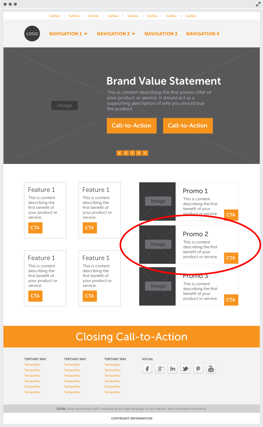
What’s wrong with them clicking another promo? Surely a sale is a sale. NO. If they don’t interact with the campaign you’re promoting your AdWords statistics will reflect a failure as “Promo 2” wasn’t the one that converted.
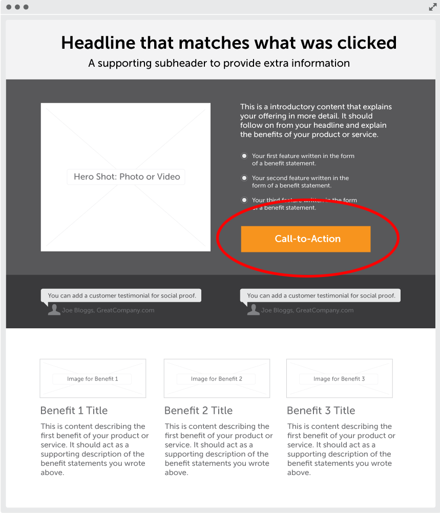
Next, take a look at the landing page below. It’s very clear that there is only one thing to do here, so the attention ratio is a perfect 1:1.
Using a campaign-specific landing page for your ad campaigns is the first step to success, but in and of itself, it will only improve the attention ratio. If you don’t improve the message match you will still fail, just not as much.
PPC Success Pillar #2 – Message Match
Message match is a measure of how well your landing page headline matches the call-to-action that was clicked to arrive on your landing page. For paid ads, this is the headline of the ad.
How hard is that?!
It’s not hard at all. Which is why it blows my mind that so many people are missing the boat.
Follow through on your ad’s promise. Maintain the scent. Match the message.
Question 1: What’s the best way to match the message?
Again it’s dead simple. Use a dedicated and focused landing page for your ad. If you point your ad at your website’s homepage you’re doing it wrong. Again.
Question 2: What’s wrong with my homepage?
Your homepage has a general purpose, and that’s to communicate the unique selling proposition (USP) for your brand in general.
A landing page on the other hand, is designed for a Unique Campaign Proposition (UCP). This is an incredibly important differentiation, as you’re going to have many campaigns, each of them with a different agenda, and each of them requiring its own unique headline.
A homepage simply isn’t the appropriate place to send your ad traffic as you can’t change your headline to reflect your UCP without having a big impact on your USP.
Design match (or visual match)
Another aspect of message match is what’s known as design match. If your ad is visual, such as a display ad or a Facebook ad – that has a graphical component to it, you need to follow the design of your ad through to the landing page. The stronger the design of your landing page matches the design of the ad, the stronger the design match will be.
Why?
Images are processed in your brain faster than words. Therefore, if the primary visual on your landing page (the hero shot) or a background image, is the same as your ad visual, your visitors will make a quicker connection. Again, this creates confidence that your visitors are in the right place.
An Example of Message Match
Consider the example below.
Your ad looks like this:
If this is sent to a homepage, the target headline may look something like this:
This is a good headline for expressing the brand value proposition, but it doesn’t match the ad at all.
Result? Bad message match.
The correct headline in this instance would be:
Result. It matches the headline (CTA) of the ad perfectly, and thus it’s great message match.
Ding, ding, ding. Got it yet?
Okay. Now you know what it is, and how it works, what does it do for you?
The 3 Impacts of Good Message Match
There are three impacts of good message match:
- More successful campaignsSounds overly simplistic to say “more successful”, but when visitors are instantly reaffirmed that they can get what they came for – because the headline matches the link (or ad) they came from – they are more likely to remain on your page.Think of it like an elevator pitch.Your headline is the foot in the door you need to allow you to pitch your product. If it’s a strong match to your ad, your visitor will proceed past your headline and on to the rest of your page content: the elevator pitch itself.This will lead to higher conversions and, as a result, a higher return on investment (ROI) for your marketing campaigns.You heard me.
- Better UX (User Experience) means better ad price and positionThe success of your campaign also leads to lower ad prices and better ad positions. This is because Google starts building a history of your success. With poor message match, there will be a higher bounce rate which is interpreted by Google as a poor user experience – which you get dinged for.The stronger your message match is, the better the user experience is – making your account history more positive, lowering your costs.Love the experience.
- Less work for OliLess work because I won’t have to work so damn hard and click on so many ads in order to find a good example of message match.#firstworldproblems
98% of Marketers are Doing it WRONG!
Okay, now it’s time to explain that horrible stat.
To explore how well marketers are applying the principle of good message match, I did a simple – albeit tedious – exercise that you should all try.
I clicked on 300 paid ads, and recorded the number that used focused landing pages to present strongly matched headlines.
What I saw was a huge $#^#&$! indictment of the state of online advertising.
To demonstrate, I’ll show you a series of searches that went like this:
Google search »ad click » landing page experience
Remember, a landing page is any page you land on. A good landing page is campaign specific.
What Does GOOD Message Match Look Like?
Now let’s look at some good examples of message match. First up is an example based on a search query of “packaging design”.
One of the paid ads looked like this:

Now the landing page that you are taken to:

YEEEEESSSSS!
Notice how the headline of the landing page matches the ad headline perfectly. One thing that would make the landing page even stronger would be if the CTA on the ad “Start your new design project today” was replicated on the button on the landing page. That would be a super awesome message match.
What does GREAT message match look like?
A Facebook ad example
Now let’s take a look at a Facebook ad. The interesting thing with Facebook is that it combines copy with imagery, so you have to start considering both message match and design match.
Here’s the ad:

And here’s the landing page:
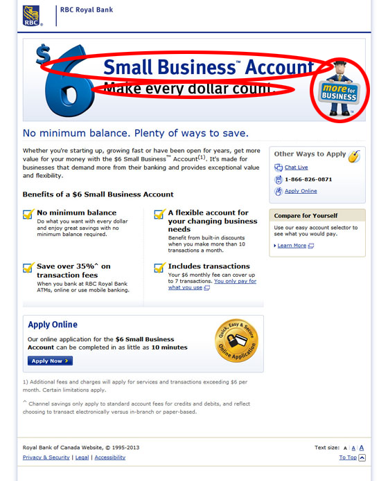
This is a very impressive example. The ad headline is matched perfectly on the landing page. The ad subhead is matched perfectly on the landing page. And the wee dude in the ad is matched perfectly on the landing page.
This is how message match is supposed to be done. Well played, RBC, well played.
HOWEVER. Take a look at the landing page in detail. There are still too many things to do.
Count them:
- Link: You only pay for what you use
- Link: Chat Live
- Link: Apply Online
- Link: Learn more
- Button: Apply Now
Attention ratio 5:1.
To improve this, the different options for applying could be on the next page. And the CTA would be a lot clearer if it was designed to have a strongly contrasting button color.
In Summary
You can see from all of the poor examples I’ve presented that attention ratio and message match are a huge problem for marketers. But this doesn’t have to be the case.
Follow the guidelines I’ve laid out and you’ll quickly start to turn your campaigns around and get a higher return on your AdWords investment.
If you have some examples to share or would like me to critique your own ads and landing pages for attention ratio and message match, throw them into the comments.