When I think of A/B tests, I’m immediately taken back to the years of eye exams where the doc asks, “Which is better, 1 or 2?” The patient’s response helps the doctor fine tune a prescription for the laser-sharp eyesight.
A/B tests serve much the same purpose for marketers. A/B testing lets Web designers and marketers fine tune a prescription to build the most effective landing page. Like the vision test, the changes between two landing page elements can be subtle and barely noticeable to the unassuming eye, but make a big difference to the user and conversions. It helps make what works, and what doesn’t crystal clear.
The following five businesses used A/B testing to fine tune the element of their landing pages to improve performance and increase conversions.
1. WriteWork
WriteWork.com was finding that despite a significant amount of organic traffic, they were seeing limited conversions. It must be the landing page. After conducting several customer feedback surveys, they decided to overhaul their landing page completely. The company not only redesigned the site, but changed the site copy and key words to make the language more relevant to their audience.
Page A – WriteWork’s original landing page showed no clear benefits for shoopers who responded to the Call to Action (CTA), reducing conversions

Page B – The new page made highlights benefits to customers and helped to reduce the bounce rate

Conversion Results
The A/B test, which was completed by Website Visual Optimizer, showed the radical redesign was a hit. In fact, engagement more than doubled.
- The new site and use of the primary CTA increased engagement 144%
- Ultimately, a follow up test revealed that payments for services rose more than 50%
Testing Service & Full Case Study: Visual Website Optimizer
2. RJ Metrics
Preparing to conduct their very first A/B test, RJ Metrics knew they needed to define goals which were achievable and measurable and lead to greater revenue. Since the company’s website doesn’t directly generate revenue they chose to test their free demo offer, the one measurable action that brought the consumer the closest to the final sales process.
Page A – RJ Metrics original landing page was busy with a video explaining the product. The CTA is small and does not provide any information as to what the free trial entails

Page B – The revamped page removed the busy video, significantly increased the size of the CTA and specifically defines the benefits to the customer who opts for the demo

Conversion Results
Using Google Website Optimizer, RJ Metric’s A/B test showed the new site to be much more effective than the original.
In fact, conversions rose 190%.
The best part, the video from the original page didn’t go to waste; it’s now being used on another page within the RJ Metric’s website.
Testing Service & Full Case Study: Google Website Optimizer
3. Obama08
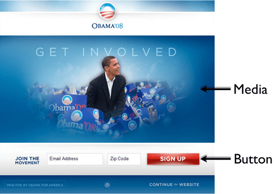
During President Barak Obama’s 2008 presidential campaign, his campaign committee wanted to optimize every aspect of his campaign. The thought was that the right web design potentially meant the difference between raising $10,000 and $10,000,000 in campaign funds. The team looked at 24 different variations of the splash page using a mix of images and CTA buttons to determine which combination produced the greatest results.
Page A – The Obama team tested several combinations of visuals and CTAs to identify the most effective pair
Page B – The winning combination engaged emotion with the image of the Obama family in conjunction with the Learn More button
Conversion Results
With more than 300,000 visitors to the splash page during the testing period, each variation was seen by more than 13,000 people.
- The winning combination saw a 40% increase in sign-up rates.
- Though the number may not be as lucrative as some of the other examples examined for this article, the overall perceived success is staggering. It’s estimated that the increase in conversions resulted in an additional 2.8 million email addresses which ultimately led to $60 million in donations.
Testing Service & Full Case Study: Optimizely
4. Kwik Fit
The business of Kwik Fit, a U.K.-based insurance intermediary, is greatly dependent upon its digital presence. Because of this, the company wanted to find a way to increase conversions from visitors to the landing page for its highest profiting product line. They decided to conduct an A/B test that looked at page-layout, content and design on its affiliate landing pages.
Page A – The original affiliate landing page was text heavy with many of the unique benefits falling below the fold

Page B – The winning design optimized the sites content and helped Kwik Fit meet its goal to increase conversions

Conversion Results
Utilizing Maxymiser’s Multivariate testing software, KwikFit recognized their original design was too busy and lacked a prominent CTA.
The winning design, which included less text, unique selling points located above the fold and a more prominent CTA, improved registration rates by 12% and increased the number of confirmed purchases by 78%.
Testing Service & Full Case Study: Maxymiser
5. Buy Real Twitter Followers
Taking advantage of a growing Twitter advertising market, Buy Real Twitter Followers works to help advertisers increase their clients’ Twitter presence. But they needed to increase their own sales as well. So, they devised an A/B test that would provide feedback on the addition of a video to their home page.
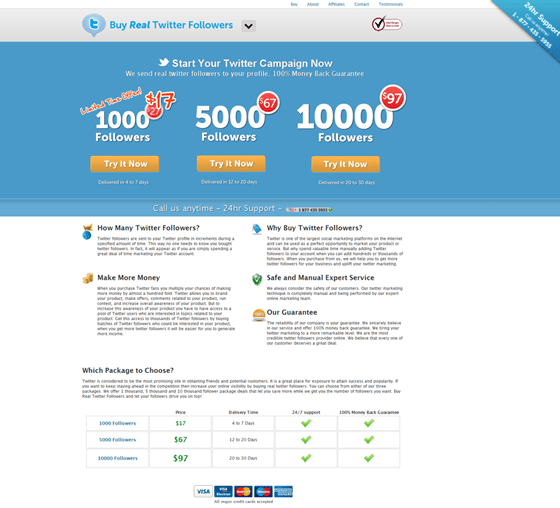
Page A – The original Buy Real Twitter Followers homepage is text heavy which many visitors would simply skim through
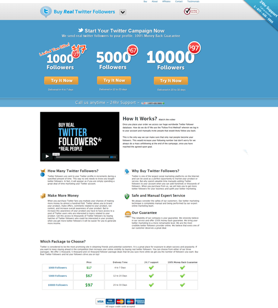
Page B – A simple addition of a video maximizes the content by drawing attention to the product information
Conversion Results
The minor change of adding the video to the landing page helped them increase their sales by an astonishing 216%.
Because visitors generally only scan through text-heavy material, the video draws more attention, providing a better understanding of the product. Despite the stellar results, their current home page is missing the video, but it can be found deeper within the site.
Testing Service & Full Case Study: Visual Website Optimizer
Reviewing some of these case studies and seeing the A and B versions of landing page elements, you often wonder why the sites weren’t designed that way in the first place?
As we all know (or should know), hindsight is 20/20. Landing page design and A/B testing are a continuous process.


