
There’s been lots of talk about the benefits of marketing automation lately, but how do you sell the idea to your boss?
I recently wrote a post about justifying the expense of marketing automation software to your C-suite by showcasing the revenue-generating and cost-saving benefits of the software. But nothing really speaks to ROI like cold, hard numbers.
That’s why, in the interest of helping businesses find the right software I’m sharing the tremendous results we’ve seen over the past year since implementing our own marketing automation system to generate leads, save costs and, ultimately, drive conversions.
The Problem
Flashback to early 2012. Our two (wo)man marketing department was spending a ton of time trying to effectively use a once-awesome email marketing tool that we had since outgrown.
The functionality was great when we first adopted it, but now the batch-and-blast system couldn’t do what we needed, and we were spending too much time segmenting lists and manually sending A/B email tests to see what generated the best results.
We couldn’t automate any of our sales follow-up emails to incoming leads because it would require our marketing team to split up the list and deploy one-off emails for each rep’s respective prospects.
And by the time we could do that, a couple of days would have passed since the lead first came in.
So, we skipped automated email follow-up altogether, and we passed all leads over to sales to deal with on a one-off basis.
Not surprisingly, our reps were overwhelmed with manual follow up. Their goal was to get prospects on the phone so that they could verify the software buyer’s requirements and make sure that the person was truly in the market for software (what we’d call a “sales-qualified lead”).
But many prospects wouldn’t answer our reps’ calls when they reached out cold, so the sales team spent most of their time emailing questionnaires to try to get the details they needed.
Even if they could verify the lead on the phone, they then spent quite a bit of time emailing back and forth post-verification to try to close the deal.
With such a manual process in place and so many emails to send, it took our reps between 12-24 hours on average to reach out to a new, incoming lead.
We’d read studies that said you are 60x more likely to qualify a lead if you follow up within an hour than if you wait 24 hours—and we were even encouraging our own customers to follow this sage advice. We decided enough was enough – it was time for us to drink the marketing automation Kool Aid.
The Hypothesis
When we pitched the idea around the office, we hypothesized how marketing automation could improve our team’s process and what would come from the investment. We planned to use the software to:
- Create an API that would feed all incoming leads from our landing pages into our marketing automation system
- Use the marketing automation system’s email capabilities to automate email follow up only with unresponsive leads who we could not get in touch with in the first 24 hours. That way, we’d still have the human outreach to fresher leads, and it would give the API feed enough time to update the lead information overnight before we started automating the questionnaire emails.
- Eliminate more than 90% of the post-qualification check-ins and touch-base emails our reps were sending by creating a dynamic nurture track to all sales-qualified leads.
- Free up reps to be able to respond within an hour to all incoming leads during business hours to boost our verification rates.
The Results
After about 6 months of building the API, implementing the software, and creating our nurture tracks, we were finally able to go live with our vision (we went with Pardot and use their professional edition for $1,000/month). The results were better than we could have hoped for:
- 94% Reduction in Average Response Time: Our reps’ average response time for new, incoming leads dropped to well under an hour. We experimented with different response times, and found that if we could call the person within 5 minutes of submitting the lead, we were most likely to get the buyer on the phone. Even though we couldn’t get all prospects on the phone within 5 minutes, if you compared the now 45-50 minute average to the nearly 18 hours it took on average before marketing automation, that’s a 94% decrease in response time!
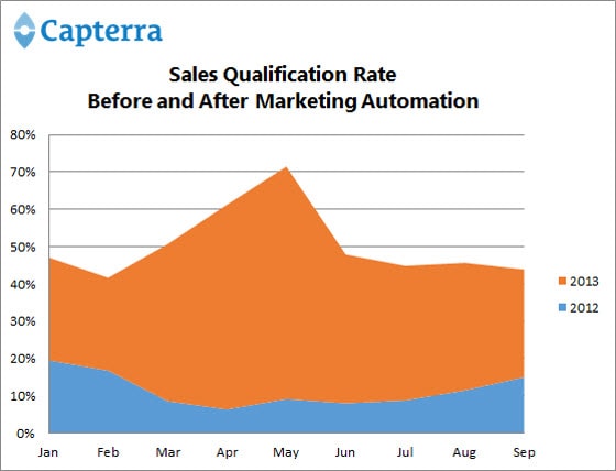
- Quadrupled the Qualification Rate: From Q1 to Q3 of 2012 (the period before we had fully implemented the marketing automation nurture emails), we averaged an 11% sales qualification rate on incoming leads. Looking over the same timeframe in 2013 to account for seasonality, we averaged a 40% sales qualification rate.
- Maintained Close Rate to Create 4X in Sales: Despite automating many of our lead qualification tactics, the quality of our leads did not suffer. In fact, close rates remained exactly the same year over year. So despite the greater volume of leads we were able to qualify with the help of automation, it did not cause the purchase rate to decrease at all, thereby yielding a nearly 4x increase in lead sales.
Hopefully you can take this example and use it to make the case for what marketing automation could do for your bottom line.
Do any other marketers have similar results to share from implementing marketing automation software?

