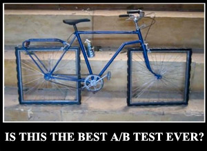
/ A/B Testing[Checklist] The Interactive A/B Testing Scorecard By Oli Gardner on September 21st, 2012 in A/B TestingTotal274 208 16 50I’d love to see this bike A/B tested with one round wheel and one square wheel. (Original image source)A/B testing is part art, part science, and part blind luck. But unless you test, you’re walking blindly through a marketing maze, not knowing which direction to turn.So to get you started down the right path, I’ve put together a checklist of things you can test on your landing pages.If you’re a smartypants, you’ve already started testing, and you’ll be able to check off a bunch of the ideas on the checklist below (if not, read “The Ultimate Guide to A/B Testing“).The ChecklistSee how many you’ve already tried and share your score in the comments below. Once you’re done you’ll have a nice to-do list of things to test next time you run an experiment – based on the ones you haven’t tried. Score: 0/21Total Score: 0/21Inbound source segmentation: If you’re driving all of your traffic to a single page, you’re losing an opportunity to measure the effectiveness of each inbound channel.Test this: Create a separate landing page for each source (email, social, PPC) and see which source gets you the most conversions.Image vs. video: Sometimes a strong image is all that’s needed to gain enough attention to keep someone on your page, but a video increases engagement and time on page.Test this: Use a static image showing a physical product (or a screenshot if it’s an online tool) and test it against a video demoing your product or service.Video – autoplay vs. user directed play: Love it or hate it, it has an impact on conversion. It can annoy your visitors and make them leave or grab their attention.Test this: Simply set up your video to start as soon as the page is loaded and test it against a version where the visitor has to choose to watch it.Video – persistent CTA vs. shown at the end: If you’re using a video, you should include a call to action in it so there’s an action item for viewers.Test this: If you show it throughout the video there’s clearly a better chance it will be seen if the visitor doesn’t watch the whole video (but is it overly salesy?). On the other hand, if you place it at the end you can make it bigger (using the whole screen) and there’s a higher chance that the viewer is interested if they got to the end.Context of use: Demo’s are a great way to illustrate how and why people can use what you’re selling. Showing it actually being used (think Slap Chop or Sham Wow) increases the believability factor.Test this: Show your product or service being used in a situation of reality and test it vs. a static image.Headline – single headline vs. primary and secondary supporting copy: Sometimes a single headline is all you need to communicate what you do, but a smaller secondary statement can be used to back it up and provide extra information while keeping your headline simple and to the point.Test this: Try adding a benefit related secondary headline beneath your primary headline that explains the WHY to complement the WHAT.Headline – long vs. short: Given that most people will only stay on your page for around 5 seconds you need to get to the point immediately and the length of your headline can affect the capacity for someone to get what you do.Test this: This goes hand in hand with the previous test. Test one long headline with a short enticing statement, or shorten it by including a secondary headline.Page copy – long vs. short Different items need more explanation that others to convince someone to convert.Test this: Try a succinct version that gets straight to the point against a long page that explains everything it does. Think of the information on a boxed item vs. the instruction manual inside.Forms – number of fields: Do you really need all that information? The more form fields you have the larger the barrier to entry.Test this: Clearly you are trying to gather leads, so try asking for an email only against all of the information you think you need to qualify the lead.Forms – required vs. non-required fields: This test by WhichWonTest resulted in a 31% lift in conversions by making all of the fields not required, and surprisingly it also increased the quality of the leads. (Disclaimer: the details of this test require an account, which I have – hence the extra information).Test this: Just try it! Remove all of those nasty little asterix’s and see how many more people complete your form.Forms – multi-step vs. single step: Despite sometimes thought of as a bit of a bait and switch, by making people think they only have a short form to fill out, it can be an effective way to get people in the mindset of “Well, I’m already half way through, I may as well continue.”Test this: Try splitting your form in half and creating a second page that completes the process.Call to action – multiple vs. one for long page: If you have a really long page, nicely chunked with different enticing pieces of content, you never know which part will nudge someone into conversion mode.Test this: Add a single CTA at the top of the page, and test it against a page that has a CTA in each distinct block of content. Or at least an extra one at the end of the page.Privacy policy location – footer vs. form: If you are doing lead gen, it’s critical to add a privacy policy to increase trust (stating how you will use their email and that you won’t spam them).Test this: Most people add it in the footer as an afterthought. Test this against placing it right beside the email field. Most people won’t even click on the link, but will feel more comfortable knowing it’s there.Testimonial location – Top vs. bottom: A believable and authentic testimonial (especially from an expert) can really help conversions, but where do you put it on the page?Test this: Have it at the bottom of the page (typical) vs. front and center to ensure everyone gets to see it right away.Social proof – webinar registrants: Lean on the concept of herd mentality by showing how popular your webinar or event is.Test this: Add the number of registrants to your sign up page and compare the speed of sign-ups and number against a version without the count. My bet would be that the higher the number gets, the faster it will accelerate.Confirmation page – newsletter sign up (preview vs. no preview): On the confirmation page of your lead gen page, or shopping cart checkout process, ask people to sign up for your newsletter to keep them in your sphere of marketing influence.Test this: By adding a preview you are showing people what they will be getting. See if it improves your sign up rate.ebook download – preview vs. no preview: The try-before-you-buy concept is a proven technique in improving sales.Test this: Just like the test above, adding a preview of your offering gives people a chance to see the quality before making a decision. Test no preview vs. a chapter from your ebook. You can also test different chapters against one another. Live chat vs. no live chat: The fence sitter. Someone that kinda wants to buy, but isn’t sure. They are the most likely to go and do some research which may result in them finding a competitor.Test this: Stick a live chat widget (Like Olark on your page to guide people through the purchasing decision making process right at the point of conversion. You will also learn from them what should be changed on the page to remove the fear of conversion which will lead to a hypothesis for your next test.Newsletter signup popup window: Personally I hate these. You arrive at a site and the first thing they ask for is your email for a newsletter without even giving you the chance to see whether you like their content or products. But, given how many people do it, it must have an effect.Test this: Try adding one a nasty interruption marketing popup to increase signups on your test page. I’d also check your analytics to see what effect it has on “time on page” – a good indicator that people are backing out as soon as they see it.Urgency – time limit vs. forever: It’s a tried and true method in the brick and mortar world – on day sales, boxing day/week sales etc. so why not try it on your site.Test this: This might be a test that you use more than two variants for. One without any time limit, one with a short deadline and one with an extended deadline (some people have to ask permission first). Then refine the time to achieve your optimum conversion rate.Research: Stop thinking you know best! Go talk to the customer support team and find out what your customers are complaining about every day. Chances are they know waaaaay more than you about what’s going on.Test this: Your ideas vs. those of people in different departments. Have a brainstorm with people from colleagues that do customer support (the front lines), design, copywriting and information architecture etc. And for the best chance of getting some great ideas, invite anyone who wants to participate, that way you’ll get people who are probably bursting to share their thoughts. Once you’ve gathered their ideas create a new test page to run against your own.Total Score: 0/21What nowStart testing! Also, remember to share your score in the comments, and any other test ideas you might have.— Oli GardnerAbout Oli Gardner Unbounce co-founder Oli Gardner has seen more landing pages than anyone on the planet. He’s obsessed with identifying and reversing bad marketing practices, and his disdain for marketers who send campaign traffic to their homepage is legendary, resulting in landing page rants that can peel paint off an unpainted wall. A prolific international keynote speaker, Oli is on a mission to rid the world of marketing mediocrity by using data-informed copywriting, design, interaction, and psychology to create a more delightful experience for marketers and customers alike. He was recently named the "The 2018 Marketer to Watch," in the under 46 category, by his mother.» More blog posts by Oli Gardner