[The 12 tests below have been used with permission from WhichTestWon]
In my last article, critiquing landing pages for conversion, I finished with a page that worked, but that broke all the rules. You might infer from this that the rules don’t matter, but that’s not the case.
Sometimes the rules don’t matter, but only when you’ve tested a page to make sure. You can bet your bottom dollar that Match.com (because that was the site in question) A/B multi-variant tested that page to ensure they optimized the conversion experience.
In this article we’re going to look at some examples of A/B testing and delve into the reasons why some worked and some didn’t.
We’ll also look at how the counter-intuitive approach is sometimes the one that worked. So on we go: Some really surprising A/B test results and some that might make perfect sense to you. In the end, this is why we test, right? What might seem obvious to you, could be not so much for your visitors.
All of the tests are taken from Which Test Won?, an online repository of testing results across many different criteria and communications types (including landing pages, email and banner ads).
Test 1: Which Copy Increased Trial Sign-Ups
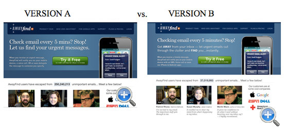
In this test, Version B increased sign-ups by 38% – a big rise. However, your gut feeling might initially be that version A is the better design. It’s a got a clear, bold headline and a short piece of supporting copy.
Why does Version B work?
Simply because the copy blocking is better. The headline is shorter, and the sub-heading is designed to pick out some key features in bold. It’s not as pretty, but the information transfer to the user is more efficient because of the emphasis within the copy. The learning from this is that a clean design doesn’t necessary mean an effective one. As we’ve seen before (see test #10), landing pages don’t have to be pretty to be effective.
Test 2: Which Landing Page Got 24% More Lead Generation Form Submissions

Surprisingly, Version A was the page that got the 24% increase in submissions, simply by removing the image from the page. Images can be very effective at communicating information and setting tone, but in this case it affected the landing page’s effectiveness in two ways: 1) the image pushes the form down the page, limiting it’s impact and drawing our attention away from the form, 2) the image is distinctly ‘stock art’ in flavor – be careful when selecting images, they can lessen impact if they are overly corporate, or in this case, simply bland.
This is a great example of why you should confirm your assumptions with quantitative testing.
Test 3: Which Radically Redesigned Form Increased B2B Leads By 368.5%?
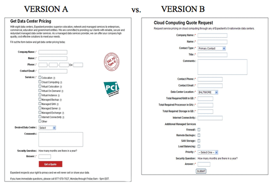
There’s an obvious winner to this test, but it’s not just the obvious elements that make the difference. You’ll look at the bright red button and the additional copy, even the images, but for me it’s the form itself that has an impact on the conversion rate.
There’s a massive difference in the amount of data you have to hand over; version A keeps things really tight and uses grouping to visually shrink the impact of the form – look at the number of control labels. The overall result is that the user feels it is less of a chore to complete the form over version B.
When designing your landing page, don’t overestimate your user’s tolerance, goodwill, and patience.
Test 4: Does Matching Headline & Body Copy to Your Initial Ad Copy Really Matter?
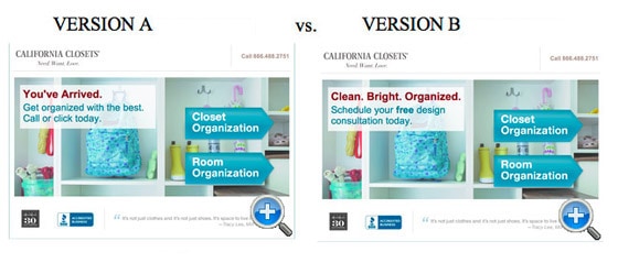
Here’s a great example of why you should test, and not one that’s immediately obvious. In fact, when asked to judge which one was more effective, 100% of the people (at the time of writing) got this one wrong, including me. Version B looks as if it should be better: the headline copy is snappier, the sub-head clearer, but in tests version A increased leads by 115%.
Why? Simply because the copy on Version A was designed to tie in with and complement the PPC ads that drive users to the page. There’s a lesson here, even for the experienced landing page builder: the sales funnel consists of many elements, making them work together is paramount in increasing its efficacy.
Test 5: Which Landing Page Increased Mortgage Application Leads by 64%?
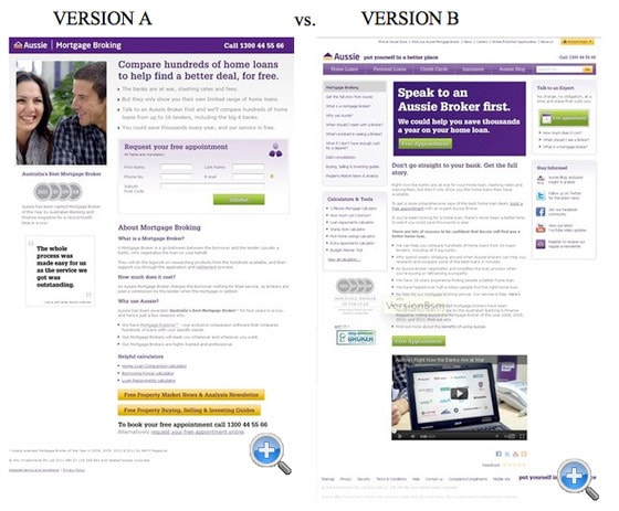
It’s easy to get caught up in trends – especially where video is concerned. Quite rightly sometimes; Video can be a very effective tool in communicating lots of information in a compact form. But the presence of video couldn’t save Version B from the rubbish bin; Version A increased leads by 64%.
In this example, it’s the way the elements have been laid out make for an ineffective page.
The video is consigned to the bottom of the page where it can have very little effect. Also, the CTA is at the top of the page, giving great visibility, but it’s placed before the user has any context – you can’t put the form before the explanatory copy, they won’t know what they’re being asked to sign up for (and no, ‘Speak to an Aussie Broker first!’ doesn’t count as explanatory copy).
Test 6: Does adding testimonials to your Homepage increase Sales?
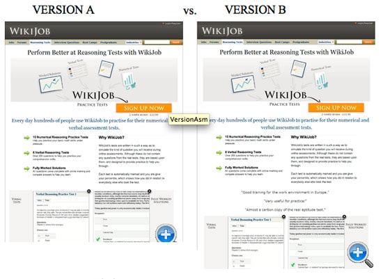
Two pages, very similar in design, but with one difference: Version B has some testimonials included below the fold. It would seem that this would have very little effect, but in practice this small change increased sales by 34% – a big margin.
Why is this? Having ‘social proof’, even in this basic form, humanizes the conversion experience, engendering trust and allowing the user to identify with other consumers. Don’t underestimate the power of this simple tool. That’s not the whole story though. Interestingly, this test was run again, this time with the testimonials at the very bottom of the page. The result was that there was no real impact on sales. So it is still important where you place your testimonials; they must be in plain sight to be effective.
Test 7: Does Social Proof Increase Conversions? ‘Big Brand Prices’ vs. Consumer Ratings
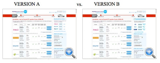
‘Social proof’ is a powerful tool that can have a demonstrable effect on conversion outcomes. LET’S GO CRAZY! LET’S SOCIALLY CONNECT EVERYTHING! Except no, let’s not. You remember when we said confirming assumptions to ensure that we got the most optimized approach; here’s an example of ‘social proof’ that, if implemented, would have cost the company hundreds of thousands of dollars a year.
The difference between the two pages is slight, in Version B the ‘Big Brand Price Check’ had an additional rating attached showing the community ratings for each of the suppliers. Yet this small change had a massive impact, surprising the team who designed the page. The reason? By adding an additional element to the ‘Big Brand’ area, they actually confused customers, instead of empowering them. During the conversion process for this industry, consumers simply want to know whether one insurer is cheaper than another.
By asking them to process an additional piece of information – customer satisfaction – consumers were backing away from the conversion because they were unable to make a straight comparison. This is an example of how important it is to understand your consumers and their expectations of the conversion process.
In this case, simple is better.
Test 8: Does an Email Security Seal Help or Hinder Lead Generation Form Completions?
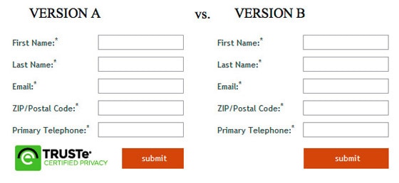
Here’s a really simple example, which beautifully illustrates how our assumptions can be very wrong. Just like example #4, the majority of people got this wrong when asked to judge which was more effective. It’s easy to see why; surely adding an eTrust image would improve form completions, it makes everyone feel safe and secure, doesn’t it?
The answer is no. Although it’s only a slight rise of 12.6%, Version B, without the image, proved to be more effective. Images of this type are usually associated with payments (especially credit cards and the like), so users were put off by seeing it in this context, assuming that they were about to pay for something. That might seem strange to the more web-savvy amongst is, but don’t assume you know your user, and don’t underestimate their naivety online – we live and breathe the web, they might not.
Test 9: Which Final Page in a 4 Step Sequence Got 439% More Leads from PPC Traffic?
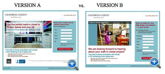
Two nicely designed pages here, both from originally California-based California Closets (the clue’s in the name). I’ll make a bet you went for Version B. Yes? No? It’s got a video centrepiece, well-structured copy; it should convert. Well, if you did, you would be wrong. Version A produced a staggering 439% uplift in leads.
If you’ve got two pages that are well-designed and both, seemingly, doing a good job, it’s easy to take your eye off the ball. Don’t. A continuous A/B testing regime, in which tweaks and redesigns are checked on a regular basis, can have a big impact. Just because a page is up and running doesn’t mean the work has been completed.
If I was to make a call on why Version A worked better, I would look to three elements:
- The placement of the text within the image brings the message into focus more quickly and increases impact
- The form is that little bit shorter, both in the number of fields and the way it is displayed visually
- The addition of the two images give the page a more authentic and trustworthy feel
Test 10: Which Page Got an 89.8% Lift in Free Account Sign Ups?
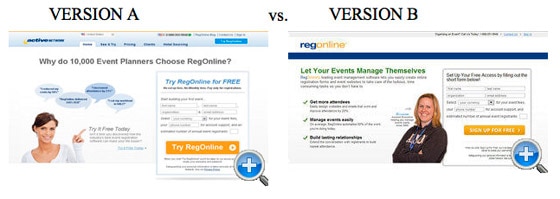
Although this caught a few people out when asked, I think this is much clearer. A good landing page communicates information quickly and efficiently. It uses good copy and also good typography to achieve this. Version B does this much better than Version A. It has three bullet points, each reinforced with a tick, as opposed to words in speech bubbles.
The removal of the tabbed navigation also helps Version B, removing a distraction from the page and reducing the risk of users navigating away from the page during conversion.
Test 11: A/B Button Color Test: Which Page Drove More Clicks to a Lead Generation Form?
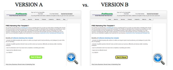
Ah! The simple button color test. As we’ve seen, just a single element on the page can have a big effect on conversion rates. None more so than the button you use to submit the form you’ve just filled out. Here’s an example of how not to style your button (in this case your ‘Get it now’ button).
Although green is an affirming color that signifies positive action, in this case it’s been used with white text which completely washes the button out. It’s hard to know what the button is for at first glance. Version B’s yellow and black button may be ugly (and I mean ugly), but it is clear and led to a 14.5% increase in conversions.
Test 12: Which PPC Landing Page Got 98% More Trial Downloads?
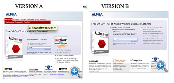
For our last example, here’s one that shouldn’t be a surprise to all you seasoned landing page A/B testing experts. A/B testing can help you to optimize your landing page. It can help you squeeze that extra 5% out of your current page to really make it the best it can be. It can also be used to simply make sure you’ve done the basics right. A/B testing can give you the insight to develop your page with confidence.
In Version B we can see a page that does the basics really well – it’s simple and clear of distractions (no extraneous navigation), has good headline copy and supporting copy block detailing the benefits and features, and has further supporting information (reviews) for those that want to read further. The result was a 98% increase in trial downloads over its rival.
So, sometimes our assumptions are right, sometimes they are wrong, but two things ring true: First, make sure you get the basics right before you start testing, and second, always be testing, because unless you test, you can never be absolutely sure.
Have you ever been shocked by the results of an A/B test? Share your experiences with us in the comments, and remember, when you assume, you make an ass out of you and me.
