Presenting information visually is an old technique and now it’s easier than ever to share those visualizations with the world. Everyone wants to publish an infographic and some of them are, quite frankly, lame!
And there are so many out there that some readers have infographic fatigue? How do you make sure your infographic passes the ‘so what?’ test and is something readers will view and share? Check out these tips.
1. Create a Strong Intro
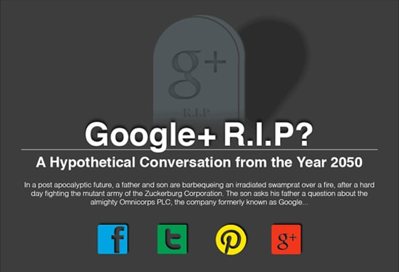
Leading with impact is not just important for written content, but for visual content too. Newspapers place the most important information in the first couple of sentences. In terms of images, that means sticking a compelling image right at the top. Your infographic needs some pizzazz if it’s to hold people’s attention for more than a couple of seconds. Don’t just use any old image; The image must relate to the theme of your infographic. Cap this with a great title so everyone knows what to expect. This infographic on Google+ grabs you right from the get-go with a powerful image and intro.

2. Use an Attractive Color Scheme
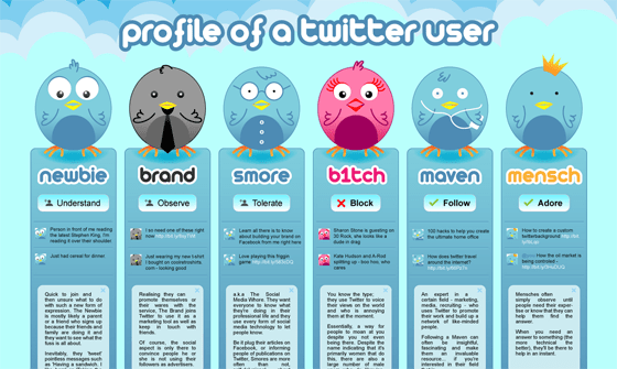
Once you have readers’ attention, they will look at the rest of the infographic but it’s easy to lose their interest if the colors don’t work. If colors are too dull, readers may ignore the content; if they are too bright, they will need sunglasses to look at it (and let’s face it, that would be ridiculous). Work with your infographic designer to choose colors that are eye-catching without being garish – which make it easy to see the text and images that make up the infographic as in the Twitter infographic below. Check out these color palette resources to help get you started.
3. Create a Good User Interface
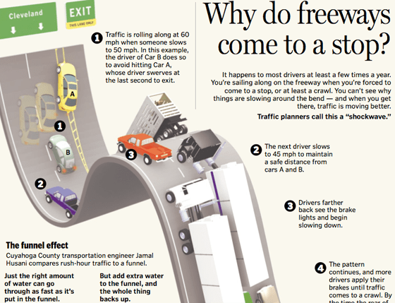
Reading an infographic is a bit like browsing a website – there is stuff to look at everywhere and the reader needs guidance on where to go. There are a lot of different ways to do this. For example, you could:
- Distinguish between different types of facts with color and shape.
Put key takeaways in boxes of one shape, with interesting facts in boxes of another, using different colors for each. This visual signposting makes it easy for the reader to figure out how to use the infographic. - Use lines and arrows to lead people.
Make it super clear where to go next by adding directional cues to different areas, such as in a timeline style infographic.
- Make it scanable. Segment different parts of the infographic with alternating colored boxes or backgrounds so readers can scan it easily.
- Stay on point with relevant imagery and/or your theme. If you are using a main image or theme, make it relevant to the topic of your infographic.
- Don’t make it long for the sake of it. Readers will only scroll if the information is worth it.
The takeaway: Avoid overwhelming the reader with too much stuff which means reining in your designer when he/she suggests a lot of bells and whistles. Simplicity is best when it comes to infographic design.
4. Find Up to Date and Credible Data
As a reader, there’s nothing worse than looking at an infographic with a nice collection of facts and figures, then scrolling to the bottom and finding out that the data was from 10 years ago. Infographics are not just about the graphics , but about the ‘info’ – and yours had better be up to date. There are a lot of good places to find information for your infographic such as:
- Government statistics sites
- World statistics sites
- Industry organizations and bodies
- Publicly available data (there’s more here)
Check out the data sources section in Daily Tekk’s list of 100+ infographic resources for additional information repositories.

Remember, your infographic has to inform and if the data is old and readers can’t learn from it, then it’s pretty useless.
While we’re on the subject, the data you use must be credible. That means it has to come from either:
- Sources that know their business (and that can include you, if you’re an expert in your field and qualified to pronounce on facts and trends)
- Research which produces new findings
5. Make Sure it’s Relevant – and Tell a Story
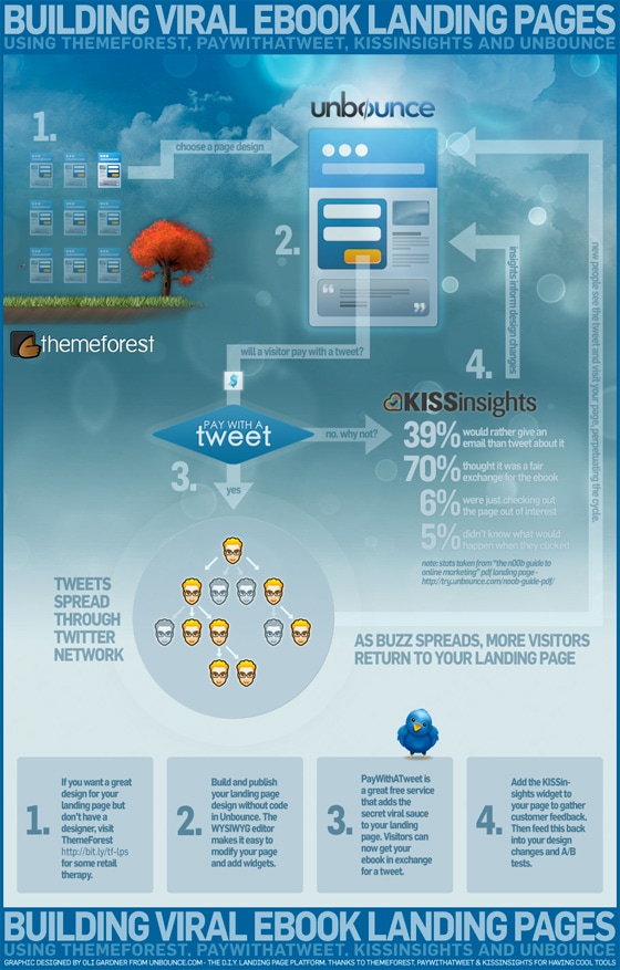
Infographics need context (check out our infographic on infographics for an example), which means you have to have a narrative about the data you’re presenting and why it’s important and relevant to both your site and your readers. Some infographics may stand alone, but a little interpretation never goes amiss, even if people disagree with your take. If you don’t give readers a reason to care, they will never look at it.
Make your infographic relevant and timely by tying it to a current event. For example, create an infographic that coincides with the launch of the new James Bond movie:

Even on the infographic itself, you are telling a story, and that story must still be interesting (or as Impact Branding and Design says, fascinate) even without the image. If not, go back to the drawing board.
6. Get to the Point & Keep it Simple
What’s the point you’re trying to make with your infographic and why should readers care? It needs a message. Even though face-off infographics are popular according to Webdesign.org, the site rightly says that often these add no value to the reader. Telling people what they already know is not providing information.
The value of an infographic is its ability to simplify complex information and present it visually. In other words, make the data understandable, as Lisa Barone points out. If people are left scratching their heads in bemusement then your infographic is no more than a pretty picture – and what’s the point of that?
Resources
Feel more informed about infographics? Here are some resources to help you create & market your own:
Visual.ly says it’s the world’s largest data visualization showcase, making it a great place to look for inspiration.
Check out 50 Informative and Well-Designed Infographics on Hongkiat.
Infographics Archive highlights 9 Free Infographic Tools
And no infographic resources list would be complete without The Ultimate Guide to Infographics.
Tweetable tips to share
- Does your infographic pass the so-what test? Get some tips on Unbounce
» Tweet This « - Lead with impact for effective infographics
» Tweet This « - Use color and shape to guide the reader to key infographic takeaways
» Tweet This « - Infographics are not just about the graphics but the information
» Tweet This «


