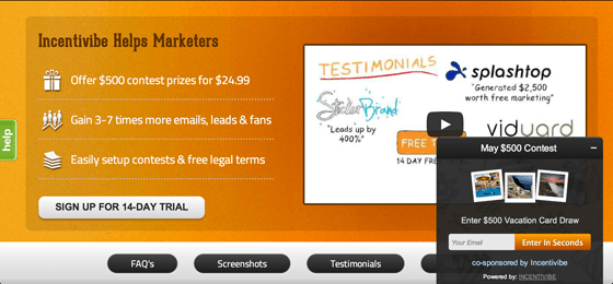
For years, online marketers have regularly used giveaway contests as a buzz-creating strategy. However, according to our research at Incentivibe, giveaway contests have another powerful benefit that marketers have rarely utilized: Giveaway contests have the ability to convert daily targeted visitors into email subscribers and leads.
Think about it, when was the last time you ran a contest on your regular landing pages to boost your lead conversions and build your email list? In this blog post, I’ll discuss our research results using giveaway contests as a lead conversion strategy, and the eight tests that we conducted to optimize this strategy.
The Test:
Before we delve into the details, here are some important points to help you understand our giveaway-as-a-conversion-strategy research:
- Data: We analyzed 3 million visitors from 100 of our client websites between the period of March 15, 2013 and April 15, 2013.
- No announcement: The giveaway contests ran only on individual client’s landing pages – they were not featured or announced elsewhere. This ensured that only the targeted organic/paid traffic saw and converted from these contests.
- Call to action: Each contest asked visitors for their name and email to either subscribe to their newsletter or stay in touch.
- Shared Prize: These clients used our shared-contest-prize service to offer a $500 contest prize for a minimal cost, and put our black contest widget with their name as the co-sponsor.
The Result
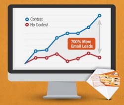
The increase in email leads due to the contest was predictable, but the magnitude of the increase was astounding. We discovered that landing pages that ran a contest with a $500 prize collected 700% more email subscribers than landing pages with no contests. You can read more research conclusions here.
The 8 factors that increased conversions from 200% to 700%
The most intriguing part of this research was not only the end result, but the journey. When we ran these contests for the first time, email subscriptions increased by 200%. How did we reach 700%? We tested and optimized eight different factors that bumped the average increase in email subscribers to 700%.
Test 1: The Month Effect
Have you ever come across a contest, only to question when it began and when it will end? It is one of the most common pieces of information that is left out of contests and one of the reasons why people won’t enter. The result in our research reinforced this point. When we specified the month of the contest on the widget, our conversion rate increased by an astounding 40%.
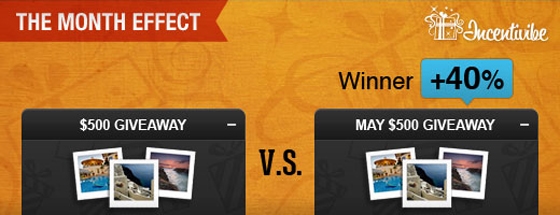
Contests that specify a month receive 40% more email subscribers.
» Tweet This «
Test 2: The Promotion Labeling Effect
Is “giveaway ” the same as a “sweepstake” in an online visitor’s mind? Do people respond more to “promotions”? In our research, the word “giveaway” was the winner. It resulted in 27% more conversions than the word “sweepstake” and 50% more conversions than the word “promotion.”
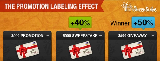
The word “giveaway” gets 27% more conversions than “sweepstakes.”
» Tweet This «
Test 3: The “Like-gating” Effect
Isn’t everyone logged onto their Facebook account pretty much all the time? Doesn’t it seem that getting a Facebook like would be a more frictionless action than requesting a visitor to type their email address? Not so fast…
In our research, the contest widget that simply asked for a visitor’s email address, got 80% more email subscribers than the widget that asked visitors to like a Facebook page to access the contest (a.k.a. like-gating).
Granted, that a decrease in email subscribers makes sense for the like-gating widget since we erected a like wall. However, the magnitude of the decrease was very surprising, given that the widget also gave visitors a clear path to bypass the like wall.
Unbounce saw a similar trend when they let people pay for their ebook with a tweet or with an email. The A/B test found a 24% conversion lift when asking for an email. Read the full case study with Oli’s psychological conclusions here.
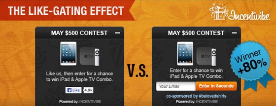
Facebook likes can decrease email subscribers significantly.
» Tweet This «
Test 4: The Location Effect
Do visitors focus more on the left or the right area of a website? We read from the left, but scroll and sign in from the right. This is one of the trickiest web behaviors, and results vary for different call to actions.
In the case of a giveaway contest, when the contest widget was placed on the bottom-right, it increased email subscriptions by a whopping 125% than when the contest widget was placed on the bottom-left.
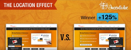
A contest placed on the bottom right increased email subscriptions by 125%
» Tweet This «
Test 5: The Stating-The-obvious Effect
This test reminded us of the importance of stating the obvious to remind online visitors that a specific action will in fact be very quick.
For the first few days, we used the words “Submit” or “Enter” as the button text for contest entry. We assumed that visitors would look at the contest form and understand that clicking “enter” will finish the entry process. However, when we changed the button text to “Enter in seconds”, the number of email subscribers increased by 33%. This Unbounce post teaches you how to write effective CTA copy & increase conversions. In addition, Unbounce always preaches that you should “Never Submit” when it comes to your CTA copy.
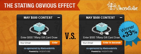
“Enter in seconds” gets 33% more email subscribers than “enter.”
» Tweet This «
Test 6: The Image Effect
Shouldn’t an image that fails to communicate the message of a $500 prize, lead to lower conversions than a message in big text that clearly conveys a chance to win a $500 prize?
It turns out that this is not the case and that simply having an image, no matter how poor or irrelevant, leads to higher conversions. The contest widget that had the fuzzy image collected 22% more email subscribers than the widget that had big text and no image.
When making snap judgements about “facts,” researchers have found that photos (even irrelevant photos) increase our likelihood to accept them as true. This study was featured in an Unbounce blog post teaching you how to use images to increase your conversions.
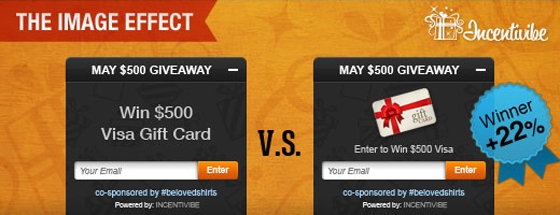
Fuzzy images gets 22% more contest conversions than big font text.
» Tweet This «
Test 7: The branding effect
Should you have your business name on a widget that has limited space for marketing copy? In our research, when the contest widget stated the name of the contest holder in the header, the conversion rate increased by 28%.
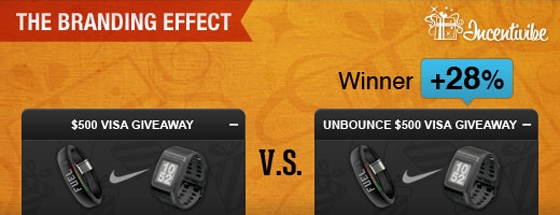
Including a company name increases contest conversions by 28%.
» Tweet This «
Test 8: The not-so-dominant lightbox effect
Is a lightbox as almighty as everyone claims it to be?
The answer is yes, but with one key exception. Yes, the lightbox increased conversions by 62% overall, but it actually led to a decrease of 20% in businesses that were in the fashion/indie clothing industry. Again, many factors are at play here, but I think businesses in this industry tend to have more design-focused websites and a lightbox was probably unsettling to their design-centric audience.
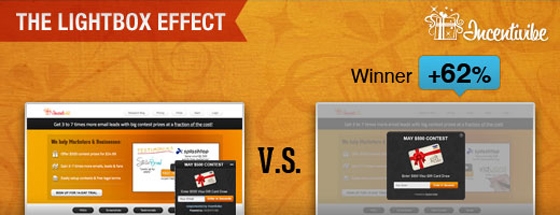
Lightbox decreases conversions by 20% in fashion industry.
» Tweet This «
What’s next?
If your marketing team has not utilized the giveaway-as-a-conversion strategy, I strongly recommend that you try it out to see how it impacts your conversions.
I hope this research benefits your online marketing goals. If you have any other questions or feedback, I am only a tweet away at @adeelv. Also, feel free to reach out to me at adeel [at] incentivibe.com
I’d also love to hear your thoughts about the results in the comments section!
