
Back in the 1990s, you had two options for website backgrounds: a solid color or a repeating image.
As a result, you’d see websites like this beauty:
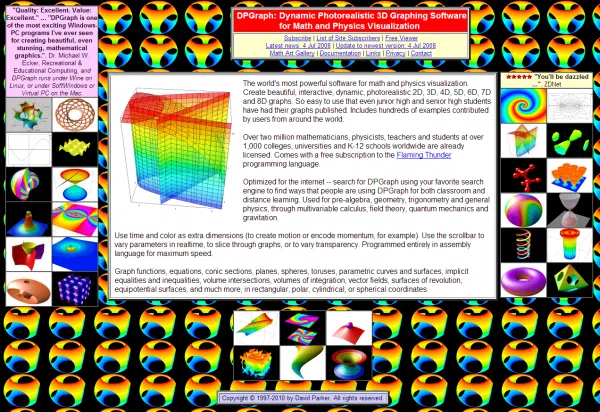
Unless you’re doing a weird bit, you don’t want your landing page to look like this. That’s because the background’s so busy, you feel overwhelmed… among other reasons.
Fortunately, today you have better tools to create simple backgrounds that manage to be aesthetically pleasing without distracting from the rest of your landing page. And we’ll show you what kinds of backgrounds you can use.
Time to talk about the importance of a good landing page background and six simple backgrounds to try on your next landing page.
How Important is Your Landing Page Background?
Before you choose a background for your landing page, you need to understand the role it plays in your overall visuals.
You see, people follow a natural visual hierarchy when they look at online content. The tl;dr of it is that people tend to look at bigger elements with more contrast than elements that blend in with the rest.
So, if your background has too much going on, it’ll be hard to get visitors to focus on your main landing page content and — most importantly — your call to action.
Plus, if you can’t nail the background balance needed to make a modern landing page design, you’ll lose respect from your visitors. Half of consumers think a company’s website design affects their brand as a whole. Also, 38.5% of them will leave a page if they see an outdated (read: cluttered) design.
Long story short, your background is an important part of the conversion-centered design process. Where possible, choose a straightforward one that helps your visitors focus on the action you want them to take.
6 Simple Backgrounds to Try on Your Next Landing Page
These six background styles will add pizazz to your landing page without taking away from your main point.
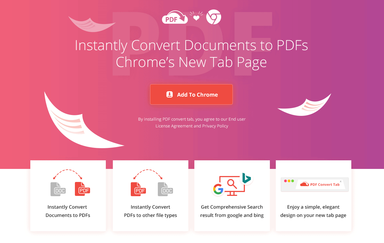
1. Gradient

A gradient pattern shows a transition between colors. Some gradients go from one color to another, while others like the one above, have multiple colors.
Gradients came back into vogue in the design world a few years ago, and their popularity is still going strong in 2022. Using a gradient in your landing page gives it a modern and trendy feel. (Just make sure it fits with the rest of your landing page’s color scheme.)
It also doesn’t hurt that gradients spice things up when you aren’t digging a solid color background.
If filling your whole landing page background with a gradient feels like too much, try using one to highlight your hero section. You’ll still get in on the gradient trend. Look how designer Adam Muflihun uses a gradient at the head of this landing page mockup.
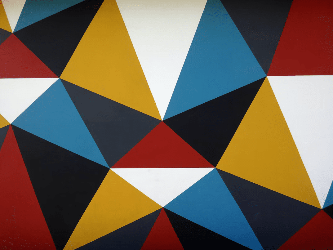
2. Abstract shapes

Abstract shapes are the basic shapes that make up the visual arts — think circles, squares, and triangles. Patterns featuring these shapes can repeat the same shape or mix it up.
With the rise of retro in 2022 web design trends, abstract shape patterns have also made waves. These backgrounds give your landing pages an old-school touch while keeping the overall feel modern.
Make sure to use the right kind of abstract shape pattern for your landing page if you go this route. Keep the colors within your color scheme and use bolder patterns carefully. For example, this landing page from Scoops uses big and brightly colored abstract shapes in the background, but only to highlight product screenshots.
3. Monochrome
You can define monochrome literally and conventionally. Literally, it means a color scheme with different hues of the same color. Conventionally, most folks mean a black-and-white color scheme when they use the word. We’re going with the latter for this blog post.
Monochrome landing pages look striking when you get the right balance of black and white. Use a pattern to complement a solid black or white, or go for a full black or white background.
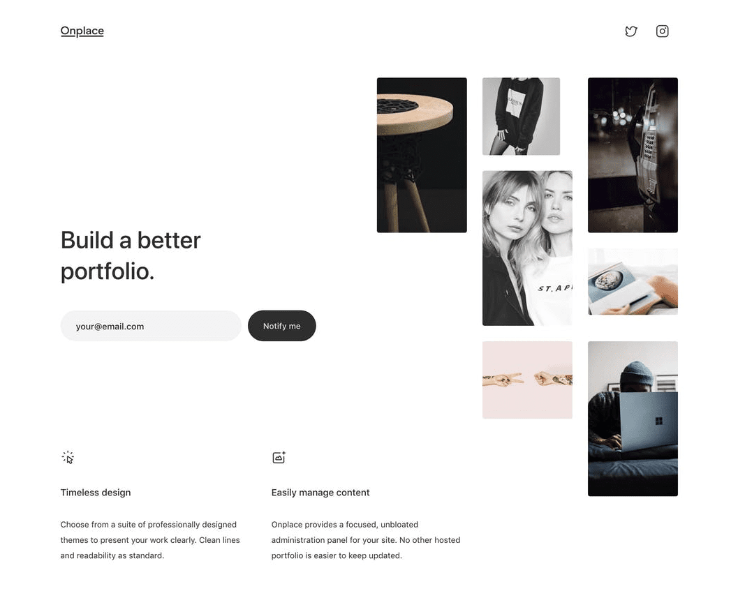
A good ol’ monochrome color scheme does well at highlighting the rest of your page’s visual elements. Check out how this landing page for Onplace, a portfolio platform, uses monochrome to let photos shine.
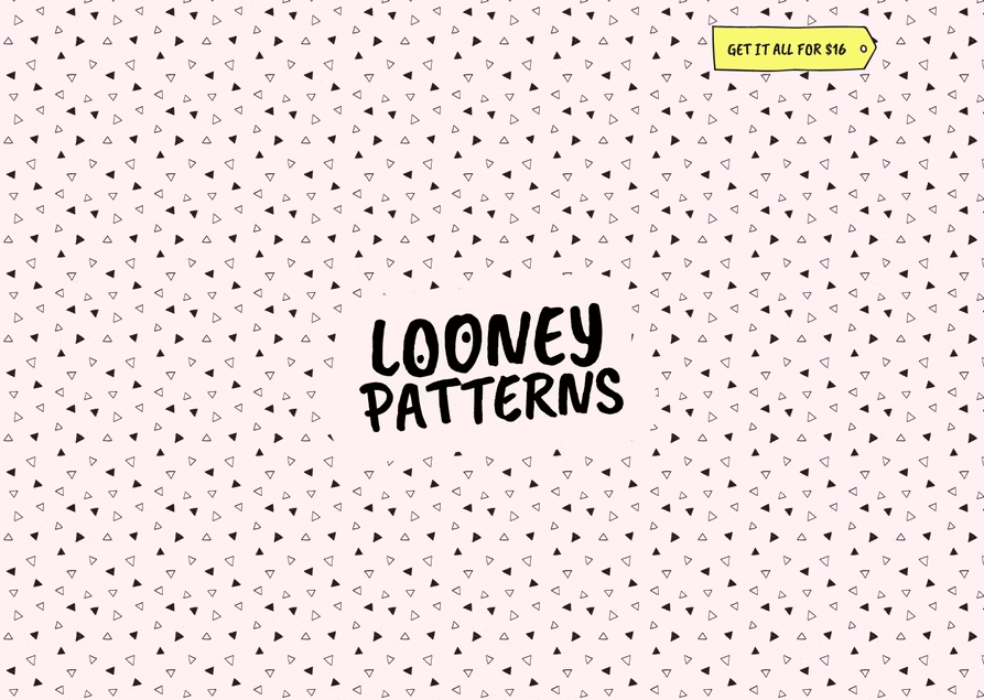
4. Geometric
Geometric patterns are kind of like abstract shape patterns, but they focus entirely on straight lines. These patterns include lines, triangles, squares, and other angular shapes.
If you want to add design elements to your landing page background without making it too distracting, geometric patterns are a great choice. Choose the combo of lines and shapes you’d like and customize them according to your brand guidelines.
Your geometric pattern can look bolder or subtler depending on how much space you put between your shapes. This landing page for Looney Patterns keeps things low-key with plenty of space between the triangles in its background.
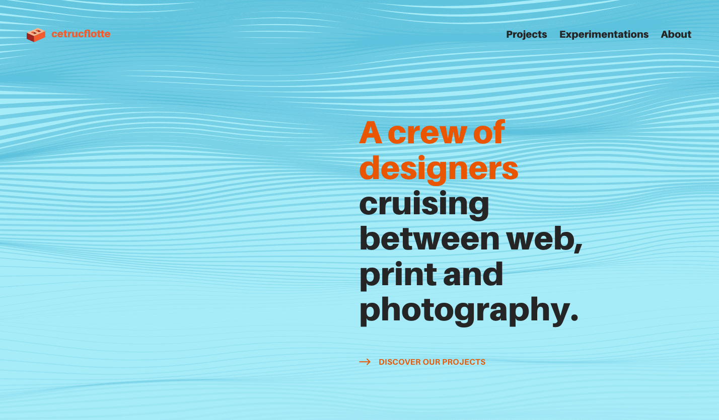
5. Parametrics
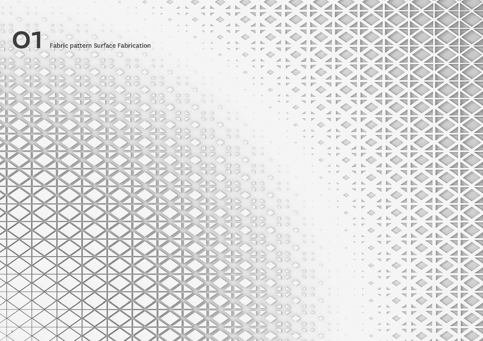
Parametric patterns are a “know it when you see it” kinda thing. Computers use complex mathematics to generate them. They usually have lines or geometric shapes presented in a gradual pattern.
These patterns work well as simple landing page backgrounds because they combine the statement-making power of geometric patterns with the fluidity of organic movement. The inconsistency adds visual appeal without feeling like too much.
Consider keeping your parametric background extra subtle by using two shades of the same color. See how it’s done on this home page for Cetrucflotte (not actually a landing page, but you can apply it to yours).
6. Trending colors
Looking to make a statement with your background without taking away from the rest of your page? Try using a trending color scheme to tie your landing page elements together with your background.
These color schemes are trending in 2022 web design:
- Earth tones (browns and tans)
- Jewel tones (deep greens, purples, blues, yellows, and oranges)
- Pastels
- Neon and pop art colors
2022’s trendy color palettes have a little something for everyone. For example, you can follow the neon trend to create a retrofuturistic page like this one for Jack McDade’s Radical Icons.
It’s All About Structure
Backgrounds are just one part of your landing page’s anatomy. Before you finalize any of your design elements, lay out your content with a solid landing page wireframe. With your landing page sections and topics in the right order, you can rest assured you’ll choose a background that meshes well.
Of course, you don’t have to spend as much time on wireframes and background choices if you use a conversion-focused landing page builder. Smart Builder will create your landing page layout based on your goals and data from more than 1.5 billion conversions. Let it handle the hard work.

