How many leads and sales are you leaving on the table?
I probably looked at over a thousand landing pages over the past year, and some very glaring mistakes seemed to repeat themselves over and over again.
These mistakes seem simple, but so many companies get them wrong. Thankfully, with a little bit of effort, these pages could see some nice conversion lifts.
Here are 10 landing page examples that demonstrate these common mistakes and how to fix them.
1. Write a Landing Page Headline With Some Impact
The headline on your landing page is what tells the visitor what your landing page is all about. It gets across the benefits of your offer.
And it encourages visitors to keep reading.
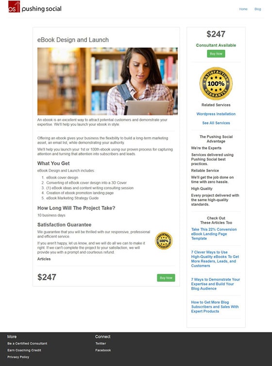
The landing page headline above does none of these things. In fact, as a standalone sentence “eBook Design and Launch” doesn’t even make sense!
Would you really spend your hard-earned marketing dollars on sending traffic to a page that has such a garbage headline?
I hope not.
Here’s how we can fix it:
- Add a benefit to the headline
- Make sure visitors want to keep reading
Here’s an example:
Want your business to be seen as an authority?
We can help you design and launch a profitable eBook for your business
The first line gets the visitor thinking, while the second line tells them about your offer. Notice the key words: Authority and Profitable. Both are things that any business leader is going to be looking for in a campaign. Plus, by saying “We can help” we encourage visitors to read on to find out how.
2. Orient Your Landing Page Visitors
When a visitor hits your page you have just a few seconds to convince them to stay. This means that you need to make sure your landing page loads quickly, but also that the layout makes sense.
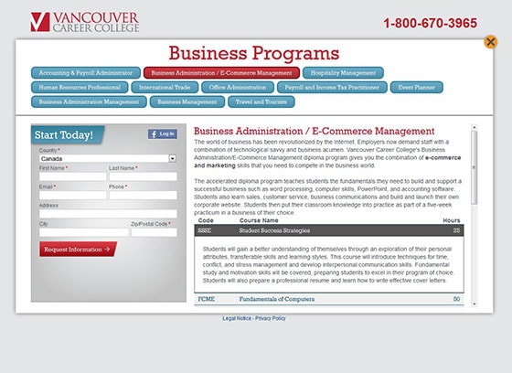
The landing page example above gets a big red X for both.
Not only is there no headline that can tell the visitor why she is there, but the layout is just plain confusing.
This landing page was found through a PPC ad campaign for business school programs. If you’re targeting customers who specifically want business program information, why the heck would you give them 11 (yes, 11) different program options as soon as they hit your landing page?!
Here’s how to fix it:
- Write a decent headline – Something like this:
Local Business Programs That Get You Hired
- Pull the program options from the top of this page – they don’t add any value to this page because the traffic should already be focused on business education.
3. Optimize Your Web Forms
Okay, so you’ve convinced your visitor that they need to learn more about what you’re offering. They go to fill out your web form, but there’s a problem.
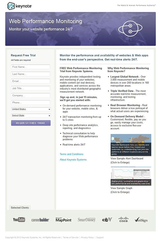
The form is too complicated.
As silly as this might sound, to a lot of visitors, a long web form seems daunting. They want what you’re offering quickly and easily.
Even one or two extra fields can drastically change the conversion rate of your landing page. Then again, you don’t want to eliminate too many fields as you might start to get crappy leads.
Here’s how Keynote could optimize their form:
- Test a two-step signup process
Try just asking for a name and email address at the beginning. Then, on the next page, ask the visitor for additional information to “complete” their profile. If a lead fills out only the first step and not the second page, you can put them in a different sales funnel that tries to warm them up further and get additional information before sending them to your sales team. - Collect location information automatically
There’s no reason in 2014 to not pre-fill location information on lead forms. With a bit of code you can automatically determine where a visitor is located, and pre-fill that information into the form. You can still give the visitor the option to change that field, but it’s just one less thing they have to fill out.
4. Focus on a Single Goal
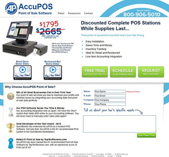
What’s going on with this page? If you can figure it out, please let me know.
The thing with landing pages is that they are meant to be specific. If you give visitors too many options, many times they will choose none.
This page has 15 individually clickable elements. That’s complete rubbish!
If you’re not confident in your offer, then maybe it’s time to come up with a better one. Instead of offering multiple options on this page, AccuPOS could test 3 different pages: A Free Trial, A Live Demo, or a Request for Information.
By testing the three angles individually, AccuPOS can find the offer that most appeals to their traffic.
5. Learn How To Design For Conversions
If you’re going to spend real money on advertising to send traffic to your landing pages, you might want to consider spending a small portion of that money on a decent design first – or just use Unbounce :)
Website visitors are getting more savvy, and a badly designed landing page can send the wrong message. In fact, website visitors can make snap judgements about the look of your page in as little as 50 milliseconds.
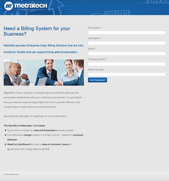
Using poor stock images (the one in this example is probably on 100 other poorly designed pages) and a slapped together layout can kill your conversions.
Here’s how Metratech can improve the design of their page:
- Lose the ugly stock image.
No one thinks this is actually your team. No one. Why not use an ACTUAL photo of your team? Or better yet, one of your customers? No matter what they choose, they should use images that add value instead of just taking up space. - Highlight the web form.
This web form is just floating in space. First off, it needs a small headline that reminds me why I should be filling out my information. Second, make the form stand out by putting it in a box or by having a border around it. - Draw attention to the call to action.
Use a contrasting colour for the submit button and boost its size just a shade. Making a Call To Action stand out can make a huge difference to your overall conversion rate.
6. Stop Using “Submit”
This one’s been talked about at length, but call-to-action copy is important.
Here’s why “Submit” is a horrible call to action button:
It doesn’t add any value. I mean, who can get excited about hitting “Submit”? Your offer is supposed to improve my life in some way, isn’t it? Focus every element of your landing page on the benefit to the user, including the call to action.
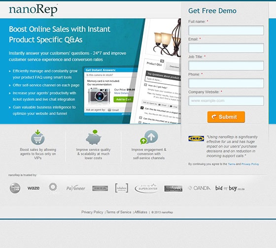
NanoRep is saying that their product can “Boost Online Sales”, and who wouldn’t want that? But instead of getting my excited about boosting my sales, I’m just going to “Submit” my information to you?
Isn’t this a trade? I give you information, and you give me something in return. So why not turn your call to action button into something that relates to the action. Something that adds value.
Something like:
Sign Up For Free Demo
And for extra emphasis you could cement the offer by putting a short sentence underneath that says:
Discover how you can easily boost sales and improve your customer service
Want to see just how much of a difference the call to action copy can make? Check out this case study that boosted conversion by over 620%!
7. Be Clear About the Benefits (Not The Features)
Why do people buy something?
Do people buy water because it’s clear and it’s wet? No, they buy it because it quenches their thirst.
The same goes for software. People don’t buy it because of all of the amazing buttons they can push, they buy it because they want to make their lives better or their businesses healthier.
What value is your offer giving to your visitors? Focus on that value and you will see your conversion rates soar.
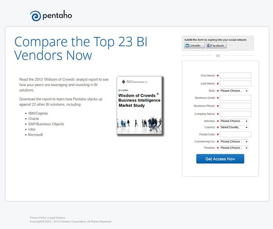
In this example, Pentaho needs to stop talking about what the report is about, and talk more about why I should care.
How will this report help my business? Why should I spend a portion of my busy day filling out this form and reading this report?
PS. I couldn’t write about this landing page without also mentioning the horrible web form. Do they really need all of those fields? Someone who doesn’t want to talk to a salesperson is just going to lie anyways (“Timeline? 10 years because plz don’t call me”).
8. Write Copy That Matches Your Offer
If you’re going to offer your visitors something, the copy on your landing page should match that offer.
It just makes sense.
But I see so many companies that simply talk about themselves on their landing pages instead of what they’re giving away.
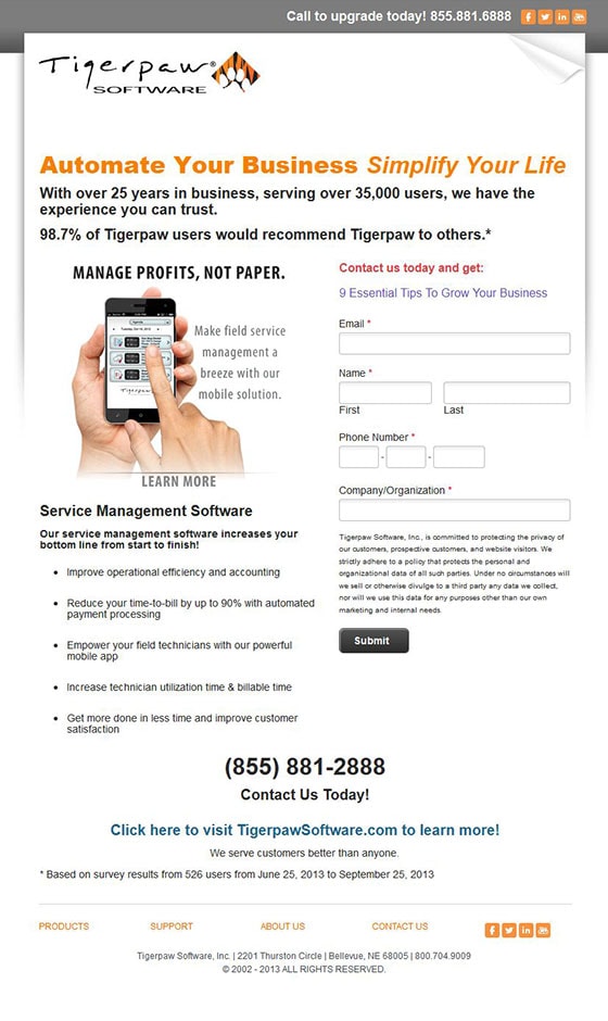
In this example, TigerPaw software has designed a landing page that gives away “9 Essential Tips to Grow Your Business” but has essentially forgotten to promote it.
All of the copy is focused on their software, instead of the actual giveaway that they are offering on the page.
The key here is to make sure that all of the copy on a landing page is relevant to the offer, and to focus the visitor on your end goal: Signing up.
Here’s how they can fix this page:
- Choose an offer to promote.
Are they trying to sell their software, or are they trying to sell a report that contains “9 Essential Tips to Grow Your Business”? If they choose to promote their software, then they need to drop any mention of this other report. In this case a “Live Demo” or something similar would probably perform much better than a crappy generic report about growing a business. - Tweak all of the landing page copy to this offer.
The entire landing page should then be tweaked to promote the offer that has been chosen. If they want to promote a live demo, then the copy needs to talk about why the live demo is going to blow the socks off of anyone who sees it.
Oh, and there’s that pesky “Submit” button again. Gross.
9. Make Your Page Legible
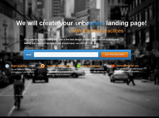
Big background images are all the rage nowadays and they can be an easy way to make your site look more “trendy”.
But the image has to be chosen very carefully to maintain legible text. In this example the copy on the landing page is almost unreadable and the design needs to be changed. Either the text needs to go onto a semi-transparent black box, or the background itself needs to change.
I see this mistake all too often and there’s no excuse for it.
Important: MAKE YOUR PAGE LEGIBLE.
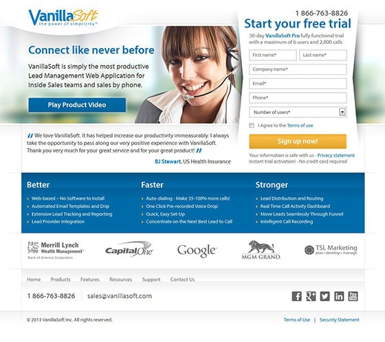
10. Drop the Useless Footer Links
This is usually the result of HiPPOs or laziness.
In either case, in 2014 you have no excuse to make this mistake. It’s fine to include your terms of use or privacy statements in the footer of your landing pages. In fact, you should.
But leaving your entire main menu and all of your social icons on the page is just plain sloppy.
The trouble with leaving these links on the page is that it allows visitors to become distracted from the goal of the page. Maybe they were just about to sign up for the free trial, but instead they click on your “features” link and get lost in the rest of your site.
The point is to eliminate as many “leaks” as you possibly can on your landing pages. Keep people focused and you will see higher conversion rates.
If visitors are searching for more information, then you probably need to think about adding more information to your landing page.
Note: Adding social links sometimes works with social landing pages or with specific offers that are shareable. In most cases however, no one wants to share your landing page for lead management software on their Facebook feed.
Time to get to work
There you have it. There are no more excuses for making these mistakes on your landing pages.
It’s time to take a look at all of the campaigns that you have running right now and make sure you aren’t leaving any conversions on the table.
See you in the comments! Oh, and as always, test like hell.

