Usually we celebrate the awesomeness of landing page design. But today we’re taking a stroll down scary street to look at some examples of how it shouldn’t be done. I apologize in advance if anyone takes offense – but really, your pages scared me!
Note: The majority of these pages were found by clicking on paid search ads, and most of them should really be using standalone landing pages specific to the promotion, rather than a homepage. I’ll give a couple of quick comments on each below the images. Yikers!! I’ll try not to be mean, but it’s scary out there.
If you do find yourself getting frightened, you can see some good examples of landing pages here.
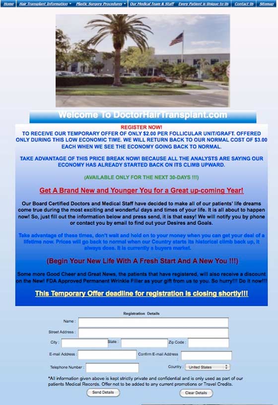
1. I think my eyes are bleeding
Tips
Hire an effin designer. Stat… You’re business is clearly worth it in a monetary sense, so present yourself accordingly on the web. And please show some before and after examples of hair replacement. We may not believe you, but we certainly expect it.
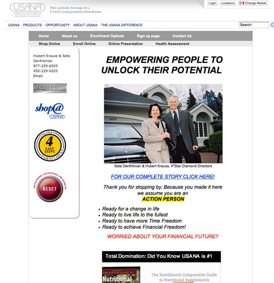
2. That reset button is what I’d click
Tips
Unlock the potential for what? Living in a cul-de-sac in a Florida gated community? Be a little more specific about what the purpose of the page and offering is.
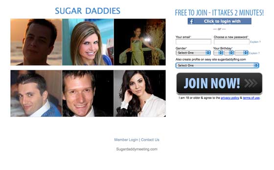
3. Sugar hermaphrodites?
Tips
I get that the hot women are there to help sell the idea (to the men) of using money to “get what you want”. But still, throw in a few statements of what the “service” provides. You’ll get more conversions if people know what to expect And maybe add a little class. #JustSayin.
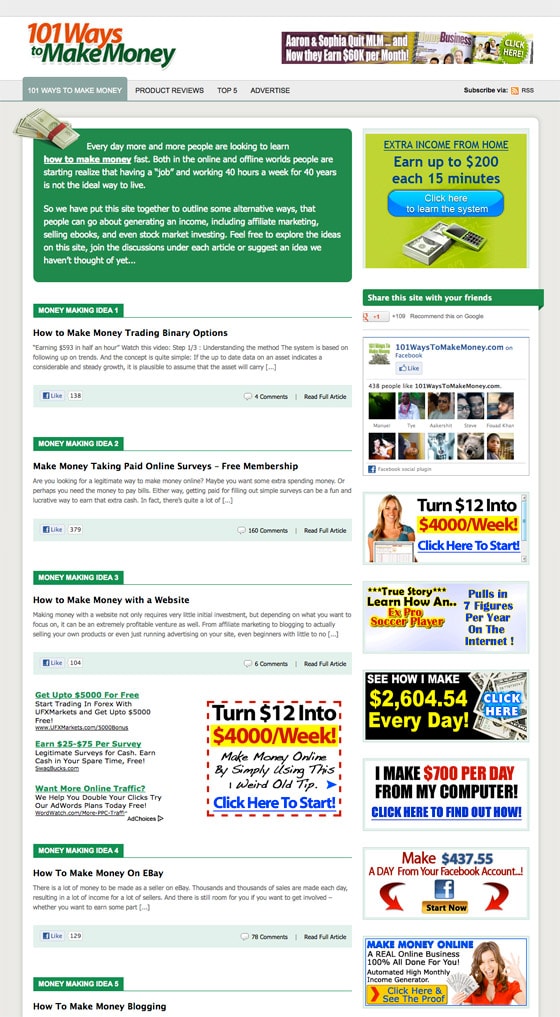
4. Get a job!
Tips
Just looks like a curated site of scams. So yeah, my advice is to get a real job. Sorry.
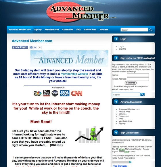
5. The internet makes money for you!
Tips
Building a site that has the potential for someone to become a “member” does zero for your chance at making money. You still need a business plan/idea. The design is all over the place here and rife with cheap stock imagery. If you want people to sign up to build sites through your service, show them some examples/previews to get them excited.
6. Arrrrg navigation!
Tips
Landing pages shouldn’t have navigation on them! If you’re paying for ads then you should be thinking in terms of campaigns and promotions – so keep your landing pages focused on those single objectives. This is lazy advertising. People will just wander all over the place with those 450 links and never achieve your conversion goals.
7. War and Peace
Tips
To quote Steve Krug – “Take your copy, cut it in half and remove 50% of what’s left”. JASON! We need your knife again.
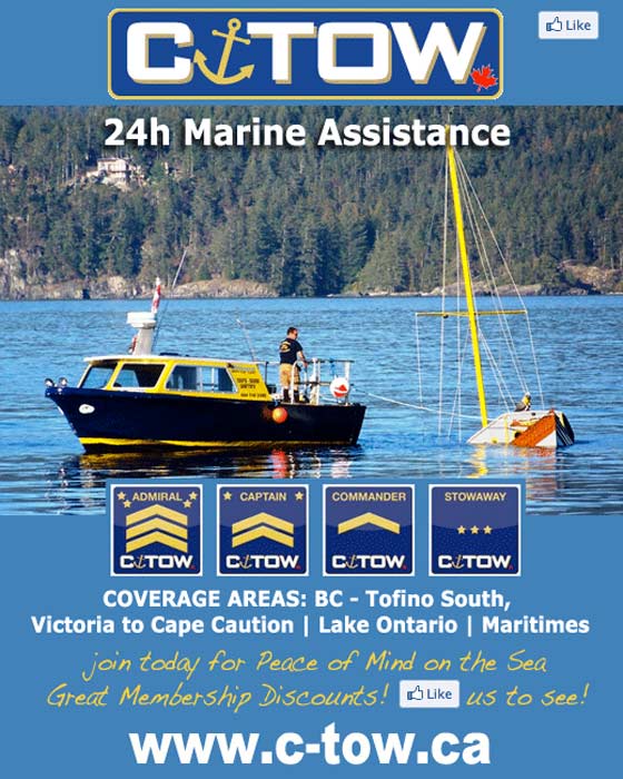
8. Waterproof phones only
Tips
Goggles? Wetsuit? Rake? Scuba gear? That’s all I’ve got.
9. Where’s the value proposition?
Tips
This page looks like Vegas. Waaaaay too much to do! I’ll say it again. Keep it simple, focused and use one landing page for each product. Sales will cometh. Promise.
10. These are not the droids you’re looking for
Tips
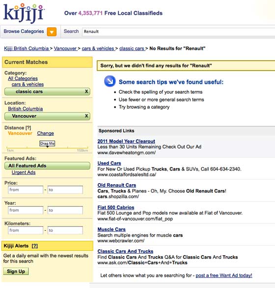
This is just dumb. If you don’t “know” that you have something in stock, don’t pay to advertise it!
11. Doctor’s waiting room?
Tips
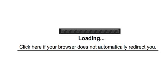
WTF. This is like a 1996 flash splash page. Just load the site already. Don’t make me wait. Slow sites lower conversions. Don’t believe me? Read abut how faster sites convert better here.
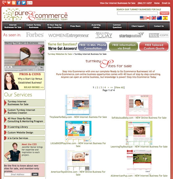
12. Is this for kids making money?
Tips
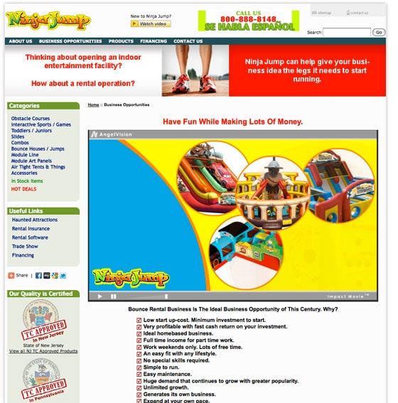
I hit the back button the moment I saw this site. Then I came back to look at it for this post. It’s beyond confusing. First off, I’d remove the banner looking thing at the top of the page as it looks like an advert which will make people gloss over it. And it has the most important info in it! What the site is actually about.
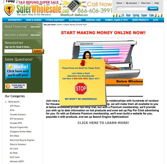
13. Who eats electronics to lose weight?
Tips
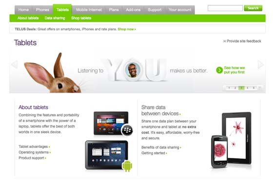
Stop bidding on irrelevant keywords…..
Scared yet? If you’re cowering under a blanket, you might want to check out these great landing page examples for some comfort. And if you’ve seen some shockers on your travels, please share them in the comments – we can all learn something from looking at bad examples.
