
Some performers fear Simon Cowell when they walk out on stage.
Then there are those special few who actually embrace the fear.
They *want* to stand on that stage. They *want* to belt their heart out and see Simon sit there speechless, with a lump in his throat.
They want pop culture’s most infamous critic to impart some of his wisdom to help their career as an artist.
I applaud those artists.
And today I applaud the Unbounce customers who have agreed to let me analyze their landing page designs in public view.
We have 22 of these brave souls and this is how our time together is going to work:
I’ll do a rapid-fire set of thoughts and ideas for each page. I’ll list what I like, but more importantly what I think should be changed to improve their conversion rates.
I’ll be brutally honest, yet fair. From experience I know that as bitter a pill it may be, everyone on some level wants to hear the truth. And honesty is the only way to learn.
Note to the businesses involved: please remember that my mission here is to help create more delightful marketing experiences for your future customers. Everything written here is with love and intended to make you succeed.
Let’s begin.
1. The Annuity Store
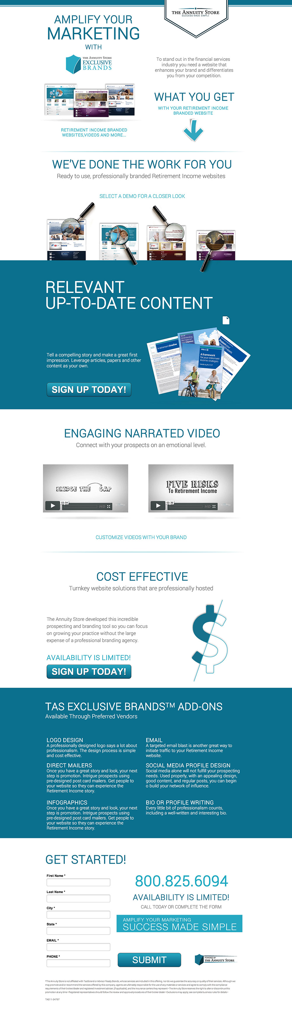
Before I break down some of the finer details, let’s do a simple exercise I call the Bullshit Detector. Pretend you are your visitor and quickly spend a few seconds scanning the page for value.
Buzzword alert: “AMPLIFY YOUR MARKETING,” “WHAT YOU GET,” “RELEVANT UP-TO-DATE CONTENT,” “ENGAGING NARRATED VIDEO,” “COST EFFECTIVE,” “TAS EXCLUSIVE BRANDS ADD-ONS,” “GET STARTED,” “AVAILABILITY IS LIMITED,” “SUCCESS MADE SIMPLE” and finally, “SUBMIT.”
If you read that out loud, you’ll realize that it doesn’t actually communicate a single thing about the offering. People scan because they are impatient. These headlines are the critical callouts of the benefit of doing business with you, so I’d consider giving this page a major overhaul. Tell a story in your scannable headlines and you’ll be much better off.
- It’s all blue! When you have a dominant hue like this, you have a prime opportunity to draw attention to your call-to-action by using contrasting colors.
- “Sign up today” – If you scanned the page as I did above, you’d have no clue what you’re being asked to sign up for. The CTA should be descriptive and benefit-driven. Try something like, “Get My Ready-To-Use Retirement Income Website” (although I still have little idea what exactly that means).
- Is it a brochure? If you look at the imagery beside the CTA, it looks like a report or some paper thingy. If it’s a website, show context of use by placing it inside a browser window.
- The headline is vague. “Engaging Narrated Video” doesn’t tell me much, so I’d go with something like, “We Create Professional Narrated Videos For You.”
- “Availability is limited!” – Not sure I buy that. Why is it limited? If availability really is limited, explain why. For example, “To maintain the highest possible level of client service, we can only take 8 clients on per month, so get started right away.”
- What happens when I click the form? I don’t know why you need a phone number or my city and state. If you are going to call me back, state that on the CTA: “Request a callback” or “I’m ready. Please call me back.”
2. PokerSnowie PokerCoach 2

Love me some poker! This should be fun.
- The offer is confusing. “20% off >> Get it now!” Okay. For how much? I have to scroll down to figure this out and then I’m told it’s €9.92 annually. But that’s a monthly price based on a yearly subscription. Confused yet? Yup. It needs to be MUCH more clear. State that it’s €9.92 per *month* and maybe show the original price to anchor my delight about your reduced price.
- Challenge PokerSnowie? Who? The logo says PokerCoach, why are we talking about snow? You’ve completely lost me. Brand overload.
- Where do you want me to look? There is so much going on that I have to work very hard to figure out the flow of the page. While the page has an excellent visual design aesthetic, it needs more clarity and whitespace so I can consume the content in a calmer manner. I’d remove the paragraph under the PokerCoach logo and speak more directly about challenging the Hold’em coaching software in the main headline.
- What’s the CTA? The “Try it free for 10 days” CTA is a good escape mechanism, but it makes me wonder if that path would be a better primary CTA. You know best which leads to higher sales overall, but if you want to present both, you might want to use an equal balance double-button approach (like the classic demo/trial setup of SaaS products). One will anchor the other and you might be surprised by the results. I’d love to hear some of your data in the comments.
- The last set of bullets was the clearest part of the page for me. Bring those bullets up top so I will actually read them and maybe cut the benefits down to three bullets.
- Said it before, say it again. Remove the social share buttons. Nobody gives a shit.
- “Designed for Windows only.” Bummer! You might want to segment early on by mentioning that. Not sure, but I got excited and then my beautiful MacBook Pro got sad thinking about some ugly Lenovo…
A little background: I used to be Creative Director at Bodog, so poker runs through my blood. ‘Twas a pleasure to critique this page. Don’t take it personally. I’m here to help.
3. The Weddingful Party
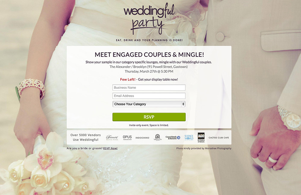
I don’t know how targeted and segmented the audience for this site is as I’ve not seen the ads, but here’s my 35 cents:
- The tagline is vague. “Eat, drink, and your planning is done.” Who is that addressing? Planning for what? My wedding? I don’t get it. How can my planning be done?
- What is a Weddingful party? I’d describe the event and why a vendor should attend in one sentence exactly.
- The headline is also unclear: “Meet engaged couples and mingle.” I’m assuming now that this is for a vendor of wedding services, but my initial reaction was to wonder why engaged couples would want to mingle. They’re already engaged. Am I going to exchange wedding tips with others? Weird.
- The benefit is clarified in the subhead but it’s very small and should perhaps be the headline. “Show your sample” is unclear. I’d be more inclined to get straight to the point: “Get your sample in front of engaged couples looking for wedding services” or something along those lines.
- The CTA is suitable for someone coming to a wedding so I get why it says RSVP, but I’d rather see a vendor benefit-driven call-to-action. Something like, “I’m attending the Weddingful Party on the 27th!” would also serve as a reminder of the date which is very hidden on the page.
4. Children’s Hospital
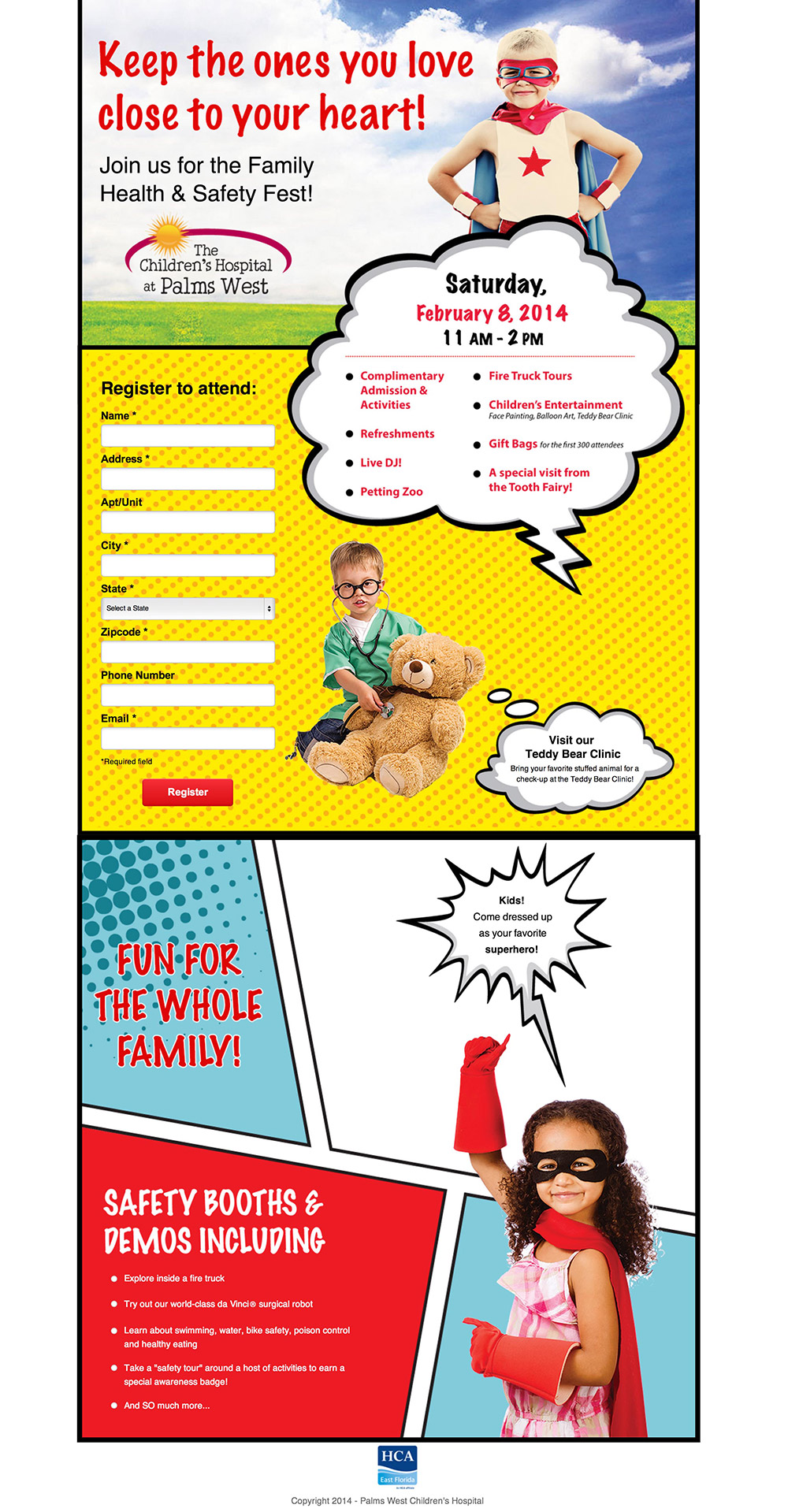
Feels harsh to critique a kid’s hospital, but it needs help. I’m assuming this is the target of an email campaign because it doesn’t seem like a paid search ad destination.
- The headline is very fluffy and doesn’t describe anything about the purpose of the page. The subhead is more explanatory and you could probably just flip the order of the headline and subhead for more clarity.
- The form feels overly long for something as simple as registering to show up. Are you really going to be sending direct mail? Why require a physical address? If you do need it, at least remove the apartment number field – people will add that in the address field. And does the state really matter? Are people coming from that far away?
- The goal of the page is buried in the design. Right now the main callout is the event details which is great, but it means that the form is hidden and looks secondary. You could try appending the form to the bottom of the cloud so people can read the details and then register.
- The CTA lacks the emotion of the event. You might want to go with something more friendly like, “We’ll be there, save me a spot!”
- Because the page is so long, consider adding a button to the bottom of the page that smooth scrolls back up to the form.
- The bullets at the end are so small I don’t really want to read them.
- I’d also consider rewriting the current heading, “Safety Booths & Demos Including…” The word “safety” is a turn off. You could probably remove that and just rely on the heading above it to introduce the bullets, especially if they’re much bigger.
5. Jamar Roofing
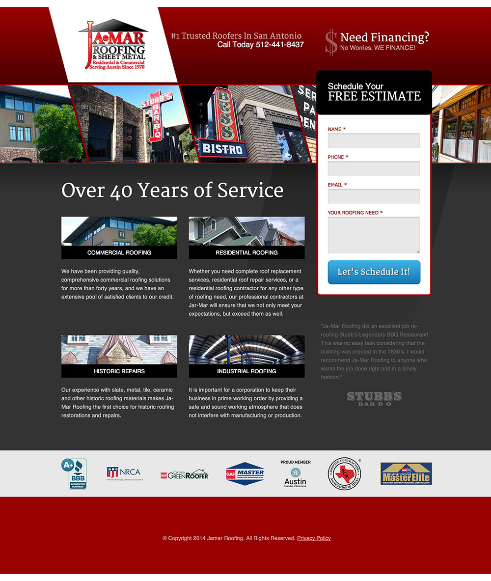
- The headline says, “Over 40 Years of Service” but doesn’t explain in what. Building roofs? Repairing roofs? Without reading the small statements at the top, you have no sense of the page’s purpose. If someone were to arrive here from an ad, the message match between ad and headline would most likely be quite poor. I’d suggest changing the headline to something like, “Schedule a Free Roofing Estimate From San Antonio’s #1 Trusted Roofers,” with a subhead that verifies the claim “According to [insert who said this].”
- Hero shot – The images at the top of the page say nothing about roofing. I’m assuming they are customers, but this is likely the wrong place to show them. You could move them down to the bottom of the page and attach a headline that states that these are your happy customers.
- The text for the four content blocks is really tiny. Reading it, there isn’t much value in the paragraphs of content. The first one just repeats what you know from the page already.
- The testimonial beneath the form is almost impossible to see and won’t be read.
- I’d recommend adding a short description beneath the form header (“Schedule Your Free Estimate”) that explains that you’ll come to their property and evaluate the cost for them. This sets the expectation of the form.
- It might help your sales process if you had a drop-down form field so people could self-select which type of roofing they need.
- This form can’t schedule the assessment for them, it only allows you to call them back. I’d clarify the CTA so it’s clear that clicking it will result in someone calling. Perhaps you could try, “Call me to schedule my free assessment.”
6. HootSuite
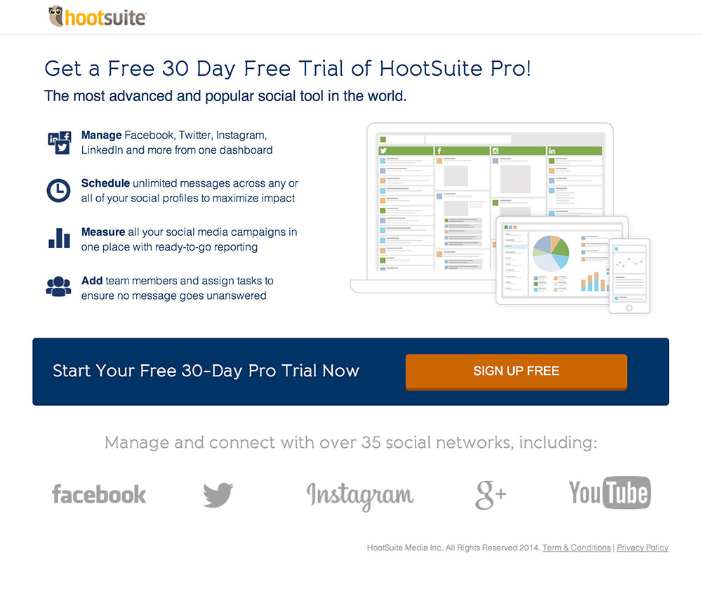
Gah, I really have virtually nothing to say about this page! It’s awesome. But I’ll try.
- I’d test reordering the headline and subhead like this: “Get a Free 30 Day Trial of The Most Advanced & Popular Social Tool in the World!” with a subhead about HootSuite.
- The two statement CTA area could be simplified by just having the button with the copy, “Start My Free 30-Day Pro Trial Now.” Note how I changed the possessive from “Your” to “Me.” As detailed in the last example from this case study about testing CTA copy, this can have a dramatic impact.
- For the list of social networks, it looks more like the standard customer list, as opposed to what you can manage using HootSuite. I’d recommend a diagram that demonstrates the management capability. Place the HootSuite logo or screenshot and have the networks connected to it around the outside. I’d also test showing all of the networks, keeping the primary ones large and the rest small.
7. ConversionLab

Great landing page. Very clean and clear with the five essential elements: USP, hero shot, benefits, a single call-to-action and social proof. Here are my thoughts:
- Excellent headline. It immediately identifies with my need (which would have been established in the ad that lead here). However, if you already ask this question in the ad, repeating it here is somewhat wasteful. You might want to test implementing some Conversation Momentum. This is the idea of starting a conversation in the ad or an email and continuing it immediately on your landing page. In this instance, you could make the headline what you currently have in the subhead: “I can help you set up and manage high performing landing pages in no time!”
- Your name and details are too small to easily read.
- I’d be inclined to start your form header from a different perspective such as, “Would you like help with your landing pages?” This establishes the goal of the form and your CTA will make more sense. For even more clarity, you could tweak your CTA to say, “Yes, please help me with my landing pages.”
- Inline form fields are generally a bad usability practice. Yes, they allow your form to appear shorter, but when your form consists of more than a single field, you can lose track of which field you clicked on (because the label disappears). This often results in having to click outside again to remind yourself what you were filling out. It may sound silly, but it happens to me all the time and it annoys me.
8. Gainsight
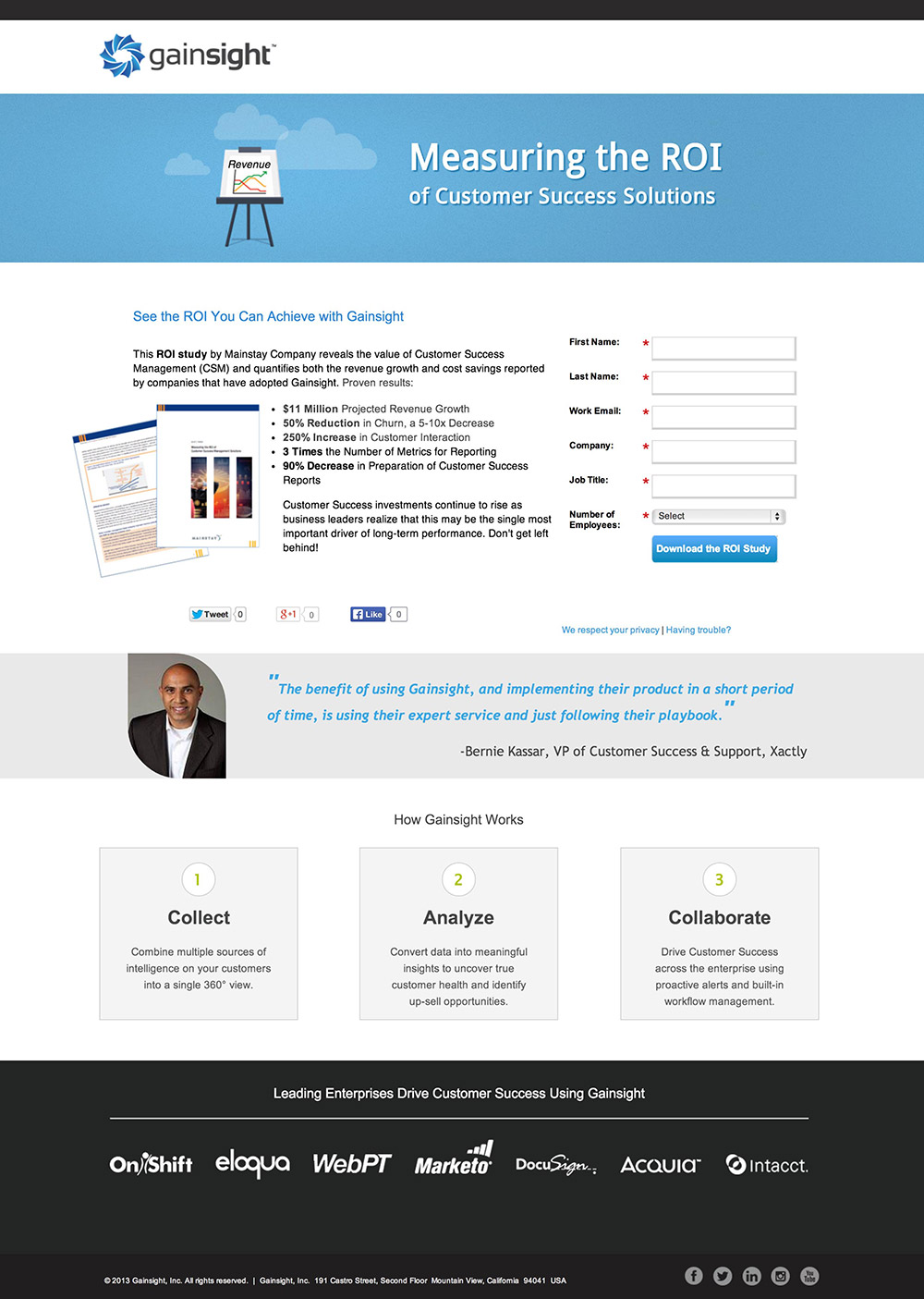
- Who’s measuring the success of customer success solutions? Is it you as a service, or me as the user of your product? The headline doesn’t make this clear enough.
- Only when I read the copy below do I even begin to realize that this is an ebook download page. There should be a hero shot of the ebook so people know what the purpose of the page is. See this ebook download landing page as an example.
- The headline should clearly state that it’s an ebook as well as the benefits you’ll get from reading it.
- Ditch the social share buttons immediately. They serve zero purpose at this point and having zeros on there is negative social proof. The place for these is on the form confirmation page/dialogue.
- Introduce the form with a form header. Stay tuned for the form sketch in #13 for a good example of form design.
- You get into the Gainsight product at the bottom of the page, but it’s too soon to do so. You’re mixing the purpose of the page. You could add this description to the confirmation page (instead of the social shares) and ask if people would like to check it out. This is also often too soon, but it’s worth validating if it gets you any signups.
9. One Hour Translation
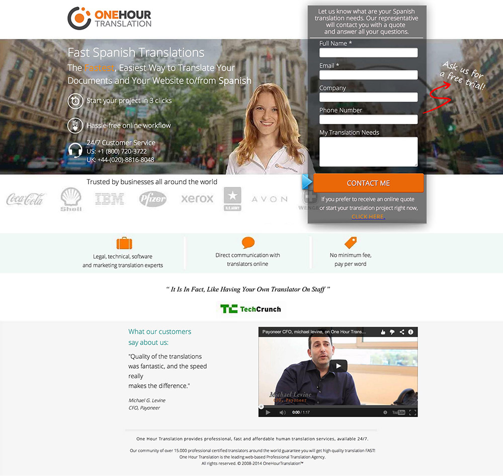
- The header copy is very hard to read due to the photography in the background. I’d place a dark transparent box behind so the copy stands out more, or get in Photoshop and darken that part of the photo.
- The callout from the form is a distraction that adds to the complexity of the page. There are two places you could ask if people want a demo: you could use a checkbox in the form, or you can ask on the confirmation page.
- Space everything out! The page is so crammed together that it’s not a very delightful experience. If you gave it some white space, it would provide visual clarity and an easier reading experience.
- Form friction – If the “Translation needs” field is optional, I’d opt to remove it entirely. This would shorten the form and stop people from having to think of a good answer to the question.
- The CTA copy, “Contact me” is okay, but I’d test changing this to “Call me back to discuss my translation needs.”
- Lack of credibility – In the form header, you have grammatically incorrect English which doesn’t inspire confidence (“Let us know *what are your* translation needs”).
- 24/7 support is all you need to say. I don’t need support now so I don’t need to see the phone numbers.
- Who’s the target market? The logos imply big business. Is it still good for me if I’m an individual? Make this clear, even if you’re doing targeted ads.
10. Geordie Shore
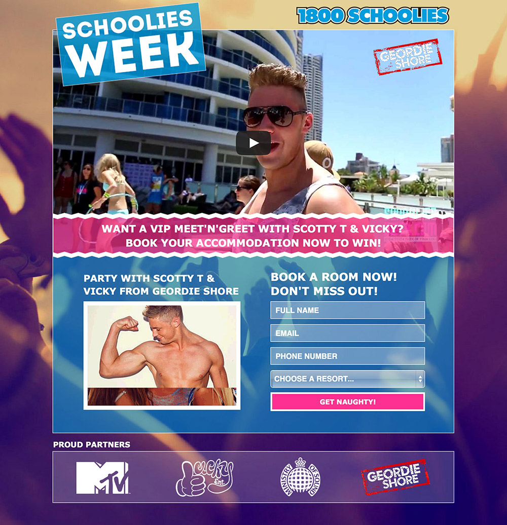
This is an interesting one. It’s the Brit version of Jersey Shore, based in Newcastle in the north of England. I know this because it’s where I was born. Yup, I was a Geordie before I moved to Scotland. Don’t hold it against me.
Thoughts:
- The headline is very clear about what you can expect to win if you enter the contest by booking your accommodation. However, it says nothing about where the event is taking place, which is a pretty big context fail. People arriving here may have this prior knowledge but it’s still dangerous to assume everyone will. I’d include it in the subhead.
- The CTA says “Get Naughty” which is cute but doesn’t really describe what’s going to happen. Worth testing something less clever with more clarity.
- To reinforce the contest and prize it might be a good idea to include some small subtext below the CTA saying something like, “By clicking this button you will have a chance to win the VIP meet ‘n’ greet with Scotty T & Vicky!” The bottom of the page does have an image slider which shows the two stars you’d get to meet, so I’d give the offer context a +1 here.
- The video at the top sets the scene nicely but it should be hosted somewhere without ads. Right now there are retargeting ads showing up behind the headline. Not very noticeable but should still be avoided.
Overall a good landing page.
11. College ScholarSHIP
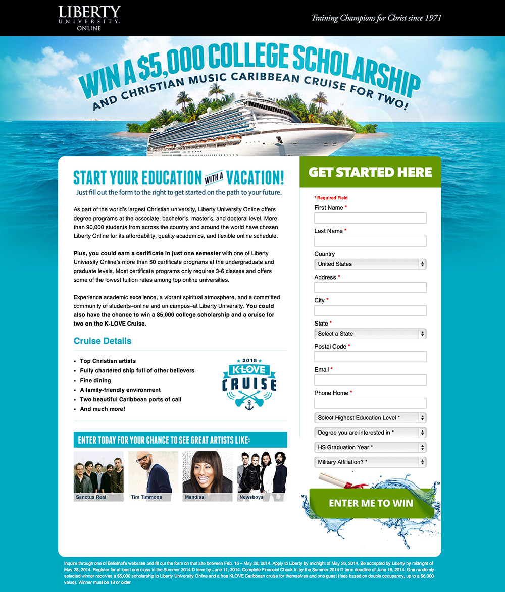
- The value of the offer is very clear from the headline, but it doesn’t mention that it’s for an online university. The word “online” is beneath the logo but it’s very small. I found myself hunting around the page to find out where the university was.
- There’s an awful lot of copy to read and the type is really small. The page could benefit from having some bullets in the second paragraph to make it more scannable.
- Love the form header. It grabs my attention immediately and lets me know where to interact with the page.
- The matching color on the form header and CTA is excellent, but a complementary contrasting color like orange would stand out more than the green.
- For the cruise details, I really want to know where it is – include a map.
- There’s no link to a privacy policy which is important for a lead gen form, especially if the inbound source is PPC. Google likes to see a link to that as a trust signal.
- I would also play on the fun fact that the word “ship” is in the word “scholarship.” :)
12. SurfEasy
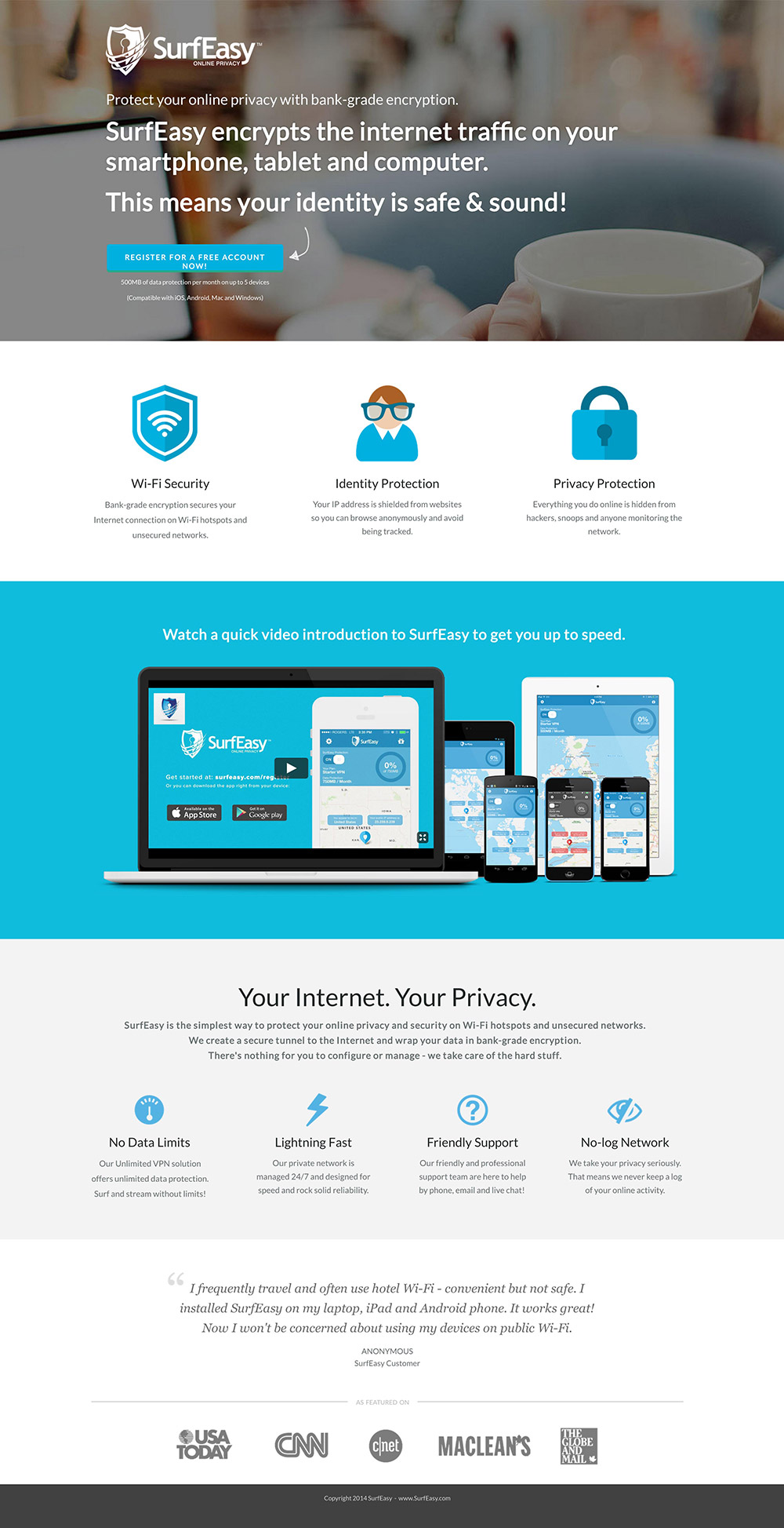
This is a really good page, so there’s not a whole lot to say. Some minor things.
- Crystal clear value proposition in the headline.
- The CTA should be a contrasting color to the rest of the page.
- The subtext below the CTA is too small. I struggled to read it.
- No idea why there’s a photo of someone with a coffee. I guess it’s to suggest someone relaxing and not worrying. Would be interesting to humanize it further with a clearer view of the person.
- The headline above the video is a good idea but it could be clarified by removing the “get up to speed” part which is just fluff and unnecessary reading for your visitors.
- Have you tested using the video up top in the main header? If not, I’d definitely give that a go.
- “Your Internet. Your Privacy.” feels like a throwaway statement and doesn’t add any real value.
13. Minuk Denture Clinic

- The headline doesn’t communicate any real value here. “Talk to us about your dentures & dental implants.” Why would I want to talk to you? The headline needs to speak to the pain first, then set up the request to get into a conversation.
- The form header is a little grandiose and doesn’t introduce the purpose of the form. I like to design pages from the inside out, pretending as if the form is the only thing on the page. Take a look at the diagram below and you’ll see that the form communicates an entire story on its own. Try designing your page form-first.
- “Find out more” is a vague CTA. Am I finding out more about how dentures can change my life, or the benefits of using your service?
- Where are you? It took me a while to figure out you are in Winnipeg (from the video title). You should reinforce the physical location somewhere near the top of the page so visitors aren’t faced with any potential confusion.
- What’s the video for? You should have a headline above it describing what it is and why I should bother to watch it.
Bonus tip: Designing a lead gen form in isolation
By designing your form to tell a complete story, you can structure your page design around it in a more relevant manner. To figure out what your story is, you should write down the pain felt by your customers and the pain relief that your solution provides.
Your form should consist of the following elements:
- A headline to introduce the reason for the form
- A description with bullets to highlight the benefit and contents of what you’re giving away upon completion
- Descriptive form fields (original label names and questions can capture attention)
- A call-to-action
- Trust statements or links
- A closing urgency or context-enhancement statement
14. Online Nursing Diploma
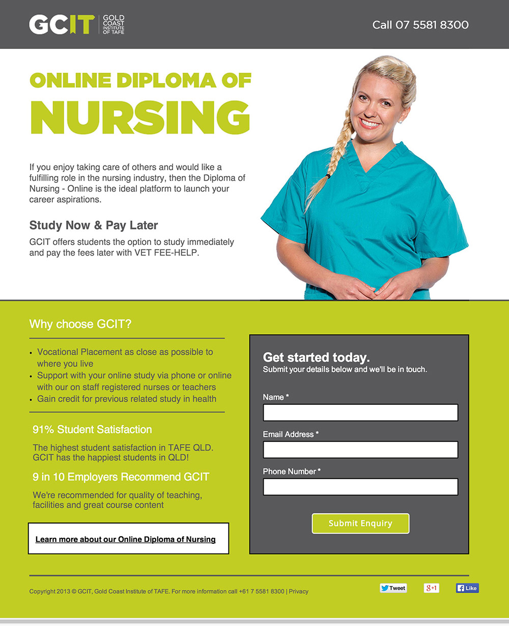
- My gut feeling with this page is that it’s lacking any identity for the school.
- The intro paragraph is so generic and not at all inspiring. Your headline, subhead and intro should represent your unique value proposition. You need to explain very quickly and succinctly why this course is different.
- Two CTAs – You have a “Learn more” link competing for attention with the primary CTA (the form). Pick one or the other.
- Bad form – All of the copy on the form is pretty meaningless. Get started with what? Make it clear. Fill in the form? No. Add value, not instructions. “Submit enquiry” says nothing about what will happen when I click it. “Please call me back!” makes it clear. And perhaps some expectation setting as subtext beneath the button: “A [name] will be in touch within 24hrs.” You could also say, “Or call us now at [number] to get started right away.” This addresses any urgent need a visitor might have. True, it adds another CTA, but it doesn’t make the person leave the page.
15. LiveSource
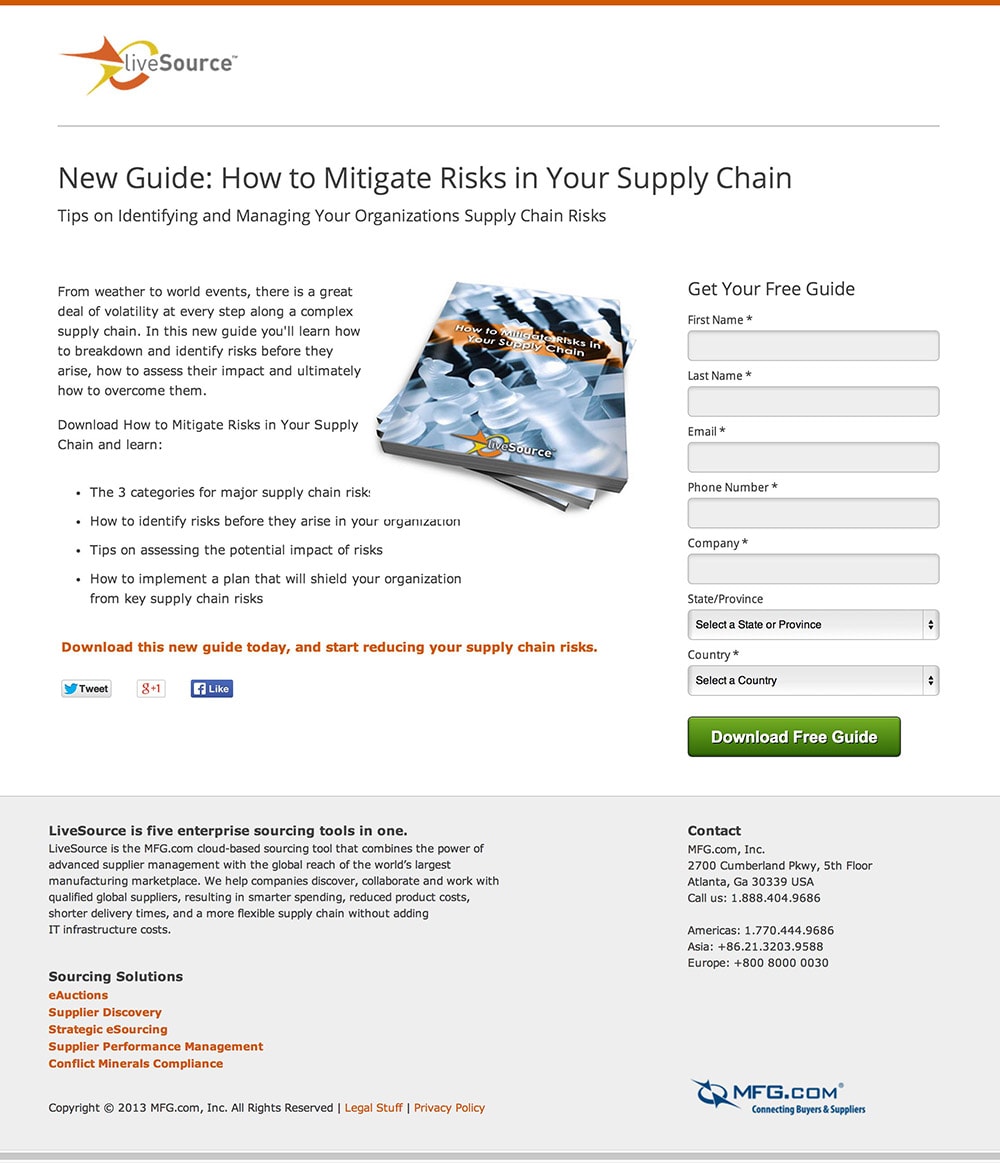
- Form-first design – As I mentioned in #13, if you pretend that there is nothing on the page except your form, you’ll see that it describes absolutely nothing about what you’re getting and why you should care. I’d focus entirely on this until you can read the form headline, intro, bullets and CTA and get a complete image in your mind of what the page is about. Then reconstruct the page around your optimized form.
- Remove the social share buttons. Nobody cares about you at this point and they’re not going to share your page out of pure altruistic desire. It’s a lead gen page, so stick the social shares buttons on the confirmation page and ask them to share after they’ve filled out the form.
- Delete the five links in the footer. They are unnecessary distractions and just serve to increase the attention ratio beyond the ideal 1:1.
- Include a short preview of the ebook so people can look through it in advance. Here’s an example of showing an ebook preview. This will give the page some credibility, as you currently have none. Alternately, you could include the testimonial of someone who has read the book.
- Visually, I’d flip the design so that the content is all on the white background on the left side and then use the gray to create a container for the form on the right. This makes it an easier reading experience as the delineation caused by the encapsulated form stops you from jumping from side to side.
- Oh, and stick an apostrophe in “organization’s.”
16. American Metal Market
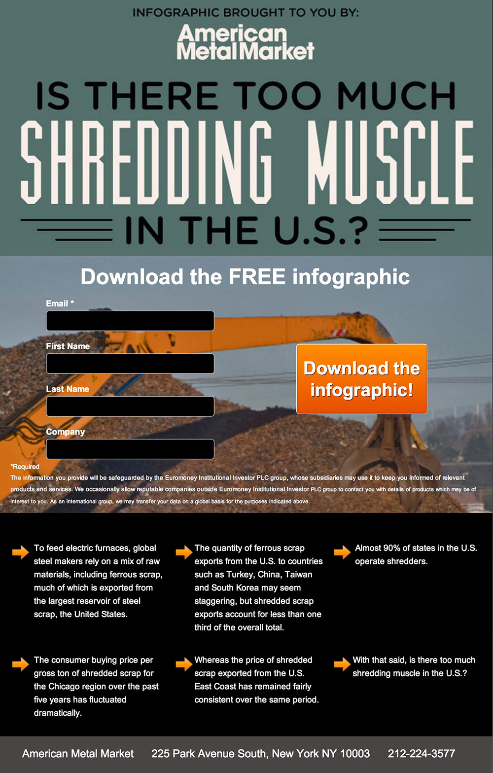
- I know I’m not the target market, but “Shredding Muscle” sounds like a shady fitness program or supplements.
- Are people really willing to fill in a four field form to get an infographic? I’d be shocked. Infographics are almost exclusively free and ungated, not to mention passé. I’d recommend asking for an email address only.
- Instead of the crane in the background, I’d suggest you include a section of the infographic as a preview. That way, people can get excited about the content. It’ll increase desire and trust in your ability to deliver quality content.
- Where are the stats? Infographics are generally about stats. Instead of all the copy you’re hoping people will read (they won’t), you should add some big bold statements and stats to make people want to find out more.
- No idea why you have an address on there. It’s confusing the point of the landing page.
17. 24hr Challenge
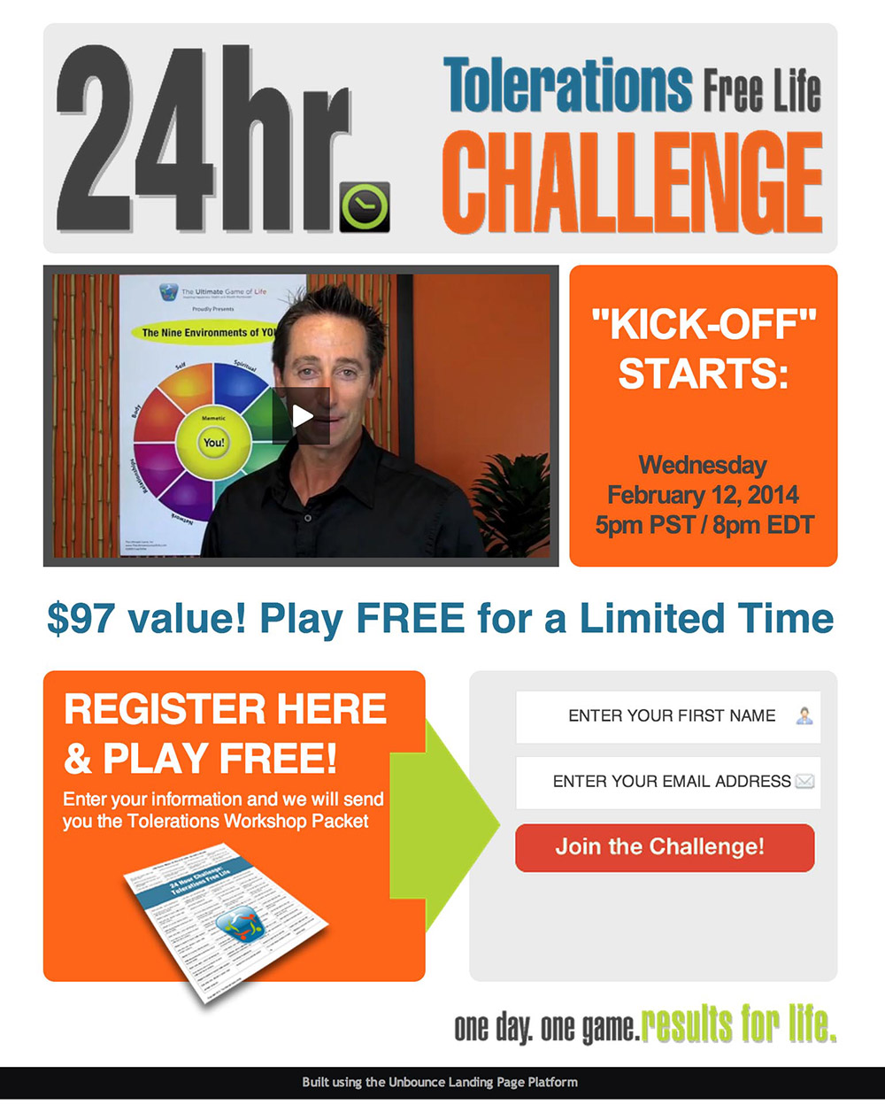
Uhm, wuuut?
- “24hr Tolerations Free Life Challenge.” What on earth does that mean? Only after listening to the beginning of the video did I realize it should be written as this: “The ‘Toleration Free Life’ Challenge,” with “Toleration,” “Free” and “Life” having the same weight. Right now it’s really hard to understand the breakdown. Is it about having a free life?
- You have to assume that people won’t watch the video and design the page accordingly. Is it a game? A workshop? How does the challenge work? Add a brief description with some bullets for clarification.
- Let me scan the page copy and see how much sense it makes: “24hr tolerations challenge kick-off starts $97 value register here and play free join the challenge one day one game results for life.” Now ask yourself if that explains *anything*. It doesn’t. The lack of clarity is really going to affect your conversion rates. Rewrite the page until it can stand on its own without the video.
18. IQ Auto Buyers

I like this page quite a bit. Here are my thoughts:
- The CTA “Get your free offer” wouldn’t make any sense read in isolation. What kind of offer is it? Is it a special of some kind? It’s very vague. Something more suitable would be, “Tell me how much you’ll give me for my bike!”
- The three bullets are very clear, but I’d further clarify the second: “We’ll make you an offer.”
- The description in the yellow area reads quite well, but I’d do a few things to improve the chances of it being read: Add some whitespace around it so it’s not all jammed in there, bump up the size of the copy and then see if you can say the same thing in about 30% less words.
- Demographics? Okay, take an honest look at the photos being used here. Testimonials are often hard to believe, and in this case, I’m really not buying that these three folks are motorcycle enthusiasts…
- Update the year in the footer to say 2014. :)
19. Budget Dumpster
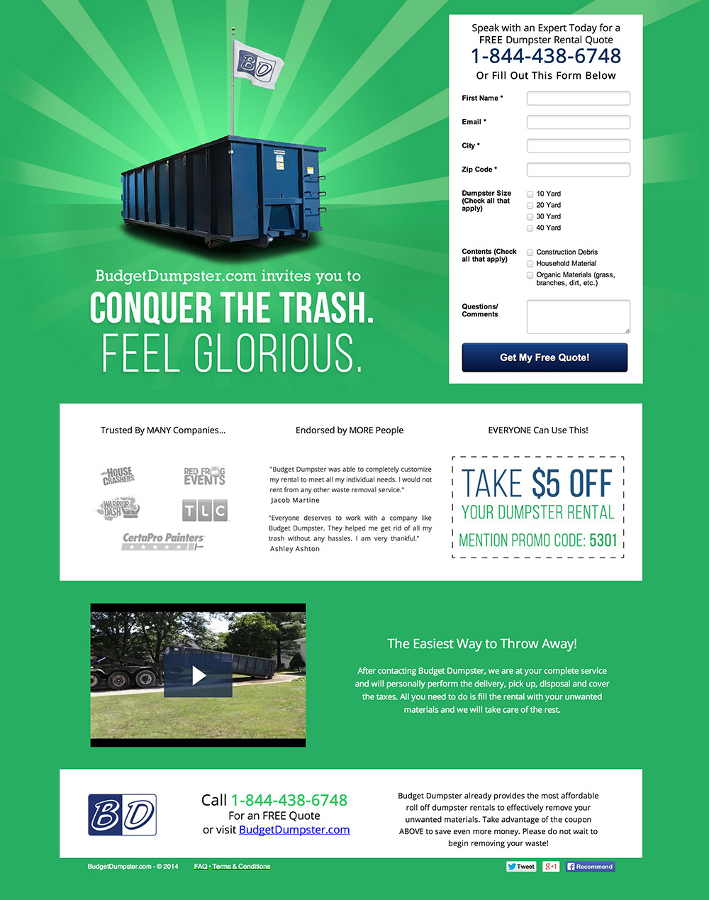
- Weak CTA: “Get my free quote” could be a bit more explicit. “Get my free dumpster rental quote” gives it more clarity.
- Ambiguous form fields – “Dumpster size” assumes too much knowledge from your visitors. The “X Yard” radio button labels say something about the length of the dumpster (I assume), yet many won’t be able to visualize what that actually means. And why can I select multiple sizes? Think of moving companies. They talk more in terms of “small one bedroom apartment” which lets the customer self-identify with the potential size of the truck.
- The next field, “Contents” has only three options. What if they don’t represent what I have? Will you not let me rent a dumpster? Provide an “other” option so people don’t disqualify themselves.
- Too many options. When I get to the bottom of the page, you’re presenting me with too many things to do. Call on the phone, visit the website and share on social. This needs to be a much more focused experience. If you value a phone call, then make the bottom section about choosing between “Get a free quote online” or “Give us a call at 1-800-bud-dump.”
- The headline doesn’t speak to the problem being solved. “Feel glorious” isn’t the best use of that prime real estate and the “invite” phrasing makes it feel a little like an event. To find a better headline, I’d study the terminology your existing customers use when describing the impact your service had on their lives and then craft a headline that speaks to that.
20. Budget Dumpster 2
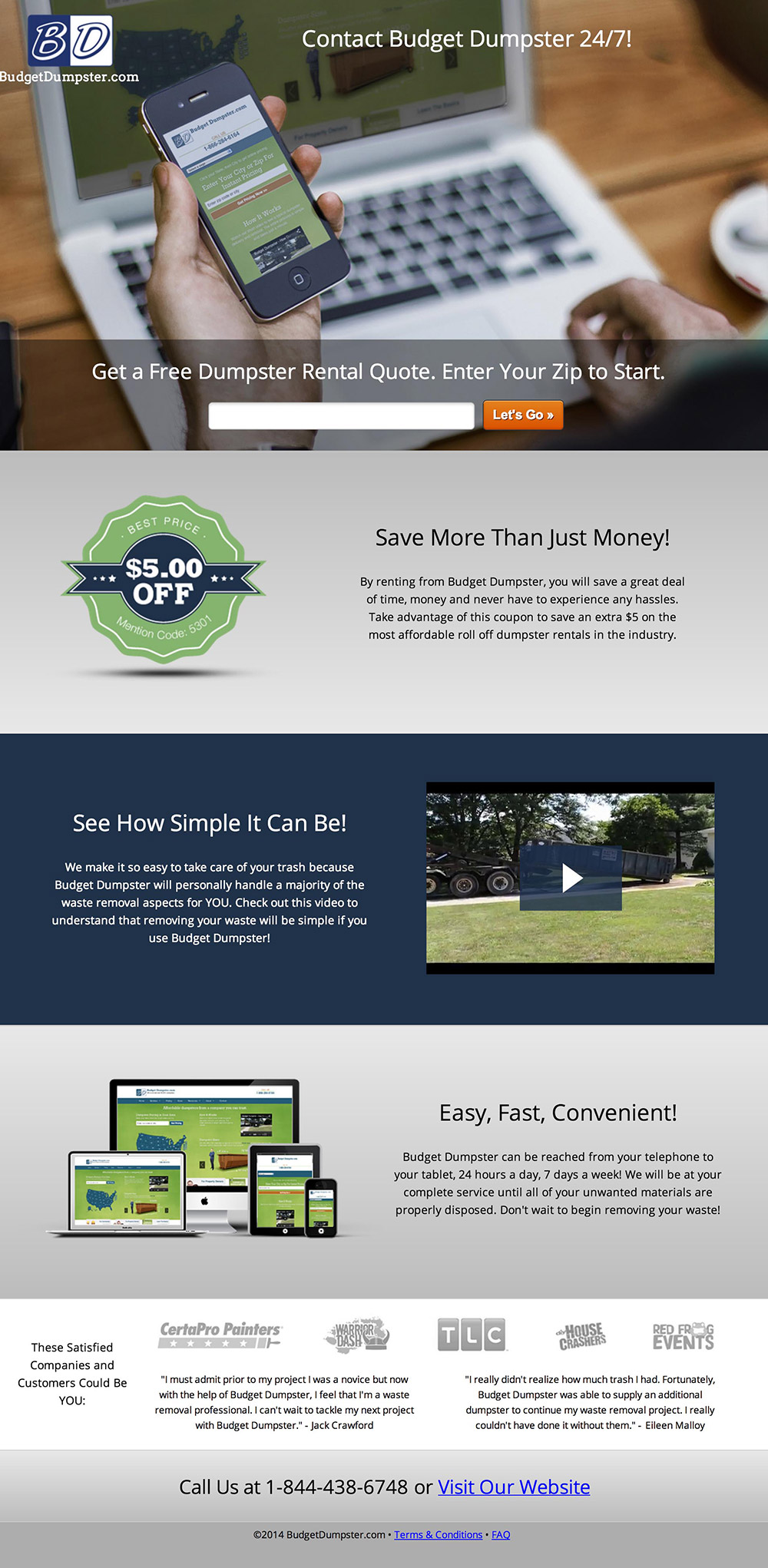
This is interesting. It’s the same company but with a completely different page design.
I’m going to jump back into scanning mode and use the Bullshit Detector for a second. Here’s how the page reads at a glance:
“Contact budget dumpster 24/7 get a dumpster rental quote let’s go save more than just money $5 off see how simple it can be easy fast convenient visit our website.”
- Zero benefits in the headline. Having a “contact us” statement as your headline is pretty weak and quite bizarre. I feel like the second headline is a lot more explicit and makes the purpose of the page very clear. Perhaps make that the headline.
- Why am I looking at a phone? If you’re showing an iPhone and Macbook Pro to make me think that I can get in touch any time I want, I really don’t care about the technology involved. Where is the shot of the dumpster so I can visualize what I’m asking for?
- What else will I save? Instead of making me read the paragraph of text, state explicitly in this headline what I will save. “Save your time, money and the hassle of carting your trash to the dump.”
- Your section headlines need to work on their own. Going back to the scanning exercise, remember that each of your headlines should be able to work in isolation. “See how simple it can be” could be rewritten as “Watch how easy it is to remove your waste.”
21. Onboardly
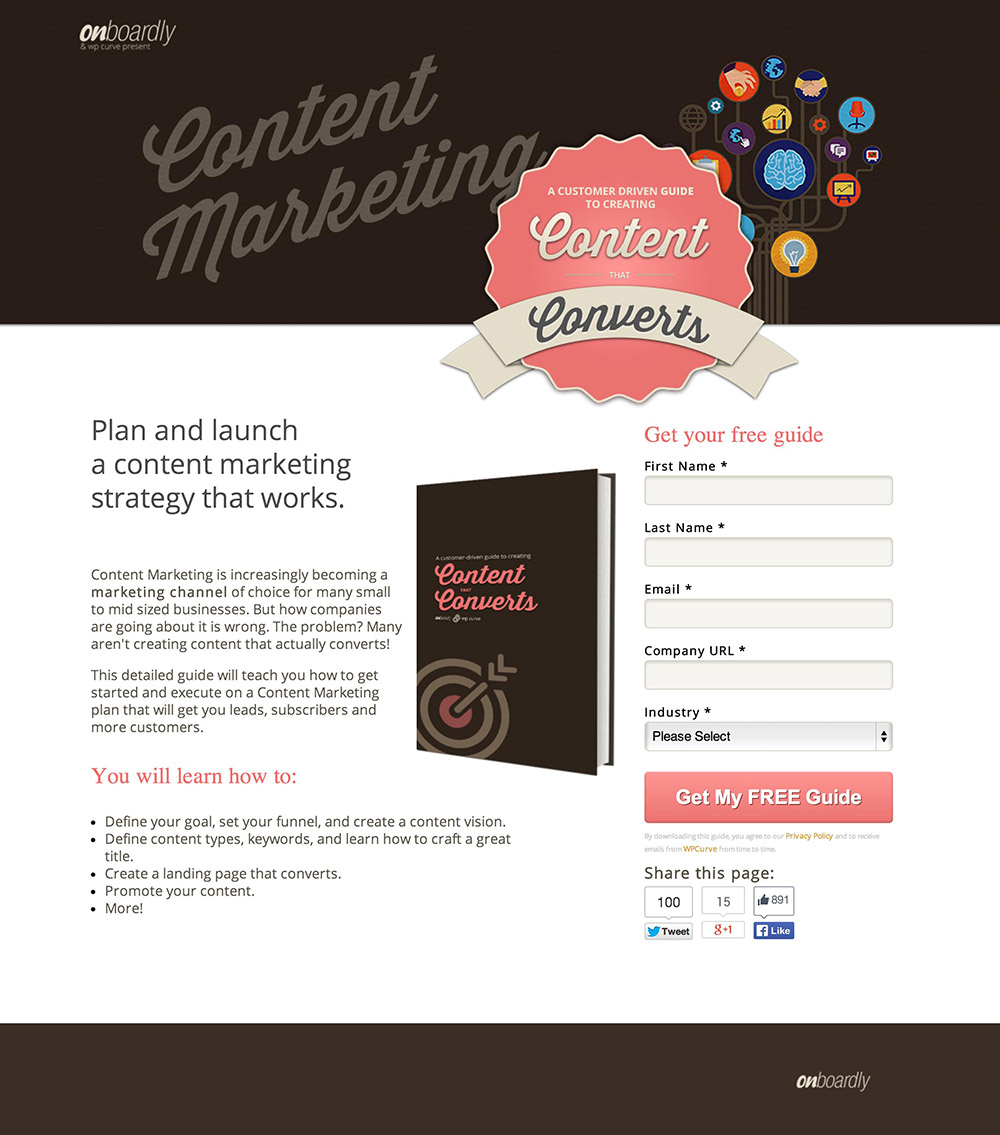
- Confusing header – The font is pretty hard to read quickly. When I open up this page, my gut reaction is, “CUPCAKES!” I’d suggest getting to the point faster. The headline is clear but it’s relegated to third position behind the wasted statement “Content Marketing” and the even harder-to-read rosette thingy.
- Show, don’t tell. The intro paragraph reads like a dull blog post. “Content marketing is increasingly becoming…” Not becoming. It IS! Speak with authority so people believe there is value in the ebook. Attach to the FOMO (fear of missing out): “It’s essential. Are you doing it? Are you doing it right?”
- Learning is hard. A subtle change, but it would sound more authoritative if you said, “We’ll show you…” instead of, “You will learn how to.”
- Who is WPCurve? Why might I get emails from a company that does WordPress stuff? You’re letting people click away to another site that has no connection to this one. If WPCurve is part of this campaign, you need to introduce the brand in a better way.
- I always suggest that you should put the social sharing buttons on the confirmation page. In this instance, the numbers are not bad, so having them on the page could be beneficial. The added social proof may outweigh the distraction. However, choose your networks. Facebook is the only one that’s working so I’d remove the other two and specifically ask people share on Facebook (after taking a look at your analytics to see if Facebook visitors actually convert).
- I did another quick scan of the page and after squinting at the logo to see what the tagline said, I saw the WPCurve co-branding. This isn’t enough and it still doesn’t clarify why they are involved.
22. 360 Finance
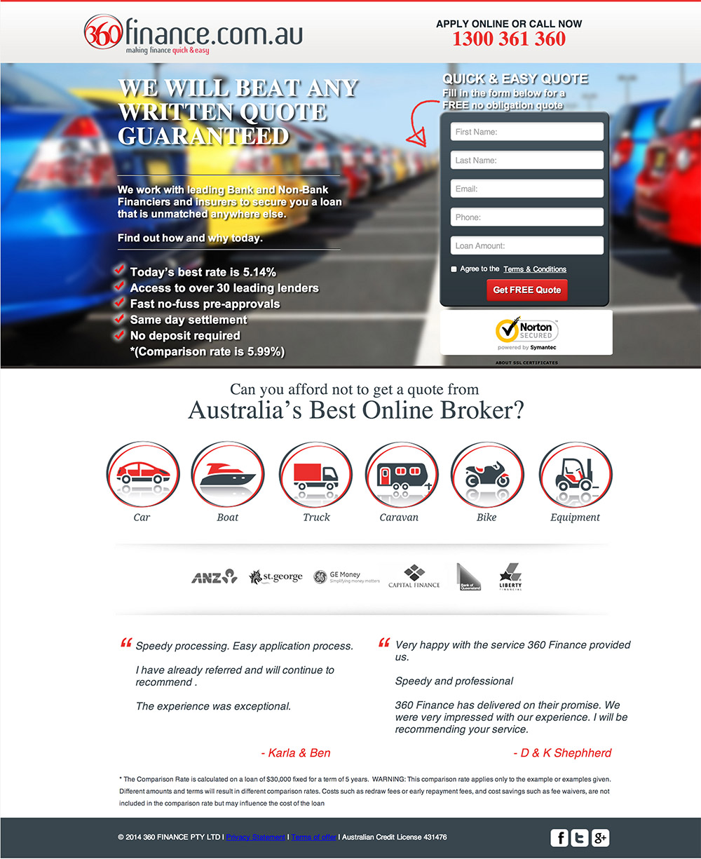
Alright! Last one. Bring on the honest true facts!
- Beat this. “We will beat any written quote guaranteed.” Quote on what? I hear this written quote is fairly good: “That which does not kill us makes us stronger.” How will you beat that? Come on. Add some context to the headline. What are you offering?
- We work with everyone. “We work with bank and non-bank financiers.” So does that mean you work with all financiers? Would there be value in saying that then?
- “Find out how and why today.” You’re asking me to find this out rather than focusing on getting a quote (which is the goal of the page). Stay focused on your objective and only add words to the page that actually add value.
- Is it car insurance? The hero shot implies that it’s something to do with cars but… gah. I’m completely lost on this page.
- Unhelpful security badge — The security seal is more dominant than the CTA and there’s a link below it to get info about SSL certificates. Who gives a crap? Don’t give people a link to something they had zero chance of thinking about. You’ve made me think about SSL when I should be thinking about what you are offering (whatever that is).
- The testimonials look fake. This is a common problem and not an easy fix. Ask yourself if you’d fill out a form because Karla & Ben said it was a good idea.
- Logos – Are these customers or financiers you work with? Always introduce the logos with a statement of why they are being shown.
- Unreadable copy – The white text over the blurred photo is very hard to read. I’d consider removing the photo entirely as it’s a little confusing anyway.
Wow, that was a harsh end to the landing page critiques!
My hope with these critiques is to get you to take a brutally honest look at your own landing pages and learn a few ideas for your next A/B test.
If you have any questions about anything I discussed, or if you disagree with me, jump down into the comments and let’s talk about it!
And to the designers of the pages above, just remember, all of my comments are written with love!

Cheers,
p.s. If you’d like to see some brutally honest landing page critiques LIVE! You should come to the first ever Unbounce Call To Action Conference in Vancouver on September 12th, 2014, where myself and two other conversion rockstars will be looking at landing pages from attendees.

