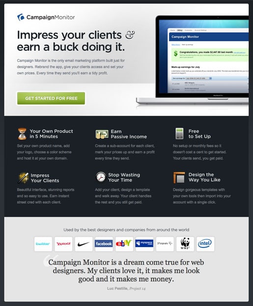
This landing page is definitely in my top 5 list. It’s elegant, focused and really well targeted to the intended audience.
Type of Landing Page: Click Through
Source: CampaignMonitor.com
Built Using Unbounce: No

Landing Pages Elements
- Product hero shot: The Macbook Pro image hits up the target demographic nicely (designers) and demonstrates the context of use (it’s an online application).
- Features/benefits list: The way to trigger emotional connections with your visitors is to talk about how your product/service can solve their pain. The benefit list here clearly addresses this with language like “Your own product in 5 minutes” – quick to get started, “Design the way you like” – creative freedom. Note: features are good for certain situations such as the capabilities of an electronics product like a camera, but benefits are generally a smarter way to communicate when you don’t have much time as the user doesn’t have to infer why a certain feature is a good idea.
- Testimonial: The testimonial used here isn’t just a “we love you” style quote. It ties directly into several of the key value propositions presented earlier on the page (it’s for designers and it makes me money).
- Trust symbols: Client logos fall into the category of trust symbols. They are powerful business testimonials that increase the trust factor. It certainly helps to have a kick-ass client list as they do. Being able to show the Nike swoosh and the WWF panda is great validation of Campaign Monitor’s success and dependability.
Why I Like It
| Thumbs Up | Reason |
| On-brand design | It’s important that the design of your landing page matches the branding and design standards of your website. This is more critical with a click through landing page, as the visitor will transition from one to the other right away – and you need to maintain the consistency. It’s a little less important with lead gen as the customer often stops at the point of form submission – although they are still likely to visit your site if they find your product/service interesting. |
| A single interactive element | As I mentioned in a recent post about how too many messages can kill your conversion rate, CampaignMonitor do a great job on this page of reducing the number of interactive elements (the call to action – CTA) to just one very clear button. |
| No risk | The CTA points out that you can get started for free. Allowing customers to “try before they buy” reduces barriers to entry. |
Final Thoughts
Campaign monitor provide a hosted email service for designers and the landing page does a great job of reaching out to that target demographic. They do this by presenting a professional and seductive design aesthetic on their landing page which sets the tone and builds trust in the fact that they understand their customers.
When you come to design your own landing page – use this for inspiration. It’s that good.
