The crazy badass Honey Badger has been on holiday, but now he’s back. Maybe it’s chilled him out, given him some perspective on his life? Who knows? All we know is, he’s been actively searching the internet for landing pages, this time focused on Software as a Service (SaaS) companies. Take it away Mr. B…
SaaS companies are seen as a way to introduce technology into an organization simply and easily, without the need to get bogged down with IT processes and procedures. That may be an over-simplification, but the audience for these services cannot be assumed to be technical, so the approach taken with landing pages has to reflect this. Jargon is out, features are in, and there should be a focus on simplicity. It’s also imperative to build confidence quickly, creating trust in the solution with the audience.
In this article we’ll look at cloud services offering everything from file sharing through to innovation, and see whether they make the right first impression with their landing pages. As always, all the landing pages were found using simple organic searches through Google, using only the advertisement links at the top and side of the results.
1. Bloomfire
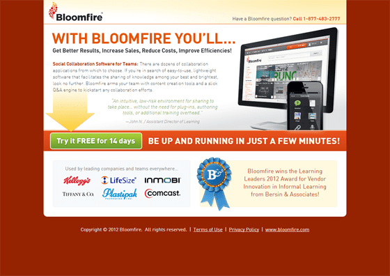
Bloomfire is a social collaboration platform for teams. They were founded in 2010.
The Honey Badger likes:
- No forms, it’s all about the sale – the more fields in a form, the less likely it is to be filled out. Bloomfire remove it altogether and concentrate on the conversion. Even the incongruous yellow arrow serves a purpose; don’t hang around on the copy, just read the headline and get to the Call To Action (CTA).
The Honey Badger doesn’t like:
- Low on features, high on jargon – all solutions will tell you you’ll get better results, increase sales, etc, etc. It’s too general to make much impact. A better line can be found in the main copy: “If you’re in search of easy-to-use, lightweight software […] look no further”. Make your copy, especially headlines, stand out from the crowd.
- Crowded design – it’s all there, a testimonial, clients, awards, but it’s all stuffed together. White space can benefit a design. Not having everything ‘above the fold’ doesn’t matter, people are used to scrolling for more information. This page would be better served by making more room for the individual elements, especially the testimonial.
2. Box
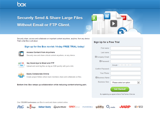
Box is a file-sharing service based out of Los Altos, California. Over the last seven years they’ve raised $248 million of venture capital funding.
Honey Badger likes:
- Does what it says on the tin – the headline copy says it all: no jargon involved. Simplicity appeals, especially when it’s solving a very real business problem. This kind of language also helps with SEO, as it mirrors the kind of query someone might use when searching for a file sharing solution. This is backed up with good clear sub-headings which aid the eye when skimming content.
- Interesting integration of video – it would be easy to just plop a video down in the middle of the form, but Box have gone for a more sophisticated option, blending imagery with the ability to play a video. If clicked, a pop-up appears containing the video. It’s good use of space, although admittedly some may miss it.
Honey Badger doesn’t like:
- Nothing – yes, that is a double-negative, of which there may be one or two more. Overall, this is an effective landing page
3. Caspio
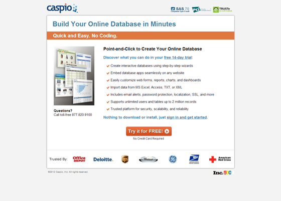
Caspio is an online database product. It enables people to create online databases for the capture and storage of data without the use of complex coding and development.
Honey Badger likes:
- Plain, but effective – I’ve said before that landing pages don’t have to be beautiful to be effective. This isn’t perfect, but it doesn’t overwhelm. There’s no form, a clear headline and sub-head that refer to differentiating features, and a small selection of impactful clients.
- Certifications – if you’re trusting data to the cloud it’s important to know that it will be secure. Caspio use the TRUSTe and PCI logos to establish this trust. You do have to be careful when doing this, as we’ve seen, ill-judged use can mislead users (see Test 8), but in this case their purpose is clear.
Honey Badger doesn’t like:
- The imagery – it seems superfluous; it doesn’t show anything of real value in the decision making process. If they want to show the variety of applications possible through the tool, they would be better served by using a rotating gallery showing larger images one at a time.
- The iconography – the ticks are reassuring, but don’t give any indication of the features. As we’ve seen before, clear iconography and imagery can help when skimming a page on first read. I’d like to see an A/B test performed with some clearer icons and less features in the list.
4. Talk Freely
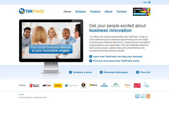
Talk Freely is an internal business innovation system that encourages employees to co-create ideas based on set challenges.
Honey Badger likes:
- The client list – but it’s a push. It’s the only good thing about this page. If you have strong clients, it can help build trust; don’t throw it away.
Honey Badger doesn’t like:
- On-page navigation – a personal preference, but it’s becoming more common to include website navigation on landing pages. Yes, it integrates the page into the main website, but it also has the power to distract. Distraction reduces conversion, that’s why Amazon removes it during checkout.
- Conflicting CTAs – another bugbear of mine. Honey Badgers are simple animals, they can only do one thing at a time (usually chewing someone’s leg, but that’s another story). Make it clear what you want your users to do, give them one option; TalkFreely present me with five: learn, find out how it works, schedule a demo, download a white paper, and get a free trial. It’s all too much and it dilutes effectiveness.
- A video that’s not a video – our brains are tuned to particular visual cues. In this case the monitor image looks like it should be a video – possibly a by product of the generic stock photo – but it’s not. The page would be improved if it was, as it would enable users to find out about the features, which are conspicuous by their absence.
5. Syncplicity
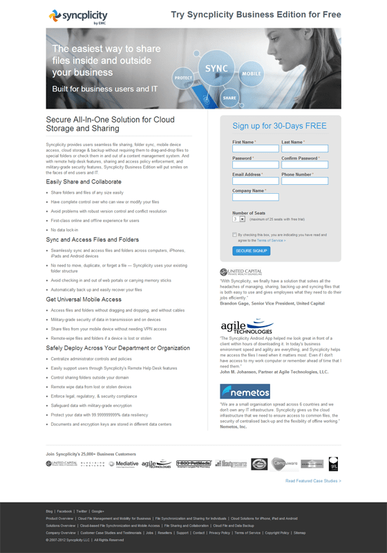
Syncplicity shares the same file-sharing space as Box, but adds the twist of real-time backups into the mix. As a younger company, and unlike Box, they’re much smaller and have attracted a lot less funding.
Honey Badger likes:
- The Banner – although as with Talk Freely, it’s the best of an average lot. The banner copy is good, focussing in on a simple message, and the addition of the sub-head’s “business users and IT” is helpful. They’re appealing to both potential audiences – end user and the potential system owners. There’s also good use of key terms, such as sync, share, mobile, and protect – it gives top-level functionality right up front. The actual image is useless in this context though and adds nothing.
Honey Badger doesn’t like:
- Bland copy – The sub-heads are useful in picking out the four groups of features, but the overall impression of the page is one of bland greyness. Better use of imagery and colour would bring this to life. A pair of shears taken to the copy wouldn’t hurt either; it could do with a trim. Don’t overload people with endless feature lists, just concentrate on a few that differentiate your product.
- Too much! – too much copy, too many client logos, too many testimonials – use rotators and other devices to limit the amount of data that people have to take in at first glance.
- Colour use – corporate colours provide identity, I understand that, but they can be limiting too. Syncplicity has a colourful logo (which I rather like), but only the blue is used. The yellow and orange could be used to create contrast and guide the eye to the most important parts of the page. Don’t underestimate the impact of colour on page structure and effectiveness.
6. Atlassian Confluence
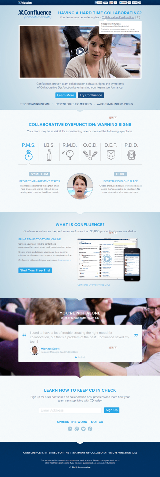
An Australian company with global ambitions, they provide enterprise software solutions to over 20,000 customers. Confluence is their collaboration product.
Honey Badger likes:
- Structure – the page is long, but its structure is really clear. Layered page layouts like this can be very effective when you have a lot to say, as they create a clear hierarchy from top-line down into the dirty detail.
- Sense of humour – sometimes it’s the strength of an idea that makes a landing page. Atlassian have really hit the right tone with this page, showing Confluence as the cure to the disease of ‘Collaborative Dysfunction’. From the amusing medical advert video pastiche, through to the earnestly names symptoms, the page carries the idea all the way through. It’s engaging in all the right ways. Visit it… now! No, really.
Honey Badger doesn’t like:
- Nothing – as with Box, this is a great landing page.
7. Equinix
Equinix, unlike some of the other companies here, provides the data centre services that underpin the cloud, rather than a cloud solution. They have data centres across Europe, America and Asia.
Honey Badger likes:
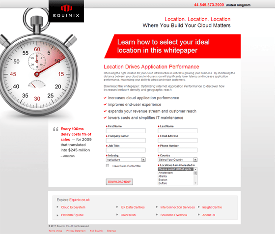
- The image and the quote – but before you get carried away saying ‘”What!” let me explain. The image and the quote fit together really well and form a strong introductory message – time means money. It’s just a pity that they didn’t make more of it.
Honey Badger doesn’t like:
- A missed opportunity – the image and the quote should be much more closely related visually (with the quote much larger) and top of the page. It would give the page context and set up the sub-heads. As it stands, you read the white on red text first and it makes very little sense. Make sure your elements support each other, and don’t forget (in English anyway) we read left to right and top to bottom!
- The form – yes, that again, don’t get me started. Multiple mandatory fields, including ones that are not relevant to conversion. First, get people to interact with you. If you have their contact details you can find out the extra information you need (like industry, location, and country). I’ll stop there. My head hurts.
8. Retayl
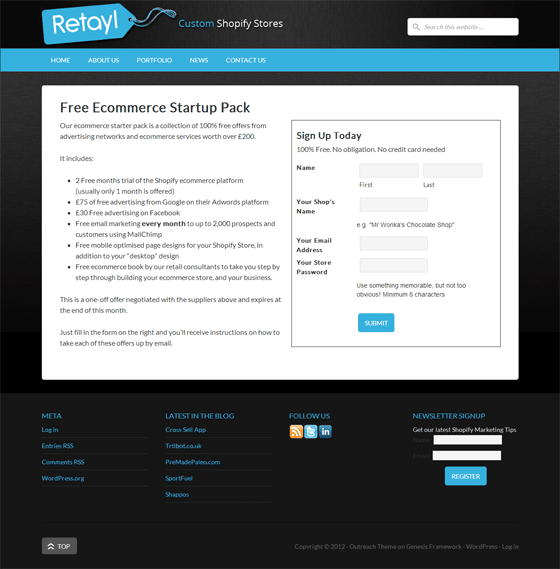
Retayl is a small UK-based agency that create cloud-hosted retail solutions using a blend of other services, including Shopify and Xero (both of whom we’ve featured in landing page critiques before). This landing page is a mixed bag.
Honey Badger likes:
- Simplicity – a clear heading, one list of freebies, a simple form. There’s nothing wrong with keeping a page to the point.
Honey Badger doesn’t like
- Over-simplicity – there’s value in visual cues. The lack of typography and any sort of imagery creates a page that is uninviting. Much more could be made of the brands they are working with, the offers they have negotiated, and of the CTA.
- Sales language – no-one believes that any offer is a ‘one-off offer’. It’s the kind of trick that double-glazing companies use when trying to get you to sign-up to outrageously overblown quotes. If the offer has an expiry that’s fine, state it, just be careful to avoid language that feels like coercion.
9. Anaqua
Anaqua Element is an IP management system – a specialised service for companies who want to develop, file and protect inventions through patents.
Honey Badger likes:
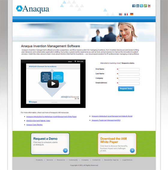
- Multiple languages – the internet is global, companies are increasingly multi-national as trade ebbs and flows around the world. Offering multiple language versions can help increase conversions, but don’t do it for the sake of it. Use analytics and tracking to understand where people are visiting your site from – preferable in advance of a campaign – and use that to guide your response.
Honey Badger doesn’t like:
- Stock imagery – seriously, why do people still insist on this stuff? Don’t waste space on stock imagery, use it wisely to tell us about your product, with well-crafted copy or a relevant piece of imagery (or both).
- Conflicting CTAs – sometimes it makes sense to have multiple CTAs, but not often. If you have to register for one, but not for the other, then there may be an argument or if you are early in testing and want to gauge demand. However, a more elegant solution is to have one CTA and two different pages, then A/B test.
10. AtTask
AtTask specialises in cloud-based project and work management systems. We featured them only a couple of months back, looking at their project management product (see #7). Here we look instead at their team collaboration software. The question is: have they improved. The answer is: yes and no.
Honey Badger likes
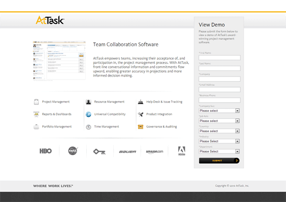
- Much clearer copy and features – the features are listed without description, but with a clear icon, and the header copy is much shorter. Both of these things are very welcome changes. A roll-over on the feature description, revealing a short description, would be even better. This change to layout means that the client logos are further up the page, making them much more visible.
Honey Badger doesn’t like
- That form, still! – it was one of my main concerns last time and it remains so. In fact, the form has got longer by two fields (job role and department). It’s not necessary and it undoes the other good work.
11. Zoho Projects
Zoho are a veritable Swiss Army Knife of a company, having products for every conceivable purpose. Zoho Projects is a project management system that complements their other products, such as Zoho Docs.
Honey Badger likes:
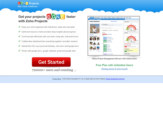
- Clear relevant imagery – I like a nice big screenshot, they tell a good story. Zoho have chosen a screenshot that packs in the features, but is still readable. Imagery used in this way helps to set expectation and build trust with the user – they know what they are going to get.
- Big buttons (and convincer) – you can’t beat a clear CTA, and the big red button is certainly that. It’s oversized and dominates the page. It’s also paired with a convincer, a piece of text whose job it is to ensure the button gets pressed. Here Zoho apply peer pressure: with 720,000 users already doing it, why shouldn’t you?
Honey Badger doesn’t like:
- Nothing – a simple page that gets straight to the point, giving the user the bare minimum of information they need. The pricing is a little hidden, but I’ll forgive them that…
12. GoToMyPC
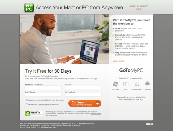
GoToMyPC is an online service for remote-access to your home and work computers.
Honey Badger likes:
- Clear copy – features aren’t the strong point here, the main point is that you can access your computer remotely. GoToMyPC focus on a headline and copy that sells the benefits in simple language. Jargon is a real killer for landing pages, unless you have a very niche audience, don’t fall into its clutches.
- Layout – the layout of a page should read as we would read a book. This page does that, creating a logical journey: headline, image and description, sign-up, post sign-up actions. They could be visually clearer, but the essentials are in place.
Honey Badger doesn’t like:
- TRUSTe seal – as mentioned above, including this on a form can decrease conversions as users associate it with credit card transactions. There’s no fees here, but users may assume this is the case.
13. Volusion
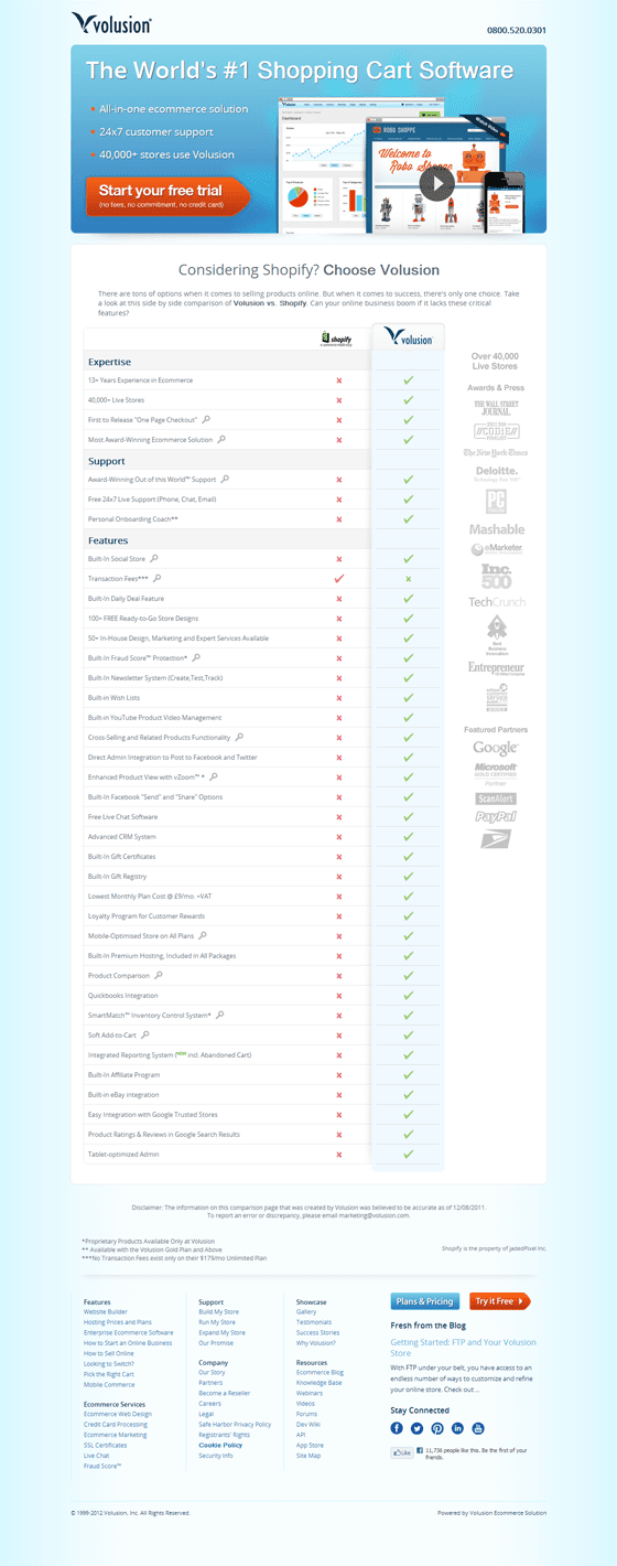
Volusion creates ecommerce solutions for online businesses, including shopping carts and mobile commerce.
Honey Badger likes:
- Confidence – confident in your product, then show it. Don’t be afraid to compare, especially when you have a rich feature-set. Volusion does this. They take aim at Shopify and pull the trigger. It’s simple, blunt, but effective in persuading potential purchasers. It’s particularly useful where you have a clear competitive landscape and some areas of differentiation (that word again). It’s Marketing 101.
Honey Badger doesn’t like:
- Nothing – this is a refreshing and combative page. It’s got a clear CTA, good use of colour and copy, and a structured layout.
14. ShareFile
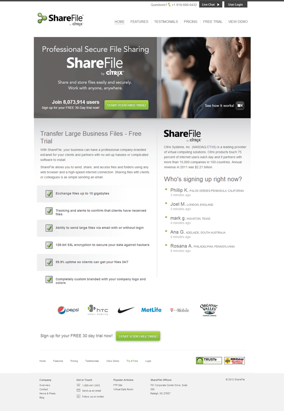
A service for sharing files securely, ShareFile has over 4 million users worldwide (according to their own literature). Last year it was acquired by virtualization and software services giant, Citrix.
Honey Badger likes:
- Who’s signing up right now? – although you can’t see it in a still image, this is a feed that displays the latest registrations – live. It’s a gimmick, but like Zoho Projects, if you have a critical mass of users, it can be immensely powerful in building confidence in your product. A nice idea, well executed.
- Small selection of client logos – if you have big clients you don’t need to show many of them. ShareFile are selective, but with Pepsi, Nike and HTC on the books you can afford to be. One word of warning, selecting all large clients might put off small business customers. If SMBs are one of your target markets, make sure you make them feel at home.
Honey Badger doesn’t like
- Navigation – as with Talk Freely, the navigation is distracting. This page would be stronger without it. An A/B test would be beneficial in this case.
15. ISL Online
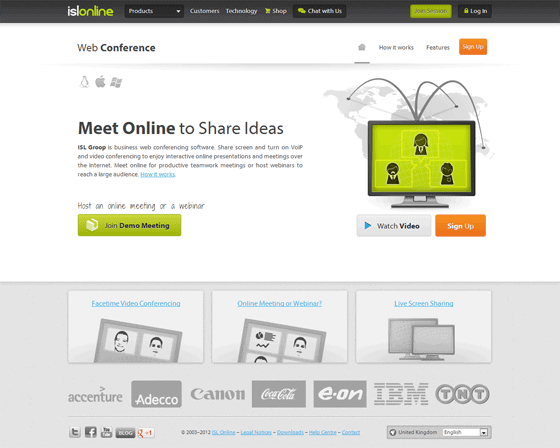
ISL Online is a UK-based company that create collaboration solutions based around online web conferencing and remote support services.
Honey Badger likes:
- Structural use of colour – by making the bottom half shades of grey (not that shades of grey) and the top half in colour, the page instantly has a hierarchy. The top is more important than the bottom. Using colour in this way, to weight content, is easy to do and guides the eye effectively. The same practice is used within the colour elements – the most important CTA is in the boldest colour (orange), the second in green, and the least important in grey.
- Relevant imagery – taking the time to create custom imagery can pay off. The image of the screen connected to the map says a lot about the product without a word being read. Much better than stock photos.
Honey Badger doesn’t like:
- Odd fonts popping up in the middle of a design – but hey, it’s not the worst crime in the world. At least it’s not MS Comic Sans. However, do be consistent with your design and if you do deviate, make sure it’s for a good reason. Consistency of visual language is vital in good design, breaking that consistency must be for a valid reason.
That’s your lot for this time. This is Mr H. Badger signing off.
Have you got comments? Do you agree or disagree with the Honey Badger? Are you a Honey Badger in spirit? Let us know in the comments section.
