Emily is a freelance writer and content marketer from Toronto. She helps tech companies and startups develop awesome content for their blogs, websites, and social media. When she’s not writing or thinking about writing, Emily can be found chilling on her yoga mat, loitering in bookstores, or exploring the city with her super cute (and super spoiled) corgi, Wilbert.
Banafshe is a writer and creator who loves long walks on the beach (kidding?). When she’s not selling you on her puns or her pop-culture analogies, she can be found at the busiest intersection in her city with her headphones. Which are totally not falling apart.
Sales pages are like the powerlifters of landing pages. Or, if team sports are more your thing, they’re the MVPs.
Where most landing pages provide immense value by setting you up to score a sale—perhaps by generating, vetting, or capturing leads—a sales page makes the touchdown itself. (Are we doing this sports metaphor thing right?)
In other words, sales pages have loftier goals than your average product page or landing page.Rather than aiming for downloads, signups, or click-throughs (all of which play a role in finding and nurturing leads), the purpose of sales pages is turning ad clicks directly into paying customers.
Suffice it to say, the pressure is on. Your sales pages need to come through with the win, which means you need to know how to create a high-converting sales page for every campaign.
In this article, we’ll tell you what makes a great sales landing page and show you how to create a sales page that actually converts clicks into customers. Plus, we’ll look at what you can learn from some of our favorite real-world sales page examples.
But first, let’s answer some of the most common questions related to sales pages for online stores and services.
What is a sales page, exactly?
A sales page is a dedicated landing page built to convert ad traffic into customers. You can think of sales pages as the modern sales letter, but more targeted and data-driven.
A good sales page is more than just a convenient place to send click-throughs. It’s the best place to send someone who clicks on a targeted ad, whether you’re running paid ads on Instagram or an email marketing campaign.
In this era of data-driven marketing, a good sales page is not just a luxury—it’s a necessity. It allows you to analyze user behavior, track conversions, and fine-tune your strategies for optimal results. It’s the fulcrum upon which your digital marketing efforts pivot, ensuring that your investment in advertising doesn’t go to waste.
So, next time you’re plotting your digital marketing conquest, remember that a well-crafted sales page is your ultimate ally, a place where clicks transform into customers and where your brand story finds its most compelling voice.
Compared to online stores, sales pages convert better in terms of volume and revenue. In fact, landing pages have been shown to convert 2X as many visitors into customers and increase average customer spend 2X. Whoa.
A big reason for this is that online stores have built-in distractions that can pull visitors in multiple directions (things like links to related products, promotions, shipping details, etc.). You use a sales page when you want to maintain momentum and ensure shoppers only have one thing on their mind: making the purchase.
Compared to online stores, sales pages convert better in terms of volume and revenue. In fact, landing pages have been shown to convert 2X as many visitors into customers and increase average customer spend 2X. Whoa.
A big reason for this is that online stores have built-in distractions that can pull visitors in multiple directions (things like links to related products, promotions, shipping details, etc.). You use a sales page to maintain momentum and ensure shoppers only have one thing on their mind: making the purchase.
Landing pages vs. sales pages: is there a difference?
Like every great landing page, a sales page is built around a specific conversion goal. However, when it comes to sales page design, the objective isn’t just any old conversion—it’s getting visitors to actually buy. In order to close the deal, a sales page might be longer than the average landing page, especially for bigger purchases.
A sales page is the virtual showroom where the art of persuasion takes center stage, meticulously designed to orchestrate a specific and crucial conversion goal: getting visitors to make a purchase. It’s not about mere lead generation or casual engagement; it’s about transforming a curious browser into a paying customer. In the realm of sales page design, the objective is clear and unwavering—to seal the deal.
Unlike your run-of-the-mill landing page, which might aim to capture contact information or encourage further exploration, a sales page operates on a different wavelength. It’s the ultimate closer, the grand finale in your digital sales pitch, where the spotlight is firmly on coaxing visitors to open their wallets and make a transaction.
In this pursuit of the sale, a sales page often takes on a distinct characteristic—it can be longer and more comprehensive than your average landing page.
Why? Because when it comes to significant purchases, prospective customers crave information, reassurance, and clarity. They want to know what they’re investing in, the benefits they’ll receive, and why your product or service is the best choice. A well-constructed sales page caters to these needs by providing in-depth product descriptions, testimonials, use cases, and persuasive narratives.
Think of it as a journey, where your visitor starts as a curious traveler and ends as a satisfied customer. The sales page allows you to convey the value and uniqueness of your offering comprehensively. It’s your opportunity to address objections, build trust, and guide the visitor through the purchase process with transparency and confidence.
So, in the realm of digital marketing, a sales page is the ultimate closer—a tailored, information-rich masterpiece aimed at one singular goal: turning curious onlookers into delighted buyers.
What about product pages vs. sales pages?
If you already have product pages, do you still need sales landing pages? Um, heck yes! Unlike product pages, which highlight features in depth, a sales landing page is built specifically to convert. That means visitors see the exact information they need to make a purchasing decision, without the distractions typically found on a product page.
Plus, sales landing pages are more flexible than traditional product pages. They can be tweaked and tested and updated before you could even begin making changes to the rest of your website.
Long sales pages vs. short sales pages—which is better?
Trick question. The length of your sales landing page could depend on the product or service you’re trying to sell, your sales objectives, and what context you need to give your audience.
A longer sales page works because you have more space and time to answer likely questions and make your visitor more confident in their purchase decision. If you have a more complicated product or a more premium price tag, a longer sales page works in your favor.
A shorter sales page works because it can be punchy and capture your visitor’s attention quickly and get them to take an action. If your product or service is easy to explain and your information is straight-forward, a short sales page is the way to go. If you’re going with a low-commitment offer or low-priced product or service for your audience, a short sales pages makes it seem like a no-brainer.
So, which works for you?
How do I create a sales page that converts?
A sales landing page is a tool to drive, well, sales. As such, it must be carefully designed to motivate leads to take action. Whether you’re creating a new sales page or hoping to optimize an existing page, there are a few key notes you need to hit. So, what goes into crafting a high-converting sales landing page?
Your sales page needs to match the ad so visitors instantly recognize that they’re in the right place. Nothing derails a potential sale faster than a page that has little or nothing to do with whatever was featured in the ad (this is basically the ecommerce version of catfishing). You also have to know your landing page basics—like how to create a landing page.
This is perhaps the most important (and often underestimated) part of an effective sales page, so here’s a quick example.
Let’s say you’re marketing a subscription service for a range of fancy jams and jellies, but this month you’re using paid ads to promote lavender honey from a local farm. It’s seasonal and supplies are limited, so it’s not something you want to add to your website’s regular catalog.
Whoever clicks on that ad has already told you they’re interested in the lavender honey (why else would they have clicked?). That means they don’t want to see that you offer ice wine jelly or canning supplies (at least, not right at that moment).
So, what does your sales page need to do? Show them the honey—and, hopefully, they’ll show you the money. Sweet, right?
Show the product in action. Sometimes, simply showing the product in use is the best way to communicate value. Include visuals of the product in action to get customers excited about their upcoming purchase.
Build trust with social proof. Address potential sales objections with real testimonials from existing customers. This helps potential customers see the value your product provides and adds credibility to your claims.
Provide clear next steps. You don’t want to pay for ads that lead to a dead end. Maintain momentum by featuring a single, straightforward call-to-action on a prominent, clickable button so the next steps are 100% clear.
What do I need to know about sales page copywriting?
Having impactful copy is key in any sales effort, let’s be straight about it. But how do you make sure you’re hittin’ the nail on the head when it comes to your sales page copywriting?
It’s easy: use persuasive copy.
Your sales page needs to do the job of a salesperson, which means compelling leads to open their wallets. The headline should convey immediate benefits and the body copy should be used to address sales objections, answer potential questions, and compel visitors to click ‘buy.’
You also gotta make sure that you’re creating compelling hero copy for your sales landing page, and back up that “elevator pitch” with supporting copy on the rest of your landing page, wrapping up your sales narrative into a neat lil’ bowtie (cute imagery, we know).
High-converting sales page examples
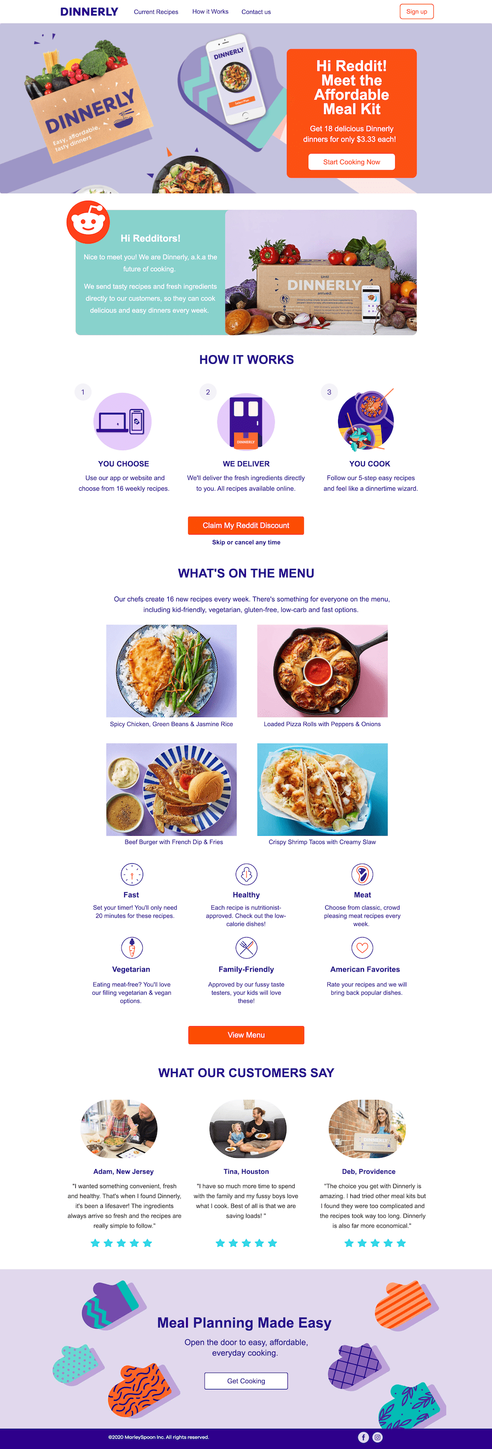
1. Dinnerly
Image courtesy of Dinnerly. (Click to see the whole thing.)
From the creators of Marley Spoon, Dinnerly is an alternative meal kit service for the budget-conscious home chef. Their price per meal is roughly half of typical meal kits, but their recipes still pack a full-plate, high-quality punch. They’re able to pull this off by minimizing costs related to packaging and marketing.
For this campaign, Dinnerly advertised on Reddit and sent click-throughs to the sales landing page shown above.
Why does this sales page convert so well? This page is built specifically for leads from a single source: Reddit. From the headline to the CTA (“Claim My Reddit Discount”), everything about this page is tailored to the leads who click through from a Reddit ad campaign. Greeting visitors with “Hi Reddit!” immediately tells them they’re in the right place. As we scroll down, the page continues to match both the source and the brand.
What can you learn from Dinnerly? What can other marketers learn from this example and apply to their own pages? The big takeaway here is to match the message and design of your sales page to the ad. If you want to run similar campaigns across several sources (say, Reddit, Facebook, and Instagram), you should consider building and customizing variant sales pages for each one.
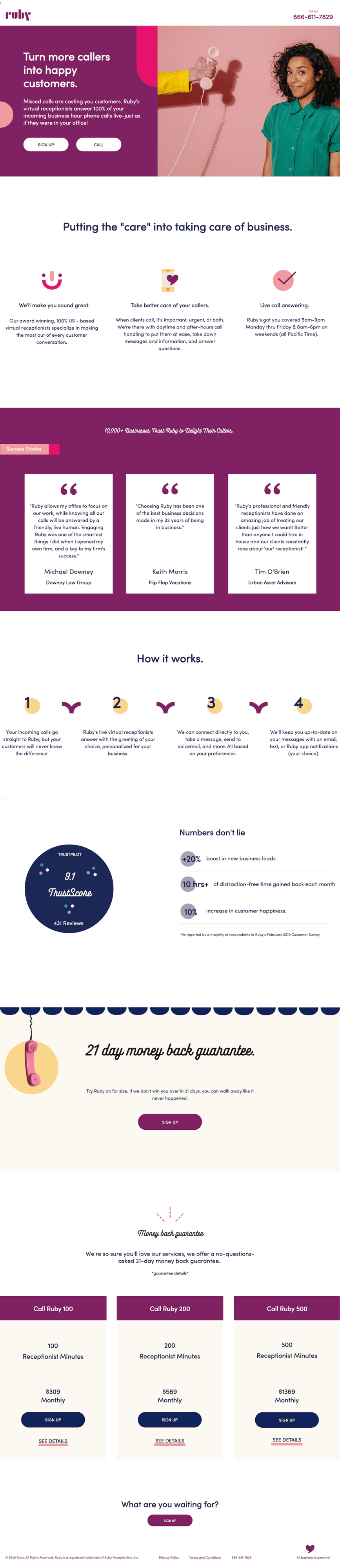
2. Ruby
Image courtesy of Ruby. (Click to see the whole thing.)
Ruby provides virtual reception and chat services to a wide range of businesses. On this sales landing page, they’re speaking directly to business owners who need live phone support.
Why is this page so great at selling? If you’re looking for inspiration on how to write a sales page, this is it. Both the headline and supporting copy reinforce benefits in terms relevant to the audience.
All of the content (including benefits, visuals, and pricing information) is targeted towards businesses that need virtual reception and are concerned about missing customer calls or not being able to handle after-hours conversations.
This landing page also wins because it:
Frames customer testimonials as “Success Stories” to add clout to standard social proof.
Features data from customer surveys to demonstrate proven results.
Emphasizes their money-back guarantee, which addresses some of the biggest sales objections. (“Is it worth the cost? Will I regret this purchase?”)
Minimizes external distractions by focusing on the receptionist services (rather than looping in their live chat offering).
Visually divides sections and uses color-blocking to make it easier to scroll for relevant information.
What can you learn from Ruby’s sales page example? A good sales page provides answers to everything potential customers need to confidently make an informed purchase. Even if you offer tiered services (like Ruby’s monthly packages of 100, 200, or 500 receptionist minutes), you can leverage a single sales page to drive conversions for all of them. The key is to aim for transparency about pricing and packages, so leads don’t have to click away from your sales page to learn more.
If you need to provide extra information that doesn’t fit on the main page, you can use lightbox popups like Ruby does for their monthly plans. This is a clever way to keep visitors on the page without bogging down the main content with excessive details that might not be relevant to each visitor.
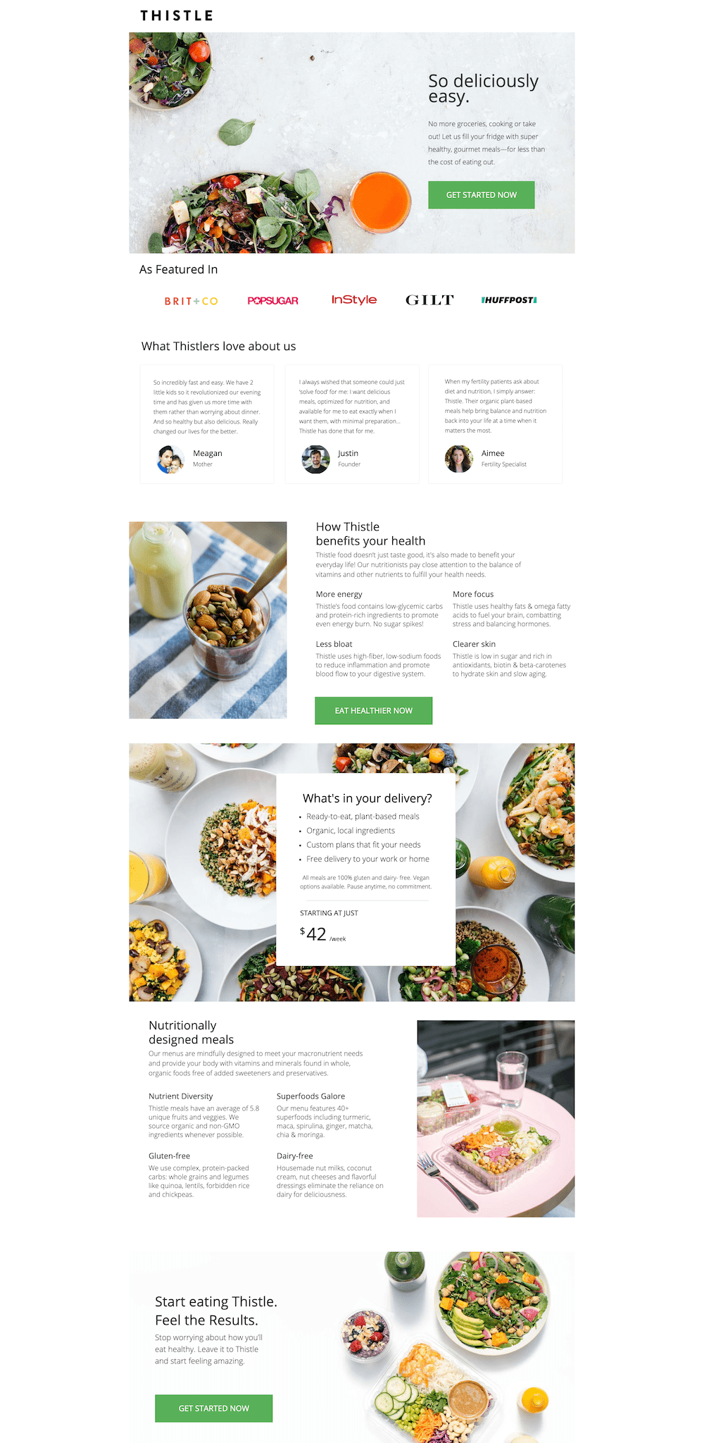
3. Thistle
Image courtesy of Thistle. (Click to see the whole thing.)
Thistle is a ready-to-eat meal subscription service that specializes in nutritious, plant-based dishes made from local ingredients.
Why does this sales page get results? One of the simplest things that makes a sales page effective is focusing on the benefits instead of features. The headline highlights what the visitor cares about most (meals that are “so deliciously easy”) and the rest of the copy uses language that says Thistle truly gets what their audience wants.
Even though text only takes up a third of the space above the fold (allowing that bright, veggie-filled salad to do much of the talking), all of these heavy hitters are visible before we scroll down: “no more groceries,” “fill your fridge,” “super healthy,” “gourmet meals,” “less cost.”
How can you apply these lessons to your own sales pages? In a highly competitive space, you need something that makes you stand out. Your sales page should balance speaking to your audience’s needs (which your competitors are likely also doing) and emphasizing your unique selling point (which is specific only to your brand). For Thistle, this means highlighting the traditional convenience and benefits of a meal delivery service, but also leaning into the health benefits that set them apart.
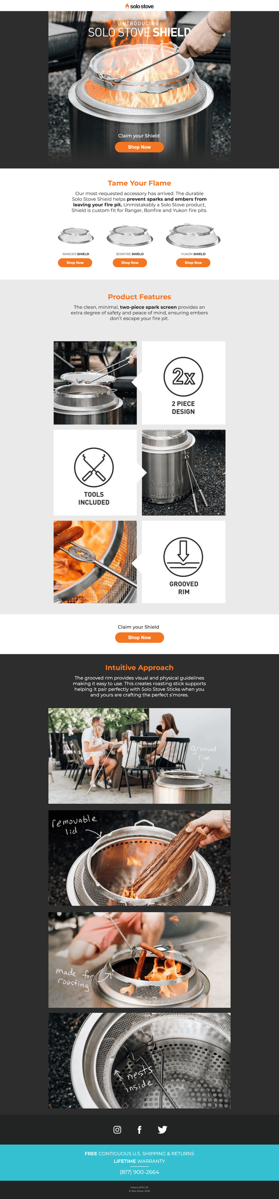
4. Solo Stove
Image courtesy of Solo Stove. (Click to see the whole thing.)
This sales page is part of a retargeting campaign for customers who’ve already purchased the Solo Stove and potentially other accessories.
What makes this sales page a winner? There are a few reasons why this sales page is so effective. Not only does it appeal to the community that’s built up around their brand, but it also uses visuals that show the product in action.
Plus, by introducing the shield as their “most-requested accessory,” Solo Stove implies that their customers already want this. This serves two purposes.
First, for anyone who may have actually requested the shield, this page offers pure validation. If you even thought about wanting a shield for your Solo Stove and saw this campaign, you’re pretty much guaranteed to buy into it right away. As for the rest of Solo Stove’s customers retargeted by this campaign, the idea that it’s highly requested primes them to convert by building social proof right into the offer.
This page also makes use of a clever CTA (“Claim your Shield” above the “Shop Now” button) that suggests Solo Stove customers are entitled to the shield after eagerly awaiting its release.
What can you learn from Solo Stove? When you offer multiple products, using sales pages creates space to focus on just one item at a time. That said, you can play around with the formula to best serve your campaign. Unlike most of the other sales pages we’re discussing today, this one breaks the mold a little by linking out to three purchase pages instead of driving all traffic to one.
Solo Stove included three separate “Shop Now” buttons to match the three sizes offered. However, splitting up traffic works here because anyone who clicks on this ad is already a Solo Stove customer. That means they already own a fire pit in one of these sizes—and since the shields are named to match each size, there’s no question of which button each customer should click.
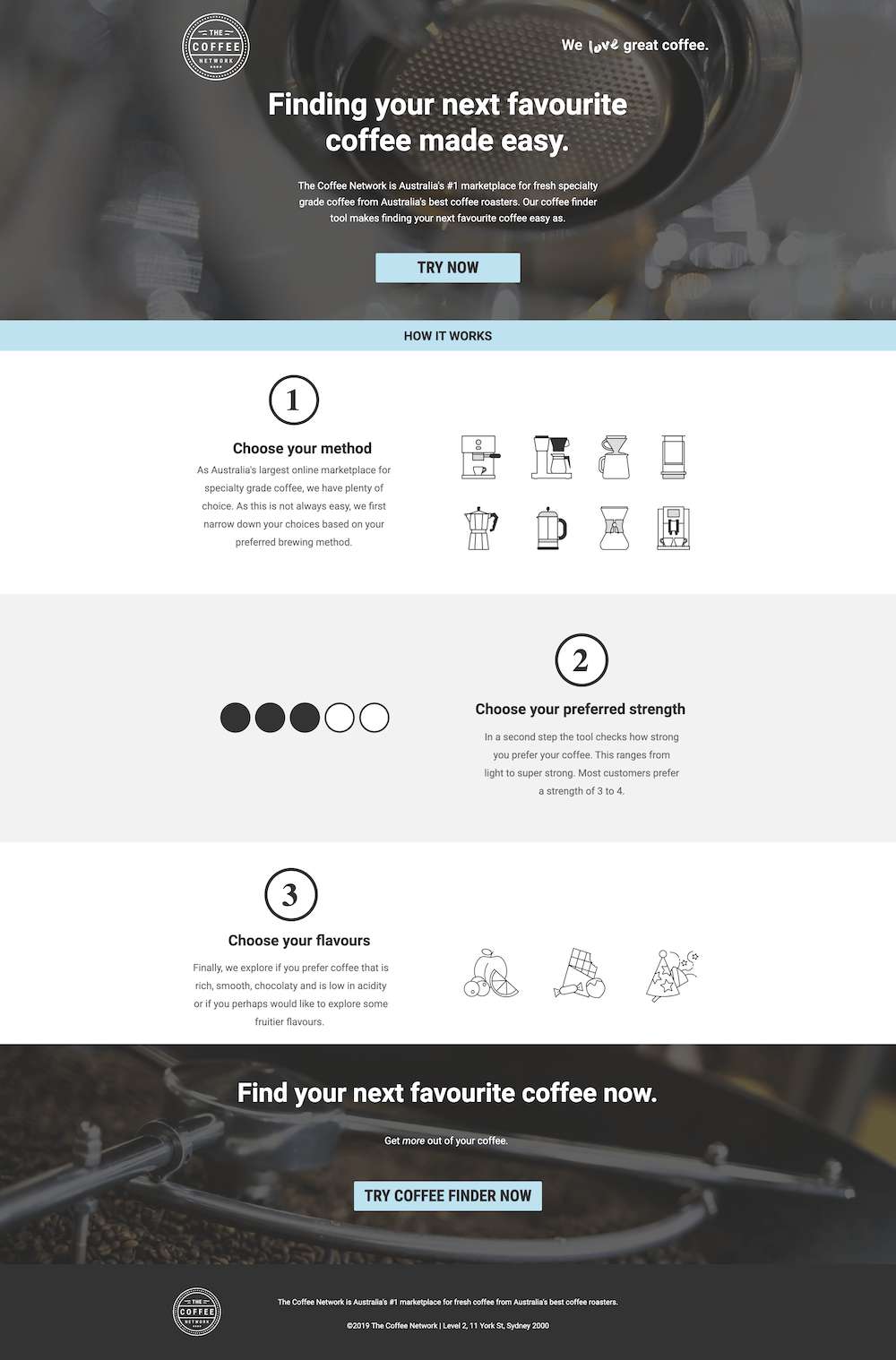
The Coffee Network is an Australia-based coffee marketplace for bean lovers with an appetite for trying new blends.
What makes this sales page stand out? Presumably, the audience here is already interested in coffee and likely searching online for the best coffee or, more specifically, the best coffee in Australia. That said, this sale page still has to sell—especially because the target audience is likely unfamiliar with the Coffee Network.
With a focus on benefits and customization (roasting method, strength, and flavor), the copy describes the coffee finder tool both clearly and succinctly. The three steps under “How It Works” are easy to understand at a glance. The call to action repeatedly urges coffee lovers to “try now” and the heading and body copy reiterate how simple it is to use.
Aside from a single link in the footer that leads to their homepage (which prevents leads from bouncing if they aren’t quite ready to buy), this sales page is free of external links and distractions. Including minimal links, offers, and buttons helps keep leads on the page until they’re ready to “Try Now” or grab more information from the website.
What can you learn from this sales page example? Shorter landing pages work best for products that are simple, smaller purchases (i.e., products that don’t require as much deliberation or persuasion). For most of us, buying coffee isn’t all that complicated. So, in this example, a short and simple sales page hits the spot. The ideal length of any sales page depends on what you’re selling. However, when it comes to deciding what to include on your sales page, quality content always trumps quantity.
5. Taskrabbit
Image courtesy of Taskrabbit. (Click to see the whole thing.)
TaskRabbit is an online marketplace that matches freelance labor with local demand, allowing people to find help with tasks including personal assistance, furniture assembly, moving, delivery, and handyman work.
TaskRabbit’s sales landing page wants to make sure you’re not putting this service app in a box. They do more than just house moves, you know.
They give you their elevator pitch in the header, but they also get down to the details of exact tasks you can hand to them.
From assembling furniture to removing junk, mounting TVs to helping with home repairs, they leave no stone unturned. What’s even smarter is their strategic placement of clear, enticing call-to-action buttons for each service. This is a great strategy if you have a product or service that could seem one-dimensional, or known for just one of their services. They’re layin’ their uses cases out there, loud and proud.
What can you learn from this sales page example?
There’s no one way to design a sales landing page. You usually get a few CTAs at most on a landing page, linking to one destination. But TaskRabbit assigns individual CTAs for each service they provide, asking you to “Book now.” Even though this could look jarring, having so many CTAs on one page weirdly works for this sales page. So don’t be afraid to step out of the ol’ sales landing page comfort zone sometimes and try out a new strategy, whether visually or through copy.
6. Expatfile
Image courtesy of Expatfile. (Click to see the whole thing.)
Expatfile is an authorized IRS e-file provider that allows Americans abroad to prepare and e-file their own tax return with the IRS in as quickly as 10 minutes.
Expatfile’s sales landing page is a masterclass in inclusivity— a diverse buffet that caters to the unique tastes (or pain points, less delicious perhaps) of every potential customer.
Whether you’re a globetrotting adventurer, a family seeking a new home, or an entrepreneur eyeing international opportunities, Expatfile’s landing page speaks directly to you. With tailored sections that address the needs of different customer profiles, it’s like having a personal concierge who knows your preferences before you even ask. (And we don’t know about you but when it comes to taxes, we’ve always got lots of questions.)
Their intuitive design ensures that whether you’re seeking visa solutions, tax guidance, or relocation advice, you’re greeted with relevant content that makes you feel like there’s a solution for you. It’s a shining example of how a sales page can be a welcoming doorway for anyone seeking their services, making each visitor feel like an honored guest.
What can you learn from this sales page example?
Unlike the last example, sometimes going for a longer sales landing page is key—especially if you’re speaking to different pain points for different sections of your audience. Yeah, buying coffee is easy, but doing taxes is hard. Especially if you add the element of doing taxes for a country you’re not even living in yet. (Doing taxes twice? Oh lord.)Delivering enough context so that your potential customer doesn’t feel lost, but instead feels supported, is important. Sometimes you need quality and quantity.
8. Notion
Image courtesy of Notion. (Click to see the whole thing.)
Notion is a freemium productivity and note-taking web application that offers organizational tools including task management, project tracking, to-do lists, and bookmarking.
What makes this page stand out?
Notion’s sales landing page is a breath of fresh air because they’re not shying away from entirely showing their product and its different use cases. Notion doesn’t hide behind the smoke and mirrors of clichéd visuals—instead, they let their product do the talking.
They showcase the diverse range of use cases, from project management to note-taking, database creation to team collaboration, all wrapped in a user-friendly design they love to show off. What sets them apart is their unapologetic display of functionality. You can pull from different parts of your product or the UX/UI design and have your sales whole page be that. Sometimes you don’t need those stock images of happy people. Who knew!
What can you learn from this sales page example?
SUBSCRIBE
Don’t miss out on the latest industry trends, best practices, and insider tips for your marketing campaigns
In essence, Notion’s landing page trusts the intelligence of its visitors and believes that the product itself is the best sales pitch. It’s a refreshing departure from the norm, reminding us that sometimes, all you need to sell a product is to let the product shine. Who knew simplicity could be so striking?
Put the power of sales pages to work for your business
It’s easy to assume that whoever clicks on your ad is interested in your business—in which case, it would make sense to take them to your online store or product page to learn more about your offerings. But, as you know, that’s not why shoppers click ads for individual products or services.
They don’t care about the rest of your product line (at least, not at that moment). They just want to know more about what you promised them in the ad. So, sending ad traffic straight to your website or product page likely isn’t going to lead to a sale.
Even if you have products or services that practically sell themselves, creating a campaign-specific sales page prevents leads from getting lost on your website instead of following through with the purchase.
If you want to grow your online sales without scaling your sales team (and costs), you need dedicated sales pages built to drive revenue. Discover how sales landing pages can take your conversions to the next level.
Get actionable insights, expert advice, and practical tips that can help you create high-converting landing pages, improve your PPC campaigns, and grow your business online.