Nobody wants to hear the words, “Umm, can we talk about this at home?” while proposing in a restaurant (as in, I’m saying no and don’t want to embarrass you). But the sad reality is that sometimes you need to be honest and let people down.

Critiquing landing page designs is no different. Some are of the “beautiful, well-adjusted, settle down and buy a house” variety. But most are more in the “I’m settling by saying yes, let’s make the boss happy and get this campaign launched and we can deal with the fallout (unwanted children) later.”
Check out the 10 examples below and see where love’s light is shining this Valentine’s Day.
1. Photoshop
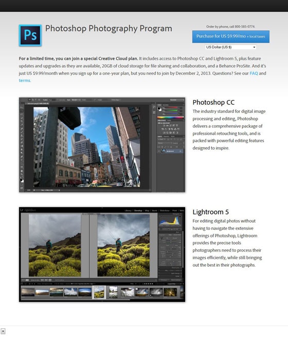
This page is definitely heartbreaking…
I can’t believe that a company like Adobe would produce such a garbage landing page. This page assumes you already know what Photoshop is, what it does, and that you already want it.
The unfortunate thing is, I landed on this page through a web ad looking for photo editing software. Traffic from ads aren’t necessarily going to already know about your product, even if it’s as well-known as Photoshop.
What am I doing here?
Is that a headline? Who calls it “Photoshop Photography Program”? It seems like a badly written SEO headline. On top of that, Lightroom isn’t even in the headline so it makes the rest of the page confusing.
A better headline would be something like this:
Photoshop & Lightroom: Industry standard image editing software
With the new creative cloud plan you get the most powerful image editing tools available
What is my goal on this page?
The call to action is bland, doesn’t stand out and doesn’t inspire clicks. The first order of business is to change the color and move it to a more appropriate position on the page.
Next, the text of the button could be more related to the order itself. How about this:
Get access to Photoshop & Lightroom
Just US $9.99 / month
What are these images?
The images don’t illustrate anything about the product or what it does. Adobe has some really amazing videos of employees and customers talking about their products. Those videos have amazing production value and would explain the products much better than these dull images and a general description of each product.
2. Laura Roeder
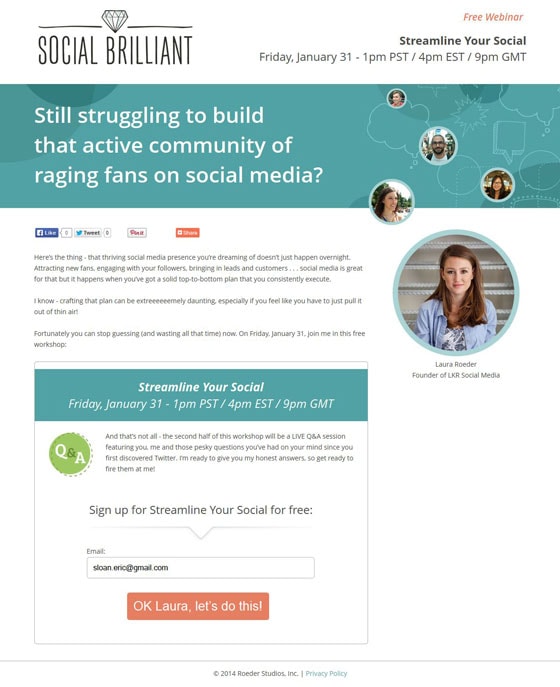
How about a landing page that does pretty well? Laura Roeder is a social media consultant who sells products for entrepreneurs looking to enhance their social media reach. This page has got a lot going for it. Here are some highlights:
Easy to consume
Laura uses a nice clean design on her landing pages and all of her typography is easy to read. This is important because you need to make your content easy to consume by visitors.
Great call to action
The call to action stands out from the page with a contrasting color and it has a nice headline right above it. It’s very clear what you’re going to get when you fill out the form. Nicely done.
Decent headline that makes use of emotional triggers
I like this headline because it speaks to the struggle that most small business owners go through with social media. The only issue that I have is that the headline is a question with no answer.
This headline could be more powerful if there was a sub-headline that used the offer as the answer. Like this:
Still struggling to build that active community of raging fans on social media?
In this free webinar I will show you exactly how to create an effective & business building social media plan
By using your product or service (in this case the webinar) to answer the question, you position your offer as the solution to your customer’s struggle. Perfect.
Why have the social media icons?
I know that this is a webinar about social media, but it kinda sucks to see big zeros on the social sharing buttons. I think she could drive many more social shares by focusing on one action: Signing up for the webinar.
Then on the thank you page, she could ask for a social share. The visitor is more inclined to share because they’ve already bought into the idea of the webinar.
What if I can’t make that time?
One of the common objections with webinars online is whether the visitor is going to be available during that timeframe. If they aren’t, you may lose the conversion.
By adding a quick note that reassures visitors that there will be a recording available, you can try to eliminate this objection and get more conversions – much like Unbounce does ;)
3. Hootsuite
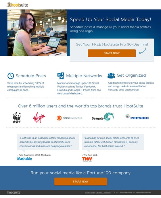
There is a lot to love about this landing page, but I have mixed feelings about the headline.
Holy smokes, a real photo!
This is a great example of a good use of a photo on a landing page. HootSuite is not using some bland stock photo, but instead use a photo that is real (presumably of a HootSuiter).
Bonus points for making the girl in the photo look at the headline. It draws your eyes to where the person in the photo is looking and adds emphasis to the headline.
Mediocre headline/sub-headline that gets to the wrong point?
Keeping a headline simple can be a difficult task. HootSuite tries by focusing on one angle: Speed.
The only problem is that speeding up your social media is too vague of a benefit. Can you tell me exactly what speeding up your social media would mean to your business?
Something more benefit-based or emotionally-driven would be a good test. Something like:
Connect with your entire social network in half the time
Powerful tools let you schedule posts, manage your profiles and measure ROI from one login
This headline doesn’t leave anything open to interpretation. It helps visitors understand what HootSuite can do for them, and how it’s going to do it.
The branding is not in your face
HootSuite knows that they don’t need to stuff their logo down your throat. When a visitor lands on your landing page you need to keep them focused on the task at hand, and a large logo doesn’t add any value to your goal. Keep your branding minimal until you’ve got the conversion.
Good call to action with an explanation right above it
HootSuite does not SUBMIT!This is a straightforward call to action with a nice explanation right above it that explains what you’re going to get when you click on the button. Nicely done.
4. The Art Institute
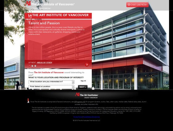
I think Ai needs to go back to school for conversion centered design.
What am I even supposed to do on this page?
It took me a while just to figure out the answer to this question. I mean, what kind of headline is “Talent and Passion”?
Every landing page needs to have a headline that orients the visitor and tells them what they can accomplish on the page. Something like this:
Follow your passion & learn at one of the top Art schools in Vancouver
Are they logo happy?
Why is there an Art Institute of Vancouver logo twice? It makes no sense, and doesn’t add anything to the page.
Lose the second one.
What’s with the copy?
The one paragraph on this page is talking about VANCOUVER, not the school that you’re trying to sell visitors on.
Chances are I can find information about the city somewhere else. I’ve come to this page to find out about attending the school. Tell me why should I give my tuition check to Ai and not some other school?
Clean up your design
The actual form not only has broken CSS (the form doesn’t fit in the white box) but it’s almost hidden on the page! There’s also a lot of wasted space on this page that could be used to sell the school and generate conversions.
Do I care about a photo of a building?
Ai needs to test different photos for the background. If I wanted to see a glass building in Vancouver I could just go for a walk.
Why not use a photo of some students that are in a class room? Or some of the work that students have produced? Or some of the companies that students have been hired by? There are at least a dozen images that would be more appropriate than a photo of the building itself.
5. Pluralis
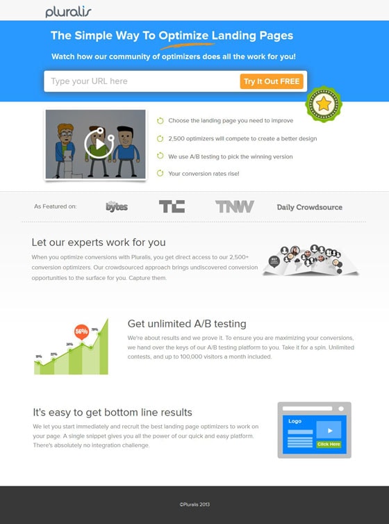
I’d be pretty disappointed if a company that is supposed to do conversion optimization produced a bad landing page but Pluralis still deserves some props for this one. Here’s why:
Small branding punches up the headline
A lot of landing pages have logos that are huge. Visitors don’t care so much about your branding on the first visit, so focus on the headline and make sure it’s front and center.
Pluralis does a great job of this, and the headline becomes the star of the top of the page.
Plus, they’ve done a good job of writing the headline as well. The key words here are “Simple,” “Optimize” and “Does all the work for you.” Sounds easy enough…
Clear features and social proof logos
I’m not really sure what the bullet images are (what’s with the floating star thingy?) but at least Pluralis uses easy to understand bullets to outline how the process works.
They also use social proof logos front and center and easy-to-understand copy to explain the benefits (not just the features) of their service.
Here’s what I’d test on this page:
In the form below the video, the sub-headline refers to the video (“watch”) so you might as well have it directly below the headline area.
I would also test a different angle. The copy in the headline is clear, but it assumes that I know what optimizing is and that I want it.
Instead, you could focus on the benefits of optimizing your landing pages (more leads, sales and more delighted visitors).
Here’s an example:
Get more sales with landing page optimization
Pluralis is the easiest way to get more leads and sales out of your website
6. Pack Manager
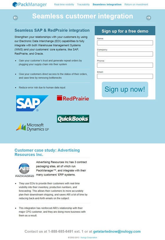
What the hell happened here? It took me about 45 seconds just to figure out what this page was all about. Bad sign.
There’s no hierarchy of information
The most important information on your landing page should be obvious. It should stand out and jump off the page. On this page there is not a single element that stands out because everything is visually similar.
The call to action is the same color scheme as the background and the sub-headline. The opt-in form box has a header that is the same color as the sub-headline. And the entire color scheme itself matches the exact colors in the logo.
Welcome to jargon city, population you
If you’re sending this landing page to a list of email subscribers that you KNOW will understand all of the terms on this page, then it might work.
But in the case of an AdWords campaign like this one you have to assume that some of your traffic is going to be confused by the blatant use of industry terms.
Keep things simple. What does your software do to make my life better?
If you answer that question, you will have a landing page that converts.
Turns out this landing page actually already has a headline on it (the first bullet point):
Gain your customer’s trust and generate repeat orders by plugging your supply chain into their system.
This statement cuts to the heart of the issue by focusing on the benefit to the end customer.
Sign up for what?
Free demos are boring. Anyone who’s ever done one knows that it’s just a sales person on the phone that walks you through a bunch of stuff and then pitches you on the product.
Why not make the demo more benefits based? Instead of saying “Sign up for a free demo” this page could say:
Let us show you how to streamline your order process and generate more repeat orders
Even better: how about you host a webinar?
7. The SEO
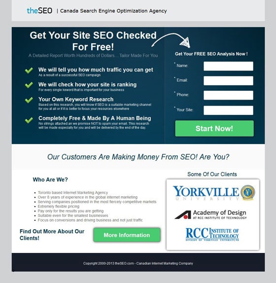
This landing page was all right but with a few tests I’m sure it could be great.
Make the form stand out from the rest of the page
There are some great visual cues that point to the form, but why not change the background color of the form area to make it stand out even MORE?
Straightforward headlines tell you what you’re going to get
This headline isn’t that poor, but the angle of the headline sucks. “Get your site SEO checked for free” is a clear headline, but the offer itself is flawed because it doesn’t speak to the visitor’s problems. It also assumes you know what SEO is, and that you want it to be “checked”.
A better angle headline would be:
Discover opportunities for your website to get more traffic and leads
Grab a free SEO report detailing how you can boost your search engine traffic starting today
This new headline focuses on the benefits of the SEO report and what it can do for someone’s business.
Strong social icons, but…
Why are they all schools? This section makes it look like this company only works with schools. What if I’m not a school? Will your techniques still work for me?
Don’t be wishy washy about what you want visitors to do
This page has two calls to action. Which one do they want visitors to take?
Each landing page should have a single goal. If you add a second call to action at the end of the landing page you dilute the effectiveness of both actions.
8. Fluid Surveys
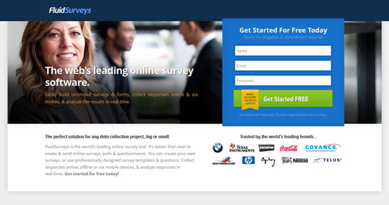
Narcissism doesn’t boost conversions
Your company may like to talk about the awards it receives and how it’s #1 in some category, but does that really benefit your visitors?
The headline says that they are the leading online survey software… Says who?
Headlines like this are useless because they are generic statements (unless it’s a really well known award). If you’re looking around for survey software, are you looking for the “leading” survey software? Or are you looking for the software that will fill all of your needs.
Don’t get me wrong, if you win an award for something, flaunt it. But unless your visitors will understand exactly WHY that award means something to them, don’t use it as your headline.
Instead, focus on benefits of the software. Use a headline like this one:
Do you know what your customers are thinking?
Collect customer and employee data with easy to build online surveys and forms. Start for free.
Social proof signals can be amplified
There are some good client logos on this page, but why not use a quote? If Coca-Cola, HP and BMW have actually used your software then there’s gotta be a quote somewhere of what they thought about your product.
Maybe you could send them a survey?
9. Conversion Lab
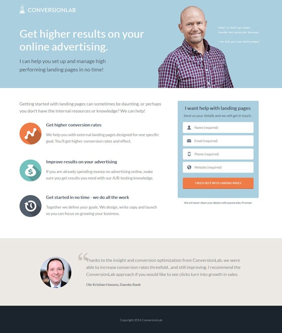
These are the kinds of landing pages that give me a hard time because it’s so hard to find ways to improve them!
Luckily there’s just as much you can learn about a great landing page example as a bad one.
The headline speaks to the visitor
No fancy jargon here. This headline talks directly about the benefits of the service provided: Getting higher results. There’s no mention about him being #1 or how amazing he is.
The call to action is easy and clear
There’s no need to get fancy with your call to action. As long as your call to action copy is relevant to the offer you’ll get great conversions.
This call to action doesn’t leave any question about what you’re going to get: Help with landing pages.
Notice the benefits?
A lot of landing page copy focuses on the features (We provide landing page consulting) but this landing page instead focuses on the benefits (You’ll get higher conversion rates).
What do you think will sell more? The benefits, every time.
The photo is of a real person!
What a concept… a real person. Lose your stock business-man-talking-on-the-phone-and-laughing generic photos and use someone real.
You’ll see results.
Watch out for color contrast
The only nitpicky thing I have about this page is that the call to action color matches the first bullet point. It might not make a huge difference, but it definitely will take emphasis off of the call to action because it stands out less.
10. Small Biz Consultant
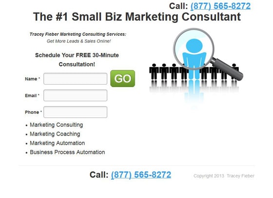
Pages like this make me cringe. Not only is it poorly designed, but almost everything is wrong about it. Hey, at least there’s no navigation menu, right?
What’s with the image?
Are we stuck in a Windows 95 power point presentation? What does this image even represent? Maybe a police lineup?
Lose the clipart and find something that matters. Or don’t use anything at all.
Make the form stand out
The form is sorta just floating out there in space. At the very least it could be put into a box that stands out with a different background color. That would draw visitor’s eyes to the form itself.
This headline is scary
You’re #1? Says who? Do you think that anyone really believes that?
The thing is, this page actually has a much better headline already on it! The third line on the page is “Get more Leads & Sales Online”. Isn’t that what you’re ultimately selling?
A spray of bullets
Ever heard of spray and pray? It’s a gaming term where you fire a bunch of bullets in a general direction and hope that one of them hits.
The bullet points on this page are basically that. It’s just a bunch of words hoping that you’ll know what they mean.
Tell your visitors exactly why the list is on your page:
These are the services that I provide:
And then list a benefit under each service to tell the visitor how that service can help them succeed.
Time for you to take action!
You’ve seen good landing pages and bad. Great headlines, and headlines that should never again see the light of day.
But it’s all for nothing if you don’t take action.
Take a look at your campaigns. At your landing pages. At your headlines and bullet points.
Be critical of your own work and come up with ways to improve it.
And once you have a plan, take action.
And test like hell.
Have questions? Let me know in the comments below, I’m happy to help!

