
Was the dress black and blue, or white and gold? (Oh no, not this again…)
Yep, we’re about to dig up the ol’ viral perception conundrum, and you’d be surprised how much our eyes (and how they process info) play a role in landing page design and conversion lift.
Landing pages are supposed to be clear. Optical illusions are the opposite of that. So how the heck can they help you boost landing page conversions?
Let’s first answer another question: Which animal do you see in the image below?

You’re right if you say “duck.” You’re also right if you say “rabbit.” Some might even see a seagull, although this illusion’s original name is “Rabbit and Duck.”
Your answer can depend on which animal you’re more familiar with, which one you’ve seen more recently, or even whether it’s spring or fall. The answer varies because our minds interpret information based on its surrounding context.
So… what lessons can we learn from “Rabbit and Duck” and other optical illusions when it comes to building a landing page, you ask? Conversion rates depend heavily on context—it’s not always about what your customers see, but how they see it that matters.
If you understand how perception and interpretation work, you can easily improve the design of your landing pages in a way that increases conversions.
Without further ado, let’s talk about brains, baby!

Placement and Proportion: The Ebbinghaus Illusion
Which of the orange circles below is larger?
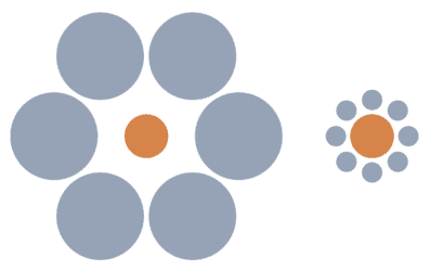
The one on the right, right?
Nope. The two circles are the exact same size. One only seems bigger because our minds perceive size based on context. And in the context of the different-sized blue circles and varying spacing, the orange circle on the right seems larger.
There are two useful ways we can use this knowledge for our landing pages:
First, placement matters. This is pretty much general knowledge by now, but to get the necessary attention, the most important parts of your landing page should be prominently placed (the CTA, for example) and not overshadowed by other content.
You should also carefully consider the context that’s surrounding your product, as it can affect how a visitor perceives its size.
If you’re selling furniture, it’s a great idea to include a sample image from a living room, so a customer could see what their new sofa would potentially look like in their home. And getting a more vivid idea of your product can sway the visitor to convert.

Doesn’t this armchair look much more appealing with such a serene background instead of a blank white one? This whole image conveys feelings of comfort and peace that you will experience if you buy the chair.
However, you should be careful not to display your product out of proportion. The last thing you want to do is deceive your audience. The DFS furniture company got a lot of bad press and even had their ads banned for shrinking the models used in the images of their furniture.
With that being said, the second lesson with the Ebbinghaus illusion is that image dimensions matter. According to a study by CXL, the actual size of your product image can affect its perception.
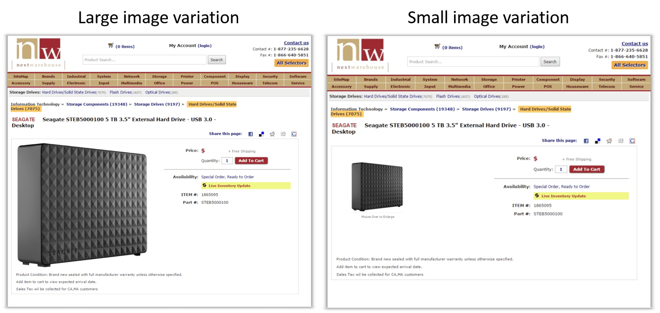
It turned out that in the case of a hard drive, people were willing to pay more if the product image was larger. And apparently, this effect depends on what type of good you’re selling, as the opposite was true for T-shirts.
What’s the key takeaway?
To boost conversions, experiment with variants to find the best-converting placement for the most important parts of your landing page, as well as the optimum image sizes. But be careful: Don’t play with placement and proportion to deceive your customers. They’ll remember you—and not in a good way.
(By the way: Check out how easy it is to send visitors to the highest-converting page variant with Unbounce’s Smart Traffic.)
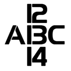
Priming and Anchoring: The B/13 Illusion
For the next illusion, let’s take a look at the following image, similar to the Rabbit-Duck illusion from up top. What’s pictured in the image below?

That’s the letter B, right?

That’s B for Bingo!
But what does it look like now?

Oh, snap! Now it’s the number 13.
An illusion very similar to this was used in a study in 1955 where one group of subjects were shown a set of letters while the other group was shown a set of numbers. In both groups, an ambiguous B/13 figure was shown. The study found that the subjects who were previously presented with letters perceived the figure as B, while the subjects that were presented with numbers perceived it as 13.
So, this optical illusion shows how perception changes depending on what comes before and after the element in question:
This brings us to an important concept in psychology called a perceptual set.
In a nutshell, a perceptual set is the tendency to perceive things a certain way, depending on factors like expectations, emotions, motivation, and culture. Because of this, a visitor arriving on your landing page might not really understand your offer right away.
Instead, they might make a premature negative judgment based on other similar landing pages and offers they’ve seen. While you can’t affect someone’s cultural traits, you can—to a certain extent— affect your visitors’ expectations, emotions, and motivations to overcome their perceptual set.
To better get your offer across, you should use priming and anchoring techniques to create the kind of context on your landing page that would prompt the user to perceive the product the way you want them to. If you manage to nudge them in the right direction, your conversion rates will improve.
A great example of priming is this ad for Coca-Cola:
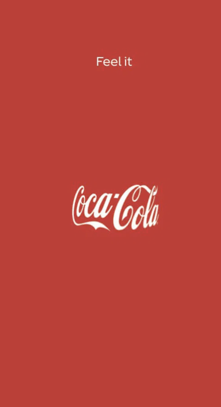
Can you see the Coke bottle? There’s no actual bottle in the image, but you’ve most likely seen a fair share of the distinctive bottles in your life, so you’re pretty much bound to imagine one here, too.
On top of that, the copy (“Feel it”) can trigger memories of previous experiences with the drink as well as other Coke ads you’ve seen.
A great example of priming comes from Teamflow:
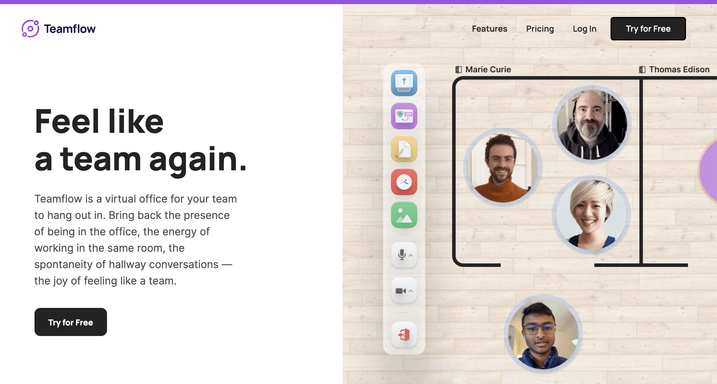
Yes, this page is very straightforward—”Feel like a team again.” But it does the trick. Teamflow’s page evokes an office layout and triggers memories of synergy, productivity, and success in visitors. This helps create a positive connection with the product.
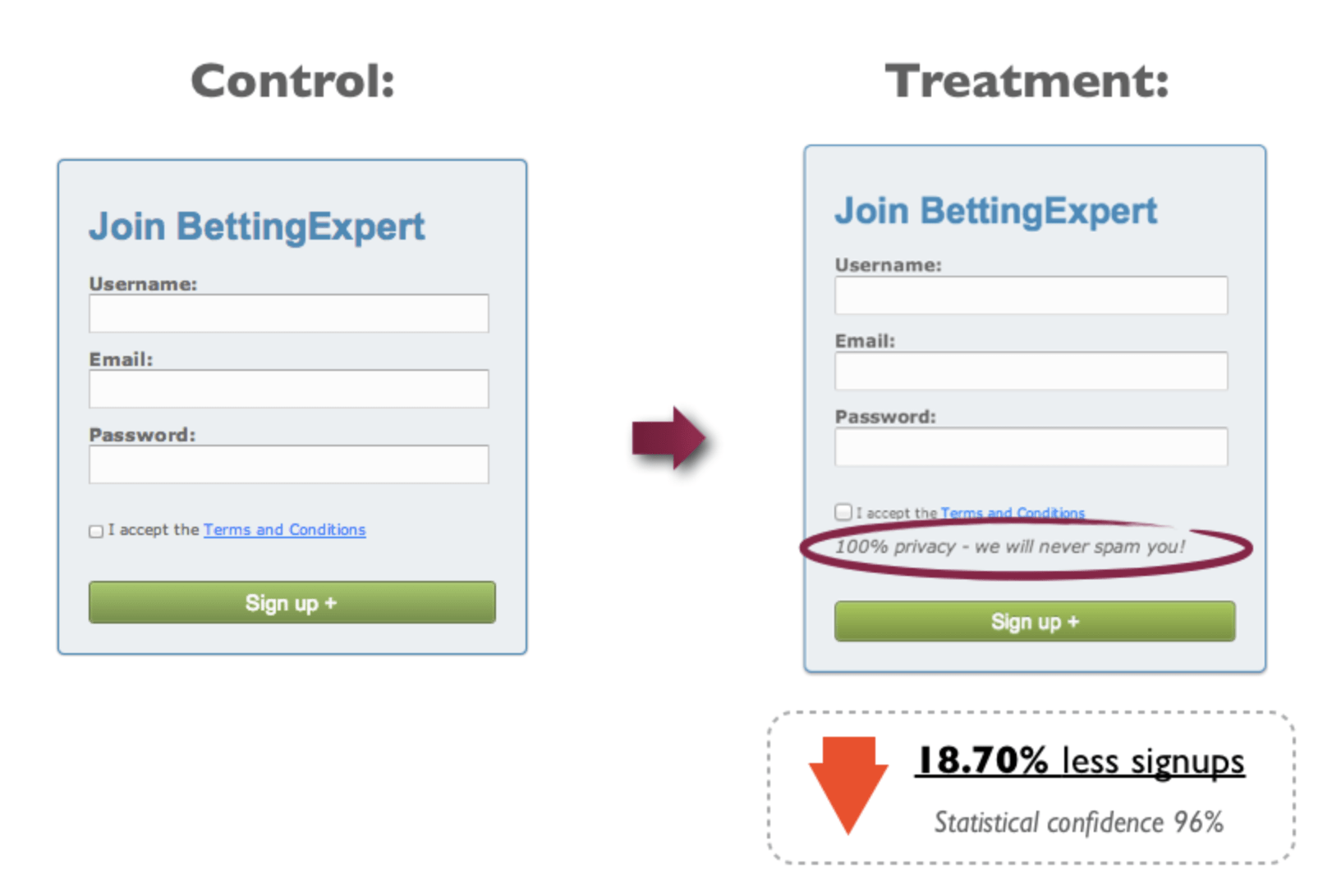
However, keep in mind that you don’t accidentally prime negative associations. Sometimes simply mentioning the word “spam” will decrease conversions—although the copy clearly states, “We will never spam you.” (Your brain says: “Yeah, right.”)
What’s the key takeaway?
When crafting your landing page, use priming and anchoring to consciously create the kind of context for your visitors that would nudge them towards perceiving your product the way you would like them to.
Focus-Pocus: The Schroeder Stairs
Next, let’s play a little trick on your eyes: Take a good look at the stairs below.

If you focus on A, you should perceive the image as a regular set of stairs, leading from the bottom right to the top left, with side A of the stairs being closest to you.
However, if you focus on B, you should see the same staircase inverted, with side B closest to you, looking at the staircase from underneath.
The Schroeder stairs help demonstrate how perception changes depending on where attention is drawn. In extreme cases, perspective can even be completely reversed.
Now, if the letters were removed, you could perceive the image either way, based on your perceptual set. Or maybe worst of all, you would keep switching between the two views. (Brain = fried.)
Similarly, when a visitor arrives on your landing page, sending mixed signals or giving them too much choice can make them bounce.
To make your visitors convert instead, you should make your landing page as clear as possible: Focus on one problem, one solution, and one call to action.
And on top of doing this on the landing page itself, you should keep the whole landing page experience consistent.
If a user arrives on your landing page through a link that primes them to expect A, they’re likely to be confused once they arrive and see B instead.
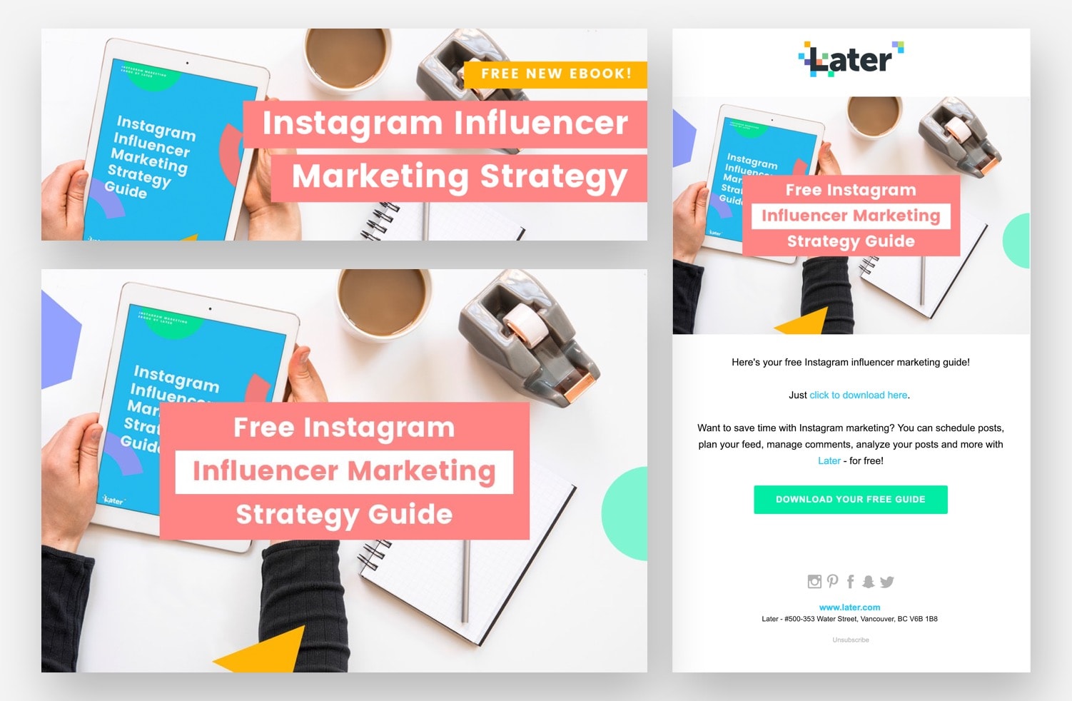
Let’s take a look at Later, featured in this list of high-converting landing pages. This is a wonderful example of a consistent landing page experience, with the design and copy completely in sync between the ad, email, and landing page:
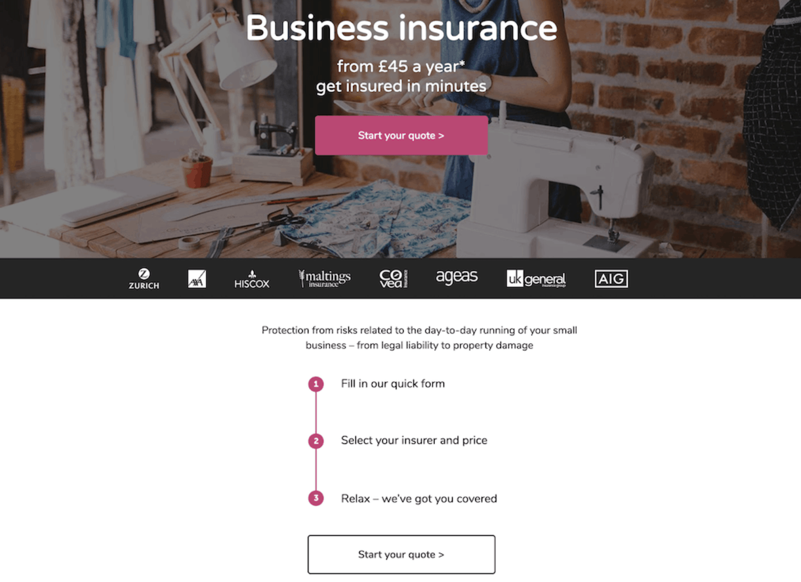
Another great example to learn from is the Simply Business landing page. They keep the page simple and consistent with a CTA that’s repeated below the fold with the exact same copy.
For more examples, you can look at other mentions in the same list, or analyze any Unbounce landing page template, really. You’ll most likely get great results with any one of them, as long as you keep everything consistent.
What’s the key takeaway?
To boost conversions you should unify your message, focusing it on one key aspect, and make sure you provide your visitors with a consistent landing page experience.
Visual Contrast: The Disappearing Yellow Dots
It’s been thoroughly proven that adding video to your landing page can boost conversions.
However, if you’re not doing it right, you might be missing out on some potential conversions. Of course, the content of the video is crucial—but you’ll also want to pay attention to how the visuals affect your landing page.
Let’s look at the illusion below. If you focus your gaze on the center green dot, the three surrounding yellow dots will soon disappear.
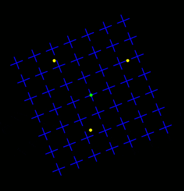
The effect is a good way to demonstrate what is known as motion-induced blindness (MIB)—a phenomenon in which motionless elements disappear in front of an observer’s eyes when masked with a moving background.
What does this illusion mean for your landing page? Well, if your visitors focus on a background video or animation, they are highly likely to pay less attention to surrounding or overlayed static objects.
This could mean copy on top of a background video or CTA buttons and other strings of copy that are too close to the video, animation, or other moving objects.
To boost conversions, it’s definitely wise to use video. But to maximize your landing page conversions, you should be careful—especially with background video.
Let’s look at a few useful examples:
The Yacht Company
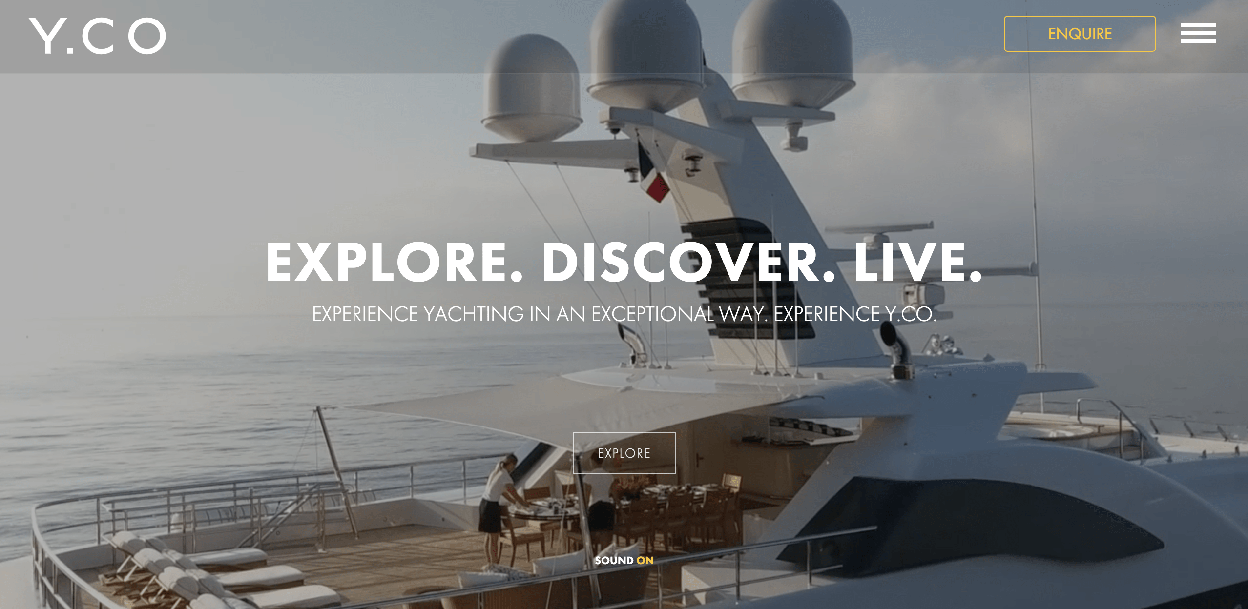
Above the fold, there’s a background video that’s blurred out when you first load the page. This gives you a chance to first get a look at the copy on top of the background video. The design is very consistent and sleek, although the contrast between the background video and copy could be A/B tested—especially with the CTA button.
Toggl
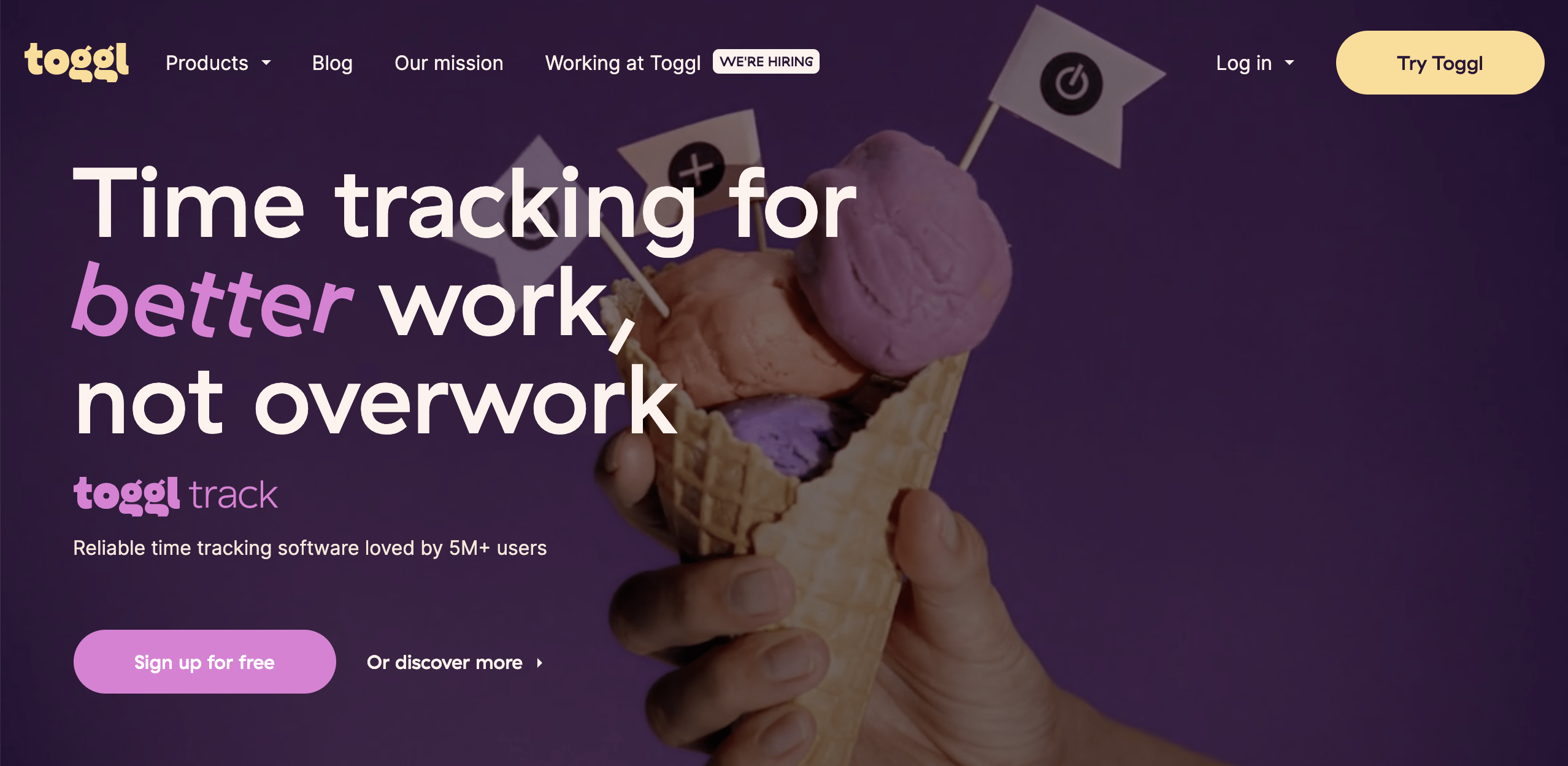
Here’s another great hero area video example, with high contrast that doesn’t take too much attention away from the clear copy and CTA. In addition to this video, the whole page has a bunch of animations—using fewer could be A/B tested as well.
Shutterstock
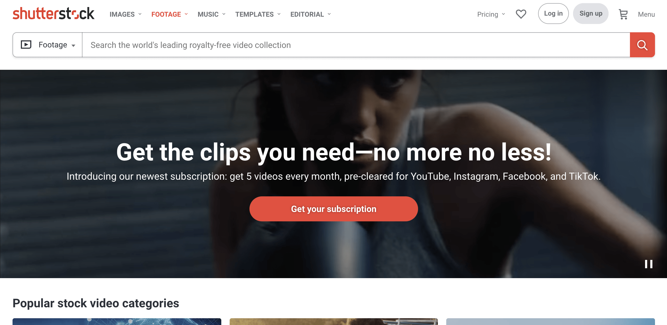
Shutterstock features a hero area video with great contrast between the background and the copy. The pause button in the bottom right corner is a pretty neat feature, too!
What’s the key takeaway?
Don’t overuse videos or animations on your landing page, and make sure to test contrast and placement for the CTA and copy—especially when putting them on top of a video.
Combine and Convert: Snag Those Leads Using a Mix of Optical Illusions in Your Landing Page Design
Remember the Coca-Cola “bottle” illusion? That’s a great ad, isn’t it?
It’s simple and ingenious and displays great use of priming. Also, it’s bound to catch a viewer’s attention and be remembered.
This brings us to our final illusion:

What can you see in this image?
Probably a happy family, yes? Most likely, you also see a figure forming in the white gap: a dog.
This ad is part of a clever campaign by World For All—a Mumbai-based NGO for the welfare of stray animals. Not only does the ad prime feelings of joy and love, but also masterfully creates an animal figure from the gap between the people—an empty space in one’s life that could be filled by rescuing an animal.
Consequently, this ad combines many of the key takeaways from the optical illusions so far, focusing on one problem, one solution, and one call to action, as well as overcoming perceptual set (in this case, negative associations with stray animals) while also creating positive connections with priming.
And on top of that, the ad is truly eye-catching and memorable—probably even more persuasive than a typical ad. A great real-life landing page example that combines key takeaways from all these optical illusions is none other than Netflix:
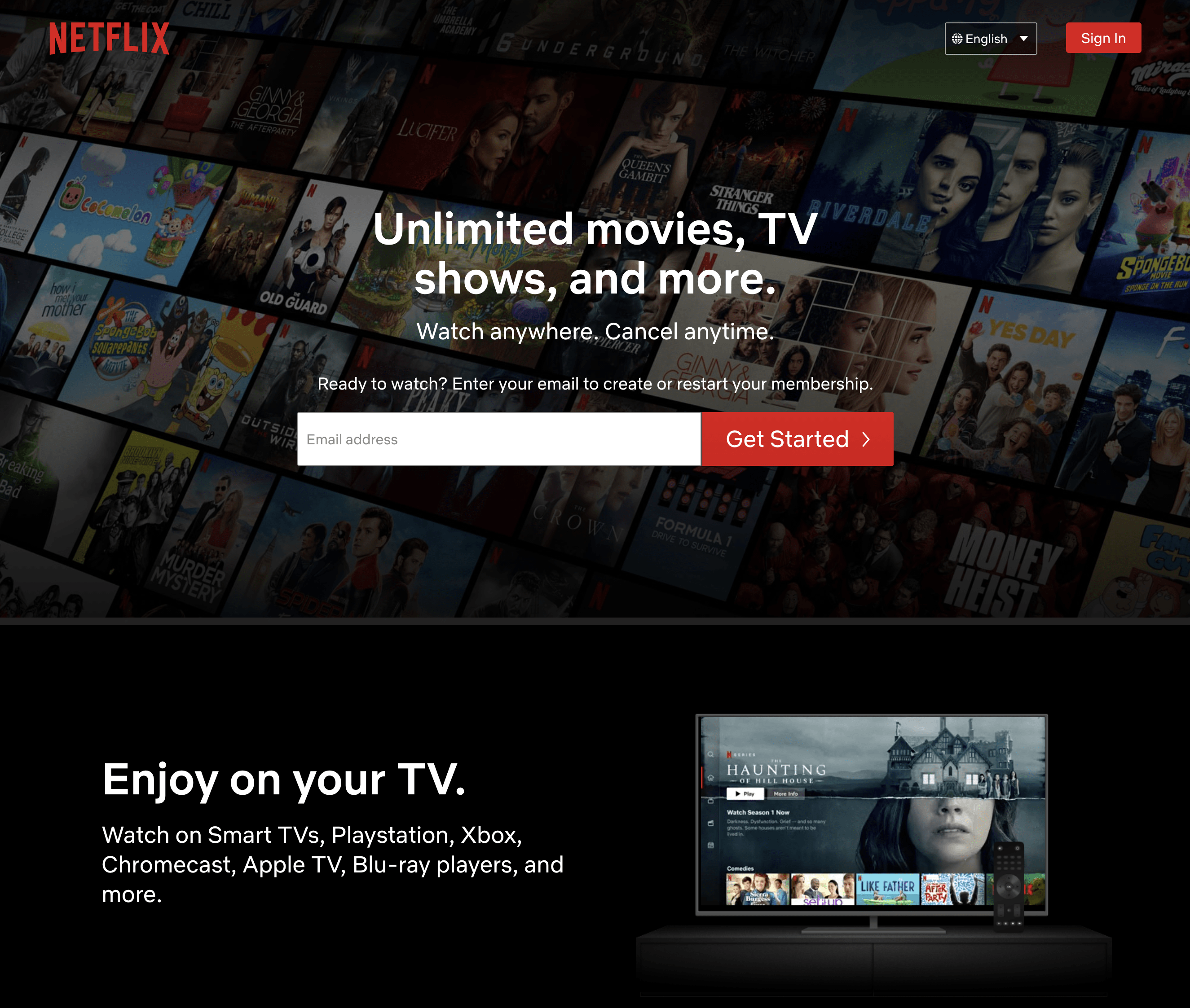
Their design is simple but impressive. The page is focused on key copy and only features a few images and two small videos that showcase the interface—either on your TV set or your computer (a beautiful iMac, of course, a good use of priming).
The CTA stands out really well thanks to the contrasting background and is repeated word-for-word at the bottom of the page. And there’s even a small optical illusion featured on the page: the ad for The Haunting of Hill House, immediately eye-catching.
What’s the key takeaway?
Combine the key takeaways from all these optical illusions in your marketing campaign to boost conversions. Be creative to stand out from the crowd, and don’t be afraid to use actual optical illusions to create a lasting impression (make sure you don’t go overboard with them, though).

Grab Your Audience’s Attention and Get the Conversion Boost You Need
Even if your visitors don’t convert immediately, they’re bound to remember your page and are more likely to come back, or at least give you their email. And triggering visitors’ interest with an optical illusion can be really helpful for boosting conversions on a squeeze page—especially if you combine it with an automated email marketing tool to keep engaging your visitors.
The most important thing is to keep building and testing new variants of your pages using tools like Smart Traffic. Don’t be afraid to try out the key takeaways we laid out in this post to see how they can help you land more conversions.

