So you want to get into landing pages hey? Great idea. They can help create more focused marketing campaigns, improve measurability and increase the return on your marketing spend.
If you’re new to the idea of using a landing page for your marketing campaigns, I’ve whipped up a quick A to Z to explain some of the terminology, jargon and theory surrounding their use.
A – A/B Testing
A/B split testing is the bedrock of landing page success. A/B testing is your friend, your scientist, and your best way to settle family arguments. Simply put, it’s the idea of running 2 (or more) similar pages alongside each other to see which performs the best. Traffic is split between the page variants according to a few basic rules.
If you have multiple variants right off the bat – perhaps 4 versions of the same page with different headline copy on each – then you could split the traffic equally to each. If you have been running a campaign for a while and want to test a new variation you might leave 90% of your traffic on the successful page and test 10% on your new page. This allows you to minimize the risk.
B – Bounce Rate
Repeat after me: “Bounce rate is bad. Bounce rate is bad.” Bounce rate is usually expressed as a percentage of the visitors to your landing page that turn around and leave right away. With a single landing page it’s actually a little tougher to measure when compared to a regular website. Normally it’s defined as someone coming to your site and leaving without viewing pages other than the one they arrived at.
This can be okay, especially if your goal for visitors exists on the first page they visited (such as downloading a piece of software).
 On a standalone landing page, the bounce rate can be determined in a number of ways and it’s really up to you. Here are 2 example ways to measure your landing page bounce rate:
- Time on page: If you are able to do so, you can state that a bounce occurs if someone doesn’t stay for longer than 5 seconds on the page.
- No conversion: It can also be the opposite of conversion rate. So a bounce is a failed conversion and is thus 100% – the conversion rate %
I prefer to use the first model as it gives you 2 metrics to work with: conversion rate and bounce rate. Yes, someone who stayed for 2 minutes and didn’t convert is a failed conversion, but you are at least able to infer that they had a modicum of interest and didn’t immediately realize they were in a bad or uncomfortable place and hence bounce.
As a side note: the name Unbounce is derived from the equal and opposite reaction to bounce rate.
C – Call To Action (CTA)
The Call To Action or CTA on your landing page is the text you use to instruct your visitor to perform your desired conversion action. An example would be “Download our free eBook”.
D – Designing for Conversion
Smart designers will be familiar with the concept of “know thy customer”. User centered design is based on the principles of knowing who your audience is and designing with your customer in mind.
Designing for conversion takes it a step further and is the art of perfectly meshing the needs of the customer with a single goal of the business. It’s important to stay focused on this ideal when designing a landing page – try to keep your mind focused on holding the visitors hand for 5, 10, 30 seconds as you guide them towards your goal.
Some design techniques you can use when designing for conversion include:
- Focus the attention on the primary action area. Use color and contrast to make a single area stand out.
- Use graphical arrows to direct the visitors attention to the action area.
- If your landing page uses photos of people, try to have them look in the direction of the action area.
- Use Z shapes or triangles to direct the eye through a series of visual steps that build toward the conversion goal.
E – Evergreen Landing Page Campaigns
An Evergreen campaign is pretty much as it sounds. One that stays live and fresh all year round.
 If you don’t need to take it down, don’t.
You can gain trickle traffic and SEO value by leaving your landing pages in place, even if you are not directly sending traffic to it.
If you decide to reactivate the campaign in the future, having a live page that Google has been aware of for 6-12 months is a major benefit.
If the campaign was time sensitive, consider a quick change to make it more generic in order to let you leave it up.
F – Focus on a Single Purpose
A landing page should be the digital representation of a single marketing idea. Your visitors need to figure out what you are offering and make a decision to continue or bail, and ultimately to convert. There is a very good chance that they won’t be very focused or patient. To help them, you must ensure that you do everything to provide clarity through your design and messaging to help keep them on track.
Some simple techniques for improving the focus of your landing page include:
- Have a clear and concise headline that describes your offer in as few words as possible. Think newspaper headline.
- Read D – Design for conversion again.
- Remove extra links and navigation so the user has no choice when it comes time to act. (The exception here is a Safety Net – see S below).
- Cut the text on the page down as much as possible.
- Use bullet points for clarity.
G – Giveaway
A giveaway is something you offer to visitors in exchange for providing their details on a lead generation landing page form. Example giveaways are:
- An eBook
- Webinar registrations
- Newsletter subscription
- Discount coupon
- Contest entry
- A free trial
- A physical gift (via snail mail)
See our post on how to grow your client list with lead capture carrots for more information.
H – C[h]ampion & C[h]allenger Landing Pages
These two terms come from A/B split testing. When you are performing a test between 2 or more pages, the page you start with is called the Champion as it’s your best performer.
 When you begin, your first page is automatically deemed to be the Champion. Then when you create page variants to test against this page, they receive the name Challenger.
You can have one Champion landing page and many Challenger landing pages.
During or after your test, if one of the Challenger pages outperforms the Champion, you would then swap it into the Champion position as the new leader.
Typically this would be the end of the test. then when you have developed further hypothesis for a new test you would create fresh Challengers to combat your new Champion page.
I – Impatient Visitors
The 5-second rule is a usability test to gauge how focused and simple your landing page is. The premise being that web visitors are a fickle and impatient bunch and will only spend between 3-8 seconds on your page before they make up their mind about you (I know, judgment is a horrible thing). To perform this test, sit a impartial test subject in front of a screen, show them your page for 5 seconds, hide it again and ask them what it was about (what the purpose of the page was).
If they can’t answer correctly you are doing something wrong. See our post on the 5 Second Rule for more information.
J – Jargon
Given how little time your visitors have, don’t make assumptions regarding terminology. If someone has to question the meaning of an acronym or overly nerdy industry speak there’s a good chance they’ll just give up and leave. Everyone has a different path in life that takes them through different circles of friends, different professional roles and responsibilities and different levels of nerdiness. These factors influence what they are been exposed to and what they can comprehend quickly.
Some examples of phrases, acronyms and terminology that I’m familiar with, but others might not be. See how many you can explain:
- USP
- ROFLMAO
- MVT
- Multivariate Testing
- EPROM
- Antidisestablishmentarianism
Google them if you don’t know. (Or keep reading for some of them).
K – Klick Through Rate
I know, I’m taking liberties with the spelling and wordplay here. But C was already monopolized by conversion, call to action, customers etc.
The click through rate is the proportion of visitors that complete the desired action on a landing page that has further steps before conversion is achieved. On some landing pages, click through and conversion would be the same thing – such as a lead capture form. The goal begins and ends on the landing page. On others, the click through is getting them to click for more information on a product advertised on your landing page, and the conversion is when they buy that item on your website.
L – Lead Generation
Lead generation, lead gen, lead capture, or lead cap refers to the process of gathering customer data via a form on your landing page. In the internet marketing world the email is king. Typically marketers will offer some incentive (G – Giveaway above) to entice prospective customers to part with this most valuable of online commodities. The length of your form can have an impact on how many people convert and actually complete the form.
Read our post on Measuring Form Threshold on Lead Gen Landing Pages to see how the number of form fields can be optimized through testing.
M – Multivariate Testing (MVT)
Multivariate testing is the more complex big brother to A/B split testing. It involves the generation of a large number of test pages based on every possible combination of several page element changes.
 For example, if you want to test the performance of 3 different headlines, 3 photos and 3 variations of button color, you would end up with 27 pages to be tested against each other. This type of testing requires a significant amount of traffic to become statistically valid.
I wrote about the dangers of Multivariate and it’s comparison to A/B testing in a somewhat opinionated article. For the record, this isn’t always the case, but there are important factors to consider when deciding on a testing methodology that works for you.
N – No More Navigation
Reserve your navigation scheme for your website. By including it on your landing pages you are giving the visitor too many options and risk watering down the primary message. Remember, standalone landing pages are not the same as your regular website’s pages. They should have a singular focus and purpose.
O – Optimization
Landing Page Optimization refers to the process of refining and testing your landing pages to find the optimal combination of design, layout, messaging and offer to convert your visitors into customers.
P – Pop-up Windows
Bad. Be respectful to your guests. It’s okay to use pop-up “layers” – HTML elements that appear as a focused overlay following a customer action – but using separate browser windows when the page loads or when the customer tries to leave is just rude. Show your visitors respect and you’ll have a better chance at creating a long lasting and meaningful brand.
Q – Quality Score
 This is a secret calculation that Google establishes by analyzing your landing page/site, to see how relevant your content is to the subject matter you are describing in an AdWords campaign.
By providing quality and highly relevant content on your pages that matches the terms used in your ads results in a lower cost-per-click (CPC) for your ad campaign.
In a nutshell, don’t advertise Blue apples when you are selling Green apples.
For the record: if you have any Blue apples, hook me up, they sound awesome!
R – Conversion [R]ate
The percentage of visitors that complete the desired action on your landing page. In some cases this is where the conversion ends. But in other situations the conversion is only established once the visitor has clicked through to your website and complete a subsequent action.
S – Safety Net (The Backup Plan)
 A safety net Call To Action is a secondary escape route from your landing page designed to capture those people who are interested but aren’t quite ready to go the distance for a full conversion or purchase. It allows them to stay within your sphere of brand influence until another day when they may be more inclined to convert.
Some examples of a safety net CTA are:
- Follow me on Twitter: Once someone is following you on Twitter they can be exposed to your other marketing and brand messages, which may entice them to buy in the future.
- Remind Me: Provide a way for them to be reminded (via email) at a predetermined time in the future (1 day, 1 week, 1 month, specific date etc.) and be sure to place a trust statement beside it that explicitly states that you will not contact them at any other time.
- A Free Giveaway: Provide a link to a free download-able brochure (without having to complete a form).
- Bookmark This Page: A classic technique that isn’t likely to yield great results as people don’t really check their bookmarks a a matter of process. It does however enable someone to find you again if they want to deal with you later on – especially important for standalone landing pages that are reached via an Ad they may never see again.
T – Trust
Trust is a critical part of the conversion process. If someone only has a few precious seconds to establish whether or not to invest their time and potentially money in your brand, then they are going to have to trust you. Designing your landing pages with credibility in mind will improve your conversion rate.
Check out our post on 15 Ways to Increase Trust in Your Landing Pages.
U – Unique Selling Proposition (USP)
The Unique Selling Proposition is a simple statement of differentiation from your competition. A well crafted USP sets clear expectations for your customers and allows them to understand why they should care about your offering.
V – Viewable Screen Area
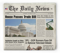 Keep the CTA above the fold.
This doesn’t necessarily mean placing the button above the fold in the case of a lead gen form, but the CTA – the statement that directs them to take an action – should be in the upper portion of the screen so it can’t be missed.
TIP: Use Google Analytics to get a handle on the screen resolution of your user base (from prior campaigns or your main website) and design your pages accordingly.
W – Who, What, Where and Why
When you start designing a landing page, remember to ask and answer these questions:
- Who are you designing for?
- What do you want them to do?
- Where are they coming from? (banners, email, affiliates, AdWords)
- Why should they care?
X – XXXL Call To Action
Make it big, make it obvious. After all, it’s the sole reason your visitors are on your landing page. Just something to keep in mind. Better yet, test different pages with radically different CTA sizes – this would include the primary statement of action and the action area or button where they need to click to enact the action.
Y – Wh[Y] You Should be Using Landing Pages
Here are 7 reasons why using standalone landing pages for your marketing campaigns is beneficial to your bottom line:
- Increased Conversions by Default
- Focused & Targeted Messaging
- Simpler Campaign Measurement
- Co-branded Affiliate Opportunities
- No More Design Dependencies
- Change & Test Without Politics
- Greater Campaign Accountability
For more detail on each of these 7 benefits, read our post on the 7 Benefits of Using Landing Pages.
Z – Squee[z]e Page

A Squeeze Page is a particular kind of standalone landing page that has no follow up action. Everything you want the customer to do can and should be performed on the landing page. Most lead generation pages fall into this category. There should be no exit links on the page and nothing is required of them following the completed action.
The purpose of a Squeeze Page is to gather information from the visitor to facilitate a deeper level of marketing at a later date. Once someone has provided their name, email and perhaps the answer to a question related to your market niche, you are in a stronger position to target them in the future.
And that rounds out our 26 alphabetized landing page factoids. I hope it helps you gain a better grasp of what they are all about.
Cheers,
