We all know someone who isn’t willing to give away their personal information — that person who will never do banking online and thinks you’re an idiot for giving any website your name and email address, let alone your credit card number.
People using the internet already have a level of anxiety about just being online. They’re increasingly suspicious of every page they visit. They’re worried about privacy, they’re worried about having their banking information stolen and they’re worried that they’re not going to get what they pay for.
Consumers are educated about the internet, and they want reassurance that they’re dealing with a company that they can trust their information with. Your landing pages are no exception; they need to work extra hard towards reducing anxiety and building trust with consumers.
Without that trust there is no conversion.
Let’s take a look at five common mistakes that could be causing anxiety on your landing pages – and how you can avoid them.
1. You have weak message match
Imagine clicking an ad that advertises one thing, but winding up on a landing page that has little or nothing to do with that thing. What would you do? Probably panic and hit the back button!
That cognitive dissonance is caused by poor message match: a measure of how well your landing page copy matches the phrasing of the ad that brought people there.
Being promised one thing and then finding another causes anxiety and will most likely make visitors bounce.
What you can do about it
Make sure that your headline is neatly matched up with the message in your ad to reassure people that they’re in the right place. Keep the color palette and typography consistent from display ads to your landing page, and make sure to repeat the specifics of the offer.
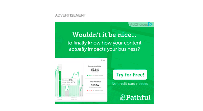
Consider the example below by content marketing analytics tool Pathful. Their ad starts out with a simple, green color scheme, and asks whether or not you’re interested in finding out more about how content can affect your business:

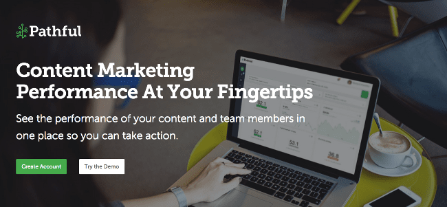
Upon clicking, visitors are taken to this page, where they’re greeted with a nice, big headline that repeats the core message from the ad and assures them that they’re in the right place. Anyone who answered “yes” by clicking on the ad will arrive at a page that speaks directly to the expectations created by the ad.

For bonus points, Pathful should consider A/B testing an ad headline that matches their page’s headline more closely. Dead-on message match like that reassures prospects that they’ve made a “good click.”
2. Your forms are too long
How much information do you need from your visitors? Do you really need 15 form fields of info in order to convince them to convert?
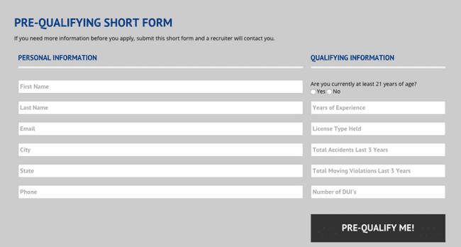
This form below from one of the pages we looked at on Page Fights is asking for too much from an initial contact. It may well be that they need all of that information in order to pre-qualify someone for their program, but this step could be taken later.

Long forms cause friction – and friction leads to anxiety.
In his epic blog post, The Most Entertaining Guide to Landing Page Optimization You’ll Ever Read, Unbounce co-founder Oli Gardner discusses the difference between perceived and actual friction.
Perceived friction might be the shock of seeing a long form and worrying that it’s going to take too much time to fill out. The solution to this issue is to either make the form shorter, or break it up so that you collect the information you need on more than one page.
Actual friction happens when physical barriers cause visitors to abandon your page. In this case, that could be the time it takes to fill in the form. Friction may also be unclear instructions or even inline form fields that disappear when you put your cursor in the field. These things confuse visitors and cause them to leave.
What you can do about it
Keep those forms short! Ask for only as much information as is necessary to begin a working relationship with your prospects. If you get their name and email address, you can start asking for a little more information with each new point of contact, starting with the first email you send them.
As always, the caveat here is that the number of form fields that’s right for your landing page will be decided by the visitors. How do they decide? You test a few different variations, and along the way, you’ll find out by which number of fields is most effective.
Who knows? You may even learn that a lengthy form and a bit of friction is an acceptable tradeoff for more qualified leads.
3. Your “facts” are not believable
You’re dealing with a savvy, educated audience who is willing to do further research if they smell something fishy.
Your landing page could have most of the elements of conversion centered design, but start spouting some questionable facts about your product and you’ll put your readers in full-on skeptic mode.
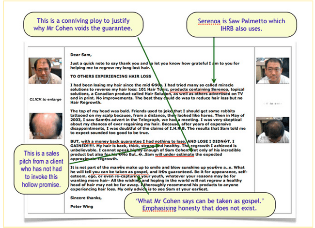
Not only will your prospects cease to trust you – people might even call you out on it, like in the image below. This “rapid hair growth” business made a few seemingly spurious claims, and a fellow has taken the time to build an entire website debunking those claims.

The same applies to hard-to-believe claims used in testimonials.
Testimonials aren’t the “magic bullet” that they’re sometimes made out to be. If they’re not credible, they can reduce conversions.
If you try to pull the wool over your prospect’s eyes, you get the anxiety flowing and the bounce rate rising.
What you can do about it
Stay honest. Use facts that you can verify. Use testimonials from real people who have used your product. It’s as easy to spot sincerity as it is to spot a fake, and testimonials can really help your conversion rates — so long as they’re straightforward and honest.
Oli is fond of saying, “testyourmonials.” What’s good for one page may not work on another, so be sure to test those testimonials!
4. You’re using a lot of words that mean nothing
One of our friends, copywriter extraordinaire Henneke Duistermaat, has at least 17 words that she’d like to see people stop using on landing pages.
All that marketing gibberish like “state-of-the-art” and “world-class” doesn’t actually mean anything to anyone. Is your product “innovative?” Really? How so?
And woe unto those of you who use the word “leverage” on your landing page copy. Woe, I say! You’ve used a word that doesn’t really mean anything unless you’re selling levers. You know what else you’ve done? You’ve just created a bounce-able level of anxiety.
What you can do about it
You can start explaining what you mean instead of using meaningless buzzwords.
“State-of-the-art” doesn’t mean anything real to anyone. Tell prospects what they want to know: what your product does and how it’ll take away their pain.
Talk about the features and benefits of your product using simple, explanatory words. Describe what you’ve got to your potential customers the way that you would describe them to your grandma. You don’t want your grandma to feel anxious, do you? Good. Make it that easy for everyone.
5. Nobody knows who you are
The simple fact is that, unless you’re a major brand, people may not know who you are. If folks don’t know who you are, they’re unlikely to trust you with their personal details.
Consumers are becoming a lot more savvy. One study showed that almost 75% of respondents paid attention to the URL address in browsers looking for “https” connections. From one of the respondents:
For the payment itself, I always seek some trusted logo and the URL bar logo and the URL address.
If you don’t show that you’re running a legit operation, your visitors are not likely to want to hand over their personal information.
What you can do about it
Give your visitors a reason to trust you. People expect to see a privacy statement, terms and conditions, and trust seals that they’re familiar with.
Trust seals are third-party badges that show people that your page is meeting high security standards, such as employing the use of HTTPS or SSL data security.
Be careful, though – too many trust seals on one page can actually add further anxiety. Be sure to place those seals in a high-visibility spot so that they can be seen.
Not sure exactly where to put it? Start A/B testing until you find the right spot.
How will you reduce landing page anxiety?
Now that you know a little bit more about your potential customers, you’re probably starting to feel a little empathy with them. You know that they have real fears, but you also know that you can alleviate those fears.
Get to know your prospects, their anxieties and what they need from you to convert. Then give it to them.
Anxiety is a massive killer of conversions. By demonstrating your trustworthiness, you reduce the consumer’s perception of risk and allow them to make the purchase they want to make.
What other methods do you use to reduce anxiety on landing pages? Let us know in the comments below!

