There are some questions that just don’t have simple answers. It’s the question that brought you here. You know the question, just as I did: Where is the fold?
The answer is as difficult to answer as it is to enjoy either of the sequels to the Matrix. But that’s what we’re here for. We answer the tough questions, folks.
The answer is: There is no fold.
This is your last chance. After this, there is no turning back. You exit this page — the story ends, you wake up in your bed and believe whatever you want to believe. You keep reading — you stay in Wonderland and I show you how deep the rabbit-hole goes.
What is the fold?
In the days before the machines took over, folks got their news from something called a newspaper. Perhaps you’ve seen them in old movies. Most newspapers were printed in a format known as broadsheet, which is typically 22 inches high. In order to display newspapers without taking up a ton of room on a newsstand, the papers were folded in half.
The term was later borrowed by web designers. Now “above the fold” is any part of a website or landing page that you can see without having to scroll.
The Matrix: Resolutions
There is no fold. Not in the way there used to be.
Designers used to argue about whether to design for 800×600 or 1024×768. The fold was a static dimension, like on a newspaper.
But things have changed. Chris Goward from WiderFunnel sent us a screenshot that demonstrates the variety of screen sizes that visit his website.
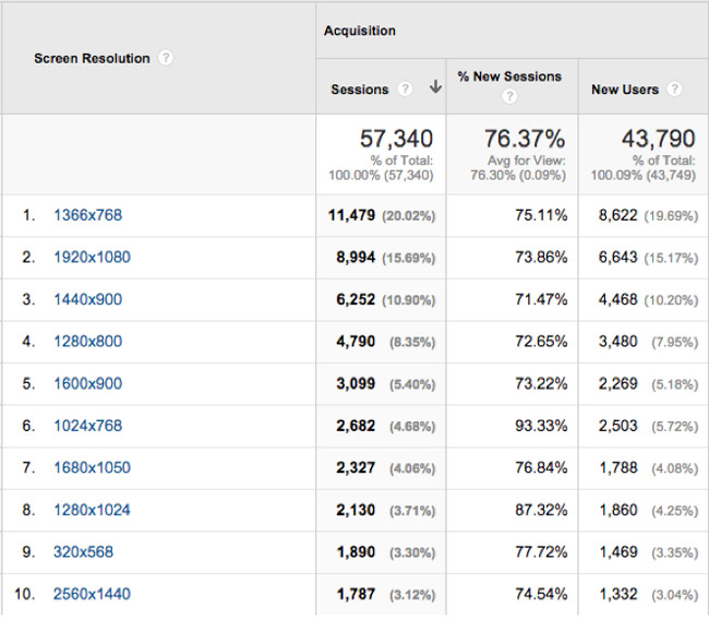
This is why there is no fold. People access the web on so many different devices with so many different screen sizes now that to design for just one size severely inhibits your ability to create landing page experiences that are both successful and delightful.
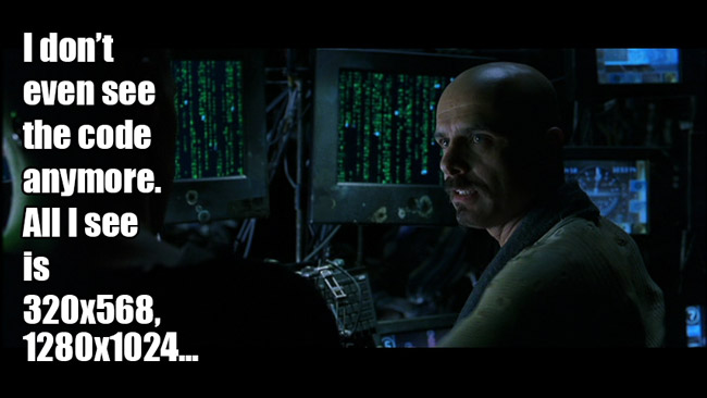
The fold can no longer be defined by a predetermined number of pixels — the fold is defined by the device used to visit your page.
Respond with responsive design
Many landing pages are still stuck in the Matrix, prisoners of a paradigm from the past, existing only to serve the search engine machine overlords.
In other words, people still aren’t optimizing their landing pages for mobile devices.
The only way to respond, the only way to break free of a construct that keeps your landing pages from persuading people to convert is through responsive design.
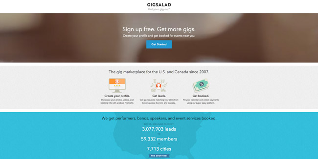
Here’s a responsive page from GigSalad. On my 27-inch monitor, it looks like this:
Everything I need to know about their offer is right here in front of me. They provide everything I need to make a decision; all the context I need to understand what their product is and why I would use it.
Between this size and a smartphone there are several different breakpoints, but by the time you get down to 320×568 (the screen size of an iPhone 5), you can see that a lot of that real estate has gone. This is when clarity and concision are as important as ever.

In the mobile version of the page, GigSalad strips down the page content to a bare minimum: they keep their CTA front-and-center along with a very strong value proposition (they can help you get booked for events near you).
You know exactly what you’re in for when you click that “Get Started” button.

But keeping your CTA above the fold on any device isn’t a hard-and-fast rule. As with most rules, there are exceptions.
As Chris Goward says:
The conversation about the fold has often centered around the call to action. Most people have assumed the button needs to be above the fold to maximize your conversion rate.
As always, you’ve got to test different configurations to find the one that will work for your visitors.
What you’re really trying to do is give your visitor the motivation to convert — regardless of the device they’re using. You can get them to click the CTA right away if you have given them the information they need to be motivated to do so.
Free your mind
You are the One. You can remake landing pages to be displayed the right way on any device as you see fit. You can make your copy relevant to your audience and clear enough for them to understand. You can remake the fold to display properly to any reader on any device.
Landing pages are similar to the programmed reality of the internet. They have the same basic rules, rules like clarity. Some of them can be bent. Others can be broken. Understand? Then convince your audience to take action and make use of that very valuable space above the fold — wherever it may be.
As you begin to more fully understand your audience, you can adapt and improvise, making your message even more enticing.
Am I trying to tell you that you can dodge bullets? I’m trying to tell you than when you’re ready, you won’t have to.
