Question: Do any of the following keep you up at night?
- I have no idea what to test, so now I don’t bother
- Our visitors are leaving our website without doing anything
- We blew through our AdWords budget in a day!
- Our market has dried up…
I’ll pause there before early onset MFD (Marketing Fail Disorder) sets in. But if these resonate with you, your marketing is failing, and you’re wasting money that could be working for you instead of against you.
Read on for 10 marketing problems, each with a solution about how to fix them by leveraging the principles of conversion rate optimization, testing, and of course, landing pages.
1. The HiPPOs Are Running the Asylum

I’m not talking about the kind you’d see on an African safari. Rather, the suits in your company, who could be stakeholders, your boss, or senior management. The term HiPPO refers to the Highest Paid Person’s Opinion, where decisions are based on conjecture or “experience” and are handed down to you to implement without any evidence of their true value.
Back when testing wasn’t an easy process, you’d have to suck it up and run with these ideas, but now (thanks to the advent of many inexpensive A/B testing tools) you can diplomatically reply to such a request with, “I have an idea too – why don’t we test them?”
If you win the test, you’ll be afforded more leeway in the future while educating the HiPPO’s about the value of scientific experimentation & testing vs. random ideas. You’ll also start making more money for the company, which any smart HiPPO would be a fool to argue with.
Just remember though, if you dare to engage a HiPPO without testing, you run the risk of becoming yet another PWTMSMEBNE in the room (Person With The Most Subject Matter Expertise But No Evidence, obviously).
Stop listening to HiPPO’s, stop the assumptions, and start testing.
2. Our Visitors Are Leaking

Sounds like a strange statement to make. Actually, here the term “leak” refers to a “link” that moves your visitors away from a page and your intended conversion goal.
But really, who’s fault is it? My guess is that you’re sending your marketing traffic right to your homepage. Thought so. This is a classic rookie mistake that even seasoned marketing vets still make. Consider the fact that your homepage probably has between 30-60 links, and who knows how many products.
Are you really surprised that your visitors are wandering around like lost sheep? We all know that sheep need a herder. Someone to guide them to their final destination. That’s your job.
One visitor, one goal, no wandering around. That means no leaks.
So how do you plug the holes and stop the leaks? Congrats if you replied “with a landing page” in your head.
Fixing the leaks with landing pages
How do landing pages solve your leakage problems? By sending your marketing traffic to a targeted landing page you’ll reap many benefits including:
- A page designed specifically with one objective in mind, to attract clicks on the CTA that represents your conversion goal
- A message tightly matched to the ad clicked to get there
- A controlled environment that allows for optimization and accurate analytical measurement
3. AdWords Broke my Credit Card

AdWords (or any other pay-per-click platform) is probably the easiest way to blow your paycheck if you don’t know what you’re doing.
There are so many moving parts to a paid ad campaign that you may as well be playing Roulette in Vegas. The ad copy, CTA, destination page, keywords you are bidding on, competing companies bidding on the same keywords etc. – means it’s easy to get it wrong when starting out.
If you want to gain an advantage you need to follow a few key principles:
- Message match for Quality Score: One of the biggest factors in how much your ads cost is the quality score attributed to each ad. This is dependent on several things, one of which being the destination page, and how closely the content matches that of your ads. The easiest way to get a low quality score for a variety of ads is to send them all to your homepage. Not only can there be multiple messages on your homepage, but if you’re targeting different keywords, there’s no way they will all correlate to the content of your homepage. By using a landing page for each ad group, you can match the message of your ad more easily and as a result get a higher Quality Score.
- Message match for higher conversions: There’s also a human factor to consider when it comes to message match. If you read an ad that said “We sell blue apples” and arrived at a page with a headline that said “Welcome to the red apple store”, you’d think you were in the wrong place and leave. A landing page designed specifically for your ad will prevent the high bounce rate associated with this message mismatch.
- Privacy policies for lead gen: If you are doing lead gen and have a form on your landing page, you need to add a privacy policy link to tell Google (and your visitors) that you are trustworthy. Not having a privacy policy can seriously impact your Quality Score and drive up the cost of your ads – never mind the fact that they probably won’t get shown as better quality ads/pages will trump you in the search results. Finally, place the privacy policy link right next to the email form field to give it an extra trust factor.
Again landing pages are the secret weapon that will help you keep both the ad bots and humans happy, and your ad costs and cost-per-acquisition (CPA) lower.
4. Nobody Clicks Our Email Links

Are you telling a big long story in your emails? Paragraph after paragraph about how awesome you are? If people aren’t clicking on your email CTAs it’s probably because they sit at the end of an experience that’s perceived as too much work. People then give up reading and delete your email instead.
There’s a better way to do email marketing, by shortening your emails into succinct and concise messages with a strong call to action.
How to Shorten Your Emails Without Losing the Details
Your email should be a teaser and nothing more. It’s singular goal is to intrigue your recipients enough to get them to click through to your landing page, which is where you place the full details of your marketing campaign. Your landing page is a much more effective place to do the selling after you’ve captured people’s attention. The reason for this is that you’ve got as much space as you need to tell your story.
If you need to showcase your product/service using video, a landing page is the perfect place to do this – again removing the need for a lot of written content in your email.
Shorten your next email and see how your click-through rate improves.
5. I Don’t Know What to Test, So My Tests Don’t Work. Now I Don’t Test.

This is one of the most common problems in conversion optimization, knowing that you should be testing, but not knowing where, what, why and how you should be doing it. I’ll answer each of these questions in the order you should be doing it as part of your testing and optimization process:
Where
You want to start with the most high profile pages on your site. These will depend on your business, but will typically include your:
- Homepage
- Pricing page
- Landing pages that you are using for inbound advertising traffic
- And other high traffic pages (check your analytics)
What
There are some fundamental anatomical elements that are common to most pages, and these are most often what you’ll be testing.
- The core value proposition of the page, usually presented in the form of the page headline and sub-header
- Your call-to-action design (contrast, use of whitespace, size, location) and copy
- Form length, design and position
- Amount of and readability of the page copy (chunk it and use bullets for improved scanning)
Why
A big mistake is when people just try to test something without a real purpose, or a clear understanding of why they are testing. This is where your test hypothesis comes in. A hypothesis is a statement of what you are going to test and your theory behind why it will be a success (and any success criteria you can include). An example hypothesis would read something like this:
“The page does not have a clear call-to-action, and prospects spend too long trying to understand what to do next. Adding a large orange button right under the main benefits will help prospects identify the CTA and get more of them to perform the desired action.”
Once you have a hypothesis you are in a better position to make changes to a test page to compete against your original page in a conversion experiment.
How
Now that you’re ready to run a test, you need to follow a few basic rules to ensure that your experiment is a clean and uncontaminated one.
- Each page in your test – most commonly the original page and one “challenger” used in the A/B test, should receive at least 100 unique visitors and often as much as 500 or more depending on how drastic the changes increase (or decrease) conversions.
- Your test should run for at least a week to account for variances in time of day and different daily behaviors (weekends are often very different to weekdays).
- The statistical significance of the experiment should be over 95%. This is a number that is calculated by the testing software you are using to determine when the results you are seeing are for reasons other than chance alone.
That was a brief intro to A/B testing, but is enough of a framework to stop you complaining that you don’t know what or how to test.
6. My landing Pages Don’t Convert and I Don’t Know Why

The best way to find out why your landing pages aren’t working is to ask. Ask your visitors and customers. Ask whoever is viewing your landing page and ignoring your wishes. The best way to do this is to add a live chat or survey widget to your page.
The information you get from your visitors at the point of conversion can be invaluable in figuring out why they didn’t convert and what to test to improve your landing pages – think of it as if they’re shopping at the Apple store and aren’t quite sure of the benefits of an iMac over a PC. Having someone right there to answer your questions (like live chat) can be the tipping point that encourages a sale.
Once you get feedback from talking to your visitors or asking them survey questions, you are in a much stronger position to create a hypothesis for a successful page. Which comes full circle back to my last point about what to test.
If you want to read more about how to gather and put user feedback into action, read part 4 (or the whole thing) from this case study.
7. Our Blog Doesn’t Drive Many Signups

There are three main points to consider here:
- Your blog is a great source of inbound marketing, and should be considered a powerful tool in establishing your subject matter expertise and thought leadership. This is a critical platform on which to build the trust required to make people believe in you. If they respect your stance on a subject they will also believe that that you know what you’re talking about when it comes to building your product/service.
- Asking your blog readers to register for your blog update emails enables you to leverage the email list by sending more excellent content to them in the future – such as ebooks, whitepapers and case studies. These documents can have subtle calls-to-action in them to turn a reader into a customer – providing an extra acquisition path.
- You can also add a CTA to your blog (in the sidebar or at the end of each post) which will provide a small trickle of new customers. A good strategy for CTA design is to make them relevant to the category of the blog the reader is in. An example being, if they are in an A/B testing category, you would design your banner with a CTA like “Learn more about A/B testing”. This should lead to a landing page with content related to the subject and how your product provides the solution.
So yes, you should keep your blog, and set it up so that it is monetized using these three approaches. And don’t forget – the bigger and better your blog becomes, the wider the reach it will have and the simpler the next point will be.
8. Our Market Has Dried Up

This is a prime time to begin co-marketing with companies that have customers with similar needs as your own. By getting your name in front of a new set of eyes, you can rapidly grow the size your target market. To run a successful co-marketing strategy you need to start by laying the foundation for a smart relationship, and then establish contact with a clear set of possibilities laid out for each partner to do in order to get your/their name in front of each others customers.
Some examples of co-marketing tactics are:
- Sending an email to each others customer list to recommend the other company’s product, and explaining how they work together to provide extra benefit and value.
- Writing guest posts for each other’s blog that shares your subject matter expertise with their readership, while staying on topic with the content of each blog.
- Adding a logo and possibly partner description to each other’s website.
- Exposure to social networks.
- Co-promotion in contests and with special offers.
- Joint webinars.
Once you have an established authority in your market, you can set up a landing page for people interested in creating a partnership. A good strategy is then to have an email autoresponder set up, so that when the prospective partner completes your partnership request form, they will receive the email outlining that a reciprocal use of the prior examples would be how you’d like to move forward (if they are deemed to be a suitable partner).
9. Our Visitors Are Coming for Dinner But Not Eating

In other words, people are visiting your website, but not converting into customers. This could be a messaging problem which you can use an A/B testing tool to optimize, or it could be that your site is designed in such a way that visitors are getting lost or not finding the important information on your pages and as a result, bouncing from the site.
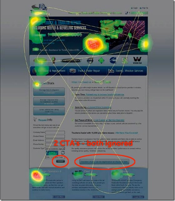
To see what they are doing on your pages, you can use heat map software like CrazyEgg to discover the most often clicked areas of your core pages, and adjust the layout to place the most important elements in the areas with the highest focus.
In the example below, you can see that visitor is jumping all around the page, and ignoring the call-to-action. It’s fairly easy to theorize that the reason for this is that the CTA doesn’t stand out from other page elements (especially contrast and color wise).
A lot of people say that button color is irrelevant, but this a complete falsehood when color contrast is the problem. Yes red might not perform better than green under ideal circumstances, but if the page is dominantly green, then a red button will stand out a lot more than a green one.

If you see something like this, you can improve the placement, contrast, size and whitespace use of your CTAs. If you see people spending a lot of time looking at the navigation or other “leaks” then you know they are confused and are seeking information elsewhere than the current page. Again, if you use a focused and targeted landing page, you can remove the potential for a lot of eye wandering and homepage A.D.D.
10. Nobody Downloads Our Content

You’ve spent the time to write an authoritative ebook or whitepaper, you’ve designed a great landing page to give it away in exchange for personal and business data. You’ve sent your entire email list to the page and shared it on your social networks. And yet, you are getting virtually no new leads from the page as nobody is completing your form to get the ebook.
It’s actually fairly easy to fix this problem. Here are three approaches to building a more effective ebook landing page.
Have a preview
Amazon pretty much invented this concept with their “Take a look inside” feature that lets you read part of the book and check out the contents. Most people are psychologically hard-wired with a sceptical “Try before you buy” mentality (think about how many people steal a grape before buying them! Yes I’m talking about you… and me). If your content is worth providing personal info for, then you should make it fair by showing off how good it is in advance.
To do this, take a portion of your ebook (a chapter for example), and make it available without barrier in one of the following formats:
- A short PDF document that people can download and read to gauge the quality of your work.
- An embedded SlideShare presentation that walks through a series of slides constructed using ebook content.
Can I say #guaranteedconversionlift?
Reduce friction
Friction is the perceived barrier to achieving a given task – in this case filling out your form. The trick here is to balance the level of friction with the “size of the prize” so that you’re offering a fair exchange. Essentially the better your ebook is, the more you ask in return. Just make sure it’s relevant data you’re collecting. Most people won’t part with their phone number to download a PDF, nor should they.
Add a viral traffic feedback mechanism
If you read the case study in part 6, you’ll be familiar with the viral feedback loop that you can use to fuel a continuous stream of traffic to your ebook download landing page. Essentially, you let people get your ebook in exchange for a tweet instead of an email. The tweet contains a link back to your ebook landing page, perpetuating the lifespan of your campaign. For best results, offer both options (PayWithATweet and exchange for an email).
So there you have it. 10 ways to fix your busted marketing campaigns. How many of these problems are you facing? I hope by next time you come back you’ll have plugged some of these holes and seen some conversion improvements in your marketing.
If you have any thoughts or suggestions about how to fix these problems, please share in the comments. I’ll see you there.
