Day 4 of Conversion-Centered Design week brings us to the mighty call-to-action. If you’re not sure how they should look or what they should say to increase conversions, you’re in for a treat. Today we have another stellar post by Mr. Michael Aagaard, the split testing junkie himself. So pay attention to this one, and learn from some of his countless case studies and experiments, all about call to action design.
Don’t forget to check out the 3 awesome posts that have already come out this week, and stay tuned for Friday’s post that will close out the week.
- Monday:The 7 Principles of Conversion-Centered Design
- Tuesday: 5 Tested Conversion Design Tactics You Should Put to Work. Right Now.
- Wednesday: 36 Creative Landing Page Design Examples – A Showcase and Conversion Critique
- Thursday (today): How To Design Call to Action Buttons That Convert
- Friday: 10 Killer Posts on Conversion & Design
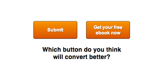
This article, packed with case studies and examples from the real world, will provide you with important insights on how to design effective call to action buttons for your landing pages.
What you need to understand about call to action buttons
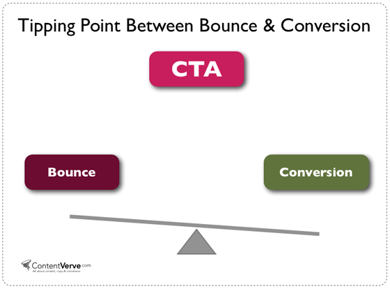
On your landing pages, the call-to-action represents the tipping point between bounce and conversion. When you ask someone to do something online, they have to go through your call-to-action in order to do it – regardless of whether you’re asking them to download a PDF, fill out a form, buy a product, or even just click through to another page.
Your buttons consist of two overall elements: design and copy
Both these elements have direct impact on conversions; however, they play two different roles in the conversion scenario.
Button design is a visual cue that helps attract prospects’ attention to the call-to-action. In other words button design answers the question, “Where should I click?”
Button copy on the other hand helps prospects make up their minds in the last critical moment and answers the question, “Why should I click this button?”
In this article we’re going to focus on button design – check out this article for a full rundown on how to write CTA copy that converts.
Let’s start with an example from the real world
I’ve anonymized the client here, but we’re talking about a major European e-commerce site that sells hand-painted porcelain.
In this case, we were able to increase sales via product pages – not just click through rate (CTR) – by 35.81% by changing the color and shape of the call-to-action button.
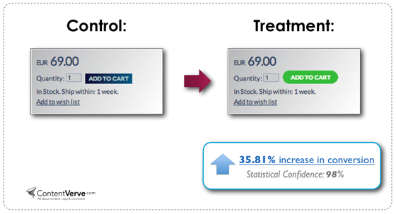
This case study illustrates perfectly how much of an impact the design of your CTA buttons can have on your conversion rate. If you’ve designed buttons to make them fit into the design with no thought to how “clickable” they are, you are in all likelihood leaving money on the table.
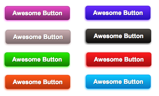
Lesson 1: There is no “ultimate button” that works every time
Buttons come in all sizes, shapes, and colors, and there really is no one-size-fits-all solution that works every time.
People like to say stuff like “You should never use red because it’s a stop color.” or “Green buttons are best!”
While such generalizations are convenient, they rarely mirror reality. What actually works will vary wildly depending on context and the layout of the landing page.
In the test I showed you before, green did better than blue. But that doesn’t mean that green is always best. I’ve seen plenty of tests where blue or red buttons have done way better than green buttons.
It’s all about standing out
The main optimization principle is that the button has to stand out from the rest of the page, so it’s easy for prospects to find the button once they’ve decided to take the next step. If your landing page is mostly green, a green button is probably not going to do very well, because it will be very difficult to separate the CTA from the rest of the page.
The best way to find out what works on your landing page is to test different versions in the real world on your potential customers.
A million colors to choose from where should I start?
My best advice is to use common sense and contrasting colors when you design your landing page buttons. The good old “squint test” is always helpful. Put together your page, take a few steps back, squint your eyes, and see if your button stands out.
Here’s an example from the real world
In this case we were able to more than double CTR on a commercial real-estate site by doing a radical redesign of the main CTA button – going from a rather obscure brownish button to a much more flamboyant orange button.
If you perform the squint test on these two button variations, it should be pretty clear which one stands out the most.
I usually start by experimenting with an orange or green button, simply because they often perform well in tests. I don’t think there is any deeper psychological reason, it just seems that they stand out on most landing pages due to the average design. Again, it’s all about context, and I’ve seen tests where e.g. a purple button has outperformed both green and orange variations.
Visual effects
Visual effects can have an impact on how much your button gets clicked, but proceed with caution! Even relatively small effects can have a surprisingly large impact – and not necessarily a positive impact.
Let’s look at a few examples from the real world
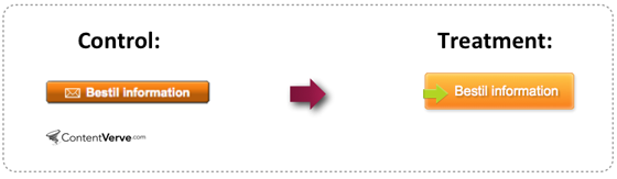
A minute ago I showed you an example where an orange button with a green arrow performed significantly better than the original “boring” brown button. Well, the designer didn’t like the new button despite the positive impact it had on conversions.
As it turns out, his main objection was the green arrow, which he found ugly. My hypothesis on the other hand was that the green arrow made the button more noticeable and thus more “clickable”.
We could have discussed our personal tastes for hours, but instead I decided to investigate whether or not the arrow had a positive effect. So I set up a simple A/B test with the range button/green arrow as the control and a variation of the orange button without the arrow.
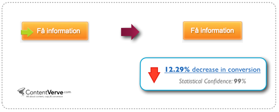
It turned out the treatment without the green arrow performed 12.29% worse than the control with the green arrow.
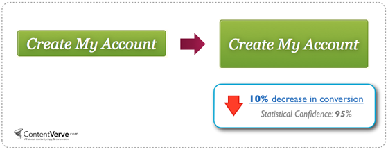
This is an example from a test I ran on the home page of a Danish portal through which you can buy and sell used cell phones.
Here I hypothesized that I could make the button stand out more and increase CTR by changing the font color of a green button from black to yellow. What a backfire! Changing the font color actually decreased click through by 18.01%.
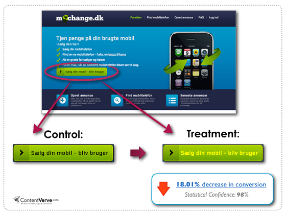
So in this case the visual effect had a directly negative effect on conversion, and it turned out that the less colorful variant performed much better.
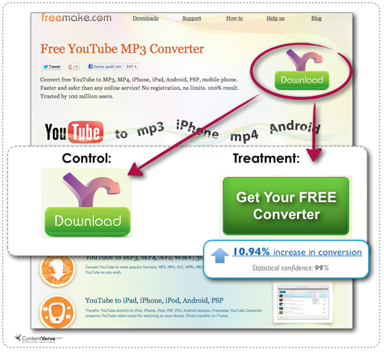
It’s really difficult to predict these outcomes without actually testing them in real life. But my advice is to keep it simple and within reason. It’s easy to go overboard on the creative solutions, but I generally find that simple variants (that are easy to recognize as buttons) with relevant copy perform better than artsy variants.
Here’s an example from the real world where a simple green button with relevant copy outperformed a creative variant by 10.94%.
Size matters – but bigger isn’t always better
I see a lot of designers make the mistake of creating buttons that are perfect from an aesthetic point of view, but way too small from a conversion stance. It’s important that your button is large enough to stand out clearly as a clickable element on the landing page. But this doesn’t mean that bigger automatically is better.
Here’s an example from the real world where making a button a lot bigger actually had a negative effect on conversion on a payment page.
My hypothesis is that the larger button simply became too big, drew too much attention, and thereby made the prospects feel pressured to carry out the conversion goal.
So again my advice is to go big with your buttons but not overboard – again testing is the best way to become certain that you’ve chosen the right size.
Respect the CTA copy!
I’ve heard designers say “Nobody reads button copy.” – well that simply isn’t true. I have a back catalogue of about 30 tests that prove the opposite; Button copy has major impact on conversion and people do read it!
In fact, apart from your headline, your CTA copy is one of the few pieces of copy that you can be 99% sure that your prospects will read.
Here’s an example from the real world
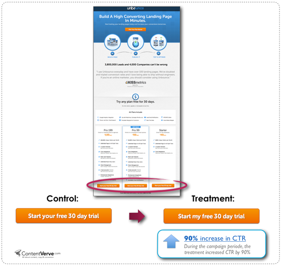
Oli and I recently ran an A/B test on an unbounce.com PPC campaign landing page of which the goal was to increase the number of prospects who signed up for a 30-day free trial.
The only thing we did was to tweak one word in the copy – we changed the possessive determiner “You” to “My”. After running the test for three weeks, the treatment button copy, “Start my free 30 day trial” had increased CTR by 90%.
In many cases the best copy might be seem wordy and out of proportion from a design perspective. But in my world that doesn’t really matter as long as it’s the version that gets the most conversions. Therefore, it’s crucial to keep your mind open to long copy variations when your designing your buttons.
For more on how to write CTA copy that converts check out this article or watch this video.
What you should do now
Go over your landing pages and scrutinize your call-to-action buttons. Do they stand out from the page? Are they easy to recognize as buttons? Are they merely there as a part of the design?
Perform the squint test and consider whether you could change the color or ad a visual effect to make the button “pop” more.
Use your observations to come up with ideas for new buttons and use a free tool like buttonoptimizer.com to design a number of treatments that you can test on your landing page.
If you use unbounce.com as your landing page platform, setting up a button test is as easy as 1, 2, 3. Otherwise, learn more about A/B testing by reading this article.

