Smart marketers create landing pages that tell engaging, seamless stories.
Every element of design, copy and social proof plays its part in the narrative and guides the visitor toward your conversion goal.
But not all landing pages have happy endings.
If there are elements on your landing page that don’t serve a distinct purpose, or otherwise give your prospects a reason to stop and think, then you’ve failed to create a delightful landing page experience.
In our latest episode of Page Fights, regular judges Oli Gardner and Peep Laja and guest judge Ian Lurie, CEO of Portent, identified a series of landing page mistakes that disrupted that narrative.
Here are seven lesser-known but all-too-common landing page optimization mistakes that give prospects cause to pause, adding friction to their experience and hindering your conversion rates.
1. Your landing page elements are out of order
Though the banner on Speak2Leads’ landing page has great design, placing it up top does no favors for the clarity of the page.
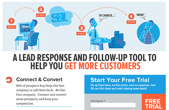
The judges agreed that leading with a hard-to-decipher graphic starts the user experience off with confusion.
Oli suggested leading with the headline to give the page a bit more context and create a more logical narrative flow for the visitor.
For extra impact, Oli suggested testing the headline for one that leads with a more specific benefit, such as this interesting stat from lower on the page: “85% of prospects buy from the first company to call them back.”
2. Your uncompressed images are slowing down your page
In the world of conversion rate optimization, small stuff matters.
If uncompressed images are causing your page to load slowly, you could be losing a significant number of prospects before they even see your landing page.
Ian pointed out that the images on Lonestar Premier Outdoors’ landing page were roughly 2-3 times bigger than they needed to be (in terms of the file size, not dimensions).
Compressing those images, Ian explained, could result in faster load times and an easy conversion win.
.@portentint says: Keep image file sizes small to maximize site speed. #PageFights
— Portent, Inc. (@Portent) September 19, 2014
If you haven’t yet compressed your images on your landing page, these are the tools Ian recommends:
3. You’re not speaking their language
If you want your offer to resonate with your prospects, then you need to speak their language.
Ian questioned whether or not Speak2Lead’s target audience really uses the term “Lead Response and Follow-Up Tool,” which appears in their headline.

After a quick Google search, he found that “Lead Response Management” seemed to be the preferred term.
Similarly, Ian wasn’t sure if the headline on BuzzTime Business’ landing page was crafted to speak to its target audience: “If I’m a business owner, I’m not sure that this headline is really targeting me.”
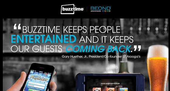
Though the headline paints a picture of bringing in repeat customers, it speaks in the third person and requires the visitor to connect the testimonial to their own business.
“Using a testimonial as a headline is fine – as long as you’re not sacrificing context or clarity.” – Oli
Peep’s beef was with the form copy lower on the page:
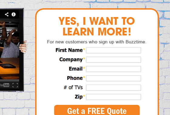
For Peep, the “Yes, I want to learn more!” headline isn’t the best way to connect with visitors because it oozes fake enthusiasm.
"Leave the enthusiasm to the user." @peeplaja #pagefights
— Seth Overly (@SethOverly24) September 19, 2014
4. Your opt-in form requires too much thought
An effective landing page opt-in form will never create friction for the visitor.
Though Lonestar Premier Outdoors’ decision to use icons instead of field labels is visually pleasing, Oli felt it sacrificed clarity.
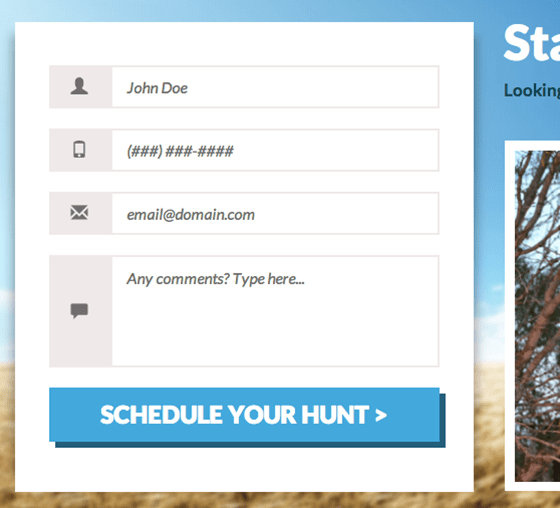
Oli explained that “having icons instead of field labels requires additional interpretation and creates ‘perceived friction’ in the mind of the visitor.”
In the same vein, Oli thought the in-field placeholders create friction because they make the form look like it’s already filled out.
To this point, a viewer wondered:
what is the better option instead of in-field labels? I think they help conserve space on the form #PageFights
— Danielle Enzinna (@DanielleEnzinna) September 19, 2014
Peep explained that having in-field labels is problematic as soon as you have more than two fields in your form because it creates a usability problem; some prospects might click and forget what they were filling out. And that creates friction.
Useful rule of thumb: "In-field labels work with 1-2 fields, with more, go with top of the line" – @peeplaja #PageFights
— Aviva Pinchas (@in_a_pinch) September 19, 2014
If you’re going to stick with in-field labels, the judges shared a couple of usability tips:
- “When I click in the field, that text needs to disappear.” – Ian
- “If you need to keep the in-field label, make the placeholder text recede into the background when the field is clicked.” – Oli
The bottom line?
Think about the experience your prospects will have filling out your form. Now make that experience seamless.
5. Your call to action doesn’t continue the conversation in your prospect’s head
Oli thought CSI’s opt-in form started off with a very powerful headline that tells the prospect exactly what they’re going to get by filling out the form.
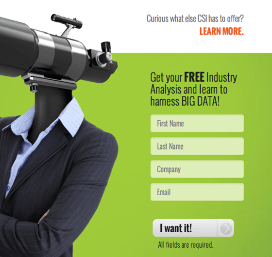
That said, he thought it fell flat with the “I want it!” call to action, which felt vague.
To make the call to action more inspiring, Oli suggested a tactic shared by Joanna Wiebe at the recent Call To Action Conference:
Repeat headline copy in your button! – @copyhackers #CTAConf
— Eric Burgess (@EricBurgess) September 12, 2014
On another landing page, Peep wasn’t a fan of this call to action button:
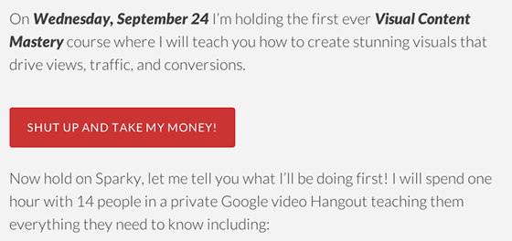
As Peep explained, “Your prospect isn’t actually thinking, ‘Shut up and take my money.’”
He suggested testing something that more closely mirrors what they’re thinking when they visit your landing page.
Whatever it is, Peep cautioned, don’t make them think of the pain of spending.
6. Your images don’t show context of use
The rudimentary design of Dynamic Lifestyles’ landing page wasn’t the only thing that turned off the judges.
The judges agreed that the images failed to show the product in context. As Page Fights moderator Tommy Walker put it, “It’s hard to visualize what the product does.”
Oli recommended showing the product in action (even if only in the splash page of the video) to allow visitors to immediately understand what they’re looking at.
Spreadsheets App’s landing page suffered from a similar problem.
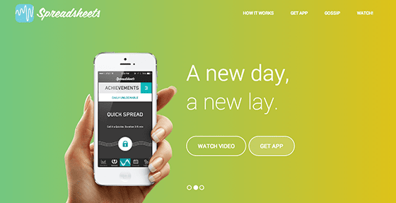
At a glance, Ian didn’t realize this page was for a sexual activity tracking app. He thought it was a serious analytics app that was trying to be cute with double entendres.
Oli summarized it well:
The video is clever, but there’s nothing on this page that tells you what it does. Let’s get some sexy, happy people in there!
Along with a better hero shot, Ian suggested a more descriptive headline:
“The title tag is ‘#1 sex app.’ I’d put that right at the top.”
In other words, get straight to the point.What is your product and why does your prospect need it?
7. You’re not showing what distinguishes you from the competition
The copy on many of the pages that were critiqued didn’t speak to what differentiated the companies from their competitors.
Lonestar Premier Outdoors’ landing page offered guided quail hunts in Texas, but it didn’t show what made their their guided hunts the best in the state.
“What makes this quail hunt better than other Texan quail hunt sites? Are they donating money to the families of the dead quail?” – Ian
Similarly, Peep found that BullyMax’s landing page made the argument for giving vitamins to your pitbull, but didn’t speak to why people should choose their product specifically.
For Peep, this is important because it’s a dog-eat-dog world.
Unique value prop is key – "Any niche where there's money to be made, there's more than one player." – @peeplaja #pagefights
— Aviva Pinchas (@in_a_pinch) September 19, 2014
As Peep explained, no matter what niche you’re in, you have competition. Make it easy for your prospects to choose you by showing what makes you unique.
Every element on your landing page should contribute to the conversion goal
Our hope is that these cautionary tales will help you improve your own landing pages so they create seamless experiences for your visitors.
If there is an element on your landing page without a purpose, consider cutting it.
Every section of a landing page should justify its existance. What purpose does it serve? Does it do it well? #pagefights
— Emese (@egaal) September 19, 2014
Are you guilty of telling a disjointed story on your landing page? Let the conversion experts set the story straight in the next episode of Page Fights by submitting your landing page here.


