
When you donate to a charity online, where does your money go?
Just by searching on Google for a few minutes you can find plenty of not-for-profit organizations (NPOs) and non-governmental organizations (NGOs) landing pages.
Are these organizations getting the most out of their advertising budget? Could they generate more donations with less ad spend?
With optimized landing pages they could.
But the sad truth is, a lot of these organizations seem to be running landing pages that fall flat. Landing pages that are full of leaks. Landing pages that are in serious need of some optimization.
Let’s take a look at 10 non-profit landing page examples and what they could be doing to generate more donations.
1. Canadian Red Cross
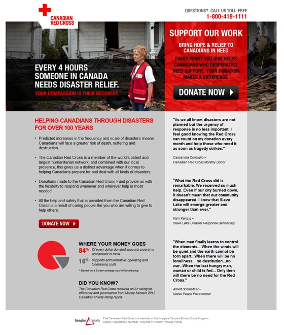
Distractions are at a minimum
This is one of the few non-profit landing pages that does a good job of limiting distractions. Most of the landing pages you will see in this post have many links or actions that the visitor, diluting the end conversion goal. The Canadian Red Cross does a good job of keeping the visitor focused on the donation.
Strong headline needs more attention
The headline is great. It pairs a powerful stat with an emotional subhead. The only problem? There isn’t enough attention toward the headline. It kind of gets lost in the design of the page. I’d like to see this headline stand out from everything else so that it gets read first.
Boost your call to action
This call to action needs two things: Emotion and contrast.
The button blends in with the rest of the page (everything is black, white or red). Simply making the CTA a different contrasting color should boost the click through rate (CTR) of this page.
Secondly, this call to action needs some emotion. How about something like this:
Donate Now
Bring hope to Canadians in need
Body copy can be more specific
The main concept in the body of this page is that they’ve been around for over 100 years. This is a valid point to get across on this page, but it shouldn’t be the focus of your supporting copy.
Instead this page would be far more powerful if it was specific to a need. For example a headline like this:
“Canadian Families Are Struggling Right Now Due to [insert relevant disaster here]”
If you can reference an event that a visitor can relate to, the page will perform much better.
2. Charity: Water
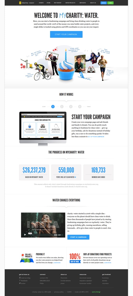
Ya, ya – we know this isn’t a *true* landing page”, but there are some elements that you can learn from the page so we thought we’d include it. For educational purposes :)
I love this charity, but I’m certainly not biased when it comes to their landing pages… and this one has a few problems.
Make me understand the purpose of the page
The term ‘welcome to’ shouldn’t be used, we’re not in the 90s anymore and it’s a waste of valuable space. Of course I’m welcome. If I wasn’t welcome you wouldn’t have created the page in the first place.
Why not tell me why I should be here, and what I can do. A headline like this would help me to understand the purpose of the page.
Create your own Charity: Water campaign
With myCharity: Water you can bring fresh, clean drinking water to the people who need it most
Am I eating cake?
The design of this page is polished and modern. However, to me it doesn’t make any sense. Am I eating cake on this page? Why would a cupcake and a candle be the largest visual cue on a page about water?
I understand that “15,000 people have given up their birthdays” but how? Why? And what does it have to do with this page?
More explanation is required for the visuals at the top of this page. Even a headline above the imagery like:
See how thousands of others are using their myCharity: Water campaigns to promote clean water
Explain the call to action and eliminate fears
“Start Your Campaign” is a decent call to action, but I’d like to see some type of explanation about what I’m about to commit to. Is it going to be hard? Am I going to be sending a bunch of stuff to my friends and family? How long will this take?
And most importantly: Am I really able to make a difference?
Possibly the “How it works” section could do better above the birthday cake to explain the process.
Write out a list of objections that your visitor will have and make sure your landing page addresses each one.
3. Sight Savers
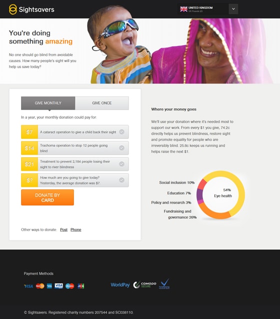
Praise to the main image
This is a powerful image to use on the landing page. That being said, strong images on any landing page need to be tested well to ensure that they aren’t in fact hurting conversion rates.
I would also add any information about the people in this image to the page. Maybe a small caption explaining who this child is and when they were treated.
What does this headline mean?
Unfortunately the image is strongest element. The rest of this page leaves a lot to be desired. This headline doesn’t mean much. Remember your copywriting basics when writing landing page headlines. Tell me where I am and why I should care.
“You’re doing something amazing” doesn’t say much. And to be exact, I haven’t even done anything yet so it’s really not true. For all they know I could be driving an SUV, littering and reading this page on my phone while driving.
How about this:
Xxxx children were diagnosed with diseases that cause blindness last year
Help save a child’s sight today by donating as little as $7
You’re over thinking the user interface
I like that they’ve turned the donation into a multi-step process (see the last critique) but this layout is really difficult to understand.
I would scrap the whole thing and get back to basics. Make the dollar amounts stand out by using a dark color on white. Instead of the user having to select the amount and then click on “Donate by card” why not just have a call to action for each donation amount?
Donate $7
Donate $14
Donate $21
Donate _____
You’ve just eliminated one extra click standing in your way of conversions.
4. UNHCR

Punch up your headline
This headline gets a C-. To get an A it needs to move me and provide some powerful figures. The points to get across are already in the copy so we can pull some for the headline:
More Than 10 Million Refugees need the support of generous people like you
What’s with the form?
If you’re going to use a really skinny form, then you need to keep it short. I don’t want to scroll for two pages just to fill out a form. Turn this form into a two step process.
Oh, and lose the bloody “Submit” button. Submit doesn’t say anything and should be replaced with a strong call to action. Something like this:
Send my gift
In support of refugees
5. World Vision
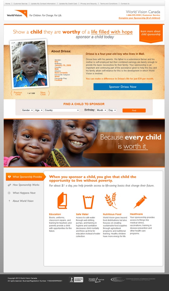
This is a pretty nice landing page so first I’m going to go over the page elements that are successful.
Leaks Leaks Leaks!
Believe it or not this page is actually a landing page for World Vision. Instead of removing the top navigation of the page, they instead chose to just make the links smaller. Remove them. They just present an opportunity for the visitor to get distracted from the end goal and don’t add any value.
Headline is direct and emphasized
This headline is to the point, but not only that, World Vision has emphasized words that they feel are important. This is a successful way of bringing attention to the important parts of your headline.
On Page engagement
This page engages the visitor with options to view multiple children and a call to action to sponsor a specific child. This is an excellent use of their call to action because when a visitor connects with a certain child they can choose to sponsor right away.
I would however test this area of the landing page. Sometimes giving visitors a choice can be detrimental as well. If you overwhelm the visitor or give them so much choice that they can’t even decide you may sacrifice some conversions.
Calls to action
The calls to action are the only part of this page that I don’t like. The way that they’ve put “Sponsor Drissa Now” right above a different page goal “Find a child to sponsor” is confusing.
I would change the second call to action to say “Or, find a child by country” and then eliminate the extra fields. By searching only by country the visitor can start their search quickly and easily.
The next element to add is a call-to -ction at the bottom of this page – under the information section. You don’t want to lose visitors by having them get lost.
More and more internet users are getting used to scrolling around pages, but charities also cater to a broad demographic. Keep it in mind when you’re designing your landing page.
6. IFAW
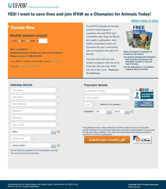
I’m torn on this page. It has some elements that are on the right track, but ultimately it falls flat. Here’s why.
The headline is not a headline
The headline on this page is better suited right above the donation form. It will help to cement the commitment to give a donation but doesn’t add any value on the top of this page.
Instead this page needs a headline that talks about the cause, and the good that can come of a donation. Try something like this:
Animals in distress need your help
Donate today and free animals around the world from disaster
The form is all over the place
Where is the form? Is it at the top of the page? The left? The right?
This form needs to be consolidated to one area so that visitors don’t get lost. If you make a form hard to fill out you’ll inevitably lose conversions. The animals are counting on you, don’t lose focus!
Also, I would test this form as a two-step process. Get the contact information first so you can market to these leads if they do not complete the billing page.
7. Doctors Without Borders
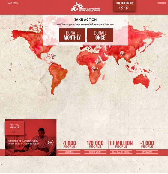
Where’s the headline?
I dig this page’s simplicity, but I don’t feel that a simple headline is right for a very simple page. “Take Action” is too generic. Try something like this:
Take action now to help medical teams save lives
Your much needed support goes directly to the field
Decent calls to action
The calls to action on this page are simple and obvious. The only issue is that they might blend in a bit too much with the page. I would choose a contrasting color for these CTAs that makes them stand out.
Oh, and lose the social buttons at the top. They aren’t needed on this page and could distract from the goal of the page. Instead, put the social sharing buttons on the thank you page to promote more social donations.
Where are the stats?
This page has some great stats… at the bottom of the page. I would make the stats more obvious to visitors by bringing them up a bit (not too much) and bringing more attention to them with a contrasting color to the map. This will ultimately support your calls to action by cementing the good that this NPO does.
8. Feed The Children
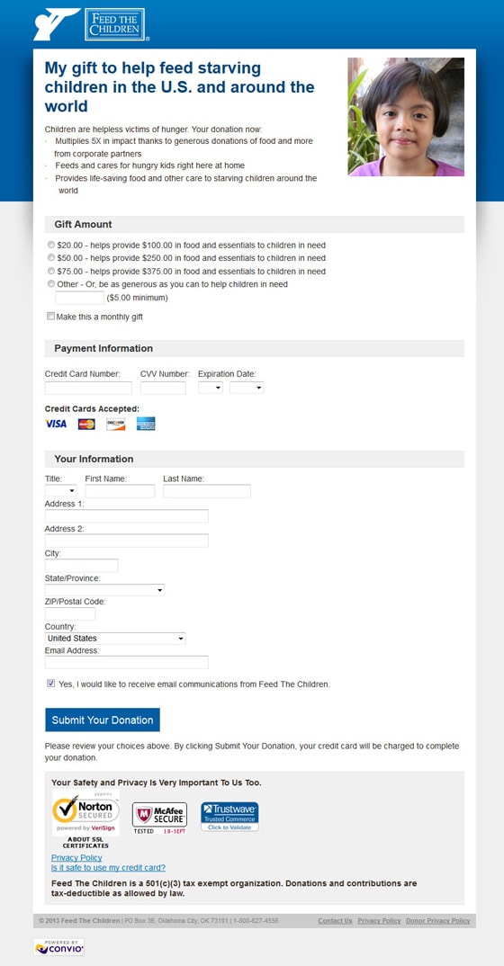
This headline is confusing
The wording of the headline is kind of awkward. It’s not really obvious why “My Gift” is used in this context so I would scrap it. The headline can be massaged into something that is easier to read and connects with the visitor more:
You can help feed starving children in the U.S. and around the world – Donate your gift below
Give me more stats
The copy on this page explains what the donation will be going towards. However, there are no hard stats on the good that this charity has done in the past.
I would include some real stats to back up these claims and possibly some social proof. For example, explain who the child in the photograph is or include a quote from a family that was helped by the program.
Test your security icons
Secure icons can have a big impact on conversions. Make sure you’re not losing donations by split testing the secure icons at the bottom of the page.
9. Oxfam
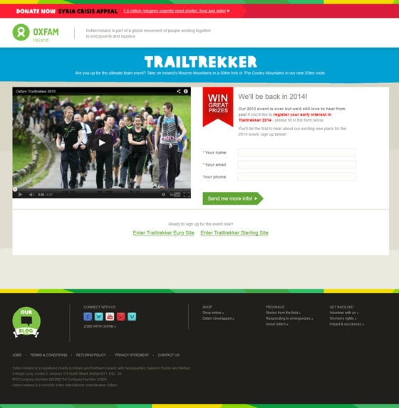
Your headlines are backwards
The name of your event is not a headline. “Trailtrekker” should be treated as a logo or a slogan that brands the event because it doesn’t mean anything on it’s own. On this page it’s treated as the headline.
The real headline on this page is the text under the trailtrekker logo and it should be the most prominent text on the page. Making this text bigger will ensure that all visitors read the headline and are given the chance to connect with the event.
Your form is great, but…
what’s with the other links on this page? You have a banner about the Syria crisis at the top, and two links to go to the main site at the bottom.
Instead, focus on the conversion first. After the conversion is made you can promote the site or donations to Syrian relief. This way you will be focused on building your list of prospects and be able to do more good in the long run.
10. Ride To Conquer Cancer
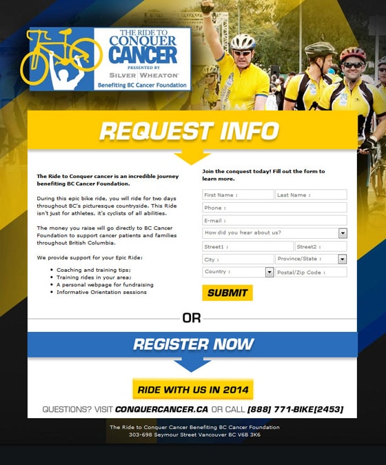
At first glance I liked this page, it had bold colors and minimal leaks. With that being said, there are some room for improvement.
Prioritize your copy
Since when did “Request Info” become the most important thing for a visitor to read? On this page it’s the most prominent text. It hits you in the face when you land on the page.
Thing is, this page actually has a headline. It’s just not treated as one. Use the line “The ride to conquer cancer is an incredible journey…” as the headline and draw visitors into your landing page. Scrap “Request Info” all together.
Submit what?
Submit is the worst call to action ever. I’m hoping for the day when I do a landing page critique post and it doesn’t come up, but it seems that landing page designers are intent on making my blood boil.
Use a call to action that actually means something. How about something as easy as this:
Send me more information about the ride
Amnesty International
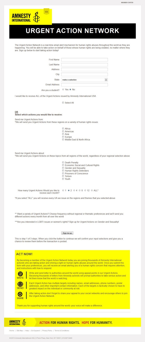
What does the headline mean?
Urgent Action Network is a title, not a headline. The point of a headline is to get the visitor to read the next line. In order to accomplish that, you need to write a headline that entices the reader to learn more.
Urgent Action Network needs to be used as a title or a logo instead of a headline. The real headline should be something like this:
Get Real Time Email Alerts About Human Rights Abuses Around The World
And maybe a subheadline like this:
Find out about events as they are happening so you can take action
This form is a mess
It’s hard to determine what’s going on with this form, and the only people who will sign up are those who are really motivated to do so. If you want more conversions you have to make the path to signing up very easy.
Instead of a long list of text and check boxes this form can easily be consolidated into a short form. Put the options on the left side of the page and then place the form fields (name, email etc.) on the right.
Next, boost the visibility of your call to action. Make the button have a strong color and have it say something like this:
Sign Up For Real-Time Alerts
What’s next?
Most of these non-profit landing pages could use some TLC. With a bit of focus, good design and better calls to action these pages can clearly demonstrate the value of their mission and make these NPOs more efficient in raising donations.
Writing this post begs the question: with so many talented digital marketers out there, why are these charities falling short on producing excellent landing pages?
Maybe instead of donating money to charity, our industry could donate more of our time. After all, if optimization could improve a charity’s conversion rate by 10-20% just think about how much of a difference that could make…

