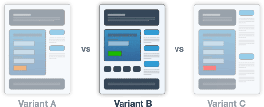
Today’s infographic covers the gamut of sales funnel testing, but I’m going to flip the order a bit to show how it should piece together for your marketing campaigns.
Here’s how KISSmetrics have ordered it in the infographic:
- Test your landing pages
- Test your signup forms
- Test your PPC campaigns
- Test your media buying campaigns
- Test your email campaigns
All of these can improve your conversion rates, but the way in which you position them needs careful consideration as they’re distinct campaign entities. Forms usually appear on landing pages (with some exceptions such as email newsletter registration), and numbers 3 to 5 need to be considered as mechanisms by which you drive traffic to your landing pages.
Landing pages are the glue that binds your campaign together, and for a truly optimized experience, both the source and destination should be tested – as we’ll find out below.
Appropriate campaign flows:
PPC campaign -> Landing page
Email campaign -> Landing page
Media buying campaign (banners) -> Landing page
Email campaign -> Landing page
How Do These Flows Benefit My Marketing?
I’ll explain the benefits of each, but first you need to look at the infographic, then I’ll continue at the end, with 5 juicy marketing tips.
Tip 1 – Segmentation
Even for the same campaign, if you segment your marketing by sending each source to it’s own landing page, you’ll be able to measure the relative performance of each. This lets you decide which of your segments are performing best/worst, and assign testing priority accordingly. It also allows you to apply different levels of messaging to both the source and destination as we’ll see in tips 2 through 5.
Tip 2 – A/B Testing Sign Up Forms
Forms are the king of the lead gen jungle, and designing them right can make a huge difference in how successful your marketing performs. Some critical aspects of A/B testing form design are:
- Visual design: If you have a form on your landing page, then it’s your primary conversion goal. As such, it needs a great deal of design consideration. Your ‘conversion centered design’ business goal is to attract eyes to the form, and you can do this by using principles such as: encapsulation (placing the form in a container to highlight it), pointing to it with directional cues (arrows are good), or using sight lines from photos to look at your form area. Read “Designing for Conversion – 8 Visual Design Techniques to Focus Attention on Your Landing Pages” for more detail.
- Number of fields: It’s simple, don’t ask for what you don’t need. This has been debated to death, and every stakeholder in your company will an extra piece of data, but think of the person on the other side for a second……. Is asking for their date of birth and address too personal? Is a fax number really a required field? Come on now. At the end of the day, testing your forms is the best way to remove conjecture and show which length of form yields the highest conversions, whilst pacifying the need for customer data.
- Field name position: You typically have two choices here. To place the field title to the left of the field, or above the field. Studies have shown that by placing the name above the form field, you reduce the amount of work required by the eye in determining which title applies to which field box. Compared to placing the name on the left, where your eyes are forced to jump from side to side. It might seem like a small detail, but it alters the time required to complete the form, which can lead to a small percentage of people giving up – especially on complex forms.
- The size of the prize: Nearly all forms lead to something of value: a newsletter, webinar registration, account signup, ebook download etc. And you need to strike a balance between the perceived effort of completing the form with the value of the prize on the other side. In the mind of your visitors – “Am I willing to climb this hurdle to get that?”
Tip 3 – Testing PPC Campaigns
PPC campaigns need to be consistent and monitored. Once they are running well, they should not be touched, unless you are testing them for a higher click-through-rate. The landing page content and headline for your PPC campaigns should mirror the ad headline very closely to maximize your Quality Score.
But if you’re driving traffic from multiple sources (email, social etc.) then you run the risk of someone needing to change the landing page to match what they’re doing. This causes your campaign to cost you more money as your Quality Score plummets and your CPC climbs. Hence the need for segmentation.
Tip 4 – Testing Email Campaigns
Emails provide an obvious need for segmentation. The length of your emails can have a direct impact on conversions – in this instance the click-through-rate (CTR). Email length is a great element to test, but generally, shorter is better. The main reason for this is that you don’t want people to get excited by your brilliantly sculpted subject line, only to baulk at 10 paragraphs of text when they open the email.
Landing pages to the rescue! Landing pages allow you to keep your emails really short and to the point, with your call-to-action assuming a greater prominence as a result. They do this by letting you transfer the bulk of your message to the landing page, where you have the space and design freedom to really move into persuasion mode. This will in turn lead to a higher conversion rate. FTW.
The best thing to test on your emails is the subject line: MailChimp does a great job of this, where they let you A/B test the subject line for 20% of your list, then 80% get sent the winning version.
Tip 5 – Testing Banner Campaigns
I don’t really like banners, but I guess I need to include them anyway. Ok, 4 simple rules to improve conversions:
- Know your source: If you know where your banners are being placed (think strategically here), then you can design your banners to stand out from the crowd. Think contrast and simplicity. Poor banner design single handedly led to the banner blindness epidemic that’s lasted for 20 years.
- Intrigue: Do you remember the classic ad that said “Don’t click this button” – everyone did. Why? Because there was no context and they didn’t know what would happen. A word of caution, some context is good, as is a strong brand. You don’t want to pay for wasted clicks. SEOmoz has an intriguing way of doing this by using retargeting banners that say nothing and just have their logo on it. A subtle nudge to keep them in mind.
- Testing: You need to pick an ad platform that lets you test your banners. By raising your CTR, you’re maximizing your traffic. Then it’s up to the landing page to take the baton and run your potential customers to the finishing (conversion) line.
- Message match: This applies to all of the above, so I’m going to finish with it as a closing note. Your landing page needs to match your ad visually (especially for banners), it needs to have a tightly connected message, and it needs to continue the story that began when your prospect clicked the ad. Without message match, your campaigns will fail and cost you money. Fact.
So there you have it. A reason for segmentation and testing in your marketing. And yes (blatant plug warning), Unbounce is great for that.
Tweetables
Share these testing tips with your followers. And don’t worry, you can change the tweet text before it goes out.
- Signup form Tip: Confusing field text can discourage visitors from filling them out.
» Tweet This « - Note to Self: An attention grabbing headline encourages visistors to stay on your website
» Tweet This « - Run two PPC ads with the same body text but different headlines
» Tweet This « - Email Experiment: The best thing to test on your emails is the subject line
» Tweet This « - Email Experiment: Try testing ‘rich-text’ vs ‘plain-text’ for higher conversions.
» Tweet This «


