It’s no coincidence that the most actionable landing page critiques are also the most brutal.
A little tough love from conversion rate optimization experts can bring to light what hours of A/B testing and conversion marketing research won’t tell you.
So for the 400 brave souls who submitted their landing page for brutal review on the latest episode of Page Fights, a little public shaming was par for the course. This month, judges Oli Gardner and Peep Laja were joined by Joanna Wiebe of Copy Hackers for the most unforgiving round of Page Fights yet.
Lots of burns and finger-less gloves coming from the #PageFights panel @oligardner @peeplaja @copyhackers
— Griffin Roer (@griffinroer) August 8, 2014
Many of our contestants were dissed for their landing page shortcomings, but they walked away with tons of valuable CRO insight. You can watch the full episode here:
Below, we’ve compiled the distilled wisdom from Joanna, Peep and Oli so you can see how your own landing page compares to that of our Page Fights contenders.
Before you throw your landing page into the ring for consideration on the next episode, be sure you’re not making any of these conversion marketing mistakes.
5 Conversion Killers That Will Get Your Landing Page Disqualified
1. The opt-in form causes friction
Though Snap Agency’s landing page has a streamlined design, each of the judges had a bone to pick with their opt-in form.
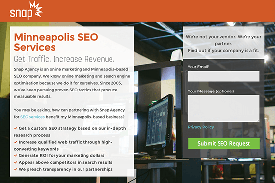
- For starters, Peep felt there was a disconnect between the offer on the page and the call to action. While the sub headline promises more traffic and revenue, the CTA button copy encourages leads to “Submit SEO Request.” For Peep, this lack of message match has the potential to confuse prospects and reduces the chance that they’ll fill out the form.
- Additionally, Oli pointed out that the form’s header is confusing when read in isolation. He explained, “You need to introduce the purpose of your form before you ask people to fill it out. Your form should be able to stand alone on the page.“
- Joanna questioned the need for two form fields if one of them is optional: “Forms can be good for qualifying prospects, but if half your form fields are optional, really think hard about whether you need all of them on the page.”
Similarly, Styler had a sleek landing page but Oli felt that their opt-in form was unnecessarily convoluted.
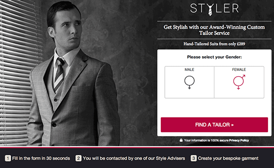
Oli pointed out that the steps below the form encourage leads to “Fill in the form in 30 seconds,” when there’s no form to be found on the page. He also criticized Styler’s decision to segment their users on their landing page – especially coupled with an image of a man as the background. He explained that it adds another step to filling out the form and could cause women to think they’re in the wrong place.
Oli suggested an alternative that could potentially increase conversions:
“Don’t make users self-segment on your landing page. Segment in your ads.” – Oli
2. The social proof has the opposite intended effect
Though social proof is universally accepted as being an essential element of any high-converting landing page, many contestants failed to implement it effectively.
C.R. England’s landing page had fine print that explained that real images of their employees had not been used:

Peep thought that this raised questions about the legitimacy of the testimonials: “If the workers were proud of working for the company, they wouldn’t want to hide their faces.”
For Joanna, the testimonials weren’t that strong to begin with. Coupled with the fake photos, she wondered if the testimonials were bringing negative social proof to the page.
Another example of questionable social proof was found on Styler’s landing page, which referred to an award without listing the award in question:

The judges wondered about the legitimacy of the mysterious award and whether it had been made up in a failed attempt at social proof.
“who gave them this award?” “their mom.” nominating this for best thing said so far #pagefights
— Olivia Roat (@OliviaCRoat) August 8, 2014
Finally, Snap Agency’s landing page had some ambiguous badges without any context for why they were included.
In reference to the Google Analytics badge below, Oli said, “They’re certified for something, but you can’t read it.” The judges agreed that without sufficient context, the unclear badges took up valuable real estate and even hurt the credibility of the page.

Which brings us to our next conversion killer…
3. The page isn’t credible
You can work as hard as you’d like at creating a beautiful landing page chock-full of conversion-centered design, but a simple overlooked element could be seriously hurting the credibility of your page. Lucky for the contestants, many of the credibility killers that the judges spotted are a quick fix.
Go Paisa’s landing page had a lengthy form ending with a math problem form field to help prevent spam.

For Peep, this was problematic for two main reasons:
- An extra step reduces the likelihood of a prospect completing the form.
- CAPTCHAs and other spambot-repelling tests put spam top-of-mind for your prospects and make your offer feel less legitimate… and they tick people off.
‘Nuff said.
On eBoundHost’s landing page, Joanna pointed out that the way the logo rested between the blue and black sections of the header made it look like the page is broken.

As subtle as this might be, Joanna explained that small details can play a larger part when it comes to negatively impacting trust and conversion rates. A viewer summed up her point neatly:
Love @copyhackers point about design’s capability to build trust (or lack thereof).. if your page looks bad or broken, no trust. #pagefights
— Matt Diederichs (@mattdiederichs) August 8, 2014
In a similar vein, Tag Team Design’s landing page hit a nerve with Peep.
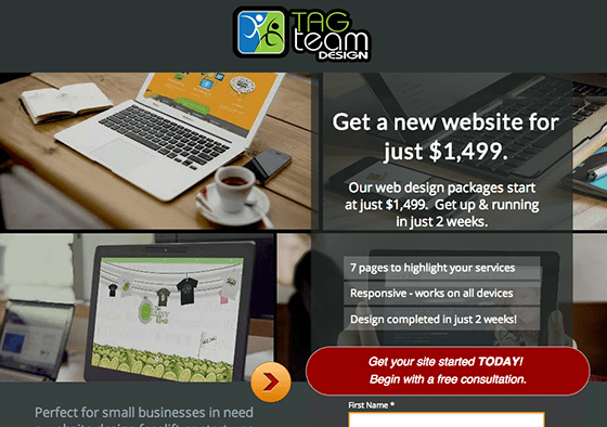
For a company that specializes in web design, Peep didn’t think their landing page felt current. And without a portfolio to show a variety of other page designs, the service just didn’t feel very credible or trustworthy.
Drink the Kool-aid of what you sell/do. Don’t have a poorly designed site when selling site design. #PageFights
— Nicole Mintiens (@Tregesy) August 8, 2014
And Peep really let them have it for failing to drink their own Kool-Aid:
“I made my very first website in 1994. It looked liked this. Any 30$ theme in Themeforest would look better.”
Buuuuuurn! #PageFights
— Tag Team Design (@tagteamdesign) August 8, 2014
To add insult to injury, Page Fights’ producer Tommy pointed out that although the company advertises responsive web design, their responsive site breaks. Ouch.
4. The CTA doesn’t inspire action
Though Oli praised QC Makeup Academy’s landing page for having the best headline the judges had seen thus far, he said their call to action button got lost in the sea of other possible actions.
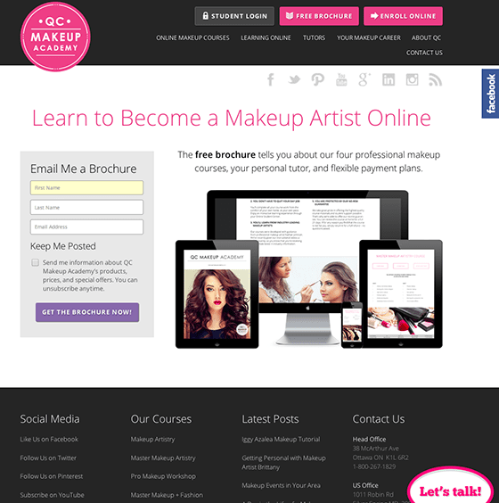
With an attention ratio of at least 60:1, Oli suggested removing the nav and footer entirely to bring the page closer to the ideal attention ratio of 1:1.
“The ratio of what you can do to what you should do is too high” – great way to explain the point of CTAs! #PageFights
— Aviva Pinchas (@in_a_pinch) August 8, 2014
But Peep found the call to action on Myagi’s landing page even less inspiring.
On its own, the “Train up to 50 staff for free now” button copy isn’t terrible. The problem Peep had with it was the lack of message match with the headline:

For Peep, the momentum created by leading with “increase sales” in the headline falls flat with a CTA button that promises to “train staff.” It’s a pretty underwhelming leap and it doesn’t make leads want to click on the call to action button.
5. The unique value proposition isn’t clear
Though a unique value proposition is one of the five essential elements of a high-converting landing page, poorly-defined UVPs kept cropping up on contestants’ landing pages.
For Peep, Snap Agency’s UVP got lost in the keyword-stuffed wall of text:
“I read the copy, and it isn’t written for humans. It’s keyword stuffing.” – Peep
Joanna agreed, taking particular issue with their headline: “Minneapolis SEO Services: Get Traffic. Increase Revenue.” Although the headline is descriptive (and maybe SEO-optimized), Joanna felt it didn’t speak to what differentiated Snap Agency’s service:
“There’s something to be said about being descriptive in your headline, but the rest of the copy doesn’t support the headline. It doesn’t add anything and it doesn’t make you stand out as the best solution in Minneapolis for SEO services.” – Joanna
Joanna suggested that the headline and supporting copy would be better served clearly communicating Snap Agency’s unique value proposition.
My takeaway from this month’s #PageFights thus far. You can’t underestimate the importance of clarity and sending a clear message.
— Christopher Griffith (@thechrisgriff) August 8, 2014
Similarly, Open Topic’s landing page lacked clarity on who the offer was intended for. Right off the bat, Peep wondered, “What’s the value proposition?”
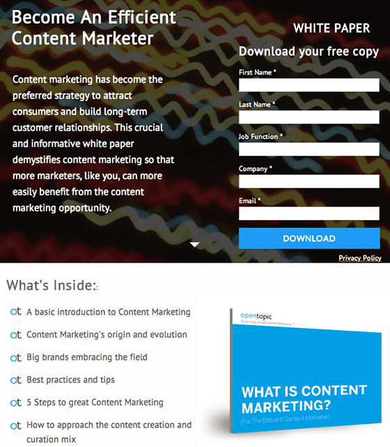
Joanna agreed: “If I’m a content marketer, why would I be interested in a whitepaper entitled ‘What is Content Marketing?’ I already know that.”
For Joanna, Open Topic’s page didn’t communicate why she should care about their whitepaper – and chances are, their prospects feel the same.
In the case of Myagi’s landing page, the judges couldn’t find a clear UVP on the landing page either, though it could have been buried in the video. Peep explained that, with only 10% of users watching landing page videos, this is problematic.
“i’m not gonna watch the damn video.” @peeplaja and also me, with every video on a landing page #pagefights
— Olivia Roat (@OliviaCRoat) August 8, 2014
For Peep, any landing page should have enough clarity and communicate value without having to watch the video. You should always test to see what resonates best with your audience, but at the very least, video should be complementary to landing page copy.
The Landing Page Conversion Killers that Sealed the Fate of the Runner-Ups
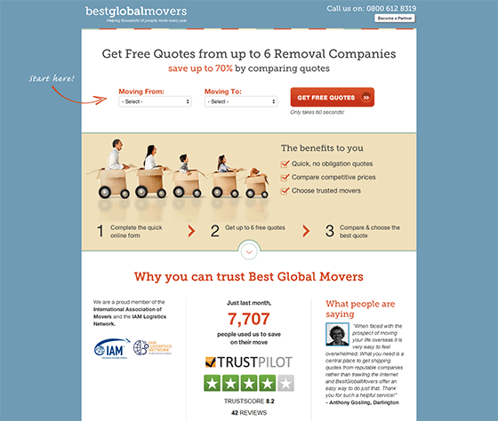
Finalist #1: Best Global Movers
The call to action doesn’t stand out
Though the CTA on Best Global Mover’s landing page was front and center, Oli suggested testing a button with a contrasting color: “My eyes jump around the page from red element to red element. The CTA should be the only thing on that page that is that color.”
“Make your CTA a different colour than most other elements else on the page. It shouldn’t blend in” – @oligardner #PageFights
— Corey Dilley (@CoreyDilley) August 8, 2014
Oli also suggested that the phone number in the upper right-hand corner may be further distracting from the goal of the page. Peep disagreed. In his experience, including a phone number on a landing page does not result in fewer conversions. He even suggested that including a phone number adds credibility.
So what’s the correct approach? The only way to find out what works is to test.
The trust elements hurt the credibility of the page
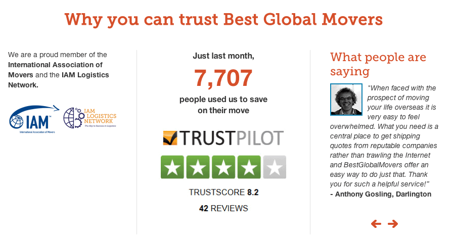
Joanna thought Best Global Mover’s landing page did a great job of pre-qualifying prospects by leading with the price, but she found that other numbers on the page didn’t do much to add credibility to the offer:
- While the headline, “Get Free Quotes from up to 6 Removal Companies,” is specific, it made her question why they could only compare quotes to six other companies – why not a limitless number of companies? Additionally, the awkward phrasing of “up to 6” implies that it could actually only be one.
- The Trustpilot score was a seemingly average 8.2. To Joanna, that seemed low: “I’d want to go with a moving company that had a 9 or a 10!” She suggested framing the score positively by comparing it to that of other moving companies.
“Are most companies at a 6? Compare it for me so I don’t have to worry that the 8.2 score seems a little low.” – Joanna
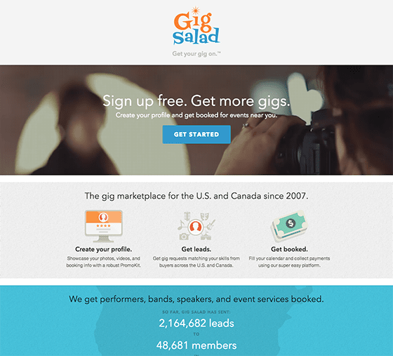
Finalist #2: Gig Salad
The unique value proposition should come before the call to action
Though Joanna praised Gig Salad’s landing page for a very clear UVP and CTA, Peep argued that they were in the wrong order. Oli agreed that leading with “Sign up free” is a little aggressive and vague.
Peep suggested moving the “We get performers, bands, speakers, and event services booked” headline up above the CTA to sell visitors on the value proposition before asking them to opt in.
The most impressive testimonial is buried
Though Joanna praised Gig Salad for their super-digestible testimonial summary headers, Oli found that one of the testimonials wasn’t being given the attention it deserved:

The testimonial above from an America’s Got Talent casting agent was buried under two less impressive quotes. Oli suggested placing it first: “You need to give it more emphasis because of its massive credibility.”
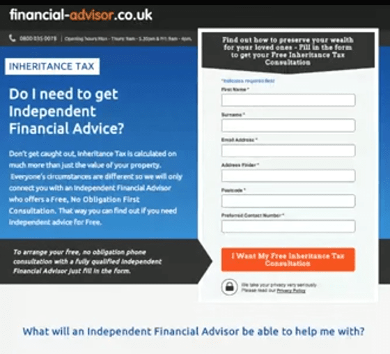
Finalist #3: Financial Advisor
The page is hard to read
Both Peep and Joanna agreed that Financial Advisor’s landing page had messaging that was laser-focused on a very specific problem. Joanna was particularly impressed by the bullets below the form:
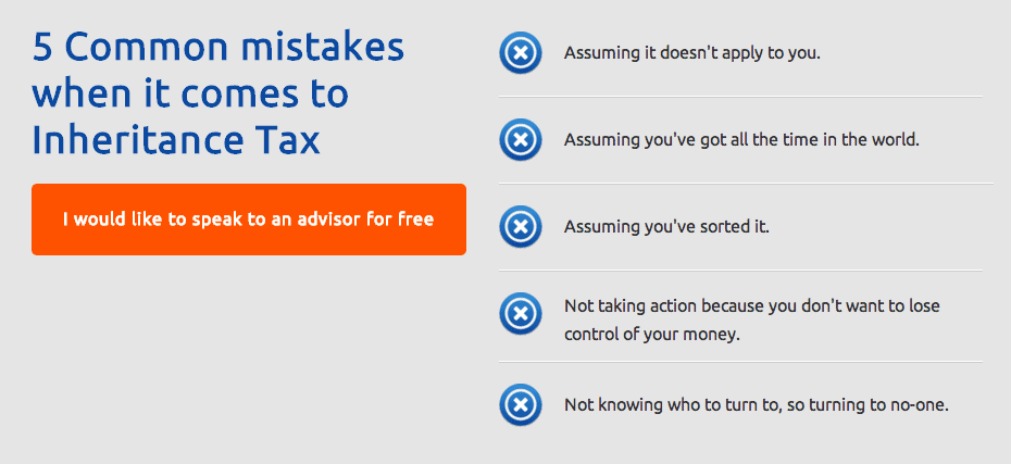
“The specifics of the bullets at the bottom work. They totally make me want to call in and find out more.” – Joanna
The issue was that the specific problem had to be teased out from the massive wall of text at the top of the page. As Peep put it, “the readability sucks.” The judges suggested cutting down the blocks of text into more digestible, to-the-point bullets.
The headline isn’t benefits-focused
The judges also criticized the vague headline that didn’t focus on the benefits of the offer.
“Do I need advice? You tell me man.” – Peep
As a copywriting heavyweight, Joanna sees a lot of people default to headlines in the form of questions when they’re writing copy for their landing page. Depending on context, this might not be the most effective for conversions.
Joanna suggested that questions can be great when wireframing, but you should always go back and test answering the question upfront rather than just asking it.
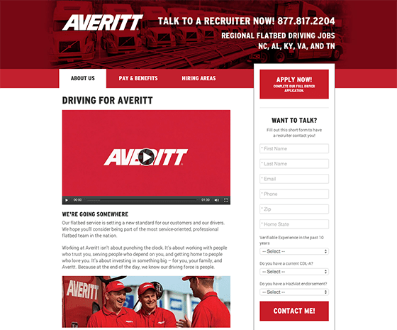
Finalist #4: Averitt
The form has too much perceived friction
Having done optimization work for moving companies before, Peep found that Averitt’s landing page form had way too many fields. He suggested breaking up the form into two or three smaller steps to reduce friction.
Oli also pointed out that the header and the CTA button had identical design and neither looked very clickable. Coupled with the lengthy form, he felt there was way too much perceived friction.
The copywriting isn’t focused on the visitor
With headers like “Driving for Averitt” and “We’re going somewhere,” the judges saw serious room for improvement in the copywriting department. To Joanna, the copy seemed like placeholder copy and wasn’t focused on benefits or the reader.
“Don’t lead with the word ‘we.’ Speak directly to your prospect.” – Joanna
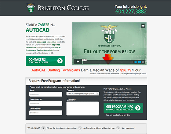
Finalist #5: Brighton College
The directional and instructional queues are confusing
Oli found the purpose of Brighton College’s landing page entirely unclear. He wondered why the video splash page invited prospects to fill out the form rather than watch the video:
“That frame should come at the end of the video. I want a reason to watch the video.” – Oli
Similarly, the placement of the “What’s Next” instructions seemed out of logical order – to Oli, it didn’t make sense that the prompt to fill out the form would come after the form.

There’s no differentiation
Peep felt that Brighton College’s offer wasn’t compelling because they failed to break down what differentiated the degree from that of their competitors.
As he put it, “They’re not explaining why someone should attend Brighton College. They’re speaking to the benefits of the degree – which really only functions to sell their competitors too.”
Does Your Landing Page Have What It Takes to Be a Page Fights Contender?
At the end of the show, the viewers voted and they crowned their landing page champion.
There could only be one survivor.
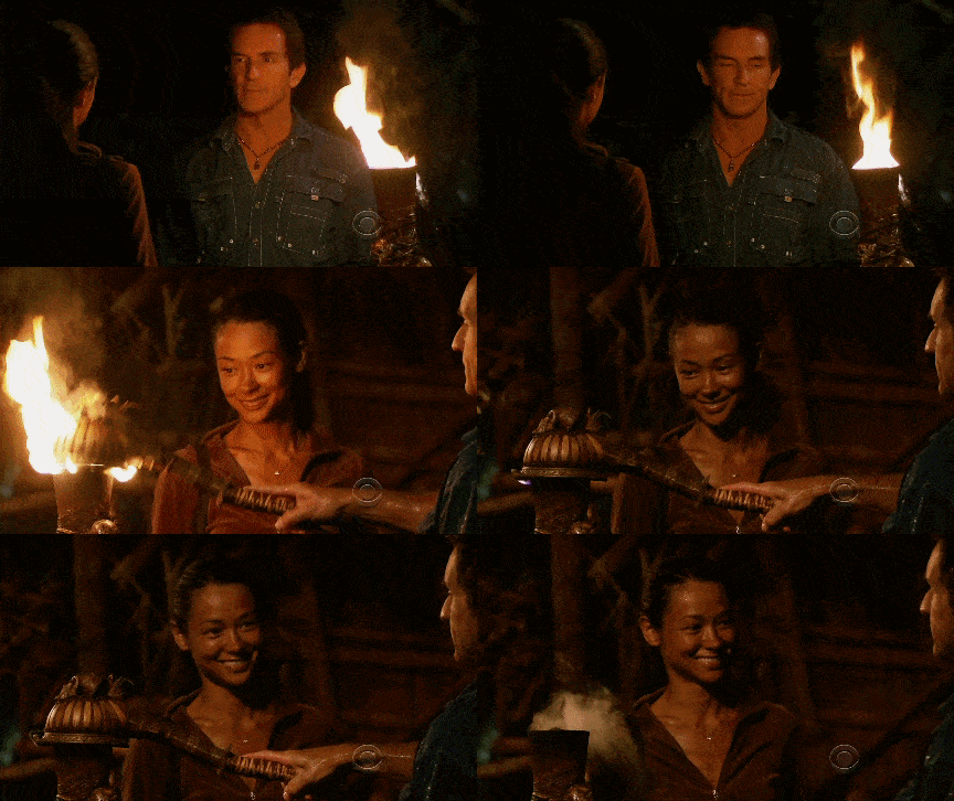
Congratulations to…
I like ranch dressing on my gig salad #pagefights
— William Gallahue (@willgallahue) August 8, 2014
While it can be a bit painful to see your landing page torn apart live, the pain is relatively short-lived when compared to the long-term gains of free advice from conversion marketing heavyweights.
Are you ready to trade your pride for a higher-converting landing page?
If you think you’re worthy of appearing on the next episode of Page Fights, throw your landing page into the ring here.
Good luck!
![]()
