Believe it or not, many of the world’s most aesthetically beautiful landing pages fail miserably when it comes to conversion.
Why? Because when you focus too much on design and not enough on your customers, it’s easy to lose sight of the bigger picture and fall into common conversion-killing traps.
In this post, I go through four of the worst mistakes you can make on your landing page, with real-world examples. Fixing even one of these mistakes should result in a serious conversion rate improvement – so let’s get started!
1. Not showing the product
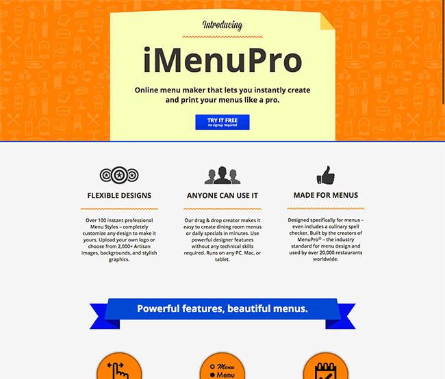
Let’s take a look at this landing page for iMenuPro – an app that allows restaurant owners to design menus online:
It’s a nice enough page, right? Solid design, pretty engaging content and it even has a bit of personality. But there’s one crucial thing missing: they never show the product.
iMenuPro is a menu designer, yet we never see any actual menus that have been designed with the tool. Believe it or not, this is an incredibly common mistake.
If this seems like a huge oversight to you, it should. Neglecting to show your product is the #1 cardinal sin of landing page design, and here’s why: humans aren’t just visual learners, they’re visual purchasers.
If I can’t see your product or what it does, how in the world am I supposed to want it? Imagine trying to buy a car that has only been verbally described to you.
The solution
Show your product up-front and clearly. Make it the hero shot of your page.
And when possible, show your product in action.
This technique, called context of use, helps show prospects how your product works and helps them envision themselves using it:
This is precisely the reason that ShamWow has become a household name – they show their product in action with real people, in real situations you can relate to.
Showing and telling will help you convert browsers into customers.
2. Not explaining what you do
It’s all too easy to forget one of the main purposes of your landing page: educating your prospects.
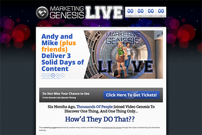
Many prospects who visit your landing page know nothing about you, your company or what it is that you do. It’s your landing page’s job to fill in the blanks. When you don’t do that, you get a page like this:
Marketing Genesis is a paid seminar for aspiring marketers – or, at least, that’s what I think it is. They never actually say.
If you carefully read a few hundred words into the text, you’ll eventually infer what Marketing Genesis is, but it takes some effort. They’re assuming that I know something about their business, but I don’t.
They make this same mistake dozens of times throughout this page:
- The main headline on the page tells me to “Register Now,” but I don’t know what I’m registering for yet.
- The CTA asks me to click for tickets, but again, what am I getting tickets to?
- They even assume that I know where the event is taking place (hint: I don’t).
If you’re thinking, “how could someone possibly forget those things on a page?”, you should know that this sort of thing happens with shocking frequency.
When you’re elbow-deep in the goings-on of your own company, it’s easy to forget what it’s like to not know about your company.
The solution
When in doubt, treat your clients as though they know truly nothing about you.
Explain what you do, why you’re better than your competition and how your product can improve your potential customers’ lives.
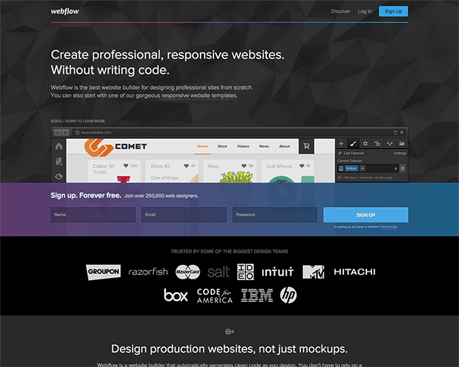
The people at Webflow do a brilliant job of this – take a look at their homepage:
Even though they’re selling a relatively high-tech product, their opening headline tells me exactly what they’re all about in just a few words: “Professional-looking websites without writing code.”
That’s the kind of quick sales pitch we’re looking for.
Note: explaining what you do does not mean telling prospects about everything you do. As we’ll see below, you want to test making your copy as minimal as possible.
3. Using lots of paragraph text
If there’s one immutable truth about your customers, it’s this: whether you’re Apple or a mom-and-pop shop, nobody wants to read the long paragraphs of text on your landing pages.
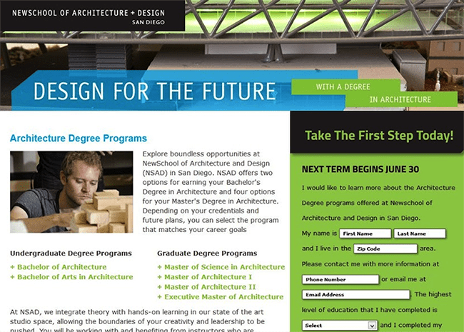
Take for example this page from Newschool of Architecture and Design in San Diego:
They seem like a lovely university, but they fall into a common trap: they’re over-explaining.
In order to get my questions answered, I need to read through at least a few paragraphs of relatively dry copy. I’m willing to bet that many potential students would rather leave the page than put in the effort.
It might feel like your business is too complicated to explain quickly but in reality, even the most complex businesses can be to be boiled down to a series of short, benefit-driven sentences.
If you absolutely need to write a longer page, communicate your unique value proposition up front and don’t write a word more than you have to.
The solution
Be kind to skimmers and impatient users by cutting down on text, focusing on the key points of your service and providing visual examples.
If you routinely have issues with including too much copy, try writing your copy first before even looking at a landing page template.
That way, you’ll be sure to design a page that complements your copy and only includes the words you absolutely need. Not sure what you need? You should test that.
4. Making users choose (or even think)
Many businesses have multiple buyer personas, which makes marketing to them kind of tough.
How do you tailor a landing page to drastically different groups of people while still resonating with your ideal customers? We’ve all heard it before: Try to appeal to everyone and you’ll appeal to no one.
As a solution to this, many companies add a click-through page that asks users to self-select what kind of customer they are. For example, take a look at this landing page by PerfumesForABuck, an ecommerce outlet for cheap fragrances:
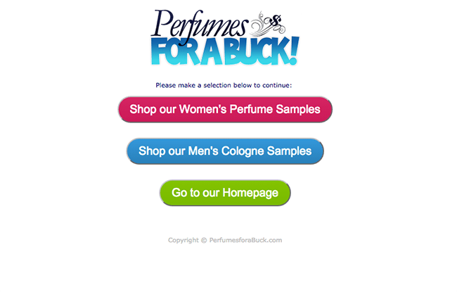
Before you can see any product, you’re forced to choose between jewelry for men, women and gift baskets. Until you choose, you can’t see anything about the business or their products – and that’s problematic.
When you force users to choose before seeing content, a strange thing happens: many prospects leave and don’t come back.
Forcing choice adds friction – you’re putting extra work on the visitor, and the visitor doesn’t like work. They shouldn’t have to think.
The solution
Even if you have a segmented customer base, you can market to all of them individually without forcing them to make choices. It just takes a little finesse.
If you’re marketing to multiple personas, create separate ad campaigns for each one and drive those separate campaigns to customized landing pages.
Instead of buying clicks for “perfume” in AdWords, buy clicks for “men’s perfume” and send the traffic to a dedicated landing page. This eliminates choice from the equation and helps drive more targeted, valuable traffic to your site.
Wrapping things up
It’s tempting to run tests on granular stuff such as your call to action and headlines.
But doing so can lead you to lose site of the bigger picture: at the very least, are you explaining what you do and showing people what you have to offer?
If you’ve made one of these mistakes, count yourself lucky. An error like this is a huge opportunity for improvement. And many of the mistakes outlined above are relatively easy to fix.
So fess up. Are you making any of these mistakes? I want to hear in the comments!
