
Mobile landing pages have the unenviable task of conveying enough information to make visitors convert, with much less space to do so than on a desktop.
Driving home your message has to be done with fewer elements and fewer words. Every single element on a landing page must avoid friction at all costs.
What exactly is friction?
Friction on your landing page is both real and perceived:
- Perceived friction is the mental block that happens in the mind of a landing page visitor when they come across a mobile landing page with unreadable text, a form with too many fields or an offer that doesn’t compel them to convert.
- Real friction happens when people struggle to fill in that many fields with their thumbs, or they can’t click the call to action button because it’s too small. Or maybe your page is not optimized for mobile and they have to scroll or pinch and zoom to get to the form.
In short, friction is a huge killer of conversions in mobile marketing campaigns. Thankfully, there are preventative measures you can take.
Let’s take a look at how smartphone users are consuming content, the challenges faced by mobile marketers, and a few simple things that you can do to reduce the friction on your mobile landing pages.
PLUS: We’ve put together a free mobile landing page checklist for you to get started with. You can download it at the end of this post.
The device itself is the first point of friction
The first point of mobile friction is the device itself, and all the challenges that arise when browsing on a smaller screen.
Both perceived and actual friction are lower on a desktop than on a mobile device. People can view more information on a landing page all at once, and they’re able to use a keyboard to quickly enter information as opposed to the small screen-based keyboard on a mobile device.
As a result, purchases are less likely to actually be made on a mobile device, but mobile is still a very important part of the research phase. According to designer and conversion rate optimizer Alex Harris:
Mobile users tend to do research on their phone and then complete transactions and purchases on their other devices (tablets and computers).
That means marketers can use mobile lead generation landing pages in conjunction with a strong lead nurturing strategy in order to glean that conversion later on on a desktop.
Let’s say you’re promoting short-term rental properties. Instead of directing mobile search traffic to a page where they’ll have to go through your many properties on their phone, you direct them to a mobile landing page where they will get a summary of your properties and a form that promises to send them more information.
The email that they receive should be persuasive enough (as with any marketing email) to entice them to your properties page with strong copy and a solid CTA. If they open that email on mobile, it should get them interested enough to revisit the email when they’re on their desktop, where they’re more likely to convert to a sale.
As long as those first, brief impressions from your emails generate enough interest to get people to revisit the email on their desktop, you’ll re-capture their attention where they’re more likely to convert to a sale.
Loading time is another huge conversion killer
Not everyone has a 4G or LTE connection. Even if they do, that connection could be unstable – and the more data on your page, the longer it’ll take to load.
Download speed isn’t always the issue, either. Some phones just do not have the processing power to display information quickly, even after receiving it.
Because we know that 43% of users are unlikely to return to a slow-loading landing page or website, keeping that page light is key to keeping people on your page.
But it’s also crucial to scoring more conversions – according to KISSmetrics, a one-second delay can result in a 7% conversion loss.
You definitely don’t want that, do you? Here are some tips to help you speed up your mobile landing pages load times:
1. Go easy on the design elements
The fewer design elements you use, the faster the page can load. The information will be passed to the device faster and the phone will process it faster.
In his article, Mobile Landing Page Checklist for Optimizers, Craig Sullivan discusses the importance of reducing design elements:
The connection of your phone to the mobile phone [tower] and then onto the internet incurs a delay. This is called latency and it adds up for every object you pull down. Two pages of 100Kb — one of which has 5 objects and one of which has 90 — will show markedly different performance to the user.
In other words, even if the pages are the same size, a page with five graphical elements will load more quickly than one with 90. Keeping design elements minimal reduces the time it takes for a page to load – and that helps keep people around so they can convert.
2. Optimize images for mobile
Once you’ve narrowed down the images to only include those you absolutely need, you’ll need to optimize them to their full potential. That means reducing your overall file size and making sure images scale to any device people might be using using.
This post on the Google Developers blog outlines exactly how to go about making sure your images are done right on mobile. In short, the article recommends:
- Tricks for compressing images
- Learning to select the right image format
- Reducing the number of unnecessary pixels in an image by scaling images to their display size
- Removing unnecessary image metadata
By investing time in learning how to best optimize your images for mobile, you’ll be reducing friction by speeding up the loading time of your landing pages.
3. Remember that every screen is different
I get a lot of comments about my phone. I have a Nexus 6 that, with the giant idiot-proof case that surrounds it, looks like a small tablet.
Mine is just one of dozens (maybe hundreds?) of different phones out there in the hands of your prospects. The new iPhone 6’s screen is different from that of the iPhone 5, or the LG G3 or… you get the point.
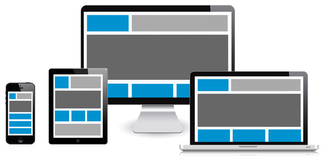
Mobile landing pages need to respond to every size.
Responsive design means adapting to the device accessing the content and displaying the information in the way best suited to that device.
You may find that you need to cut back on some of the content to make the experience more enjoyable for mobile users. Test your heart out, and remember that at the end of the day, you’re trying to give them the information they need to convert.
4. Make your content readable
Larger fonts help readability. In the example below, it’s tough for the reader to go through the content and figure out what’s there. While not strictly a landing page by definition, the page below is one of the paid results I got when searching for “mobile marketing.”
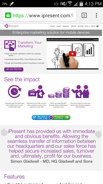
The first mistake they made was not using a dedicated landing page for this campaign. The next was making the content on the page barely readable as the font is so small.
Each of the sections on landing page designer Jen Gordon’s homepage is optimized for mobile, and has font that is readable.

You can see that snippets of information have been broken up into readable sections, which encourage the reader to keep scrolling down the page. This is exactly how a mobile landing page should look. The friction generated by forcing readers to pinch and zoom to get to your content is eliminated, and they’re free to find out what you have to offer.
Testing your mobile landing pages
Once you’ve optimized your mobile landing pages for those four things, your work isn’t done. You’ve still gotta test.
Your A/B tests are an invaluable part of learning what your audience responds to because at the end of the day, they decide which version of your page is the best.
But before you start A/B testing different versions of your page, make sure you do some basic user testing:
- Does the page work on all devices?
- Does the page load quickly?
- Does it work on all browsers?
- Does it display within all break points?
Why is troubleshooting the technical side of things essential? As Unbounce Senior Conversion Optimizer Michael Aagaard said:
If your variation breaks the layout and mobile users end up seeing a totally screwed up version, your data will be 100% useless and you might as well not test.
What’s more, your tests should not stop at the conversion on the landing page.
Are your visitors converting into sales further down the line? Does one page seem to contribute to sales in the future more than another?
Ask yourself these questions regularly to help you decide on the best way forward.
Killing mobile friction
As results-oriented marketers, we can sometimes get behind the curve on design trends, but make no mistake: mobile is not a trend. Mobile is a real and viable channel for reaching customers.
Remember that if you’re sending your mobile traffic to pages that cause friction, you will lose the opportunity to convert that traffic – possibly forever.
Take the time to understand your customers’ needs on mobile. Design the best experience you possibly can. Give your customers the opportunity to interact with you on their terms. And when they’re happy, you know that you’ve reduced friction.
