My first camera belonged to my mother.
I’d sneak it out and take photos of the dog, the sky and even take photos of photos — this was in the days of film, when every photo was precious. Of course, she’d get mad when odd photos would pop up between shots of birthdays and family outings.

I continued taking photos all the way through university and later, ended up being a paid photographer for Airbnb.
The giddy feeling I remember feeling while stealing my mom’s camera came back to me when I heard Instagram was available to marketers. In some ways Instagram has replaced that old Kodak, except the stakes are much higher than a spoiled roll of film.
With 400 million active users spending over 21 minutes a day on the platform, Instagram is an opportunity that performance marketers can’t ignore.
The key to figuring out how to market on Instagram effectively is to understand that Instagram is a mobile tool and that people have different behaviors, expectations and needs when they’re in the mobile environment.
We combed through hundreds of Instagram ad examples and examined what works and what doesn’t so you can begin your next Instagram campaign on the right track.
1. Create Mobile-Friendly Forms
People have short attention spans — and there’s nothing more distracting than a mobile phone.
Your ad is competing for attention against other Instagram accounts as well as every other app on your prospect’s phone. It’s impossible to determine where and how they will see your ad. It’s likely that they are juggling many things at once: groceries, a dog and a flurry of Facetime calls from their mom. Why not make things easy for them?
If you’re looking to generate leads from your ad, provide an opt-in form that’s easy to read and simple to fill out.
Example: Easy2buytool
Easy2Buy is a tool that will let you sell directly from your Instagram feed. What they’ve made here is a nice and simple lead generation ad.
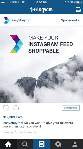
Some breathtaking clouds with a bright colored logo. Okay, I’ll click.
This ad is clear and actionable. It uses distinct imagery, copy and branding from start to finish. There’s no friction and that’s what makes it inviting to click on.
The signup form is easy to understand and fill out without distractions. The greyed-out text lets the visitor know what information they need to share.
An added bonus is that the entire landing page fills my screen, which means there’s no need to scroll and I can keep multitasking while sharing my information.
Download Your Free 12-Point Mobile Landing Page Checklist
Example: Foundr Magazine
Foundr magazine is a digital publication for entrepreneurs that curates insightful interviews, case studies and ebooks.
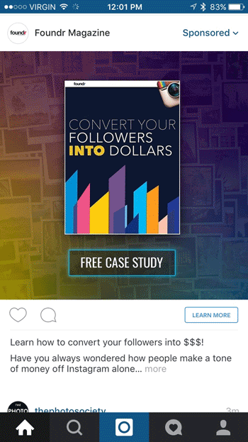
Their ad copy s-p-e-l-l-s out what the prospect will receive when they click. The title of the ebook, “How to Convert Your Followers Into Dollars,” is included on both the ad and the landing page copy.
As you scroll down, there’s a form with a nice bright call to action button: “Download The Free Guide.” The color of the button makes it stand out from the rest of the form. And we know that the word free is an effective way to convert.
The simplicity of this form results in efficiency. You enter your information and you’re done!
2. Use Responsive Landing Pages
What makes Instagram so addictive is that it’s a minimalist experience. The main action is scrolling and the primary visual assets are images and video. Such simplicity requires the corresponding landing page to be simple too.
Using a responsive landing page goes beyond having a page that scales to fit the device; it’s about creating a truly frictionless experience.
This means using a landing page that:
- loads fast
- has several prominent CTA buttons
- uses design elements to support the CTA
I can’t over-emphasise how discouraging it is to land on a page that isn’t responsive. They’re hard to navigate, they usually don’t render, and they make me want to tear my hair out. This is the point where most prospects just bounce. Ain’t nobody got time for that.
Creating a responsive landing page is one way to combat against this frustration. If you don’t believe me, just check out the examples below.
Example: Photoshelter
Photoshelter is a marketplace that provides cloud storage, website templates, business guides and more for photographers.
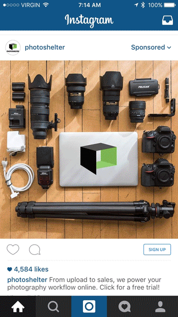
Look at all that shiny new equipment! As a photographer, I couldn’t help but click.
I landed on a page that didn’t elaborate on Photoshelter’s “Sign Up” CTA. So, I kept scrolling because I wanted to know more about the features and benefits offered. Unfortunately, I scrolled for a very long time.
After bumping into a few people on the street, I finally landed on the “Start Free Trial” section at the bottom of the page.
This landing page scales to fit the screen, but it creates friction when it assumes the prospect will sign up using the first CTA button presented. What if a prospect needs more convincing?
The CTA button in your ad serves to prime people. It’s how you let them know what to expect: learn more, shop now, sign up or install now. Make sure to have multiple CTA buttons that reinforce your campaign goals throughout your landing page.
Making them scroll to the bottom of your page feels like an unusual form of punishment for a someone that liked your product enough to click, doesn’t it?
Example: Sonos x Apple Music
Sonos is an electronics company that creates wireless speakers and other products. They partnered up with Apple Music for a new campaign to curate music for your speakers.
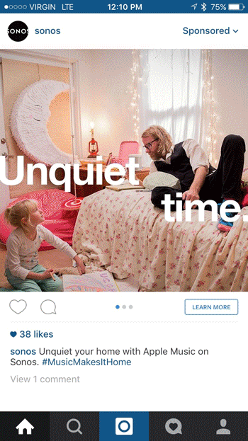
I’ve heard a lot about Sonos, so I was curious when I saw their carousel ad. It had cute images of a father and daughter participating in “unquiet time.”
But I was confused by what I landed on.
About 80% of the images on the landing page were GIFs of cool artists having a great time. There were so many different elements to click on it was hard to focus. Every scroll was met with friction: images and GIFs that simply wouldn’t load.
I was curious, though, so I kept scrolling. As I explored, my Instagram app crashed – not once, but five times.
Sonos’ landing page was more confusing than enlightening. Their CTA said learn more but there were no other places on their landing page that invited me to actually learn more.
Using GIFs is a cool way to attract attention but it was a poor way to communicate the value proposition of the ad. A responsive landing page makes sure the elements on the page support the CTA and don’t distract from it.
Besides the lack of clarity from ad to landing page, this page was so long and robust that my phone couldn’t handle it. This is a case where curiosity killed the app.
Example: Canadian Tire Canvas Lighting Collection
Canadian Tire is an iconic home and hardware store in Canada. With this Instagram ad campaign they are introducing Canadians to their new Canvas Lighting Collection.

Cool stuff! Canadian Tire used carousel ads to showcase their new collection of lamps in different settings.
I’m a sucker for accent lighting so I decided to click. I was surprised by the beautifully-curated campaign-specific landing page.
The experience from first click to last click was seamless. The page loaded fast, was fully responsive and it also expanded on the story introduced in the ads. As I scrolled through the landing page I was reminded why I clicked on the ad in the first place.
I loved this experience so much that I shared this ad with friends that are in the process of moving. Amazingly, Canadian Tire, an old retail store my mother used to bring me to, gave me a reason to want to shop more.
3. Be Adventurous, Test Video
Images and videos are what Instagram is all about, so make sure they not only stand on their own, but that they stand out from the crowd, too.
Your product or brand will be inspected within seconds and scrolled past even faster. Get it ready for its closeup so it can be seen in the best light.
Video, in particular, offers you a new way to engage with your prospects. Make sure to test things like video length, sound and format, and whether landscape or square video works best.
Now you can stand out from all those bespoke lattes set against marble countertops.
Example: Andy Boy’s Eat Broccoli Rabe
Yes, this is an ad about broccoli! Andy Boy has dedicated an entire account to it, and created an eye-catching and mouth-watering Instagram campaign around broccoli rabe (also known as rapini).
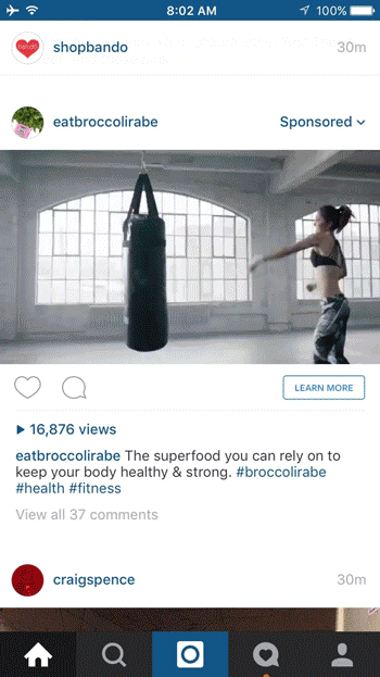
The fast chopping movement and the text across the video would draw anyone’s attention. I never thought I’d say this, but this was the most action-packed broccoli ad I’ve ever seen.
The CTA button on the ad led me to a page that fulfilled the “learn more” promise. Not only did I learn about the health benefits of broccoli rabe, but the landing page was filled with recipes, each of them enticing me to learn more.
A slick brand awareness campaign from beginning to end.
4. Think About Clarity
Instagram is all about consuming images and videos. Simplicity and clarity are key elements in the Instagram environment that should be defining principles when you’re building your next Instagram ad campaign.
Think of your ad as a trailer for your landing page. The best movies trailers give you a teaser of what’s to come without giving it all away.
Your Instagram ad should do the same by cultivating interest and enticing people to click. Your landing page needs to deliver on what your ad promised, by matching the design and copy in your ad and giving the people what they came for in a clear, frictionless way.
Clarity is your friend. It’s what will ensure that prospects don’t become anxious and leave your landing page.
Example: The National Finance Journal

Bold flashy text and cool cars? Great. You’ve got me.
But when I click through, my excitement vanishes – and is replaced with insurance forms. There may be a wee bit of design match with some of the colors of the typeface on the ads and the CTAs on the landing page, but there is very little message match from the ad to the landing page.
I get that insurance is a highly regulated industry, but some sense of continuity would be great here. Matching the text over the images with the headline on the landing page would be a great start.
As a prospect I was compelled to click because of the image of cars and the associated monthly ticket price was attractive, but now I find myself on a lead gen form for car loans.
Is this what I originally clicked on? Giving up my name and email address seems like a lot of commitment with little explanation. Unfortunately, The National Finance Journal lost me.
Example: Videofruit
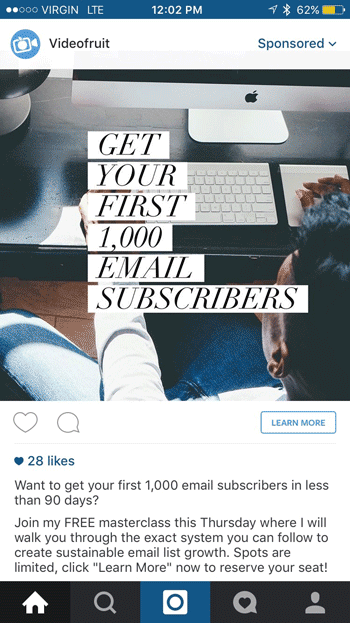
You know what? This is actually a pretty good ad. Their value proposition is clear: “Get Your First 1,000 Email Subscribers.”
When I click through, I see an eye-catching visual: a giant illustrated hand. The progress bar at the top of the form creates a sense of urgency.
However, the visuals in the ad and landing page simply don’t match up. The lack of design match makes me question what I’m signing up to and reduces the sense of clarity I had before I clicked the ad.
Thinking about clarity is important when designing a campaign; without it, you may end up with leads that aren’t worth the cost.
Now go forth and create the best Instagram campaigns

The core elements that make up an Instagram campaign are the same as any other social ad campaign — the main difference is that the entire experience, from start to finish, is mobile.
A great Instagram campaign needs to provide a great mobile experience by using mobile forms, responsive landing pages, unique creative and above all, clarity.
When you’re designing an Instagram ad campaign, make sure your landing page is responsive. Always check to see what the experience feels like before launching your campaign. Grab your phone and your friend’s phone, scroll and click. This is how you get better at the craft — by being your own best critic.
And remember: Instagram is a tool, much like a camera. You’ve got to know it inside out. Once you understand the platform, the mobile environment and what your prospects are expecting from you, you’ll be taking shots just like the pros.
