
Let’s start by getting one thing straight: this is not a political article.
As tempting as it might be to enter the fray… by “tear down” I don’t mean a smear campaign, ill-tempered mudslinging or anything quite that provocative.
What I mean is a detailed examination of the two US presidential nominee’s online “sales” funnels and their overall presidential marketing tactics.
Why?
Because no matter which side of the political aisle you’re on, these could very well be the highest stakes online funnels in the history of the world.
In the wake of Barack Obama’s second presidential win, Kyle Rush — former Head of Optimization at Optimizely and now Hillary Clinton’s Deputy CTO — pulled back the curtain to reveal how their approach to conversion rate optimization raised a historic and record-breaking $1.1 billion in total funds, $690 million of which “came through our various web properties.”
For anybody doing the math, $690 million is 62.7% of the campaign’s total fundraising efforts.
As Kyle himself told me when I asked him about the role CRO plays in Clinton’s campaign today:
It’s something we are very focused on.
Our teams are data-driven and we act on data. We have run over 100 A/B tests in the past year. Some of the tests resulted in over 200% increases in mission critical metrics.
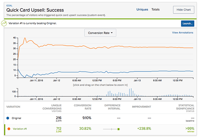
The monumental role CRO plays in presidential success is why digging into each step of each current candidate’s funnels — screen by screen — offers a wealth of insights on how to optimize your online funnels and marketing campaigns.
But first — lest things get bloody — let’s set some ground rules.
Ground rules for the teardowns
Here’s how this is gonna work.
First, I’ll show you a step-by-step, visual walkthrough of the candidates’ online funnels: from their homepage, to their pop-up or splash page, to their email signup page, to their donation process.
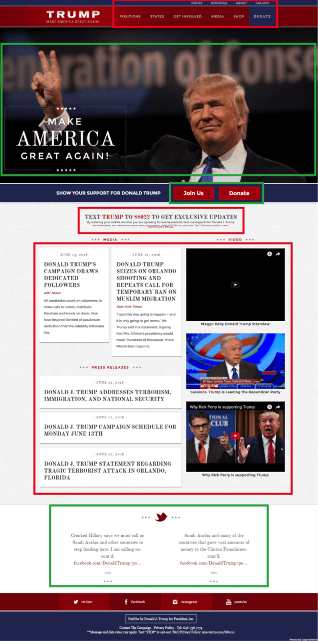
Each visual will be color coded: green boxes for “The Good”… red boxes for “The Bad”:

After each visual, we’ll examine why the color-coded elements work from a CRO perspective (or why they don’t).
Third — and this is where things get really amazing — I’ll hand the teardown off to 18 of the world’s top CRO experts and let them weigh in.
Ready?
Don't have time to read this post?
Donald Trump
Step 1: Homepage
The Good:
Love him or hate him, Donald Trump is a brand. And a massively recognizable one at that.
In contrast to Clinton — who shares her header spotlight with President Obama (see below) — Trump is front and center, taking full advantage of his brand recognition.
Likewise, he’s the only candidate with a recognizable and emotionally charged tagline, which he wisely displays prominently: “Make America Great Again.”
The CTA below the hero section — while not as emotive as the language above it — is nothing if not clear. It presents the visitor with two simple choices: “Join Us” or “Donate.”
Also positive are the social media widgets towards the end of the page. While Clinton buries her social links in the header and footer, Trump’s site features live social media updates, which makes sense given his dominance on all things social. Rather than just soliciting visitors to follow him, he gives them a preview of what they can expect.
The Bad:
From a design perspective, Trump’s site is crowded and noisy. The dark colors pile on top of one another around the hero section, and the smorgasbord of clickable options in the body of the page is paralyzing. Instead of leading visitors along a path of action by creating a clear visual or written hierarchy, everything comes barreling toward them at once.
The navigation bar is likewise crowded. There are 10 visible options and if you count up the drop-down menu options, that number jumps to 22.
Finally, the “Text TRUMP” box is a questionable choice, because rather than prompting visitors to simply enter their number on the page itself, it asks them to cross one of the most difficult conversion bridges: changing devices.
The Experts:
 |
Neil Patel:
|
|---|
Typically, when you use call to action text that is related to the problem you are solving, your clicks and conversions are higher than if you used generic verbiage like ‘join now.’

Also the website copy isn’t telling a story.
If his big pitch is to make America great, then all of the surrounding elements — such as news clips and videos — should reinforce that message. This will help create an emotional connection between the website visitor and Trump, which should help him gain more votes and donations.
Lastly, some of the headlines for his press releases don’t encourage you to click. If you’re lucky, eight out of 10 people will read a headline, and two will click through. With a headline like, ‘Donald Trump’s Campaign Draws Dedicated Followers,’ you’re not likely to get many click-throughs because it doesn’t highlight the benefits of clicking through.”
 |
Oli Gardner:
|
|---|

If the goal of the page is to get people to donate, it could use a little more focus to make it happen. And if they’d done a better job with their responsive design, the primary donate button would be above the fold.
The navigation could be simplified if they did a better job with targeting. To participate based on your state, you need to go to the States page, find your state, click on your state and then fill in a form. With proper targeting the secondary CTA, “Join Us,” (which leads to the same type of form) could be renamed to something like “Get involved in Kansas” or “Join the movement in Kansas.” A Kansas resident would be far likelier to be inspired to click if that was the case.
At the bottom of the page, the tweets weren’t handled in the best way. The first was an incongruent mention of a book by someone other than Trump and the second a link to a Washington Post article about Hillary Clinton that takes you off-site. If you want people to part with their money, don’t send them away.”
 |
Valentin Radu:
|
|---|
Fun fact: If we analyze the hand signal Trump is using, Wikipedia states that in American sign language this actually means ‘number two.’ I trust Wikipedia.
As for the menu, I would A/B test it by simply inverting the colors to make the Donate button red.

Going further, the buttons ‘Join us’ and ‘Donate’ are actually competing — they’re the same size and color and they’re positioned together. One should be more important than the other and therefore given more credit via more space and prominence.
The paragraph font size may also be too small for some visitors, and there are no links connected to the various media and press releases to ‘Read More.’ I can’t argue too much with the multi-column format, although a single-column layout would be worth testing.
Another thing that I would test is Donald Trump’s facial expression. On both video thumbnails his face is showing that he is ready to fight.
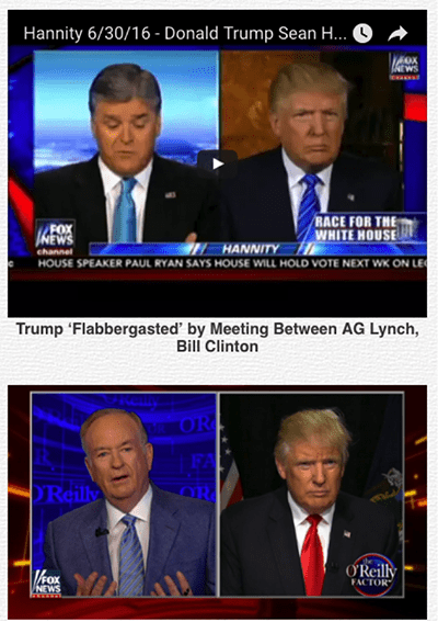
But… maybe that’s what Americans want: a wealthy fighter that will share his prosperity with them.”
 |
Michael Aagaard:
|
|---|
All the main functionalities are easy to use. The logo and tagline confirm you’re on Trump’s presidential website and both the ‘Sign Up’ and ‘Donate’ forms work well.
While the donations themselves are handled by a third-party tool, there’s a good match both visually and message-wise, so you get the feeling of an uninterrupted experience.
The header doesn’t quite line up on a 15-inch screen, and you can’t see the bottom of the hero shot that contains the two main CTAs. But other than that, most of the UX is on point. Likewise, the mobile version works well. In fact, I’d say it works better than the desktop version.
Only negative thing is that there are quite a few navigation points in the burger menu, which makes it a bit overwhelming:

In my experience, people who come to a website like this have already made up their minds, so the website doesn’t need to do much persuading. But it has to be real easy to use, so you can do what you set out to do with little or no friction.”
Step 2: Join Us
The Good:
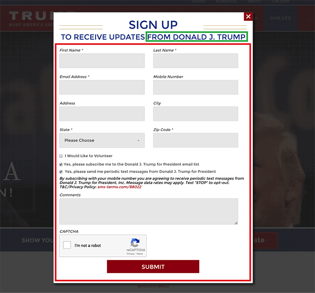
The subhead on Trump’s email opt-in leverages a personal connection to the candidate. Instead of inviting supporters to join the campaign or “Get updates,” this opt-in invites them to “Receive updates from Donald J. Trump” directly.
The Bad:
Unfortunately, that’s the main positive. To sign up, a supporter would have to enter information into five required fields. Compare that to Clinton’s dramatically simplified sign-up process, requiring only two fields.
All told, there are 13 form fields and checkboxes. Too many options is the hallmark of low-converting forms.
In addition, the text on the CTA buttons — from (1) the homepage’s button “Join Us,” to (2) the form’s headline “Sign Up,” to (3) the form’s button “Submit” — creates a disjointed user experience (not to mention that “Submit” is a notoriously lame and low-converting CTA).

The Experts:
 |
Kristi Hines:
|
|---|
While I think the form does have a lot of fields, I believe those fields are necessary, especially the state and zip code.
Why? Because it allows each candidate to email and text supporters about upcoming local events and voting rules. Plus, if supporters enter their full address, that also opens the door to some direct mailing opportunities.
The use of a CAPTCHA field doesn’t bother me. Considering the amount of spam most online forms receive, this is probably the easiest way to at least bypass the automated spam. I’m sure their marketing team is already fighting a lot of fake submissions from Trump haters.
The only disconnect for me on this form is not requiring the mobile number — which is smart — but then having the ‘Yes, please send me periodic text messages…’ box automatically checked.

Finally, I think they should try testing some different messaging on the ‘Submit’ button. I’d bet a button that said ‘Let’s Make America Great Again’ would get some smiles from Trump supporters.
Overall, the form may seem lengthy, but it gets the information the candidate needs and works well on desktop and mobile. In any case, no one is going to switch their vote just because the other candidate has an easier form to fill out.”
 |
Chris Goward:
|
|---|
Since Donald Trump is already a master at gaining free press mentions, and he apparently has plenty of funding, one would assume his goal is to gain direct access to voters to mobilize them on voting days. That means his ‘Join Us’ call to action is very important.
If his transactional goal — the bottom end of the funnel — is to maximize subscribers, he could test some improvements:
- The Join Us pop-up form seems complicated at first, with 13 fields preceding a big red ‘Submit’ button. Hmm… does Trump want us all to ‘submit’ to him? Especially for mobile, this is a very long form for a seemingly simple CTA.
- Form fields broken into two columns make scanning difficult. This isn’t an issue on mobile, but I certainly wouldn’t stick around to fill out a mobile form with that much scrolling required.
- Why am I being asked for a mailing address when that’s not needed for the messages I’m subscribing for? What else is my information being used for?
- Right before completing the form, there are two big barriers: (1) an ‘I am not a robot’ field, which seems unnecessary, and (2) an opt-in warning.
If Trump isn’t testing, he should get started. Based on Clinton’s website, she’s got a more effective conversion optimization team — her simple signup form reigns supreme in comparison.”
 |
Sean Work:
|
|---|
Moving on to the signup page, sometimes collecting a lot of information is a smart thing to do. It might not convert as well, but the benefit of collecting more info sometimes outweighs total conversions. I’ve heard of cases where more form fields actually converts better!
We could ax the mobile number field. It’s not a required field so why let it get in the way? However, having supporter phone numbers might be incredibly valuable when election day is near. You might want to call your base supporters to make sure they know where they are going to vote and inform them of any last-minute details.
If we are going for just pure sign ups and nothing else, I would simply have first name, last name and email. I would remove all the checkboxes and the comment field. I might consider keeping the CAPTCHA because I can see the opposition trying to flood the form with bogus entries.
My final words on this: It really has to do with Trump’s strategy and goals.
They need to be nailed down first. What do you want to achieve? Then you work backwards.
You create your hypothesis, build the page, test it, measure it then repeat the cycle.”
Step 3: Trump’s Donation Process
The Good:
Unlike Trump’s previous pages, the donation process is clean and visually minimalistic. It includes an image of the candidate that — thanks to the blue hue — drives home the personal and patriotic connection mentioned earlier. At the same time, the imagery doesn’t distract from the action.
The Bad:
Unfortunately, the white text on light-grey background makes the buttons hard to read. Adding some visual clarity in the form of affordance could be valuable. Also hard to see is the fine print. And, as opposed to Clinton’s donation pages, there isn’t even a note to expatriates who might want to contribute.
Lastly, the trust factor on the page is low. Trump doesn’t include anything about where the money goes and — outside of the generic word “SECURE” and the image of a lock — the page doesn’t provide security measures to assure donors their payment information is actually secure.
The Experts:
 |
Ben Twichell:
|
|---|
“Copy is one of the most vital elements of a landing page.
My recommendations would be to include and test three sections: (1) a prose style emotion-evoking paragraph, (2) a bullet-point list of his platform stances and (3) social proof.”
 |
Shanelle Mullin:
|
|---|
“Going back a step, Trump’s site misses a huge opportunity.
If someone selects the ‘Join Us’ call to action instead of the ‘Donate’ call to action on the homepage, the site asks for a lot of the same information.
Why not ask for a password during that process to make the donation process easier for those who are, presumably, the most likely to donate? It would also make mobile donations easier.
In the same vein, there’s a login option on the Trump donation page, but it’s well below the fold. If someone who has donated before returns to this page, intent is high. Make it easier for them.
Overall, the UX is fairly standard for a presidential campaign site. However, there are a few little things that could be improved:
- On mobile, when you advance to Step 2 of 3, you’re automatically scrolled down to the ‘Continue’ button. All that’s visible is the button and the start of the fine print, so you have to scroll back up.
- Also on mobile, if you don’t immediately choose the “Scan Credit Card” option, it disappears.
- In the fine print, it says the maximum individual contribution is $2,700 per election. So why am I able to select ‘$1,000’ or ‘$2,700’ and then ‘Make this a monthly recurring donation’? Furthermore, how many months am I signing up for here?
- There are in-line error messages, which is great, but the form still accepts obviously false information. For example, a zip code that is not in the state selected and an invalid email address.
- There’s no confirmation of how much you’re donating (and how frequently) before clicking the final ‘Donate’ button.
- Another big issue is donation amount. Why the big jump? Why so many small amounts? Maybe the Trump optimization team did their conversion research and found that most people donate smaller, recurring amounts. But why not have ‘Make this a monthly recurring donation’ selected by default then?”
Want more awesome content to help you crush your marketing goals?
Hillary Clinton
Step 1: Pop-Ups
The Good:
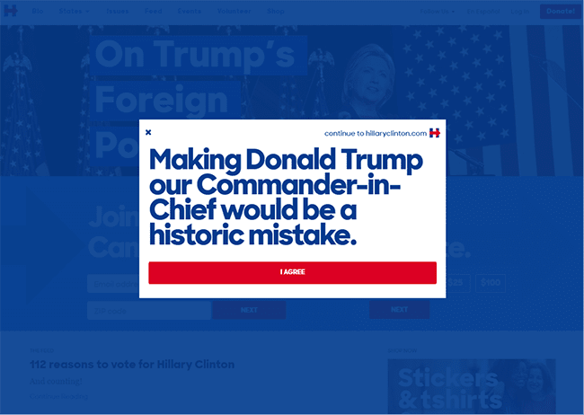
From the jump, Clinton’s site kicks things off with a bang. The first pop-up takes aim directly at her opponent:
Making Donald Trump our Commander-in-Chief would be a historic mistake.
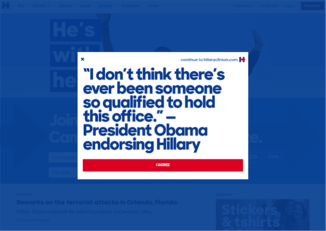
And the second leans on social proof, with a quote from President Obama:
I don’t think there’s ever been someone so qualified to hold this office.
Clicking “I agree” on either immediately presents the visitor with the option to join Clinton’s email list:
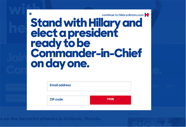
On top of being laser-focused, the CTAs are written from the perspective of the visitor.
The Bad:
It’s difficult to say whether or not the themes of Clinton’s pop-ups “work.” Instead of defining herself proactively, the visitor’s first impression is directed toward either who she’s against (Trump) or who supports her (Obama).
For a candidate who regularly gets lambasted on Saturday Night Live for being unrelatable and aloof, this worries me from a conversion perspective.
Moreover, both pop-ups make the assumption that her visitor will be a “party” voter. The first message — being anti-Trump — is probably a safe bet. However the second is riskier given that the most recent polls put President Obama’s approval rating at 50%.
The Experts:
 |
Henneke Duistermaat:
|
|---|
“You can see two interesting persuasion principles at work here. The first is what psychologists call the consistency principle, also known as the foot-in-the-door technique: once you’ve agreed with one small request, you’re more likely to agree with a bigger request.
This is exactly what’s happening with the two-step sign up: first agree with a simple statement (small commitment) before submitting your email address (slightly larger commitment). Of course, this flies in the face of conventional advice on making the sign-up process as easy as possible. I assume they’ve tested both options and the two-step process worked better.
The other point to note are the two different phrases: one portraying Trump as commander-in-chief as a mistake (avoiding a risk) and the other agreeing with Obama that nobody is better qualified than Clinton (gaining a positive benefit).
The question here is: do people want to avoid Trump as president or do they want to support Hillary Clinton as president?
Many of us are risk-averse. We prefer avoiding problems rather than gaining something. It’s a great test to run for any business.
For instance, do your customers want to avoid internet downtime or are they looking for consistent internet access? Or, imagine you’re selling bikes: do your customers want to avoid a sore butt or are they looking for a comfy saddle?”
 |
Bryan Eisenberg:
|
|---|
“There are all kinds of challenges with these pop-ups. However, when we are dealing with political websites versus business websites the intrinsic motivations are completely different. Why people do and don’t do things radically changes. Political websites can add additional friction points — like extra clicks — and people’s motivations will still provide the momentum to convert.
Why?
Because we are not dealing with an exchange of money (at least not primarily) but rather a reinforcement of an individual’s values. The key thing about these pop-ups is how they fit the candidate’s brand narrative.
Both tell the same story and appeal to the same values. In that sense, they’re ‘selling’ a consistent vision… one that visitors to this site would no doubt connect with.”
 |
Danielle Devereux:
|
|---|
“Great design is one of the most crucial aspects of user experience on your landing pages. Design relates to many critical components such as navigation, layout, colors, font choices, text and videos. You want users to have an easy and pleasurable experience navigating these elements of your site.
To accomplish this you must reduce friction. Friction is anything visual, technical or logical that gets in the way of a user completing your landing page’s desired goal.
Clinton’s pop-ups create a point of friction, because the first non-essential pop-up — ‘I Agree’ — gets in the way of the essential CTA pop-up — the email signup form.
The goal of the quote design is to present an attractive invitation to subscribe to the Clinton campaign newsletter. So why ask your users to click on an extra pop-up? This creates friction by adding an unnecessary click and weighing down the interaction.
To solve this problem, limit your signup process to as few steps as possible. One or two steps works really well. Show them one pop-up with a compelling CTA and as few form fields as possible.”
Step 2: Homepage
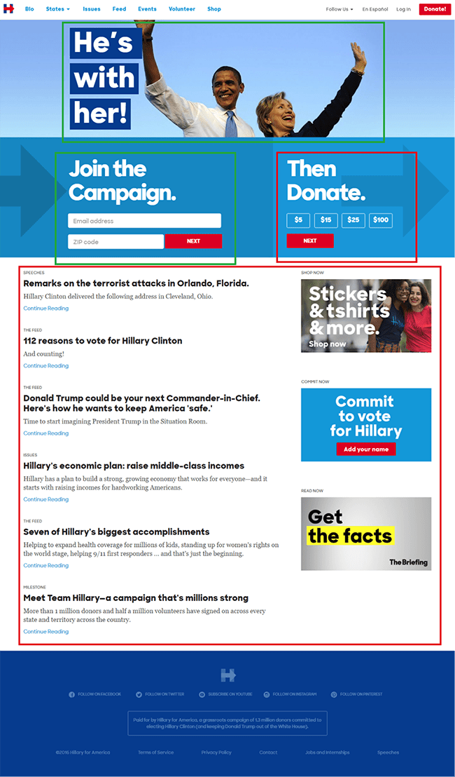
The Good:
Setting aside Obama’s struggling approval rating, using the header image to make a powerful and joyous announcement is a smart move. As opposed to the negativity of the first pop-up, Clinton’s homepage copy and imagery is decidedly positive.
The area below the header then offers two clear options for people who want to participate in Clinton’s campaign. Both options include the first steps to completing the desired action right there on the page. They’re also presented in a logical order: join first… then donate.
The menu options are elegantly lined up and not as crowded as Trump’s. The red “Donate” button on the top-right leaps off the page. And Clinton cleverly sows elements of her progressive logo throughout.
The Bad:
While not as overwhelming as the body of Trump’s homepage, Clinton’s homepage lacks focus, direction and a clear visual hierarchy. After the initial CTAs to either join or donate, there are no follow-up boxes to engage visitors once they leave the header section.
Instead, the majority of the screen is dominated by text-heavy article excerpts.
My first thought was that the articles would link to outside resources, something that Trump does well. Instead, they’re internal links to pieces on Clinton’s own site. While internal linking keeps her visitors on-site, the downside of this is it doesn’t offer objective or outside validation (i.e., social proof) to back up the claims being made.
Even the so-called “Get the Facts” box links to another of Clinton’s own pages:
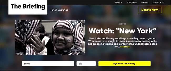
Lastly, because her social icons are presented in the footer only and obscured by light-blue text on dark-blue background, they might as well not even be there:
The Experts:
 |
Andy Crestodina:
|
|---|
“Clinton’s homepage is relatively lightweight and fast loading: 1.3MB at ~2 sec.
It’s also light in terms of copy… just 350 words including the navigation. It’s action oriented and carefully edited. There are 50+ verbs and zero adverbs.
You can’t miss the calls to action. They’re prioritized — subscribe, donate, shop, then follow — and the arrow, borrowed from the logo, helps to move the eye along. More than half the page is dedicated to these actions. That’s an extreme ratio of CTA to content.

The content area is also super concise, with tiny headers (speeches, the feed, issues, etc.), big headlines and small excerpts and consistent links. This area has no images, which makes it easy to scan.
Some of the headlines are missed opportunities for editing. They could have left out the first few words on this headline: ‘Hillary on why we can’t let Donald Trump bankrupt America like one of his casinos.’
We all know who’s website we’re on. No need to use the name again. Also, it’s strange to see this link off to Medium.com. Unless the candidate has a strategy for building an audience there, she would probably be better off keeping the visitor here.
They’re using Optimizely, so presumably, we’re looking at a test. This is definitely a carefully optimized tested page. Some might say that’s an accurate reflection of the candidate.”
 |
Everette Taylor:
|
|---|
“After clicking through the pop-up, the page does a solid job of reinforcing the desired outcome and drawing people further in. The use of Obama throughout — and now Bernie Sanders — is great use of social proof and a ‘third party endorsement’ of sorts to validate her brand.
One thing I notice that’s interesting is that she’s requesting zip code along with email. If she’s doing super targeted localized emails then awesome. If not, just unnecessary friction. Also the CTA of ‘Next’ on the red buttons are super weak… c’mon, Team Clinton.
It’s very surprising, too, that there is no use of video on the homepage, which can elicit an emotional response that connects with voters and drives conversions for emails and donations. There’s also no search bar on the homepage, which in my opinion hurts usability of the site.
Lastly, the fact that the tags like ‘Speeches’ and ‘The Feed’ are unclickable — as well as ‘Shop Now’ and ‘Commit Now’ — are a user experience no-no. If you want people to enjoy the website experience, give them multiple ways to accomplish their desired action. Also, a huge missed opportunity is not having an email capture at the bottom of the page.”
 |
Johnathan Dane:
|
|---|
“One of the first things you need to focus on when it comes to conversion rates is making it insanely simple for the visitor to understand what to do.
If you have two calls to action, like Clinton does — one for email and another for donation — then start off by potentially only using the call to action that has the lowest threat in the mind of the visitor. In this case, it would be email over donation.
Once you’ve gotten the ‘easier’ foot in the door and the visitor trusts you, then you can ask for the next thing (what you originally wanted): the donation.
When it comes to what’s below the fold, it may be a better design choice to use this space to add benefits surrounding the two calls to action — preferably one call to action — instead of having additional calls to action and blog-style posts to divert attention. ‘Feed’ and ‘Shop’ can already be navigated to from the header, so leave it at that.”
Step 3: Clinton Donation Process
The Good:
Visually, Clinton’s donation page is masterful. Not only is the image aspirational, her hand cleverly provides a directional cue, driving the visitor’s attention exactly where she wants it to go: the form.
Better yet, the form is easy to read, easy to fill out on both desktop and mobile and the buttons (unlike Trump’s) are obviously buttons.
The note in the footer provides a clever two-part persuasive push: (1) social proof by way of the 1.2 million “grassroots” donors and (2) a common enemy with the parenthetical note: “Keep Donald Trump out of the White House.”
The Bad:
The copy, on the other hand, definitely leaves something to be desired. Rather than continue the positive momentum from her homepage’s hero section and the aspirational image to the right, it reads like a perfunctory declaration of fact: “Hillary just secured the nomination.”
Worse, the only action words on the form are equally uninspiring: “Chip in to stand with her.”
The fine print below the form does a better job of highlighting the option for “Americans Abroad,” but it’s still something you have to hunt for.
The Experts:
 |
Jen Havice:
|
|---|
“Clinton’s image does a good job directing your eye towards the call to action. Clinton’s gaze and arm position act as a giant arrow making it clear what she wants you to do.
In addition, the red, white and blue color scheme hits all the right patriotic buttons.
It would be interesting to test having an image of her with other people — other real people — instead of other political figures.
The copy is asking the visitor to stand with her, yet no one else is. That may create undue friction in visitors’ minds. I would tap into the herd mentality both through the copy and the visuals, hitting home the fact that the visitors themselves are far from the only people backing Clinton.”
 |
Talia Wolf:
|
|---|
“In many cases, when it comes to donations and raising money, most NGOs focus on the situation right now: the poor child or the terminally ill mother. However, the most successful donation campaigns in the world are those that show donors the outcome of their donation: a happy kid or a smiling mother.
Why does this work? Though we donate because it’s the right thing to do, we also donate because we want to feel good about our actions and ourselves. I would like to see Hillary Clinton’s page make donors feel good about their choice to chip in and promise a brighter future for them.
Currently the landing page’s main focus is Hillary Clinton and her success. People may like to see her win, but there’s a lot more behind their votes than simply the idea of Hillary Clinton being president. Choosing a president is about believing that this person can change our lives for the better.
I would test a different strategy that focuses on the visitor rather than Clinton personally. While the hero shot of Clinton is clearly directing visitors’ attention towards the call to action, I would test adding many other people around her to show that her success is everyone’s success and that she has many supporters.
I’d also add a lot more social proof — perhaps testimonials, showing how many people have already donated and highlighting the change Clinton will deliver by being elected. I’d focus on making the page in terms of content and visuals all about the people ‘chipping in’ and the emotional outcome — the pride, excitement and promise of a brighter future.”
 |
Alex Harris:
|
|---|
“I think Team Clinton has done a great job of combining the image of Clinton pointing with the clean, interactive donation box.
It may be worth testing ‘Select an Amount’ versus ‘Choose Amount Below’ and making it left aligned. Sometimes you can increase conversions by breaking up the grid layout so the users can scan each section in a zigzag motion.
The same thing goes for the ‘Next’ button. I would test it in a variety of ways, including making the button not expand the width of the section and making is skinnier. Also I would not make it flat. After years of testing buttons on banners and landing pages, I’ve found a beveled button with rounded corners tends to work better than a flat button. There’s also no hover on the button, which is just lazy development.
As far as the ‘Secure’ text and icon, I think it is good enough, but it can be better. I would test making the lock gold and playing with text — something like ‘100% Secure.’
The rest of the interaction and forms are pretty standard. I think they work well and seem to flow from page to page pretty easily. That said, the form doesn’t include accepted credit card logos, which can be confusing to visitors. They may accept all cards, but they rely upon users to deduce that for themselves. Also, why is ‘Employer’ a required field? That field could stop a user from donating, or they will enter a fake company.”
And the winner is…
Sorry, but if you’ve been holding your breath waiting to have Trump or Clinton declared the conversion rate optimization victor, only time will tell.
Besides, I told you from the jump this is not a political article, and I’m not going to go breaking that promise here at the end. More to the point, I don’t want to get bombarded in the comments or on social media by adherents to either party.
Truth be told, the real winner in all this is conversion rate optimization itself.
Why?
Because thanks to the staggering success of presidential optimization in the past, these might very well be the highest stake funnels in the history of the world.
And that means one thing: No matter what side of the aisle you’re on, they hold a treasure trove of insights for copywriters, designers, UX engineers and anybody looking to improve the results of their own websites.
Huge thanks to all the CRO gurus who contributed.
Now… it’s your turn.
Did we miss something good, bad or ugly?
If so, be sure to let us know to it in the comments.
