
The best landing pages are concise and include just enough copy to make the sale – and not a word more.
That’s not to say that, “shorter is better.” Long landing pages definitely have their place.
For example, maybe prospects have never heard of you and need to be educated about your solution. Maybe they’re not even entirely aware of their own pain. Or maybe your offer is particularly complex or super expensive.
In those cases, a long-form sales page could be exactly what you need to tell your story and set the stage for conversion.
So how do you know whether you should be testing a longer-form sales page? And how can you be sure that you’re not falling victim to some of the biggest long-form sales page pitfalls?
Keep reading to get the skinny (and – spoiler alert – to download a free sales page template).
Part I: When your landing page needs long-form copy to make the sale
Before we jump into where long-form sales pages can go wrong, let’s go over some signs that you should be testing a longer sales page.
Your product/service costs a pretty penny
When people are asked to part with larger sums of money, they’re more likely to scrutinize an offer.
A higher price tag leads to an increased sense of commitment and anxiety – and it’s your job to include as much copy as you need to soothe your prospect’s fears.
They want to know where their money is going and if they’ll be getting enough value for how much they’re shelling out. Take the space you need to be crystal-clear about the benefits of your offer and exactly what they’ll get.
Your product/service has a lot of moving parts
How easy is it to explain how your product or service works? The more features to your product or pieces to your offer, the more copy you’ll have to go along with it.
Michael Aagaard of Content Verve showed this correlation between cost/complexity of an offering and the length of a landing page.

In the above example, he found that the shorter landing page converted better. Why? The gym membership is relatively inexpensive, the offering is simple, and the perceived level of risk is low. An A/B test revealed that giving people more information isn’t necessary.
However, when he tested a longer version of a landing page for an insulation company where the offer was more complex and with a much higher price tag, the shorter version lost.

The offer represents a larger investment and directly concerns the prospect’s home and comfort. The thought of making the wrong choice about an insulation company is one that causes anxiety – which in turn requires more explanation about the offer.
As Michael put it, “It’s a complex offer that could result in a large investment in insulation. So there’s a high level of commitment and perceived risk involved.”
Your prospects aren’t yet aware of the solution to their problem
Your prospects may not yet be aware of your offer and how it’ll fix their problem – in fact, they might not even be entirely aware of their problem.
Depending on your prospect’s level of awareness, they’ll need varying degrees of information to get them to hit that buy button.
Joanna Wiebe at CopyHackers does a fantastic job of explaining just that with her post How Long Should Your Pages Be?:
Your page needs to be as long as is necessary to make the argument that will address the prospect in their state of awareness. If you don’t know how aware they are, you need to find out in order to shape your argument…
Basically, the less aware people are of their pain and that a solution exists to relieve it, the more copy is required to make them feel comfortable with the offer.
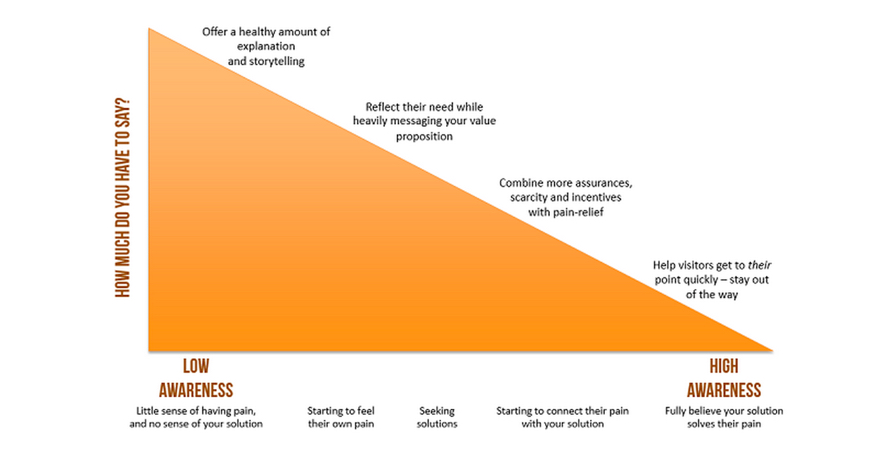
If your prospect has low awareness, then you need to paint a vivid picture of the pain they’re experiencing before you even mention your offer.
Once you’ve painted that picture, then you’re in a great position to educate them about your solution by showing how their life could be better with it.
Part II: Avoiding long-form sales page pitfalls
Now that you’ve got a better idea of when it’s necessary to test a longer-form sales page, it’s time to look at a few easily fixable mistakes that can make your pages really shine (and convert).
Problem: You’re letting design overpower the message
Let’s just get one thing straight. I do believe you can have gorgeous design on your long-form sales pages. You don’t have to go the ugly or plain Jane route to get conversions.
But if cool graphics and eye-popping photos are getting in the way of quickly getting to the message, there’s a problem.
Take a look at this sales page for a design and copywriting course:
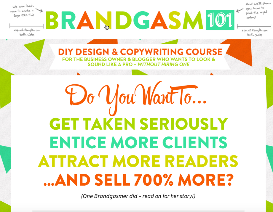
There’s way too much going on above the fold. Between the multiple font colors, handwritten notes up top and multiple big blocks of text, its easy to go on cognitive overload. Where should my eye go?
This design forces the reader to think way harder than they should have to.
Fix: Make your design support your message
Your priority when designing your long-form sales page should be to give prospects the information they need to make a decision. Any design elements you add to the page they should serve the one goal of the page.
Take a look at this screenshot from just below the fold on the same page:
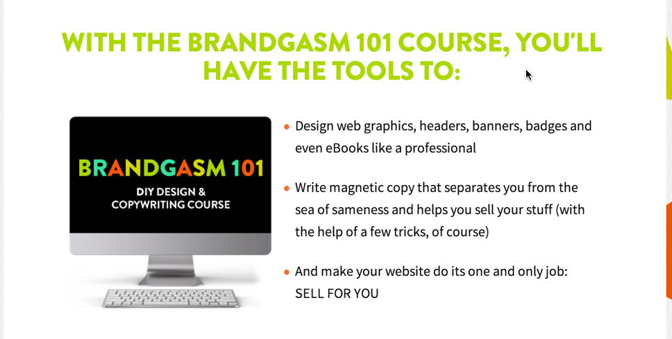
The elements are no longer competing for attention – the design, typography and formatting enhance the message without making it take a backseat.
And the most important things are emphasized.
Problem: Your story isn’t compelling your visitors
If you’re selling a $2,000 coaching course and you’re not a household name, simply explaining your offer and providing a few benefit bullet points isn’t going to cut it.
If your prospects need a lot of information in order to convert, your landing page copy had better tell a compelling story.
You need to immediately hook prospects in by keying into their pain and reflecting it back to them with the promise of a solution as they move down the page.
Fix: Take your prospects by the hand and walk them through your why
Especially on long-form sales pages, storytelling is one of the best tactics for persuading your audience.
Every single piece of copy should keep the eyes moving down the page and build on the narrative you’re weaving.
For example, the flow of your argument on the page may be:
- Setting up the problem
- Explaining why you’re uniquely qualified to understand (and solve) that problem
- Explaining how your course will fix the problem
- Giving the benefits buyers will gain from the course
- Anticipating any objections your prospects might have
- Telling your buyers what kind of results they will see after taking the course
- Laying out exactly what they will get (lessons, tutorials, etc.) after purchase
The screenshot below shows a sub-headline and text from Tara Gentile’s Quiet Power Strategy sales page. Here she begins the process of setting up the problem that many entrepreneurs have: not knowing how to grow their businesses or find the support they need.
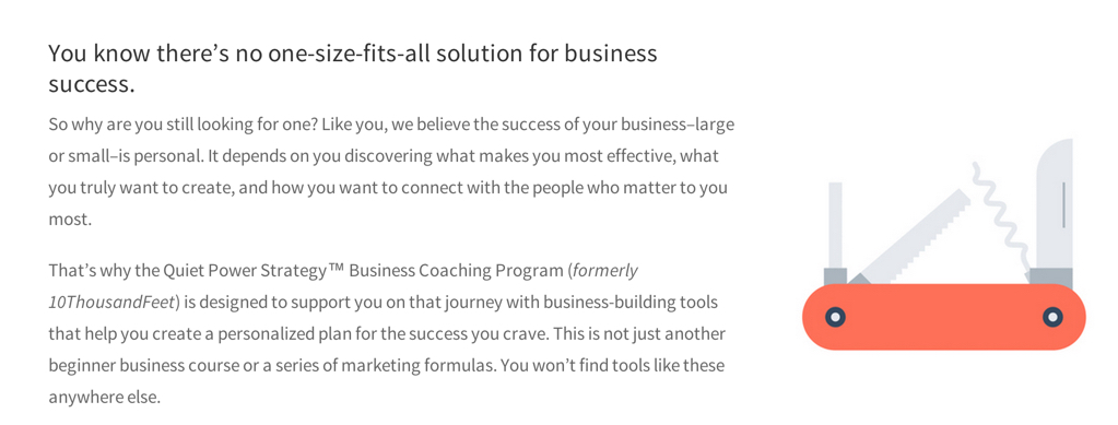
If you move down the page, you’ll see where each sub-head picks up the thread of her argument as to why her coaching is ideal for her prospects. She does all this while making sure to address their most pressing concerns with FAQs and testimonials peppered throughout.
On your sales page, explain the why of your business. Show that you care and understand before you ask prospects to whip out their wallets.
Problem: You don’t adequately convey the value of your offering
This is a biggie. Time and time again, I read survey responses from recent client customers saying they almost didn’t purchase from the landing page because they weren’t convinced of the value.
More often than not, the question of value revolves around price. But time can play a role as well. Everyone’s time is worth something – and your visitors will weigh the amount of time necessary to complete your course or get up to speed using your new product with all the other commitments on their plates.
In their minds, they will be asking themselves questions like:
Will I really have enough time to complete the course?
Will this just be another thing I buy and never use?
Will I gain enough skills to raise my rates and pay for the course?
So how can you address these concerns before they even come up?
Fix: Reframe the cost by breaking it down into a more manageable sum or comparing it to something tangible
One of the most effective ways to convey value is to frame the expense in terms of something else the person can relate to in their everyday life, or to simply break it down into smaller bite-sized pieces.
Have a look at this sales page that I wrote for Girls Gone Strong:
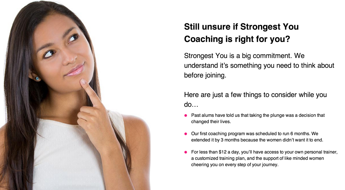
We addressed the time and cost commitment issue by turning it on its head.
The first two bullet points talk about what value previous coaching clients got out of the program. The third breaks down the cost by the day. Spending $12 a day suddenly seems like a no brainer for everything you get.
Is your sales page ready for primetime?
Take a look at your sales page and take some time to:
- Determine if going long-form is the right call. Depending on the particulars of your offer and how aware your prospects are of their problem and the solution, keeping it concise may be exactly what the doctor ordered.
- See if your page is suffering from any of the common mistakes cited above. If it is, take the time to rework your design or copy.
- A/B test a longer version against a shorter version. No matter how much we’d all love for there to be tried and true best practices, there simply aren’t any. You’ve got to test for yourself.
It may seem like a lot of work. But if it’ll help you bring in more conversions, it’s definitely worth it.

