Did you know that almost 66% of all emails are now opened on a mobile device? A statistic all marketers should be aware of, no doubt, but what should really grab your attention is that 75% of people who receive email that isn’t optimized for mobile will just delete it.
If you’re a marketer who is sending emails that haven’t been optimized for mobile, you’re missing out on so much of the action that you might as well choose another profession.
The good news is that there are solutions to your mobile woes, none of which require you to be a rocket surgeon. Just a little bit of data mixed with a little bit of design with a dash of common sense thrown in for good measure.
Here are four reasons your emails might not be getting opened and read on mobile – and what you can do to correct it.
1. You’re not teasing the content of the email
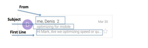
The crucial first step of any marketing email is getting people to open it. In most mobile email apps you have three lines to convince your audience to open and read that email: the subject line, the first line and the from line.
Our friend Aaron Orendorff has written a handy guide that breaks down the importance of these three fields and how to get the most out of them. Here’s what he says, in a nutshell.
Subject lines
An ellipsis can’t tell anyone what you really mean, so before your subject lines start trailing off into a mess of meaningless dots, remember that you have just 20-30 characters to reach your mobile readers.
That actually works out quite well, as 28-39 character subject lines get the highest click rates.
With so few words at your disposal, you may wonder which ones will do the best job of reaching your future readers. Aaron breaks that down as well, with a little help from the good folks over at Retention Science:
- Personal words like “you” and “I” work well, as do slang terms and colloquialisms. Even emoticons are starting to help open rates here at Unbounce, however slightly. The point is that your email should sound like it’s coming from a human.
- Emotional words that give your audience some sort of attachment to your value proposition are super good.
- In one study, using pop culture references saw an open rate of 26% over ones with traditional subject lines, which were opened only 16% of the time.
But don’t get carried away. You still have to make sure that you’re matching your subject line with the copy on your landing page. “You can learn to dance like Beyonce!” might fit the criteria above, but if you’re selling car parts, you probably won’t get too far.

First lines
The best kind of marketing is sincere and personal. According to Aaron:
The first line of your automated emails should read as much like the first line of a real email as possible.
Unbounce co-founder Oli Gardner often does this in his emails to prospects. A couple of examples of first lines from Oli:
CRO Day was one of the proudest moments of my professional career.
Hard to believe, but Page Fights is one year old!
They read much like an email that you’d get from a friend, which prospects are more likely to open.
From lines
Automated emails should come from a real person and not look like they’re coming from an automated system.
Again, Aaron sums it up perfectly:
Avoid from lines like support@yoursite.com, customerservice@yoursite.com, sale@yoursite.com, or, worst of all, the dreaded word auto.
Instead of sending the email from your company as a whole, send it from a specific person with a face and a name.
This article from Crazy Egg reveals some numbers behind personalized From lines. According to one study, personalized emails had a 29% higher open rate and 41% unique click-through rate.
As a marketer who is trying to get email content opened, read and acted on, adding a personal touch is a simple way of getting your audience to open your emails and click through to the next stage.
2. Your font size is creating friction
You work hard on the content of your emails, and so you want to make sure people are actually able to read them.
I subscribed to The Economist the other day. Their content is great, their delivery through their apps is spot on, but this email that I got after I signed up was a prime example of what not to do.
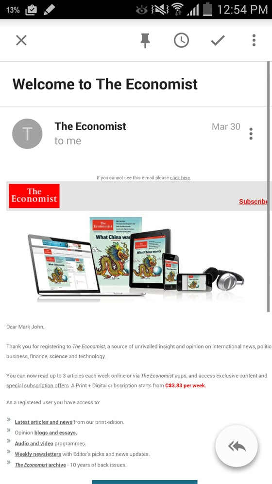
What is that, an email for ants? Here’s a better job from our friends at Inbound.org.
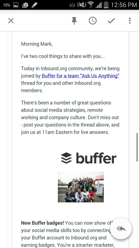
Well, that’s much easier to read! The text is much larger and doesn’t require a microscope or any pinching or zooming.
So, how do you make sure that your text is readable on any given device?
While the iPhone automatically resizes tiny text, other devices won’t – so you want your font to be legible by default.
This comprehensive article on the Salesforce Canada blog recommends a minimum font size of 14 pixels for text in the body of the email, with minimum 22 pixels for headers.
But you’ve really got to test yourself to find that sweet spot for your audience.
3. The design of your emails is getting in the way
Good email design is all about enabling readers to actually see your content.
As my colleague Brad puts it: “Get out of my way so I can read the damn email.”
This isn’t a statistical analysis, but it does speak to the heart of what we’re trying to get at: the best designs are the ones where the people reading the mobile emails are not aware of the design.
If you include images in your emails to mobile readers, there’s a good chance they won’t even be seen. As Rose Barrett at Storyports points out, 43% of Gmail users read email without turning the image display on. Some mobile email clients, like the Blackberry and Windows phone clients, block images by default.
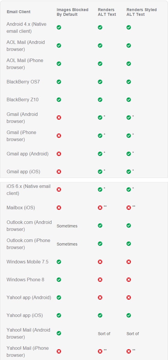
The way around this, according to Barrett, is to use HTML emails instead of text emails with images added. You’ll still get to send highly stylized and informative text to your readers, and because CTA buttons are separate from the images, they’ll still appear in your email.
And if you do decide to use images, don’t forget to keep the design consistent between your email and your landing page. Good design match never hurts conversions.
The key is to keep it simple. And don’t forget to test. What works for one audience may not work for yours, so make sure you’re testing all the things!
4. Your call to action isn’t very touching
By now you get that there is limited space on a mobile device, and the real estate that you do have is valuable. The point of your email is to get people to click a link that takes them to your awesome landing page.
Give your email readers the ability to click that link by making your call to action button big enough for them to see, and big enough for them to actually be able to tap it with their thumbs.
You want to avoid text links as CTAs in your mobile emails. Remember, your mobile audience is all thumbs (badoom pssh), and you can reduce friction by making your CTA big and beautiful.
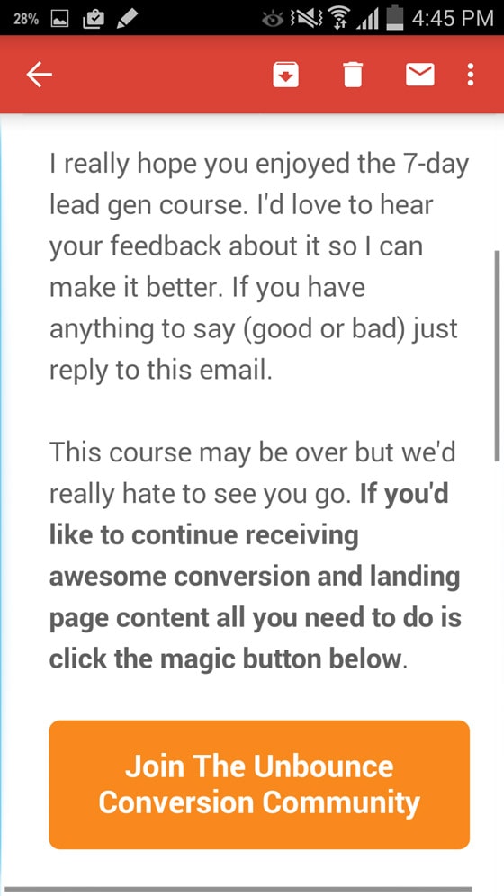
Below is another email from Oli that shows this in action. The CTA button is large enough to see and large enough to actually tap.
Chris Hexton at Optimizely does a great job of breaking down the art of the email CTA. The goal here is not so different from that of your landing page: make your CTA stand out.
Chris is fond of using the CRAFT method of CTA design. That means making your CTAs:
- Colorful: Make them stand out from the rest of the text
- Relevant: Keep CTAs in line with the message in the email
- Actionable: Keep it clear, direct and understandable
- Forceful: Tell your readers what to do
- Targeted: Speak to what your readers’ needs and aspirations
By doing so, you give your readers a reason to take action and convert.
Mobile is not going anywhere
Take the time to get to know them by going through your email analytics to see how many are interacting with your emails via mobile. Dig in deep and see what you can learn about them. Offer them great experiences whether they’re on mobile or desktop by making sure that both your emails and your landing pages are mobile responsive.
Not adjusting to the needs of your mobile customer means that you’re leaving money on the table. And we’d hate to see you do that.
As always, we’d love to hear from you. Are you seeing a lift in your conversions by making use of any of these tactics? Let us know in the comments below!

