
It’s that time again, where we showcase and critique some awesome landing page examples to inspire your next designs. Last time we looked at 35 Beautiful Landing Page Design Examples. Today we’re focusing solely on lead generation landing pages, so if you are in the business of list building, you should be able to learn a lot from these ones. And thanks again to our customers who built the pages and agreed to let us show them off.
10 Tips for Lead Gen Conversion: At the end of the post, I’ll be doing a recap of what we’ve learned over the course of these critiques so you have a starting place for your next page.
1. Right Signature

What I like
- Nicely encapsulated form: The first thing you see on this page is the form – it’s beautifully positioned and designed for clarity using the rule of encapsulation . And it will always be above the fold.
- Clear info about what you’ll get, including freebies for extra incentive: The text beneath the button helps put the visitor at ease by describing what will happen next – and the addition of some free usage is a good incentive to sign up.
- A headline that describes exactly what the product does: I love this headline. It’s so clear and to the point that you couldn’t fail to understand what the service does instantly.
- Demonstration of simplicity: The 3-step design below the main area makes it really quick to understand how the service would be used, which will limit the number of bad leads you’ll get as they know what they’re signing up for.
- High profile testimonials: Big trust factors come from these testimonials and they help describe the benefits at the same time as showing off the exposure the service has received.
Things I’d change or test
- Nothing!: I could go on all day about why I like this page, but I have too many more to write so I’ll stop now. Great job RightSignature.
Site*: rightsignature.com
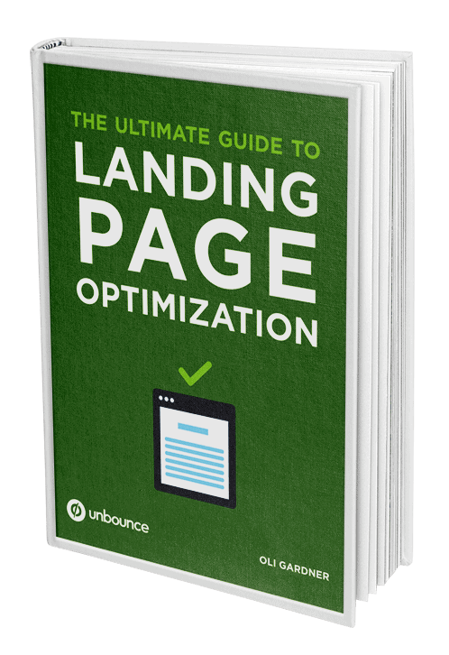
2. Monetate eBook

What I like
- Design of eBook image shows professionalism: By having a nicely designed cover you show that time and effort went into it’s creation (as opposed to a boring plain white cover).
- Simple bullets break down why you would want the eBook: The headline for the bullets “You’ll learn” really sets the tone that it’s useful and listing what you will get out of reading it (as opposed to what’s in it) is a much stronger benefits driven approach.
- Clear definition in headline of what you’ll get: Sometimes it’s nice with an eBook to know it’s not War and Peace. By limiting this to 10 tips, they stand a good chance of increased conversions by providing an easy to consume resource. While long eBooks can be authoritative, they often go unread.
Things I’d change or test
- Social sharing location: People are more inclined to share something right after they actually get it. So I’d suggest placing the social sharing buttons on the form confirmation page. This also has the benefit of removing distractions from the main page.
- Preview: People react well to the psychology of try-before-you-buy, so adding a preview of the eBook (first chapter or a few choice pages) would help people know what they are exchanging their personal data for.
Site*: monetate.com
Interested in learning more about landing page optimization?
3. Nerds On Call

What I like
- Live chat to boost conversions: Live chat is great for nudging fence-sitters onto the right side (the conversion garden). If they are unsure about continuing, then a nicely worded and timed popup in the lower corner of the page asking if they need any help can really lift your conversions and lets you gain insight directly from your customers which can be fed back into an A/B test hypothesis for further optimization.
- Simple checklist of benefits and core offering: The checklist of 4 benefits are really simple and easy to digest, and describe the service very well.
- Strong indicators of success: When you couple the statement of over 130,000 computers fixed with all of the media logos, you can be sure these guys know what they are doing.
Things I’d change or test
- Form purpose: It doesn’t seem to have one. Send message? For what reason? Include a clear statement at the top of the form about what it’s intention is.
- Live chat: As great as it is (see above), to gain access to it you need to click a button that says “TRY FOR FREE”. It should describe what will happen instead. Something like “Ask a nerd why your computer is sick”.
Site*: callnerds.com
4. iPhone App Development

What I like
- Crystal clear headline: The headline makes is obvious that they are an iPhone app dev company and the phrasing makes it feel like they’ll take the pressure off your hands and get it built for you (knowing that everyone needs an iPhone app but has no time to build one). Us included :)
- Action oriented form headline: There’s no dilly dallying with the form header (one of the most important elements of a lead gen page). “Get your project started” inspires you to take action.
- Client testimonial video: Great testimonial! It has a nice written one coupled with a video. You also get to see what the app is which shows you the quality of their work.
- Confident benefit statements: All of the statements in the main content area are titled in a way that makes the company sound very confident in their ability = trust x10.
- Guarantee: A guarantee is always a nice way to lay out a security blanket. iPhone apps are often rejected from the App Store – but they guarantee you entry – big win.
Things I’d change or test
- Umm, nothing: It’s a great page. I was worried when I saw the contact us button at the bottom (thinking they were mixing click-through with lead gen) but it just pushes the page back up to the form. Nicely done.
Site*: 21alta.com
5. Double Chin?

What I like
- Emotional photography: The hero shot here evokes an emotional reaction. It would instantly resonate with anyone who feels self-conscious about the topic being discussed. This will help people feel like there is a solution to their problem, increasing the chance of a conversion.
- Asks a question: By asking a question, you will immediately gain the attention of anyone who says YES in response. This will increase engagement and hence conversions. It does this in the main headline and the CTA.
- A guided experience: The form header instructs you to do something, increasing the persuasion value.
Things I’d change or test
- Move social buttons to the confirmation page: You’ll be hearing this a lot. Everyone seems to be doing this.
- Remove website URL: Your goal here is to get the form filled out (or a phone call). By giving your website URL out you run the risk of them visiting their and either losing their way (loss of information scent) or converting in a different place. Yes, you still get a conversion , but it gives you false information about the effectiveness of your landing page.
Site*: cvillemedresearch.com
6. Keas Employee Wellness

What I like
- the benefits: Just like the RightSignature page, the “What you’ll learn” bullets are all about what you’ll get out of the eBook. A common mistake here is to list the contents rather than the affect the content will have on you by reading it.
- Feel good factor: Part of me thinks the psychology behind doing good may be a factor in conversion. Sure it’s more about the need for the content, but the statement above the customer logos about changing lives – adds a strong sense that this eBook could do something great for you.
- Trust: Along with the customer logos, the inclusion of the physical office address adds an extra layer of trust.
Things I’d change or test
- Encapsulate the form: The form completion is the goal of the page, so make it stand out as much as possible (without putting gaudy Christmas lights on it). To help this, try placing it in a box like the RightSignature example discussed earlier.
- Move the social sharing buttons to the confirmation page: I’m seeing a pattern of pages having too many interactive elements. This post on post-conversion strategies explains why you should move them.
- Privacy policy position: I’d try moving it closer to the form to ensure people see it and feel comfortable giving away their email.
- Phone number: They might want to enhance the trust factor further by adding a phone number beside the address.
- Form length and required fields: Try a shorter form or consider not making all of the fields required.
Site*: keas
7. Draytek Networks

What I like
- Strong value proposition: The headline gets right to the heart of a fear their customers will have – maintaining uptime and the bullets below do a good job of backing up the statement.
- Low-risk element: They use a subtle secondary CTA at the bottom for fence-sitters. If you’re not ready to commit to giving up your info, they invite you to follow them on Twitter which keeps them in your sphere of influence and may produce more marketing opportunities down the road.
- Directional cue: The arrow pointing to the form makes it clear where you need to go. It’s not as critical on a page this short and simple, but it’s always a good device to use to add a little persuasion. And matching the color to the button is a nice touch.
Things I’d change or test
- Privacy policy: All lead gen forms should have a privacy policy – especially if you’re doing pay-per-click (Google AdWords etc.) as they will often penalize your quality score or ding you in another way if you don’t have one.
Site*: draytek.co.uk
8. BPP Law School

What I like
- Descriptive CTA: You know that you will get to talk to someone if you submit the form.
- Clear primary & secondary headlines: The main headline and sub-header beneath the video spell out the purpose of the page nicely, and lead nicely into the form header statement.
- Use of video: The interview video makes it feel more real.
Things I’d change or test
- Social buttons: I’d remove these unless they had large numbers on them for social proof, and preferably put them on the form confirmation page. They definitely shouldn’t be the first thing you see on the page.
- Remove link: there is a link directly below the video – which could leak people away from your landing page.
- Live chat: As the goal is a conversation with an advisor, I’d consider adding a live chat widget to the page so that prospects can talk to an advisor immediately.
Site*: bpp.com
9. Spanish Slang Dictionary

What I like
- Enticement through fun: People like to know at least a few dirty words in a foreign language (especially the younger demographic) – it makes travel more fun.
- CTA explains what you’ll get: The cTA couldn’t be any more clear – this is exactly how every landing page button should be written.
- Form doesn’t ask for anything more than it needs: Just an email. Perfect. You can still re-market to them, but the barrier to entry is the absolute minimum.
Things I’d change or test
- Social currency: Increase the viral potential by using a service like PayWithATweet.com to spread the word. Yes, you lose the email, but the exposure is often worth it. Or to get the best of both worlds – set up an A/B test and split the traffic 50/50 – half asking for an email (so you have a lead list) and half boosting the viral nature with the tweets.
Site*: f.generallinguistics.com/quick-start-spanish
10. Optimize New York

What I like
- Persuasive reward: Cash is king (yup, more than content). So the headline does the job of grabbing your attention, the rest of the page needs to do the convincing.
- Paying it forward: Most people have a favourite business of some kind (restaurant, bar, clothing store). If you’re a regular in any way, you’ll probably be more than willing to recommend the company A) to potentially get the reward and B) to help out and become more of a celeb at your local.
- Personal contact: To help the trust factor that you’d actually get the money, there is a name and phone number for a personal contact. Trust is definitely key with this type of promotion.
Things I’d change or test
- Clearer headline: The $500 reward is enticing, but it’s not clear what it’s for unless you read the fine print. I’d use a larger sub-header to state what you’ll get the cash for.
- Belief: How do I know that you’ll let me know if the company you refer becomes a customer? It would help to have a video testimonial that showed the client being happy with the service and the recipient of the $500 receiving or talking about getting the money.
Site*: optimizenewyork.com
11. Spine Center

What I like
- Information kept to three simple statements: Although text heavy (mentioned below) – the page is simple and keeps the information breakdown into simple chunks.
- Phone number: You can speak with a care coordinator which adds a personal touch, but for what is probably an expensive process, it should really be a toll-free number.
Things I’d change or test
- Headline clarity: The page starts with “Backed by Dr. Patel” (nice back pun btw). However, it’s not likely that people will know who he is, so it would be more important to clearly address the “pain point” of a potential customer. Such as “Experiencing chronic back pain?” etc. This will connect their issue to your solution.
- Less text heavy: Explain the benefits in bullet points for easier scanning. People are im”patient”. (Couldn’t resist).
- Success stories: It would be nice to hear about the types of physical issue Dr. Patel has successfully treated, to make a direct connection with people’s problems and to add some authenticity.
- Profile details: Have a modal popup window layer that gives a more detailed history of Dr. Patel’s background.
Site*: floridahospitalspine.com
12. Go Fun

What I like
- Not much I’m afraid: The visual design and layout are good, with a focus on the form, but the purpose of the page is so hidden that I wouldn’t stay here long.
Things I’d change or test
- Change the informational hierarchy: the first thing you see is “SIGN UP NOW” which is very aggressive as there’s no real supporting reason to go with it. Message match is critical for conversion, so make this first statement match the ads/link text people are arriving from.
- What is this?: There is no description of what Go Fun is. Most people’s reaction to confusion is to hit the back button. On further exploration, there is a tiny portion of small text that explains what it is. This should be big and prominent. They are asking for 20 emails of your friends, you need some serious trust factors on the page to give out your friends emails.
Site*: gofunhongkong.com
13. Drug & Alcohol Counselling

What I like
- Emotive image: People interested in being counsellors are compassionate by nature, so this image choice evokes the right emotional response of caring for someone in crisis.
- Locations: the map is useful as it lets you know quickly if this is something that you could feasibly enrole in.
Things I’d change or test
- Target audience: I’d try to make it clearer that it’s about learning to be a counsellor. The form header uses the word “program” which is ambiguous in the sense that it could be implying that you’d be signing up to receive help (rehab etc.) rather than a training program.
Site*: icdccollege.edu
14. Speedy Limousines

What I like
- Headline explains what you’ll get: And it does it in a way that answers a customer pain point (stress-free).
- Encapsulated form area: The boxed in form keeps it separated from the rest of the page content, but I’d rather see it in a solid block of color.
- Immediacy statement in form to encourage participation: Knowing that you’ll get a response in 10 minutes again reduces the stress and encourages participation.
Things I’d change or test
- Put the Facebook recommend button on the confirmation page: Tired of hearing that yet?
Site*: charleslimousine.com
15. Voxeo

What I like
- Contact options: The product seems to be targeted at a fairly high price point (assumption) and as such, it’s important to offer alternative contact options. If you need to hand-hold someone through the sales process then phone or live chat can really help.
- CTA contrast: Boom! The purple stands out like a suit at a rodeo.
- Access to expert advice: The report and white paper are freely available without having to go through a form, showing that they are willing to give their knowledge away for free, building trust and establishing themselves as subject matter experts.
- Benefit statements include stats: Everyone loves numbers, and showing the improvements that the product can produce will help persuade a visitor to convert.
Things I’d change or test
- Modal content: The first report goes to a different site, taking them away from your page. It would be ideal to load this within a modal window – but understandably difficult as it’s another site and you can’t control the size.
- Reduce options: Despite their usefulness, I’d test removing the report and whitepaper – and placing them on the confirmation page as a bonus.
Site*: voxeo.com
16. Villa Huinid Cabanas

What I like
- Seductive imagery: Travel accommodations are all about the experience, and the background photo really sets the scene for what you’ll get to enjoy.
- Simplicity: It cuts to the chase. If you like the look the accommodations, you’ll proceed.
Things I’d change or test
- Brochure: I’d include a brochure PDF right on the page so people can see what other amenities are available. Apologies if that’s what they are already sending you one if you complete the form. As I say below – my Espanol is muay terrible.
- Not too sure what else: I don’t speak Spanish well enough to critique the copy :)
Site*: villahuinid.com.ar/es
17. Fast Track Sales

What I like
- Strong headline explains value prop in seconds: They sell homes fast, and they explain it fast. Great headline.
- Social proof: A strong set of logos adds trust to the fact that they have a good reputation and
- Form contrast: Both the color contrast of the form area and the fact that the guy is holding it, make it stand out nicely, making the page simple to read.
- Form headline and CTA explain clearly what you’ll get: Nuff said.
Site*: fasttracksales.co.uk
18. Hillbrush Food Safety

What I like
- Strong angles provide directional cues to the form: the use of triangles helps to focus your attention on the area of conversion.
- Strong headline: the headline contains a strong value proposition
- Form header clearly explains what you’ll get: You get a catalogue. Simple. this is the goal of a landing page and they get high clarity marks for this.
Things I’d change or test
- Stickers: They’re free, but I’m not sure what they are for. Assuming you stick them up in your kitchen or restaurant to show compliance, but more info would be good.
Site*: hillbrush.com
19. OCD – Clinical Trials

What I like
- CTA asks a question: Questions are very powerful persuasion devices and placing one on the CTA (button) can help people convert as they want to know the answer.
- Photos help relieve the pressure: By showing pictures of regular everyday happy people, they put you at ease by de-stigmatizing a common issue that can affect anyone.
Things I’d change or test
- Move the social buttons: As I keep saying, put these on your confirmation page. If people have just converted they are more likely to share.
Site*: clinicaltrialsinfo.us
20. Empires & Allies

What I like
- Very benefits based: Gain levels fast (benefit). Free secrets, tips and updates for life. That’s pretty compelling for a gamer.
- Short form: Doesn’t ask for much and seems like you get quite a bit for your info.
- Design appropriate: The design is very playful and suitable for the target audience.
Things I’d change or test
- Add a free tip: Consider adding a free tip as a preview of what you’ll get.
Site*: dominateempiresallies.com
21. Azure Luxury Malta

What I like
- Super clear headline/value prop: You can get the benefit of Mediterranean sunshine for x cost. That’s a nice lead in to wanting to know more.
- Seductive contextual imagery: People that like sunshine getaways will appreciate the view of the pool and sense of relaxation.
- Leading the way: after reading the reasons to care (benefit statements) you are lead straight to the form with a directional cue. It’s a nicely crafted story arc.
Things I’d change or test
- Where can you fly from?: I’d add in which airports the trips fly out of so people can be sure it’s convenient for them.
- Submit button: Grr. I thought we’d got through this list without seeing many. Instead of Submit – repeat what you are going to get when you click. It makes people feel safer about giving up their info.
Site*: azure.com.mt
22. Learn French

What I like
- Use of video: the page is kept simple because the video removes the burden of extra copy, a good technique for enhancing page clarity. It’s also quite an emotional video about the founders reason for starting the company after marrying someone from a foreign country. Very authentic.
- Differentiation: The way they leverage the concept of a conversation rather than just learning words, seems likely to be more appealing to potential customers.
- Clear CTA: Learn French. Yup.
- Multiple directional cues: There is the visual arrow directing you to get started, and the video also ends with a friendly request to sign up.
Things I’d change or test
- CTA copy: I’d try changing the button text to “Learn Conversational French” to maintain the concept of the page.
Site*: mangolanguages.com
23. Invest in Wine

What I like
- Appropriate design: Love the use of wine barrels for the form container. And the use of an investment chart is very good at showcasing their point about the investment opportunity.
- Good use of whitespace: The page flows nicely with the opposing image vs. text layout.
- Testimonials: The testimonials do an excellent job of selling the concept to the reader. I’d invest if I had any money. For now I’ll just stick to drinking wine.
Things I’d change or test
- Repeat the CTA: As it’s a long page, I’d place at least one extra CTA half way down and have it scroll you back up to the form at the top. Right after the chart would be a good spot.
Site*: investmentwine.info
24. Kingsley Judd Wine Investments

What I like
- More wine!: Gotta like that.
- Two word headline: You don’t get much simple than that. In just two words they’ve told you exactly what the page is about.
- Beautifully simple and compact design: The blurred image is clear enough to convey the vineyard feeling, while pumping the form box right out at you. Great use of contrast for the form container and button.
- Incentive: Having an opt-in for a free prize draw is a good way to entice conversions.
Things I’d change or test
- Terms & conditions: If you are going to have a prize draw, you should have a link to terms & conditions.
Site*: kingsleyjudd.com
25. Cookie Dough Fundraising

What I like
- Headline establishes status: The declaration of being America’s #1 is reminiscent of Grey Goose and their “World’s Best Tasting Vodka” statement that served them so well.
- Delicious photos: Showing high quality photography of the products helps you believe it’s something that people would want – that you could be successful selling them.
- Step-by-step guide: A nice directional cue (arrow) points you to the a simple “How Does It Work” which explains the process well.
- Success stories: The success stories are very believable and hit the demographic perfectly, which helps to build lots of trust.
Things I’d change or test
- Simplify the goal: there are several things to do here. Request an info kit via the form, or click a button to get a brochure from their site. I’d suggest keeping them on this page and having one goal only. Especially if your primary goal is to collect leads.
- Focus more on the benefit to the customer: Even though it’s for fundraising, people need to know what’s in it for them and there are only a few small spots where this is mentioned. Use language that says that you’re doing good while making an income for yourself – then show the numbers.
Site*: justfundrasing.com
Recap: 10 Expert Tips for Your Next Lead Gen Landing Page
Now that we’ve run through those critiques, I thought it would be good to pull together a recap of the most important lessons we’ve learned that you can use for your next page. Use these tips and you’ll be creating pages that convert better.
- Previews: If you are giving away written content (eBook etc.) then include a short barrier-free preview. Like Amazon’s “Look Inside”.
- Form headers: Your form header should describe why someone should fill in your form and what they’l get.
- Form CTA: The button copy should reinforce #2 and describe what will happen when it’s clicked.
- Encapsulation: Keep your form in a high-contrast container to make it stand out from the rest of the page.
- Ask a question: Make your headline a question to encourage people to think about the answer or have to complete your form to get the answer.
- Message match: Ensure the page content (primarily the main headline) matches your upstream ad copy very closely. This is good or building strong information scent (for humans) and good for increasing your quality score if you’re doing PPC.
- Use video: To make things simple – just read this.
- One at a time!: Don’t have multiple CTA’s and links everywhere to leak people away. That’s what your homepage is for.
- The confirmation page: Put social sharing buttons and bonus giveaways on your confirmation page so they are in position at the highest point of lead warmth and to de-clutter your main page.
- Testimonials: Make them authentic, and when sourcing them, ask your customers directly for examples of how your product or service has benefited them. Dollar signs and numbers work best.
