The cardinal sin of ecommerce landing pages — for physical and SaaS products alike — is mixing lead generation and sales… on a single page.
At first, that sounds incredibly odd. After all, shouldn’t ecommerce landing pages cater to both audiences: those wanting to learn a bit more and those wanting to buy?
Short answer: No. Long answer: Yes, but…
Instead of building targeted landing pages for multiple stages of the sales funnel, many ecommerce companies try go all-in, all at once. This creates a painful disconnect for would-be customers, especially for products that desperately need a foundation of trust built early on in the funnel.
The result?
Worthless PPC campaigns, wasted money and dismal conversion rates.
So how do you create high-converting ecommerce landing pages that drive signups, subscriptions and sales? You don’t reinvent the wheel. Instead, you take a detailed look at existing good, bad and shockingly terrible ecommerce landing page examples.
This article breaks down three pages from separate industries to diagnose exactly where your own pages are succeeding… or failing.
Need Inspiration for Your Ecommerce Landing Pages?
1. Consistency counts: Kettle & Fire
Let’s start with a somewhat non-traditional product: “100% Grass-fed, Organic Bone Broth.”
This stand-alone landing page doesn’t contain anything shockingly terrible, but its highs and lows do offer some potent lessons for ecommerce landing pages. Before we dig into the details, here’s a color-coded screenshot of the whole thing: green for good and red for bad.
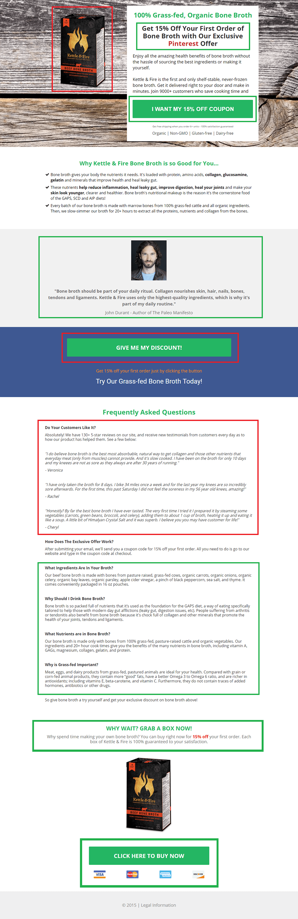
The good
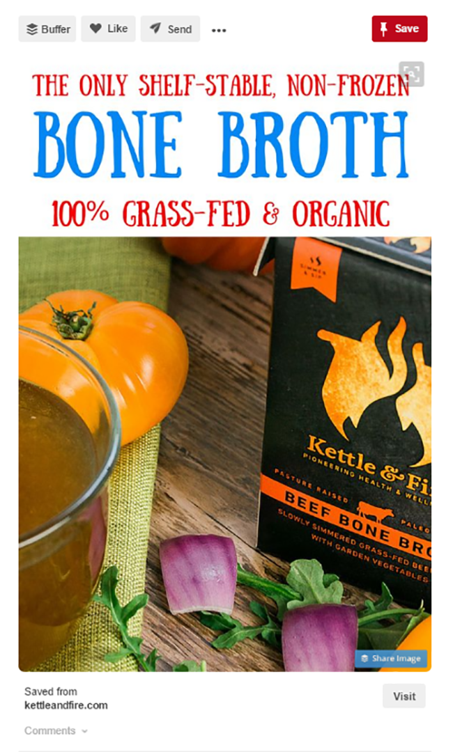
To start, the headline is a direct reflection of the Pinterest ad driving traffic. This creates strong continuity and follows Oli Gardner’s very first rule in “A 50-Point Checklist For Creating The Ultimate Landing Page”: Does your landing page headline match the message on your ads?

The rest of the page obeys Oli’s second rule: Is your landing page messaging focused on a single purpose? It has one CTA — a discount — that’s repeated multiple times. The CTAs build on one another the farther down the page you go, ultimately culminating in a “Click Here to Buy Now” button for visitors who are ready to purchase.
Likewise, each button leads directly to the same multi-step opt-in process that immediately delivers the promised discount (instead of forcing users to retrieve it from their inbox later). Having different CTAs on one page is a conversion stopper. However, that doesn’t mean you can’t have multiple buttons, so long as they all have the same conversion goal:
And the testimonial is phenomenal:
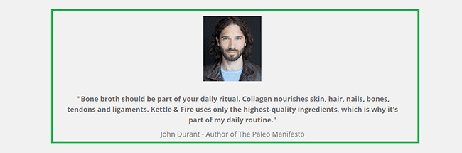
John Durant is a heavy hitter in the paleo diet industry, which is one of Kettle & Fire’s primary targets. Plus, the language is substantial, containing a direct recommendation, detailed reasons why, exclusivity (“only the highest-quality ingredients”) and lastly a personal note (“part of my daily routine”). Lastly, it contains an image of John, which is a must when presenting a persuasive testimonial.
If you’ve ever had questions about how to craft and present testimonials… this should be your model.
The FAQ section is a mix of good and bad.
The supplemental testimonials that head it off should be placed into their own section. But for anyone wondering about the broth itself, the questions address common objections in everyday language. For audiences that need education about your product, writing body copy without jargon is a must.
I ran Kettle & Fire’s landing page through Unbounce’s Dejargonator, and the only words it flagged were “best,” “most,” “only,” and “amazing” (most of which appeared in the testimonials).
The bad
The page is easy to scan from a design perspective; however, the two product images do nothing to whet the appetite or evoke emotion.
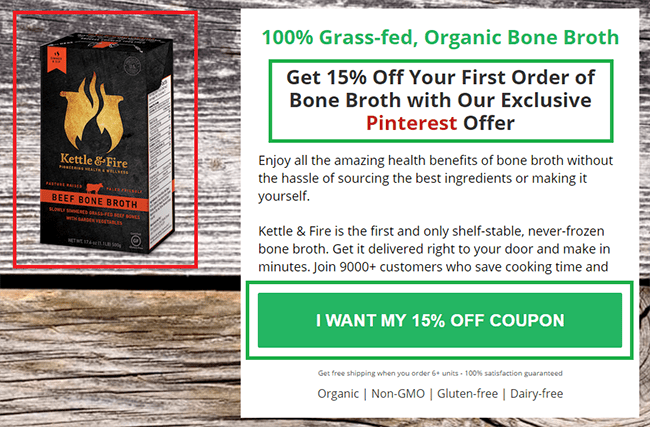
While the wood-grain background in the header is a subtle touch highlighting the naturalness of the product, it ends up obscuring the image so it fades instead of pops.
This should go without saying, but always check your copy for tiny errors, like not completing a sentence (“Join 9000+ customers who save cooking time and”). Silly, yes. But also a credibility killer.
Speaking of credibility, organic, non-GMO, gluten-free and dairy-free are four of the most important phrases on the page. After all, they’re the primary reasons Kettle & Fire’s target audience would buy the product.
Unfortunately, they’re hidden under the CTA, and don’t get repeated elsewhere.
Lastly, for a product whose primary audience cares deeply about quality and credibility, the page doesn’t include a single organization, certification or trust seal. Bad? Yes. Shockingly terrible? No. That comes next.
2. Just let them buy: Blackmagic Cinema Cameras
Blackmagic Cinema Cameras has a truly beautiful landing-page-meets-product-page hybrid. That’s fitting because its product is designed specifically for an aesthetically savvy audience.
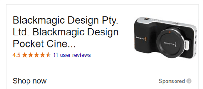
A Google search for the highly targeted keyword “cinema cameras” triggers the following ad:
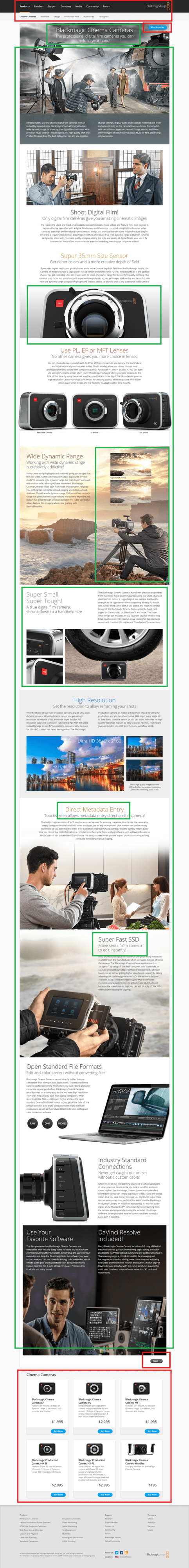
Which leads to the hybrid page. From this aesthetic perspective, the page does not disappoint:
Sadly, pretty doesn’t pay the bills.
The good
Two elements stand out as huge wins.
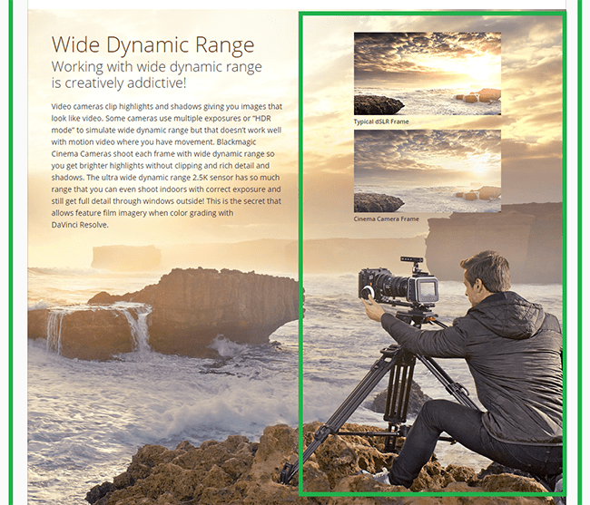
First, the page is a visual feast. It’s filled with no-fewer than eight high-quality images of the product itself, both in action and from multiple up-close angles. This leaves no room to doubt what the camera looks like up close, and you can almost feel what it would be like to touch it in person. In addition, the non-product images evoke the photographer’s imagination, putting them in the hero position, behind the scenes.
Second, the subheads and copy throughout scream expertise.
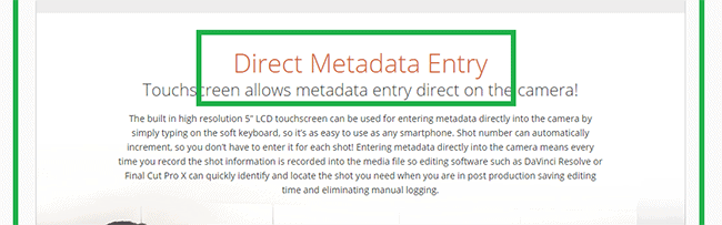
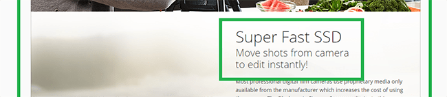
The copy certainly borders on being feature-focused rather than benefit-focused, but the images nail the emotional question of “What’s in it for me?” leaving the text free to hit technical point after technical point. This approach works because the product is tailored to a professional-level market.
The bad
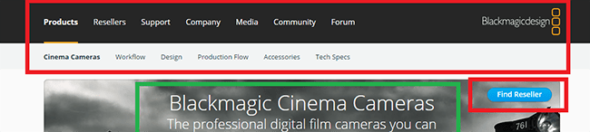
Although the page is stunning and speaks effectively to its target audience, it has no clear objective. Regardless of funnel stage, every landing page — even a landing-page-meets-product-page hybrid — should have one goal that’s glaringly obvious.
Blackmagic leaves you wondering, “What do am I supposed to do… besides stand in slack-jawed amazement?”
First off, the entire navigational bar should be removed. This is a huge landing page no-no, because it only serves to weaken the rest of the pages CTAs. In fact, it violates the most foundational principle of conversion-centered design: attention ratio.
Attention Ratio is the ratio of the number of things you can do on a given page to the number of things you should do.
Wanna guess the magic number?
1:1
On a landing page — or virtually any marketing collateral — the one thing you want your visitor to do should be only thing they can do.
In addition, the “Find Reseller” button on the very top-right of the page is profoundly confusing (especially when you add in the 14 other navigational links above it). The button takes a prime position, so we might assume that clicking it is what we’re supposed to do. But is the goal really to get visitors to click away immediately?
Any clickable elements on your own ecommerce landing page that don’t move your visitor closer to your one goal should be removed immediately.
Also bad are the “Buy Now” buttons at the page’s close.
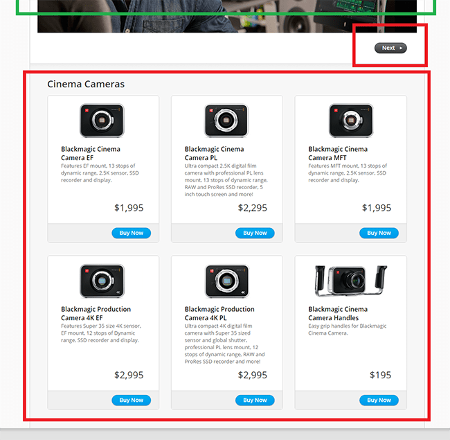
The problem isn’t so much including “Buy Now” CTAs on a landing page (although the mysterious “Next” button should be eliminated). Why? Because as long as the traffic being driven to the page through is high-intent — meaning the keywords aren’t set for the general “camera” audience but instead is targeted (or retargeted) at people further down the funnel — pushing for a purchase is fine.
Unfortunately, this section is situated at the end of the page and ends up being a kind of afterthought. Instead, if the goal is get visitors to buy… then that’s what the page should focus on, early and often.
The shockingly terrible
Button placement aside, assuming that someone makes it all the way down and decides to purchase, here’s where everything completely falls apart.
When you click any of the “Buy Now” buttons, instead of adding that specific product to a cart or sending you to a checkout page, you’re taken here:
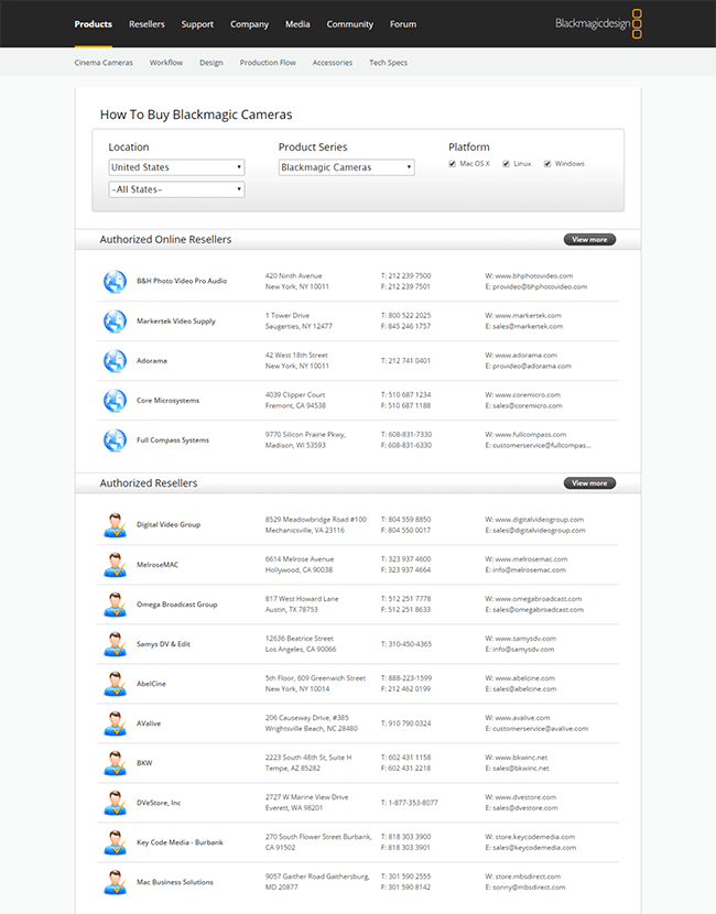
Talk about a conversion-killing nightmare.
All the beauty of the previous page has been brutally stripped away. And didn’t I just click “Buy Now”? Why, for love of all that’s sacred, are they not taking my money?
The disconnect is painful. I shouldn’t have to say this, but if the goal of your landing page is get visitors to buy… then let them buy.
The easiest way to do this is use one of two approaches.
First, if you already use Unbounce, you can integrate your ecommerce landing pages directly with a platform like Shopify. Alternatively, you can add embeddable “Buy Now” buttons into your existing pages, no matter the platform your website runs on:
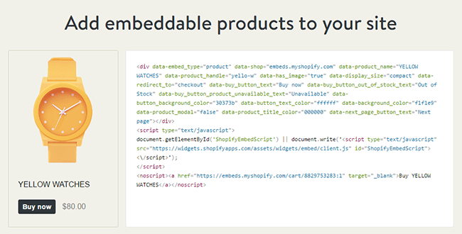
That way, when someone wants to buy, order and convert the result is seamless.
Remember, the worst thing you can do on your ecommerce landing page is stand in the way of your own conversions. So don’t.
3. Nobody likes (awful) surprises: Milk-Bone
While you might not expect to see a top-notch ecommerce landing page from a dog treat company, that’s exactly what Milk-Bone’s Brushing Chews offers. However, not without a few drawbacks (marked this time in black and red).

The good
Where Blackmagic Cameras lacked focus, Milk-Bone nails it. None of the usual conversion-killing distractions exist. No navigation bar at the top. No “safety” CTAs. No social media icons. Not even a clickable logo to take you back to its homepage.
Instead, the one thing you can do on the page is the one thing they want you to do: Print the coupon — an invitation that’s repeated four times.
The headline, subheads and copy are brilliant; they’re direct, playful and clear. Plus, they hit the problem right on the head: How to care for your dog’s teeth when they won’t allow you to brush them.
The visuals on the page reinforce this loving relationship, featuring owners with their dogs. Plus, two play on the whole brushing-without-brushing concept.
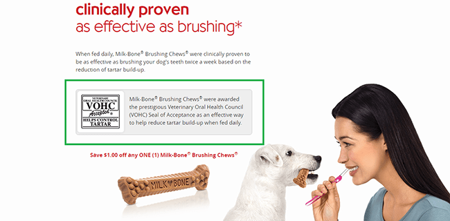
The Veterinary Oral Health Council Seal of Acceptance midway through addresses the question, “Why should I believe your claims?”
Including trust logos and endorsements is a persuasive tactic. Rather than asking your audience to take your word for it, you instead rely on instantly trustworthy third parties. The words coming out of your mouth are always less powerful than the words coming out of someone else’s.
Best of all, the page includes testimonials (i.e., social proof) from Milk-Bone customers. But rather than showing pictures of the owners, the dogs are the stars:
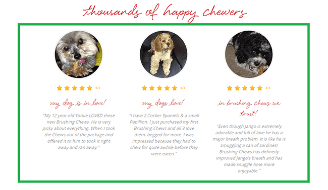
If your landing page straddles two audiences (e.g., owners and their dogs, parents and their children, teachers and their students, etc.) combining both groups in your social proof is genius.
The bad
Sadly, it’s not all tail wagging.
For example, the very first clickable element on the page is this “Play video” text. Video is a powerful element to include on any landing page. However, the text and icon are so small, they virtually disappear.
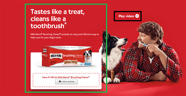
Instead, if your landing page is going to rely on video — especially in the hero section — then either embed the video directly into the page itself (with autoplay turned off) or give your “Play Video” button affordance: that is, make it big and really, really, really clear it’s a play button.
Or, you can do both like Sticker Mule:
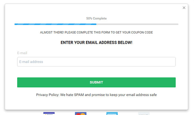
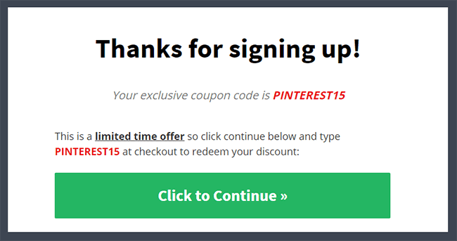
While Milk-Bone does a fantastic job building its page around just one goal, things go a bit off the rails when you click “Print Coupon.” First, you’re presented this popup:
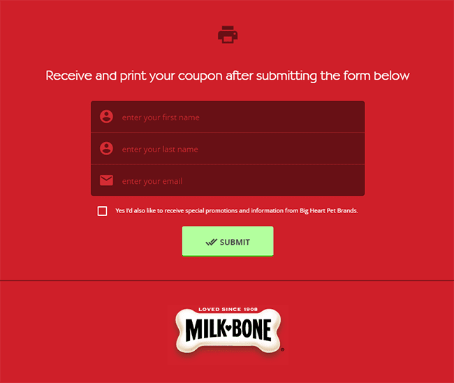
Certainly, it’s smart to try and collect a visitor’s email, but three form fields definitely aren’t necessary.
In particular, notice that the “Yes I’d also like to receive special promotions and information from Big Heart Pet Brands” is unchecked by default. Not forcing your soon-to-be customer is fantastic, except for one thing… fill out the form, click “Submit” without checking that box and boom:
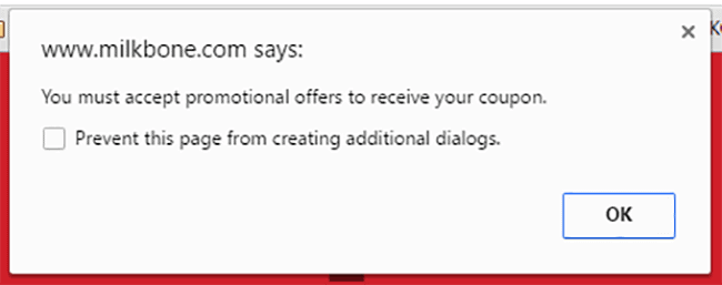
Nothing turns prospects off more than telling them they don’t have to sign up to get a deal, and then forcing them to sign up once they try.
Your Own Ecommerce Landing Pages
The truth is, your own ecommerce landing pages don’t have to be shockingly terrible to fail.
All it takes is undercutting your credibility (Kettle & Fire), breaking down at key moments (Blackmagic), or forcing your visitor to sign up for more than they expected (Milk-Bone).
If the above examples teach us anything, it’s that even great landing pages can be better.
Most of all, they have to meet your visitor where they are. Asking for too much, too soon stops conversions in their tracks.
Instead, stick to one goal per page, lead your audience through the buying funnel… and please, no train wrecks.
