Imagine you’ve finished creating your brand name and messaging. After hours of research and brainstorming, you have a name and an offer you’re proud of.
Then you send those deets over to your designer, and they come back with this business card:
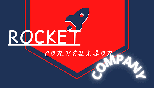
You’d cringe a little, right? You might be cringing right now.
As a marketer, you know your choice of words matters. Well, your font choice matters as much as your messaging. This principle applies to any marketing asset, including your landing page.
Consider this guide your crash course in the world of typography and how to use it best on your landing pages.
The Psychology Behind Typography
What makes every font “feel” different? You’ll find the answer in your noggin.
According to psychological research, we treat each font kinda like people—we give each font its own “personality.” For example, Americans find satire written in Times New Roman funnier and sassier than in Arial.
These research findings mean the fonts you choose for your landing page will impact how visitors understand your copy. You might not even realize that you’re giving your landing page an underlying tone through your typography.
For example, the name “Browman & Sons” can look like it belongs to a different business depending on the font you write it in. Which of these font choices looks like it belongs to a law firm? Which should belong to a record store?
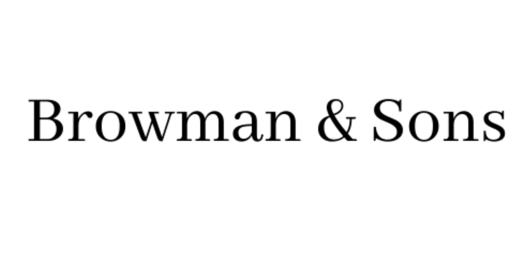
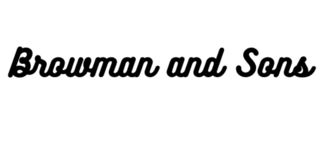
You’d probably associate the first typography choice with a law firm and the second with a record store. (Unless you’re working with some funky lawyers.) The first example’s use of a traditional font feels professional, while the second example’s round script feels fun, vintage, and artsy.
When a font carries baggage
Since we assign every font its own character in our brains, some fonts also have specific reputations in our minds—good and bad.
Plenty of fonts carry a backstory due to branding. Look at this logo and ask yourself: What’s wrong with this picture?

Pop this logo on a hoodie and call it fashion.
Supreme and Disney are two brands with very distinct fonts, so pairing the Supreme-style logo and a Disney-ish font just doesn’t look right, huh?
Sometimes, a font has a not-so-great reputation. For example, many folks consider fonts like Jokerman and Comic Sans cheesy.
Keep your font’s reputation in mind and how it’ll affect your landing page. If each font is like a person, you want to keep a network of fonts with good reputations and no conflicts of interest.
Typography 101
Now that you understand the emotional impact of your font choices, here’s the nitty-gritty behind typography and its design specs.
Type classification and families
Fonts fall into four broad types:
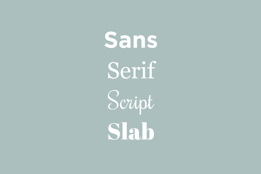
Let’s dig a little more into each font type listed in the picture above:
- Sans-serif: No divots or embellishments at the ends of the letter (e.g., Arial, Verdana)
- Serif: Includes divots or flourishes at the ends of each letter (e.g., Times New Roman)
- Script: Curvy with connecting strokes, like cursive handwriting (e.g., Lobster and Sacramento)
- Slab: Extra thick and distinct letter strokes with or without serifs (e.g., Rammetto One and Slabo)
You’ll mainly see sans-serif and serif fonts used on a landing page. Some pages use a slab or script font in a headline, but those font categories don’t work well for body copy.
Another type of font you might see used outside of landing pages is a decorative font. As the name implies, their purpose is to decorate a design. These fonts often come custom-made, making them less ideal for web content like landing pages.
Editor’s note: If you’re scratching your head over what kind of font to use on your landing page, you can take out the guesswork with a template. Templates like FreshGoods take the guesswork out of font choice and combination so you can focus on making great content.
Kerning and leading
The space between your letters and lines matters as much as your font choice. Jumbled text is tricky to read, and text with too much spacing just looks off. You want a good balance of white space for better visual appeal and ease of reading.
Let’s go over two terms to help you space your text the right way: kerning and leading.
Kerning is the amount of spacing between letters. Fonts generally have one of two monospacing types: proportional and monospaced.
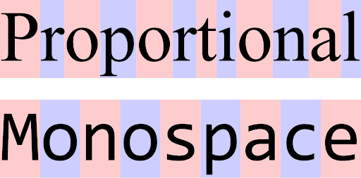
Some fonts have tight kerning between specific character combinations, so give your text a once-over before finalizing your font choice.
Leading is the amount of spacing between lines of text. If you’ve ever had to write a document for someone else, you know how important line spacing is for readability. Look at the difference leading makes in this text:
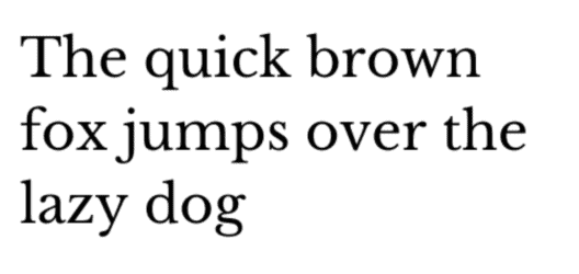
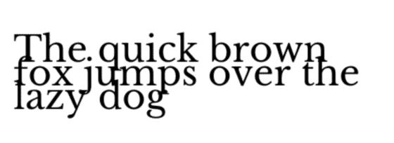
The second example feels crowded and hard to read, right? As you structure your landing page text, make sure every line has enough space to be legible.
You should also know that kerning and leading can differ between desktop and mobile layouts of a landing page. As you review your text spacing, check both your desktop and mobile formats. A mobile-friendly landing page builder will handle most of the work for you.
Size
Typography isn’t one-size-fits-all.
You really paid attention to that line, right? In typography, larger fonts suggest more important text, and smaller fonts represent less critical text.
Due to that rule of thumb, you’ll see titles and headers in larger fonts than body text.
However, make sure that your body text isn’t too small—you want your visitors to be able to read it. According to usability research, your body font should be at least 12pt for younger readers and 14pt for older readers. And honestly, since so many folks read websites on mobile, you should aim for even larger sizes.
The Learn UI Design Blog recommends the following font sizes for mobile-responsive websites:
- Body: 16pt
- Text input: At least 16pt
- Secondary text (captions, etc.): 13pt or 14pt
They also suggest sticking to about four different font sizes throughout your page—any more is going overboard.
This landing page from Intercom has good contrast among its header, subheader, and body font sizes while keeping everything readable:
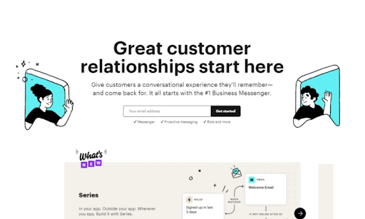
Intercom writes their header—and main product benefit—in a font that’s at least twice as large as the subheader font to make a huge impact. You don’t have to make your font sizes as distinct as Intercom, but you want to have different header, subheader, and body font sizes throughout your landing page.
Color
Your font’s color affects its psychological impact and its legibility on your page. If you’re working on your landing page design from scratch, make sure your font color matches the feeling you’re going for and works with surrounding colors.
Contrast is your number one goal for font color. In most landing page designs, background and image colors do the heavy lifting for emotional impact. While a green font on a black background might seem cool, you’re gonna have a hard time making it easy to read.
If you decide to go unconventional with a non-black-or-white font, use it to draw attention. Think headers and subheaders. Since those text lines come in large sizes, readability will be easier to achieve.
This advice doesn’t mean you have to avoid mixing fonts at all, though. You just have to combine them strategically. Try using a color wheel tool to find complementary colors for your font.
Peep this landing page contest design for clever use of unconventional font color:

See those satisfying hints of yellow? The hero image header text pulls yellow from its form box to emphasize benefits. Look for ways to keep your font colors consistent with your landing page design while drawing the eye where you want it to go.
Pairings
Landing pages that use a mix of fonts look more dynamic than pages with uniform fonts—if the creator plays their cards right.
If you decide to spice up your landing page with a font pairing, it’s best to mix fonts from different categories. (Think a serif with a sans-serif or a slab with a sans-serif.) This list of more than 30 font pairings can help eliminate the guesswork and stoke your creativity.
Wanna see landing page font pairings in action? This example from A Place for Mom mixes a serif header with a sans-serif subheader:
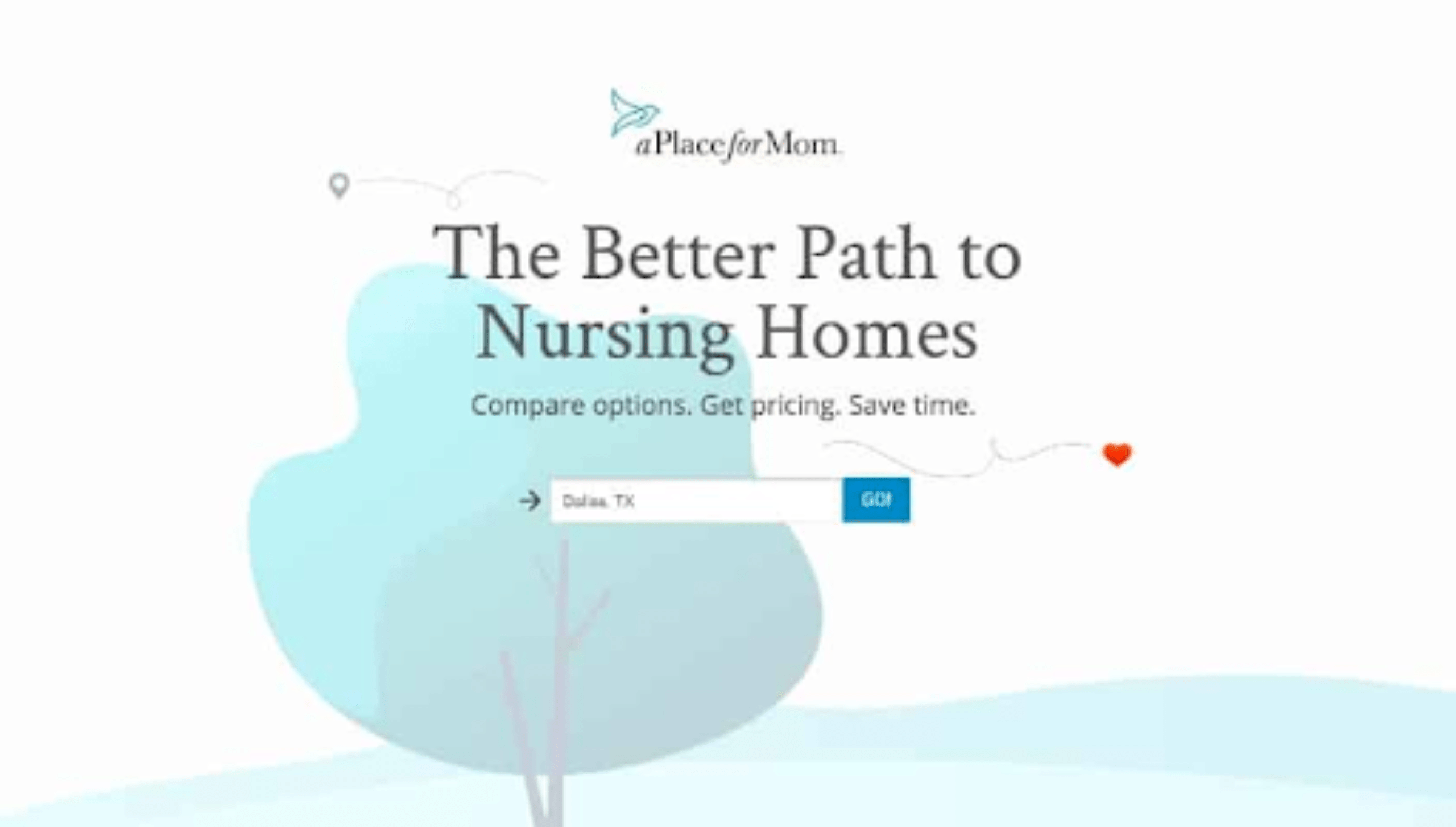
Both fonts look distinct but elegant enough for a serious topic like senior care. When you choose a font pair, keep in mind that both fonts should match the theme and tone of your landing page.
Remember to Note Everything in Your Style Guide
Once you find some fonts that mesh with your brand, you’ll look more professional when you use them consistently in your marketing assets. Make a note of these typefaces in your style guide, including ideal font styles, kerning/leading, sizes, and colors. That way, the next time you need to make a landing page or another piece of marketing content, you can pick from your style guide and get to creating.
Design Your Landing Page for Conversions
As you choose the fonts for your next landing page, remember this: Your visitor’s experience always comes first.
It can be tempting to use a bunch of different fonts, colors, and formatting all at once. But, while it’ll be fun for you, your visitor might bounce because of font confusion (nobody likes to have their eyeballs assaulted). Start simple, and get more creative as you get a handle on landing page design best practices.
Your visitors will appreciate it, and you’ll have a better chance at those sweet, sweet conversions. Looking for more conversion-focused landing page design tips? Check out the 7 Principles of Conversion-Centered Design.

![[Build – TOFU] Conversion Centered Design – V1 – 2024](https://unbounce.com/photos/7-principles-of-conversion-centered-design-cta-scaled.jpg)
