
A visitor lands on your site. They browse around…
And then they leave.
It happens all the time. It’s frustrating. And it means you’re leaving money on the table.
How can you possibly get people to stick around? And, more importantly, what can you do to turn those one-time visitors into lasting customers?
The answer: Opt-in pages.
In this post, we’re going to cover:
- What opt-in pages are and why they’re so effective
- Why you need to be using opt-in pages
- What features your opt-in pages should include
- 9 awesome examples of opt-in pages
- Best practices for building your own
Let’s get started.
What is an opt-in page?
An opt-in page is a landing page that asks visitors to provide their contact information in exchange for something of value. This could be anything from a free eBook to exclusive access to a webinar or even discounts on future purchases.
Opt-in pages are important because they allow you to capture the attention of potential leads. When someone provides their contact information, you can add them to your email list and market to them in the future.
This usually marks the beginning of a relationship between you and the lead—and you’ll need to build on that relationship by providing valuable content on the regular.
What are the benefits of using opt-in pages?
Opt-in pages have a host of benefits for anyone using them. The first and most obvious? These pages help you build your contact list fast. Remember, the end goal of an opt-in page is to gather contact information and capture potential leads.
But it’s also worth noting how this differs from the efforts you undertake to build your mailing list. At the risk of sounding like a broken record, opt-in pages are so-named because a user is agreeing to let you market to them more directly, in exchange for something they want.
And because of that, opt-in pages are a great way to start improving your conversion rates. Because you’re offering some sort of value, you’re effectively jump-starting their position through your funnel and making it more likely that they’ll convert.
What’s more, opt-in pages help reduce the total cost per conversion—you’re decreasing the number of touchpoints it takes to make a conversion, helping reduce your marketing costs.
What is the difference between a squeeze page and an opt-in page?
By now, you’re probably looking at what an opt-in page does and thinking, “Hang on—isn’t this just a squeeze page?”
Close! Opt-in pages and squeeze pages are incredibly similar and the terms are often used interchangeably, even though they have a few key differences. No matter what you call it, these pages have similar, singular focuses: Get contact info in exchange for something valuable to the user.
A squeeze page is lean and zeroes right in on getting a visitor’s email address. They put that offer front and center—a lead magnet—and remove any and all distractions. Squeeze pages are there to “squeeze” out an email address.
Opt-in pages, meanwhile, provide more detail about the offer on hand, supporting it with other information and trust signals to help make the pitch. Opt-in pages are usually part of a bigger marketing plan, giving visitors more details and making them feel more comfortable before they decide to share their info.
Essential features of an opt-in page
An opt-in page needs to be well-built if you want it to convert visitors into leads. Here are some must-have features to keep in mind:
Value proposition: Your opt-in page should explain what the visitor will get in return for providing their contact information. This could be free content, a discount on a product, or some other type of incentive. The more value you can offer, the more likely someone is to provide their contact information.
Lead form: The lead form asks for someone’s contact information. You should make this as easy as possible to fill out, and avoid asking for too much information at once—the more you ask for, the more likely the user is to bounce.
Call to action: The call to action is the button or link that encourages visitors to submit their information in exchange for something of value. You want it to be distinct from the rest of your page so it stands out to visitors. Plus, you should include a strong directive, such as “download now.”
9 opt-in landing page examples
Now that you know what an opt-in page is and what it needs to be effective, it’s time to look at some real-world examples. Here are four pages that do a great job of enticing visitors.
1. HubSpot
HubSpot offers an inbound marketing certification program that companies use as a training tool for their employees.
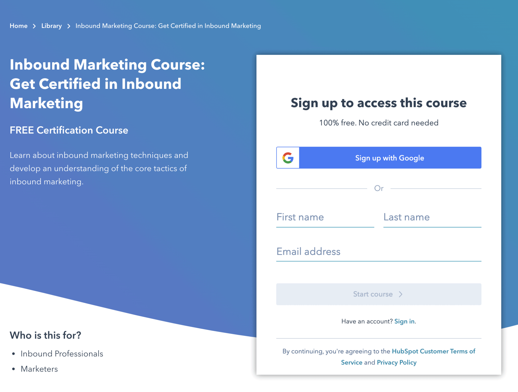
What works:
- The lead form is short and sweet, and it only asks for the basics—name and email address. Plus, it also gives the visitor the option to easily sign up via Gmail, Microsoft or Apple.
- The fact that the course is free is prominently displayed (a big incentive).
- The page also teases more content below the fold—the point in the page where a user has to scroll to see more. This is a great way to highlight additional content if a user wants to see it without overloading your primary offer.
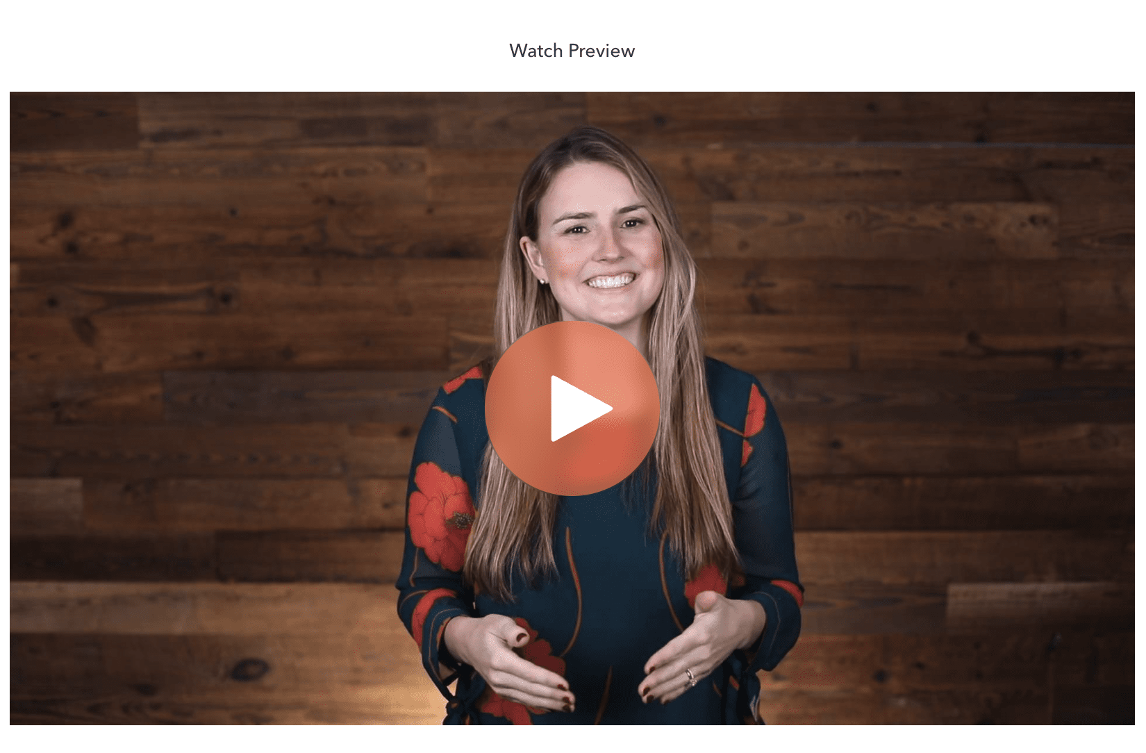
- An older version of this page used to feature a video below the lead form, introducing the program and explaining how it can help employees learn inbound marketing skills. Note that while a video can give useful information, it does not necessarily boost conversions.
2. Unbounce
If we can sing our own praises for a moment, Unbounce’s Conversion Benchmark Report is a great resource for anyone looking to dig into conversion rate data as they optimize their pages. The report itself offers a bunch of useful data up front, but to really dig in, users need to opt in with a form further down the page.
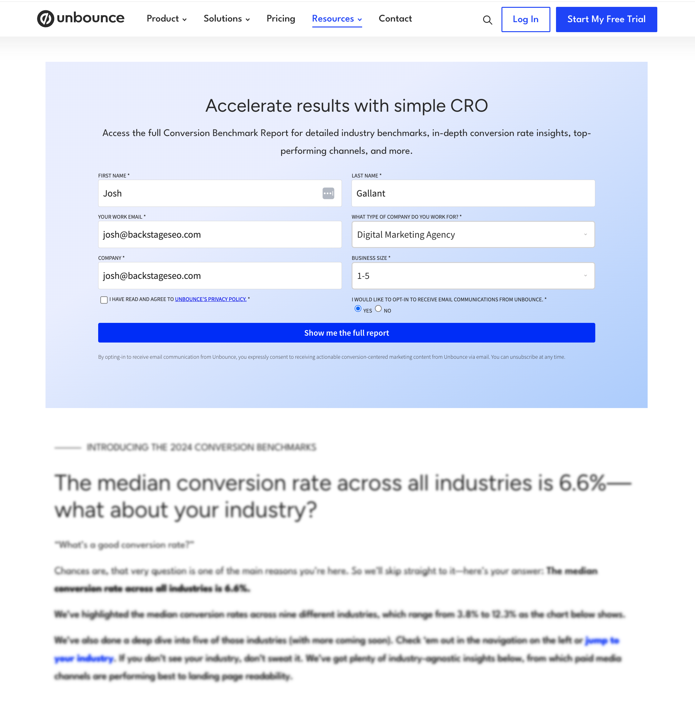
What works:
- The page offers useful content but blurs out more of the deeper insights, using the design to entice users to opt in to see more.
- The CTA puts what the end user will get front and center to remove any ambiguity.
- By placing the CTA further down the page, users are drawn in by the content and explore what it has to offer. To dig deeper, they have to opt in.
3. Uberflip
The content marketing platform Uberflip helps users create, curate, and publish content. Here they offer a free eBook on collecting data to improve your content marketing:
What works:
- The opt-in page is centered in the middle of the screen, making it easy to see and focus on.
- The lead form box does not expand until your mouse clicks on the single form field displayed (work email), which makes the opt-in form appear seemingly less involved.
- The page highlights three concise points you can expect to learn from the eBook.
4. Rival IQ
Rival IQ offers a free benchmark report on useful Instagram Stories metrics collected from hundreds of brands.
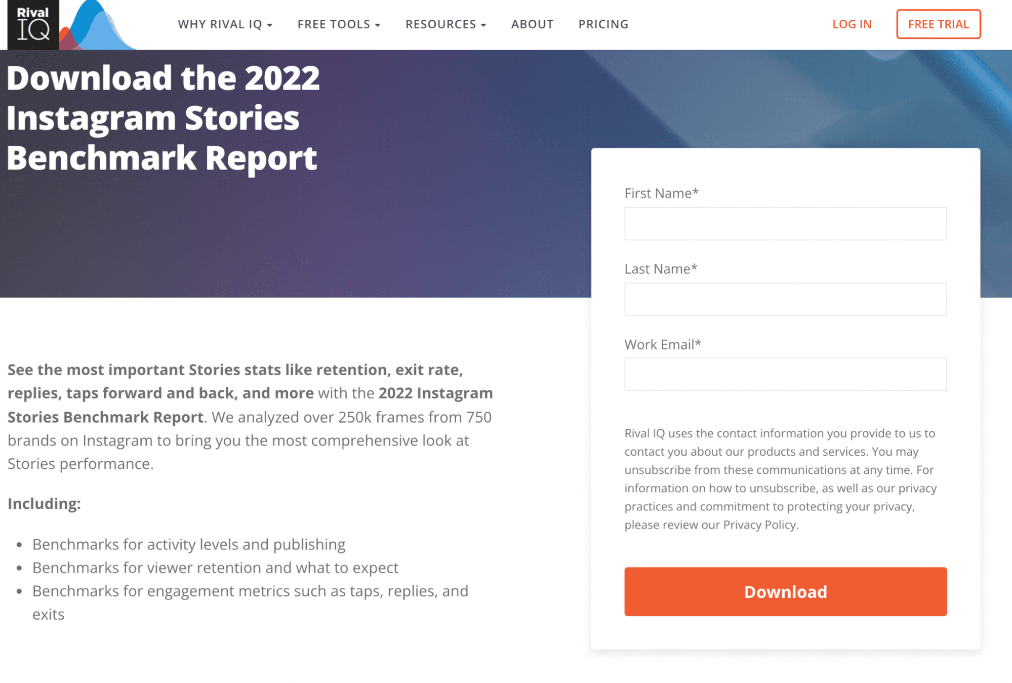
What works:
- The opt-in page promises an irresistible benefit (a free report) while not requiring too much more info on top of the basics (your name and work email).
- The bottom of the page lists well-known companies that trust Rival IQ (L’Oréal, Nature’s Path, and the Human Rights Campaign).
- The CTA copy is clear and actionable (“Download”).

5. Morning Brew
Morning Brew is a business news site that shares daily updates with readers. They offer a newsletter summary of the day’s top stories directly to your inbox, and their sign-up page is as straightforward as it gets.
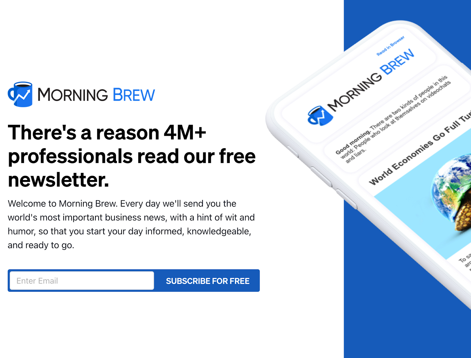
Image courtesy Morning Brew
What works:
- Sometimes less is more—and what you see on this page is all there is! The page is straightforward and simple, with no strings attached. Users can subscribe for free, a compelling CTA no matter the field.
- Long forms increase friction—reducing the number of fields is a great way to keep users from bouncing, and Morning Brew’s one-field form is the ultimate in simplicity.
- Including strong imagery is another great technique—in this case, showcasing a teaser of what the newsletter looks like on a phone gives users a sense of what they’re getting when they sign up.
6. Assent
Assent is a compliance-focused B2B company that helps businesses manage their supply chain data. Their opt-in page for a handbook about identifying harmful substances in the supply chain offers deep insights in exchange for contact information—a classic exchange for this sort of page.
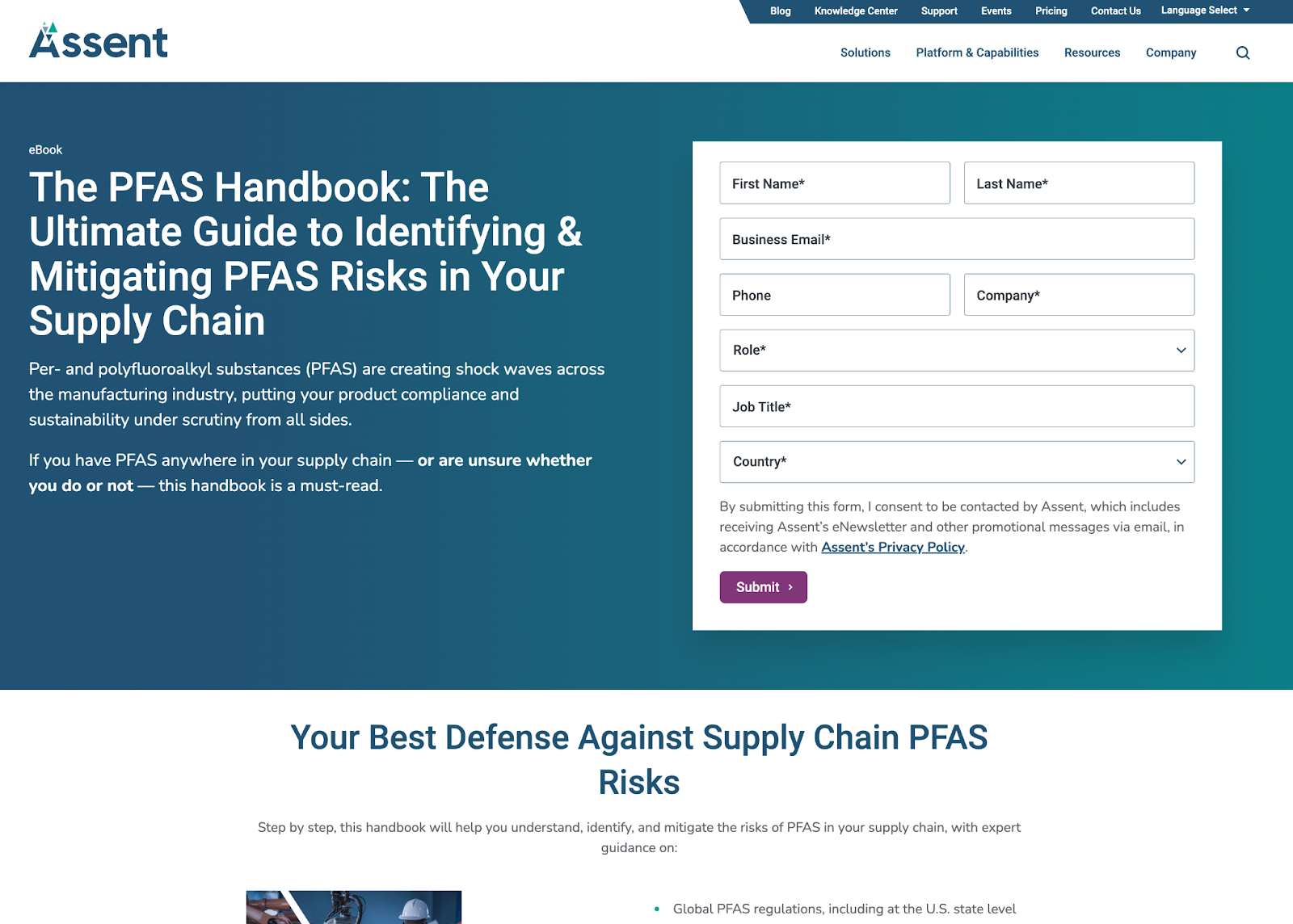
Image courtesy Assent
What works:
- Speaking to your audience in the language they use is a must—and the copy on this page (and the asset on offer) are extremely specific to compliance audiences.
- B2B marketing can focus heavily on gathering as much data as possible, which often means lengthy forms. Assent has opted for a simplified form to reduce friction and only gather the critical information they need.
7. VeryGoodCopy
VeryGoodCopy is the brainchild of copywriting guru Eddie Shleyner, and the homepage acts as a pitch for courses and an opt-in page in its own right. Using a simple layout and plenty of social proof is a winning combo—just ask the 69,280 subscribers.
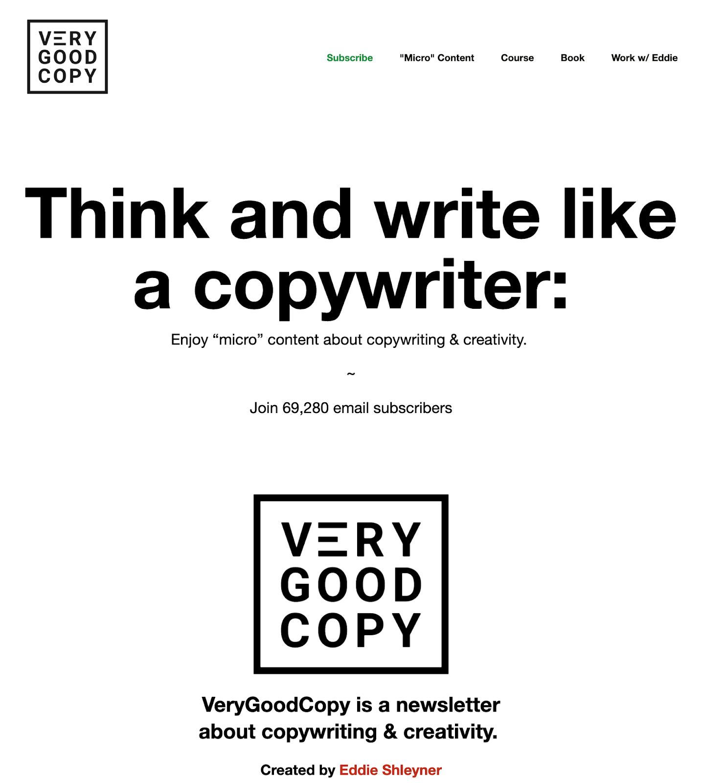
Image courtesy VeryGoodCopy
If you scroll down below the fold, you’re met with an incredible offer (access to micro courses, for free) when you sign up. The page backs it all up with ringing endorsements from other writers.
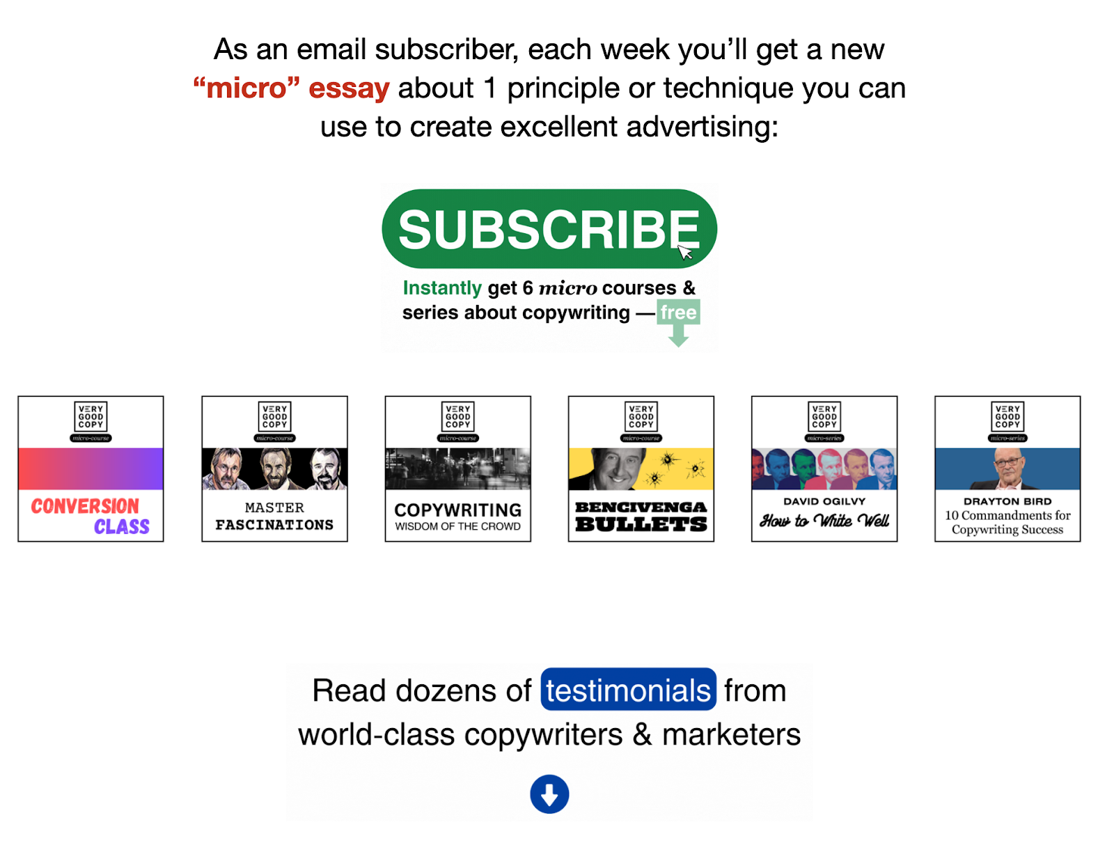
Image courtesy VeryGoodCopy
What works:
- The effectiveness of social proof on an opt-in page can’t be understated, and this page has it in spades. There are testimonials from other writers who’ve taken the courses, email newsletter subscribers, and other marketers.
- The CTA buttons are great—they stand out from the background of the page with bold letters and a pop of color to grab attention.
- The page is completely transparent about what you get in exchange for signing up. By putting the offer front and center (and repeating it at key positions on the page), it’s all the more enticing and engaging.
8. CrowdStrike
Global cybersecurity company CrowdStrike’s Global Threat Report is a collection of key insights into the cyber threats facing businesses everywhere.
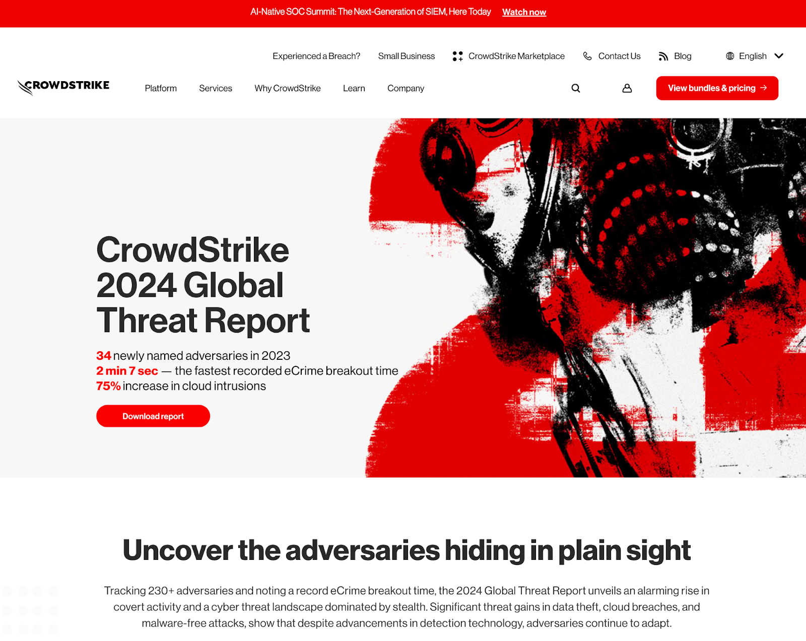
Image courtesy CrowdStrike
What works:
- This is a classic “asset for info” opt-in page, and CrowdStrike have peppered in key stats and data points through the page to entice users to sign up and download.
- The page’s visuals are eye-catching and draw users in to learn more.
- Users who read through the page and scroll to the bottom are met with a selection of related resources. This is a great way to keep leads engaging with content and to help drive them further down the funnel if they’re not grabbed by the asset at hand.
9. Figma
Figma is a collaborative design tool that’s shaking up how creatives go about their work. This opt-in page for a webinar they ran is a simple-yet-effective classic with streamlined design to get folks into the webinar and onto the email list.
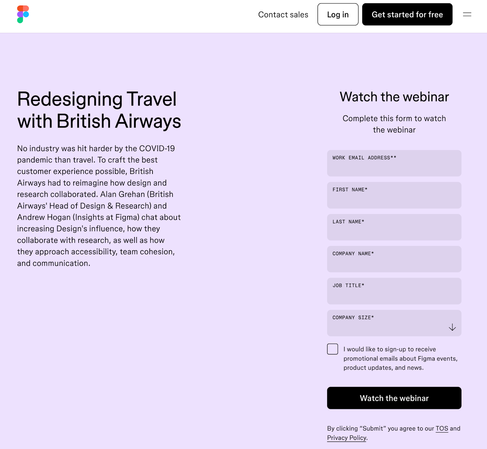
Image courtesy Figma
What works:
- Although it’s a design company, Figma has downplayed the visuals, instead focusing exclusively on the content of the webinar and the insights it has to offer. This helps streamline the page and keep the focus on opting in.
- The headline and body copy are the stars here. The CTAs and form copy, meanwhile, are as simple and straightforward as can be, showcasing exactly what users will get when they click through.
Opt-in landing page best practices
With all that awesome opt-in page inspiration, you’re almost ready to start building your own. Before you do, though, we’ve gathered some of the best tips to help you create a high-converting page:
- Start with a clear and compelling headline: Your headline is the first thing a user will see on your page. Make it stand out but don’t overstay your welcome. It should immediately grab attention and explain what’s in it for the visitor.
- Highlight your value proposition: We said it once, and we’ll say it again—tell visitors what they’ll get by signing up. Focus on the benefits to make it irresistible.
- Grab attention with eye candy: Keep the design clean and aligned with your brand—but don’t be afraid to throw in some awesome images, graphics, and other visual elements to really make your offer.
- Streamline your forms: Only ask for essential information—if you don’t need it, then don’t include it in your form! The shorter your form, the more likely it is for users to sign up.
- Highlight your CTA: Make your CTA stand out with contrasting colors. It should be clear and compelling.
- Use trust signals and social proof: Use reviews, testimonials, or user counts to build credibility. Highlight any endorsements, security badges, or privacy statements. These add even more credibility.
- Keep your copy to the point: Write in plain language. Skip the jargon and make sure anyone can follow what you’re saying.
- Simplify structure: Keep the page easy to navigate with no distractions. All the focus should be on your offer and CTA.
- Nail your follow-up: What happens after a user opts in? Make sure your follow-up is ready to go, whether it’s asset delivery, a discount count, or something else. And don’t forget to nail the thank you message to keep communication going!
Try A/B testing: Continuously test different elements like headlines and CTAs to see what you can do to further enhance your page’s performance.
How to create an opt-in landing page with Unbounce
Opt-in pages are a great way to help you increase conversions and capture attention from potential leads. To make the most of your opt-in page, include a strong value proposition that offers something of immediate value, a lead form that’s simple to complete, and a clear call to action.
Remember that opt-in pages are never set-it-and-forget-it pages—you’ll need to work on your design and content regularly to make sure that you’re converting as many visitors as possible.
The best way to do this?
Monitor your opt-in pages’ metrics and analyze the results to see what’s working and what could use some improvement. Better yet, let Smart Traffic do the work for you by automatically directing your visitors to a page variant where they’re more likely to convert.
See how Unbounce helps you easily create and test new opt-in page designs to boost conversions.
Get started with Unbounce today.

