
What happened?
You’ve crafted the perfect landing page copy. It’s downright brilliant. It’s persuasive and succinct. It cuts to the heart of your offer, focuses on the visitor, and is set to generate a bunch of leads.
You hit launch. Away it goes. Traffic pours in from your campaigns and you start seeing results.
A day or two later you check your stats with a grin. But wait, there must be something wrong!
The results are better, sure, but they aren’t the amazing boost that you had hoped for.
So what went wrong? Well, it could have been that you put most of your attention into your copy, and not enough attention into your design.
Here are nine landing page design elements that you can use to truly bring your landing page conversions to the next level.
Editor’s note: This post was originally published on March 19th, 2014. We’ve updated it with the latest insights.

1. Choose Contrasting Colors
There are a lot of case studies out there about call to action button colors. Some people might insist that one color is better than another, but often times it’s simply color contrast that causes the increase in conversion.
By using colors that are different but complementary, you can make certain landing page design elements stand out from the rest. The point of doing this is to create a visual hierarchy that tells a visitor what is important and what is not.
Take a look at this same page when blurred slightly and see what stands out:

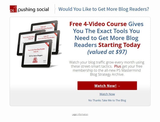
The call to action is prominent and the text in red stands out as well. Perfect.
(On a side note, I don’t like how the tablets in Pushing Social‘s product image are facing away from the text. It would be a worthwhile test to have the tablets facing in toward the landing page copy to draw visitors’ attention inwards.)
The other way that you can bring attention to text is to use font-weight contrast. This is basically bolding the words that you want to stand out and be more memorable. Heck, why not go crazy and use color contrast AND font-weight contrast like this:

2. Feature Real People for Real Results
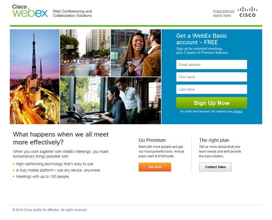
Webex fails to understand why photos are used on landing pages. Photos aren’t used to fill space, they are there to add value to the overall landing page experience.
Instead of finding some great photos of real customers who have used the service, they fill a LARGE amount of prime space with useless graphics.
The problem is that visitors mostly ignore filler photos of generic people or objects.
That means that Webex has essentially thrown out two-thirds of the space above the fold. Space that they should be using to persuade visitors that their offer is worth signing up for.
The same goes for testimonials. Using real photos instead of placeholders or no photo at all can increase the impact of a testimonial and make a real difference to your conversion rate.
If you need to pad out your in-house photos with other pics of people, shoot for high-quality stock images that feel genuine, such as pictures that don’t have models pretending to look interested in the fake spreadsheet on their screen. Unbounce’s Unsplash App has a People section with plenty of non-cheesy, professional photos like this one:

As covered in our blog post on landing page imagery, remember to keep your photos capped to one or two main focal points, too. The mishmash of pictures on the Webex page makes it hard to tell where you should focus your attention.
The bottom line is to make sure that every image on your landing page has a purpose. If it isn’t adding value to your page, remove it.
3. Show Visitors Where to Look
There’s more to an effective photo than just a good-looking person. What the person is doing in the photo can have a huge impact on where a visitor will look on your page, and what comes across as important.
If the subject of the photo is looking at the camera, towards the text, or away from the text, this can make a big difference in how visitors perceive your landing page.
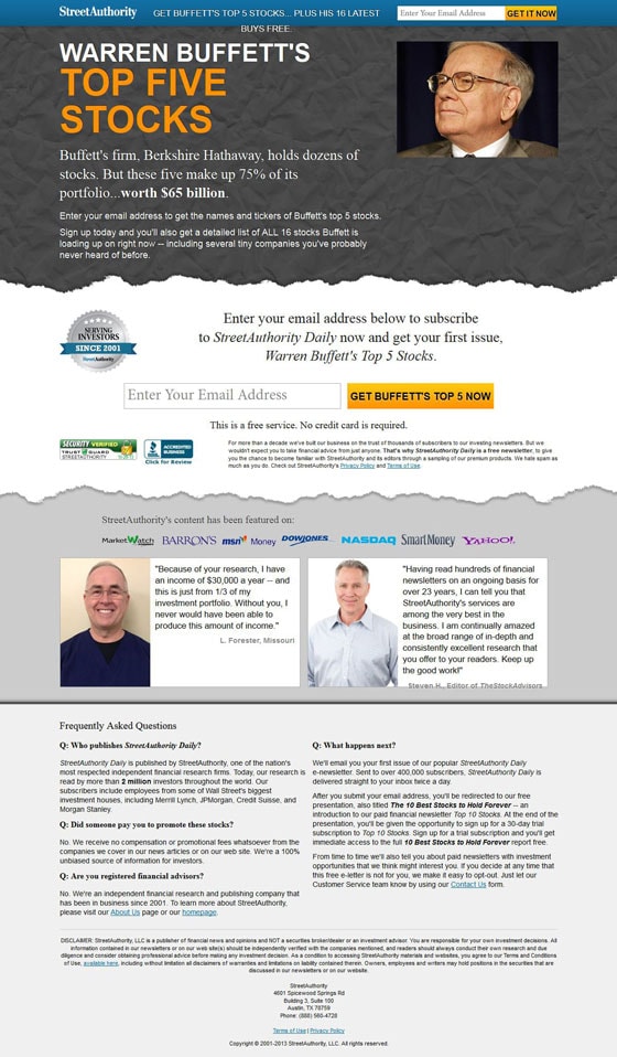
Notice how in the example above, the photo of Warren Buffet has him looking directly at the headline. This will encourage visitors to look at the headline first.
This eye-tracking study shows how the woman’s gaze in the photo increases the visibility of the product AND the headline:
By using a photo of someone who is looking at your headline or your product, you can draw a visitor in and help them focus on your call to action.
Be careful, this visual cue is not a substitute for a bad headline so make sure you put the time into finding a solid headline before you start testing different photos.
You can also direct your visitors’ viewing patterns by leaning into the visual hierarchy our eyes naturally follow. Folks tend to look at landing pages in a Z- or F-shaped pattern. Their eyes also prioritize bigger and higher-contrast elements over smaller and crowded ones.
Consider building your landing page’s visual hierarchy as early as the wireframe stage. As you hash out your landing page layout, note where you want your visitors to look first through the gaze directions and viewing patterns mentioned above. Add details on your photo’s subject’s directions and what elements should be bigger and higher contrast than others.
4. Plant Visual Cues
Nudging your visitors in the right direction is not always an easy task. In addition to using directional faces on your landing pages, you can use visual cues such as arrows and borders to draw attention to sign-up forms, headlines, or high-impact testimonials.
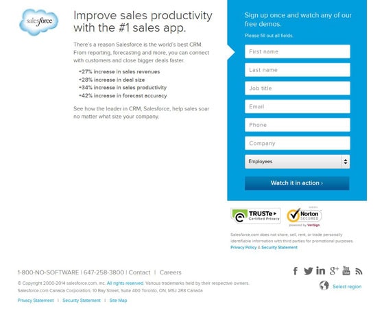
Look at how Salesforce has built an arrow into their sign-up form to naturally draw the visitor’s eye from the headline and supporting copy to the goal of the page. They’ve also surrounded their opt-in form with a strong blue box that stands out against the rest of the landing page design.
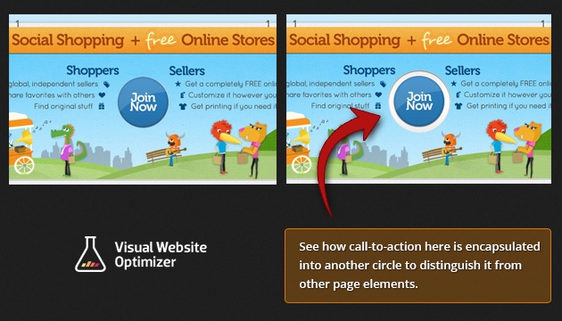
You can also use the element border to draw attention to a call to action, as in this example from VWO:
5. Don’t Forget About Design Match
This was the banner ad for the campaign.
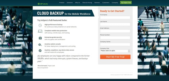
Notice the use of the same background image on their landing page.
We know that this is not a proper landing page because it includes a primary navigation, but this example proves a good point.
Design Match is the visual cousin of Message Match. It means keeping your design elements—in particular, your paid ads and landing pages—consistent both visually and content-wise.
A visitor shouldn’t be surprised by what they see when they go from ad to landing page. When the entire funnel is relevant and consistent, the visitor spends less time orienting themselves to the new page and more time focusing on your message.
Try to use similar colors, images, and iconography throughout your campaigns to make sure visitors understand each step.
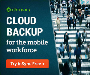
Oh, and Druva, it’s time to smarten up and lose the navigation on your landing page. You’ll thank me later.
6. Pick The Right Colors
You want impact? Use bright colors on your landing page and you can grab someone’s attention very quickly. But be careful, the wrong color match can actually turn off visitors.
We’ve already talked about color contrast, but the color choices you make for the look and feel of your site can change the emotions that your site provokes in your visitors.
Example: If you were selling office chairs to executives, you could easily turn off your visitors by using the color pink in your design. This is because the color pink doesn’t convey the right feeling to the visitor.
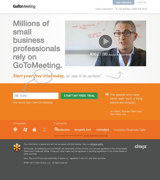
GoToMeeting in this case uses very bright colors that match the style of the product they offer. Do you think this landing page design would have the same impact if it were the color purple?
Let’s look at a few more examples of colorful landing pages that match their brand’s tone.
The “sold out” landing page for Marie Forleo’s B-School for female entrepreneurs flashes through bright background colors. Since the B-School works in the online marketing space, they can rock contemporary colors with pride:

Does a full-color bold background feel too intense for your brand? Try using bright accents on a white background, like Taskade:
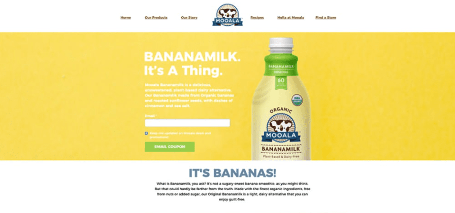
One more example for you to chew on—Mooala uses yellow in its hero section’s background because, well, their product’s made from bananas:
Scratching your head wondering what color combos will look good together? Use a trending color palette to make your page look cohesive and fresh. 2022’s hippest colors include jewel tones, earth tones, and neon colors—a little something for everyone.
7. Be Visual
Sometimes it’s just too difficult to explain your product using bullet points and text. This is when a picture or diagram can help you remove a lot of copy and help visitors understand a new concept quickly.
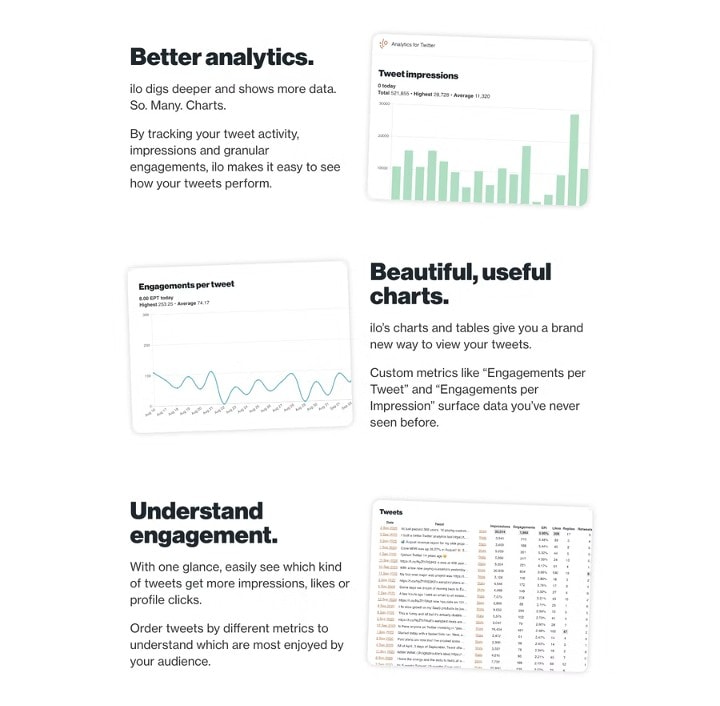
Product pictures (or screenshots, if you sell software) explain features better than a wall of copy ever could. Check out how ilo shows off its Twitter analytics capabilities through screenshots of their product:
Never assume that a visitor is going to easily understand the benefits of your product. If you can back up your copy with a picture, it makes it much easier to convey your benefits to visual people.
8. Order Extra Large Elements
Want to draw more attention to something on your page? Try making it bigger. The point is to make the element so large that even your grandma could see it from 10 feet away.
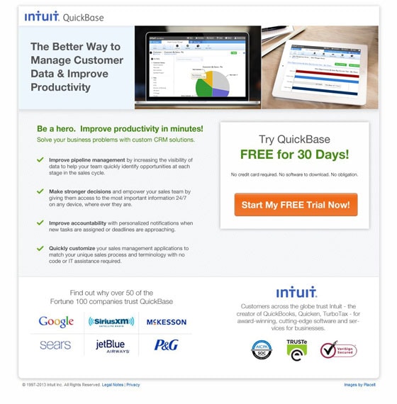
Intuit uses this technique on their page by making their call to action almost a third of the width of the page. Paired with a bright color (see color contrast above), this makes the call to action impossible to miss.
Make sure that you only use this technique for the elements that you want to stand out from the rest. The largest element will be at the top of the visual hierarchy, but if you make multiple elements large then it ruins the effect by bringing equal attention to every element.
Increasing the size of your buttons or forms is not a cure-all, though. Sometimes it can backfire and actually lower your conversions, but it’s worth a test.
9. Embrace White Space
What is it that connects all of your landing page design elements together?
It’s not more clutter, lines, or other elements.
It’s white space.
Using white space not only helps you organize design elements on your landing pages, but it also can be used to emphasize something important, like your call to action or a product image.
White space also improves the legibility of a page. If there’s a bunch of text crammed together on a page with little or no “breathing room,” it makes the text difficult to read.
Most importantly, white space sets modern landing page design apart from older approaches. We’ve learned a lot from the older examples covered in this blog post, but you might have noticed that they feel more cramped than the newer pages I shared. If it feels like your page doesn’t have that professional polish, try giving your elements more space.
You can increase the white space on your landing page simply by using shorter paragraphs and more bullet-style lists. I’m not saying to turn your copy into a big stream of bullet points and three-word paragraphs, but they are nice elements to add to your copy to make it more legible.
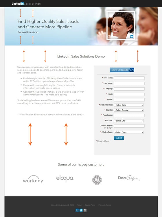
Notice how LinkedIn brings attention to their headlines, the content, and the happy customer logos at the bottom of the page by spacing out the elements on their landing page. They also make their copy easier to read by having a bullet-style list halfway through.
Okay, let’s get serious for a second. I thought I was going to make it through an entire post of examples without seeing a single “Submit” button. But I guess there always has to be a troublemaker in the room. I expected more from you, LinkedIn.
It’s Time to Create Design That Speaks Volumes
Take action. Start testing your landing pages and improving the design elements.
You can only have a really effective landing page when great design and great copy come together to lift conversions through the roof.

