
Marketers are often constrained by the demands placed on us by our boss and clients. But external pressure can also come from the industry we work in — especially when it comes to conservative industries like banking, healthcare or government.
With these industries comes a certain degree of pressure to conform to specific aesthetics, brand guidelines and previously established marketing practices. This restrictive environment can make it difficult to test and develop new methodologies (read: increase conversions).
And it doesn’t help that these industries typically require more personal information from customers, introducing more friction into the signup process and making building trust more important than ever.
But in spite of all these hurdles, there are ways to be creative in a conservative industry — as we saw in our recent webinar with First Midwest Bank. Their creative approach allowed them to stand out from their competitors all while building trust with their prospects, ultimately leading to a 195% conversion increase.
How did they do it (and how can you do it too)? You can watch the recording here, or read on for the distilled wisdom.
Push best practices to their limit
Everyone knows photographs of people are a powerful way to draw the eye on landing pages. This best practice is repeated in so many blogs that it has in some ways become a cliché.
And when First Midwest Bank tested this best practice, they found (predictably) that images of people did help increase conversions on their landing pages.
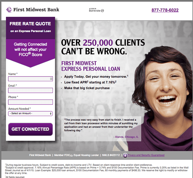
But they also uncovered something interesting: the “ideal” person represented on the page differed depending on where the lead was from.
While a landing page with a smiling man increased conversions by 47% in Illinois, it performed poorly in Indiana, with a 42% conversion decrease:
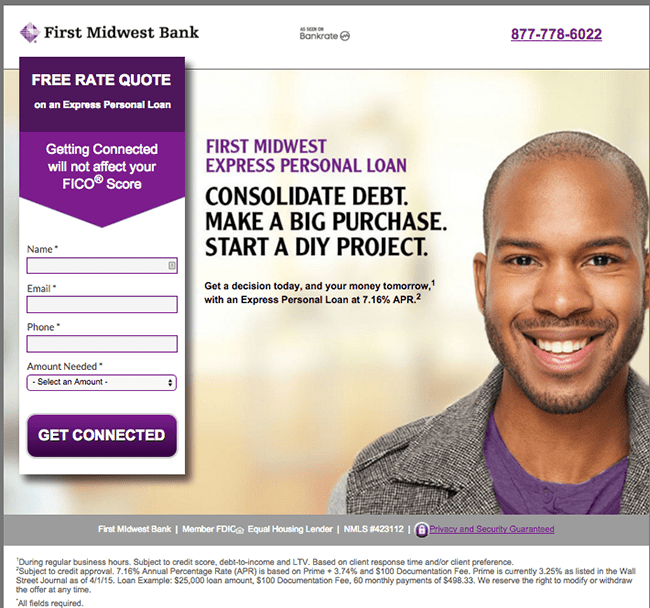
This insight led to more A/B tests, resulting in 26 different landing pages depending on the state.
In other words, adding a smiling person to First Midwest Bank’s landing page wasn’t enough. They had to find the best possible smiling person for each state.
The takeaway here?
Best practices are a great jumping off point for A/B tests, but don’t allow yourself to get too comfortable. Get creative and push best practices to their limit. As fitness celebrity Jillian Michaels says, get comfortable with being uncomfortable.

Test best practices ’til you break them
Getting creative with your A/B tests means pushing best practices, but it also means questioning their validity.
We’ve all heard about the importance of placing important information “above the fold” — that the majority of visitors can’t be bothered to scroll below it. This advice has been shared so much that many marketers wouldn’t be caught dead putting a form or call to action below the fold.
But A/B testing revealed something interesting for the First Midwest Bank team, who kept testing even though they had a high-performing champion landing page. They decided to stick their form below the fold. And boy, were they glad they did:
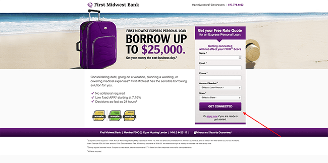
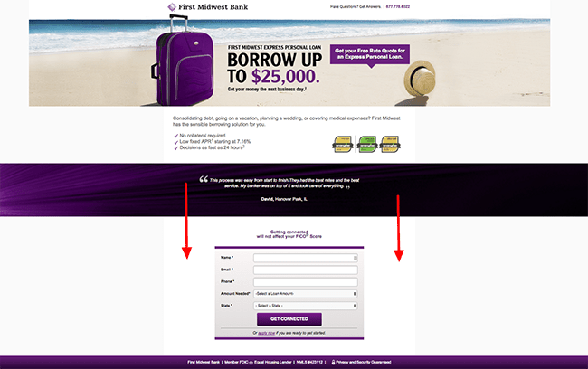
The challenger, with the form below the fold, increased conversions by 52%.
Perhaps the variant with the form above the fold came on a little too strong; maybe prospects needed to be sold on the offer a little more before forking over their personal information. No matter the reason, this so-called “best practice” just wasn’t right for First Midwest Bank’s leads.
But this isn’t the only “best practice” they debunked through A/B testing.
If you’re an established brand, you’ve likely got a set number of colors that you incorporate into your designs — they’re part of your corporate identity. And in those brand guidelines, you’ll often have a contrasting color or two to draw attention to specific elements.
For example, it’s a best practice to use a contrasting color so that your CTA button stands out and makes a prospect’s next choice obvious: click the button.
So when First Midwest Bank began testing their landing pages, they decided it made sense to complement their signature purple with a colorful CTA:
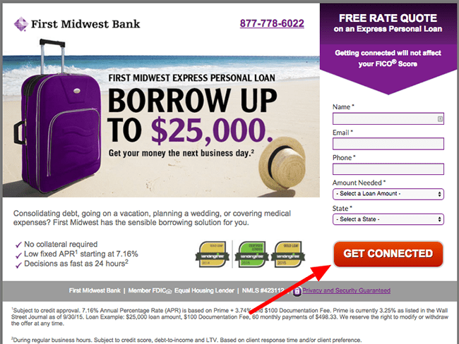
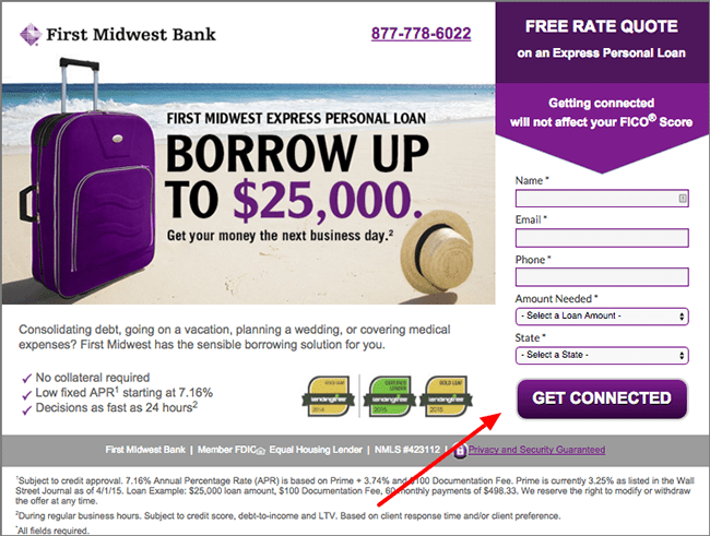
But the results surprised them: First Midwest Bank saw a conversion rate decrease of 20% when they used a red contrasting button instead of a purple one.
The takeaway?
Best practices are guidelines, not gospel.
Be creative with what you test, even if that means that you’re deliberately being a rebel and breaking the rules.
Use SSL to reduce anxiety and establish trust
As much as you want to be daring and think outside of the box, there are still basic things that your prospects need from you to feel at ease. Especially in conservative industries, if you don’t want to cause prospects anxiety, you need to reassure them that their personal information will remain private.
So how can you demonstrate that you know their personal information is important and that you don’t take their trust lightly?
SSL or Secure Sockets Layer, is an industry standard security measure that uses encryption to ensure that any data sent through your landing page forms is secure.
A secure SSL landing page shows a client that you’re as serious about their business as they are about their private information. It subtle, but effective.
Notice how the URL for this First Midwest Bank landing page contains that little lock and https:// at the beginning?
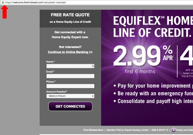
First Midwest Bank understands the importance of being creative, but they also understand the importance of credibility and security — so they used SSL landing pages to connect with security-conscious customers.
This keeps the path toward conversion as seamless as possible — squashing anxiety and providing leads with the confidence they need to become customers.
The result for First Midwest Bank? Over one million dollars in loans in 5 months.
Get down with your creative self

Your industry shouldn’t introduce constraints; it should be an opportunity for you to stand out.
Especially in conservative industries where competitors aren’t likely to be pushing the envelope, there’s a lot of room to get creative and push beyond the status quo.
Because at the end of the day, creative campaigns and fun A/B tests aren’t only for cool lifestyle companies. Even bankers, insurance brokers, health professionals and government workers can get down with their creative selves.

