Don’t take that too personally, I’ve not actually seen your landing page yet. Rather, I’m going to cling to the assumption that it sucks simply because most of them do. Sad, but horribly true.
Note: I’m bringing this post back from the archives. A) because it’s timeless, B) because it’s awesome and C) as a teaser to an upcoming landing page examples post.

A real-world style landing experience
Imagine walking into a restaurant, and finding that the decor is gross, the music is too loud, the staff look sketchy, the menu has 400 options on it, they have an award on the wall for “Best meatloaf in Idaho, 1995” and to top it all off, the place is empty. What would you do? I know I’d be getting the hell out of Dodge.
And online…
And that’s exactly what your visitors do when your design sucks, you have a video auto-playing with no mute button, there are no indicators of trust or security, the form has a million fields and the testimonials look like you wrote them yourself.
Excuse me waiter, could I just get the back button please?
Soooooooo, today we’re going to take a trip down to the Top-Notch Landing Page Store and see if we can rustle up something to inspire your next design.
Each of the following pages exhibits excellent qualities of conversion centered design, but most of them also do a couple of things wrong.
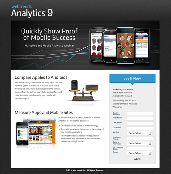
1. WebTrends Analytics – “lead”ing the way
I’ll admit it right off the bat – I have a crush on Webtrends landing pages. If you’re looking anywhere for design inspiration for lead capture forms, this is a good place to start.
What I like
- The hierarchy of page elements and information is well structured and focuses on the basics: a logo, a hero shot that combines a clear headline, a short description of the reason for and benefits of the product/service (in this case a webinar) and a lead capture form to gather visitor data. And… importantly… nothing else.
- The call to action (CTA) of lead gen forms almost always falls below the fold. To get around this they’ve placed a directional cue (arrow) at the top of the form to point the way to the action area below.
Things I’d change or test
- A tighter relationship between the directional cue and the CTA. Specifically, I’d make the button blue to match the form header – it blends into the gray background a bit too much right now.
- Change the CTA to describe what you’ll get when you click it. It should say “Register for webinar” rather than the undescriptive “Submit”. Sorry Webtrends, as much as I love you, this is a rookie mistake that should never be repeated.
Site*: Webtrends
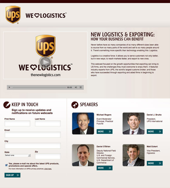
2. UPS – using modal windows to keep visitors on the page
Even with a clean and conversion oriented design, many pages still commit the cardinal sin of providing outbound links that aren’t part of the conversion funnel. UPS have done a good job at avoiding this.
What I like
- The “More” links for the speakers all launch modal dialogs (using a Lightbox style). This keeps visitors on the landing page instead of wandering off onto another page – and away from your conversion goal.
- They have a video. Good! Video is a proven conversion enhancement mechanism. Studies from eyeviewdigital.com report up to 80% improvements in conversion. Video marketing specialists Turn Here highlight good conversion improvement numbers and the side benefit that properly optimized video can be 53 times more likely to reach the front page of Google search results. Tip: you can often re-use your video by placing it on YouTube.
Things I’d change or test
- The links at the bottom of the page still go to external microsites (click the image to see the full screenshot). Microsite’s still offer a more focused experience than your homepage so it’s not a big negative, however, a better “All In” move would be to embed them in Lightbox windows like they did with the speaker bios.
- The call to action would be better if it read “Get updates on future webcasts” rather than the generic and intimidating “Sign Up”. (The words might not seem intimidating to wily online veterans like yourself, but it expresses no benefit or gain – making it a negative interaction reinforcement statement).
Site*: UPS
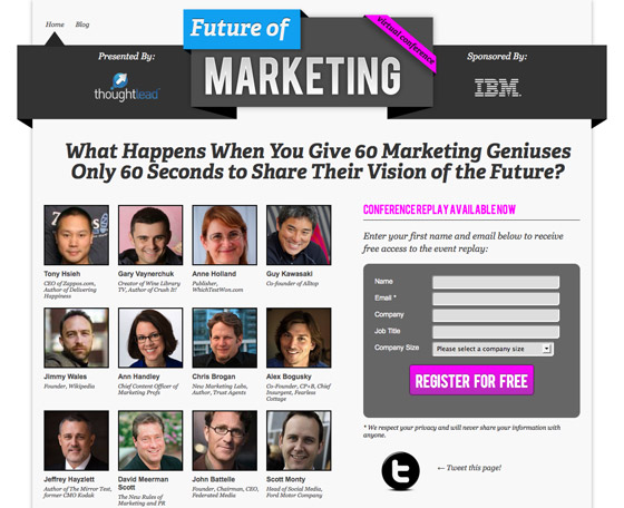
3. The Future of Marketing – socially proven
Social proof in the context of landing pages refers to the idea that your visitors will be influenced positively (although there can be negative effects) by showing evidence of others participating in the use of your product or service. This can be presented via counters showing your social followers (Twitter, Facebook etc.), and testimonials that describe the emotional reaction to your offering from real world customers.
What I like
- Social proof is off the charts here. Instead of showing people following or registered for the conference, they are showing the photos and names of a huge collection of famous players in the marketing industry. Endorsements create credibility, which leads to conversions. Even if you don’t know who the organizer is (ThoughtLead in this case), the fact that it’s sponsored by IBM and has speakers such as Guy Kawasaki will do the selling for you.
- The call to action describes perfectly what you get. Free registration. (Note that this screenshot was taken after the conference so the messaging is related to a replay of the audio rather than registering for the conference itself).
- Contrast: The bright pink CTA stands out from the monotone background.
- Repeated CTA: On long landing pages (click the image for a full view), it’s important to repeat the CTA to remind people of the goal of your page if they’ve been scrolling for 10 screens. Here it’s placed at the top – above the fold, and at the end – for those who’ve finished exploring the whole page.
- Secondary CTA: In today’s social world, WOMM (Word of Mouth Marketing) is key. Here, they’ve added a Twitter sharing button to help visitors spread the word on their behalf.
- Confirmation CTA: Once you complete the form, you’re again presented with an opportunity to spread the word via Twitter. This is great use of thank-you page real estate.
Site*: Future of Marketing
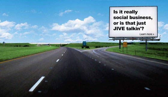
4. Clearvale: No Jive Talkin’ – a seductive single CTA
If you were in a car driving down this highway, you’d have 2 choices: left or right. On this landing page, there’s only one thing to do, click on the sign. This is what’s known as a “click through” landing page. Other names include jump page or the beautifully named “romance page” – as the purpose of the page is to enhance the interest level of the visitor to a point where they are ready to move to second base. (I’ll give credit for the term “romance page” to Scott Brinker).
What I like
- The simplicity and seduction. It makes you want to click on the sign for two reasons: first because it’s your only option, and secondly because the copy on the sign implies some kind of controversial point of view.
Things I’d change or test
- I was a little underwhelmed when the next page was a blog, rather than a continuation of a marketing experience, so I’d do something more engaging at that point. But there’s no denying that the click through rate of this landing page would be very high.
- I don’t really get the connection of the visuals to the copy on the sign, but I suspect this is part of the allure, that you don’t really know what’s coming.
Site*: Clearvale
5. Groupon – beautifully simplistic flow
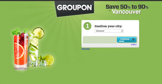
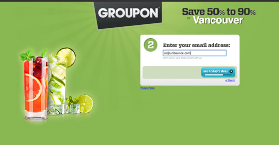
Here’s a great example of a simple guided landing experience from Groupon.
What I like
- They have used geo-targeted segmentation to set up my location, and are presenting a big bold value proposition statement (50%-90% off) to get me interested.
- Colorful with good action area contrast . The bright bold color is seductive and makes the action area (form) very clear.
- Usability. The progress indicator below the form lets you know that there are 3 steps and where you are in the process.
- Simple forms: In step 2 (the lead gen portion), they ask for your email address only, reducing the barrier to entry to a bare minimum.
Things I’d change or test
- If you don’t know who Groupon are (and despite their size, they haven’t reached everyone yet), there’s nothing to really tell you what you might be saving 50%-90% on. The imagery indicates alcohol which might be why I agreed to enter my email, but some qualification of the offer details would be good.
Site*: Groupon
6. Oprah – sweepstakes for lead gen
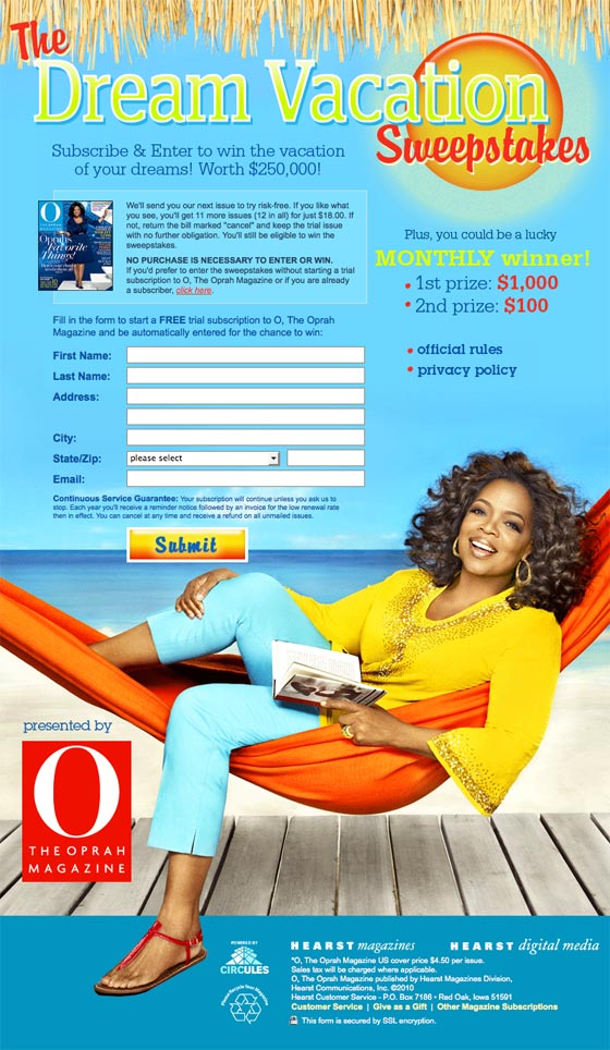
It’s Oprah. This stuff will generally sell itself, but it’s not all good. Read on.
What I like
- Focused on the benefits: By leading with the vacation prize they are tapping into people’s desires right away. The branding is so powerful in this case that it can be safely relegated to the bottom of the page.
- Branding: Oprah’s brand is her selling point, her face is on everything associated with her and here she evokes the feeling of being on vacation to entice her loyal following to win a little piece of the Oprah lifestyle.
- Sweepstakes are a very popular lead gen mechanism, and here they are using the free prize giveaway as an add-on to a “no risk” magazine subscription.
Things I’d change or test
- The privacy policy and rules links open up new windows which is a bit messy. A better solution is to use a modal lightbox like the UPS example above. You can see what I’m talking about on one of the Unbounce contest landing pages (click the contest rules link near the bottom to see the modal window).
- It pains me to repeat the same thing over and over, but the call to action on your buttons is REALLY IMPORTANT. Any doubt in the visitors mind as to what will happen can lead to little leaks in confidence. Spell it out clearly so people know what to expect. Here it could use a double lined CTA that starts with a primary first line: “Enter the contest”, then a second line “and start your trial subscription”.
Site*: Oprah Magazine
7. Verisign – shaping trust
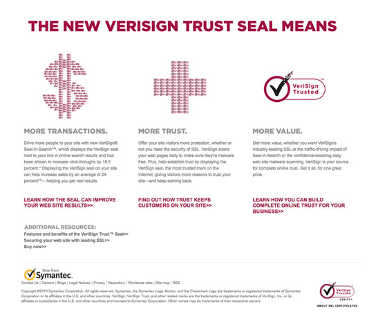
This landing page is all about building Verisign’s central brand promise – trust.
What I like
- It tells a simple story: As a click through page, it provides enough information and interest to warm up visitors and encourage them to continue down the intended conversion path.
- Benefit based CTA’s: Each call to action is based on a real business benefit, encouraging a click to find out how Verisign can improve trust and what effect that can have.
Things I’d change or test
- CTA contrast: I’d prefer to see the CTA’s presented with more contrast to the rest of the page.
Site*: Verisign
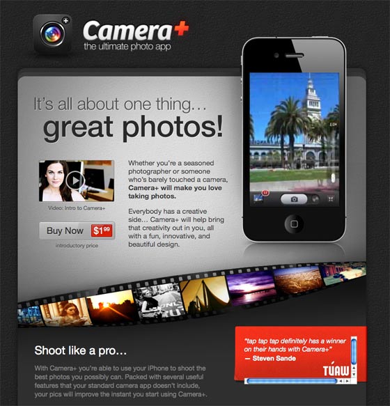
8. CameraPlus – the ultimate long product sales page
This is the modern apple-esque equivalent of the old-school long sales letter landing page. You’ve probably seen the less trustworthy ones before, where the writer uses reams of ultra persuasive copy to convince you that, despite being an average Joe, they have managed to build an online internet business that prints money.
While it borrows the concept of a long page that piles on the features until you’re ready to buy, that’s where the comparison ends.
This is a very good landing page.
What I like
- The design matches the desires and expectations of the buyer. The target customer already has an iPhone, so they are used to seeing beautiful design with apps placed in context with their intended use.
- Context of use: This is an IMPORTANT concept. The primary iPhone image plays a video showing the app being used. This is pretty much all you need to be sold on the app’s cool factor. You can then explore the big feature list below to reinforce your purchasing decision.
- The price and call to action to buy the app are nicely positioned above the fold, leaving you to explore the page knowing how to interact when you are ready.
- Celebrity endorsement: Including celebrity photographer Lisa Bettany – who for the record (and gossip factor) is dating Mashable founder Pete Cashmore – is a clever device to help convince visitors that it’s worth buying. Professional photographers that just want a cool app for their phone will find this convincing.
- Proof of concept: The photo gallery at the end caps it off nicely by showing that you can take great photos with this app.
- The reviews beneath the phone are highlighted in red, making them the most important visual aspect of the first screen. While I would normally recommend the CTA get this level of attention, it really pushes you towards what is often the swing vote in a purchase – what other people say.
Things I’d change or test
- I’d be really interested to A/B test a short version of the page, letting the video do the selling instead of 10 pages of scrolling content.
Site*: https://campl.us/
9. SEOmoz – choices with the info to make an informed one
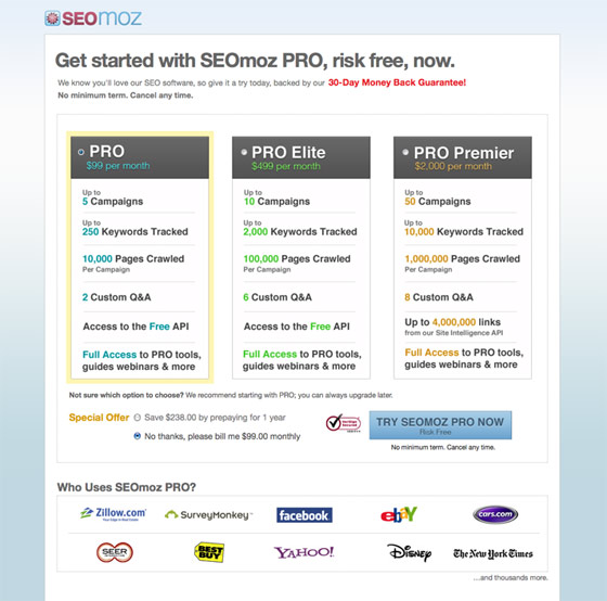
Despite how much this looks like a standalone landing page, it’s actually their main pricing page. They’ve taken conversion design principles and applied them directly to the most important page on the site. I like this approach a lot. It’s becoming increasingly common (for good reason) to include testimonials on pricing pages.
What I like
- Trust and credibility: The Verisign symbol is placed next to the purchase button and the grouping of worldwide brand names directly below helps to reinforce the value of the product.
- Succinct headline.
- Subtle mention of the customer count: Beneath the big brand customer logos is a nice little addition – “and thousands more” – adding to the trust element.
- Attention to different reading styles: There is a nice mix of bullet points, coupled with detailed descriptions for those who need to dig deeper.
- REAL testimonials: The photos look like they are taken from social profiles. Coupled with the name and company name, you’d be able to verify that these are real business people quite easily.
Things I’d change or test
- Call to action: The CTA here uses a nice soft word – “TRY”. Which gives off the sense of a low commitment offer. However, the only mention of the no-risk element, is the “30-day money back guarantee” at the top of the page. This should be restated at the point of conversion (i.e. beneath the CTA).
- Would love to know how this converts in comparison to a similar page that had the regular global navigation and footer distractions.
Site*: SEOmoz pricing page
10. Times Reader – showing context of use
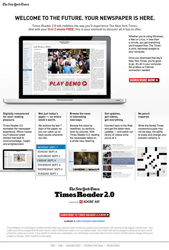
As one of the world’s biggest newspapers, they clearly need to keep up with the times when it comes to marketing. (Trying desperately hard for a pun there).
Let’s dissect the final landing page of this collection…
What I like
- Lifestyle. The level to which they demonstrate the modernization of news consumption is impressive. Using a beautiful Macbook Pro and an inline video displays excellent “context of use”, and lets you imagine the new reading experience they are selling.
- It’s a great video that really demonstrates the power that video has to tell a story. Especially poignant given the product.
Things I’d change or test
- Like the SEOmoz page, I’d like to see the safety message (in this case – 2 weeks free), repeated beside the CTA.
Watch the video
Like I said at the start, I don’t want to link to the campaign page, to prevent skewing the stats just for editorial purposes. However, the video from this landing page is freely available on YouTube, which as I mentioned earlier, is a great re-use of campaign content to help your organic rankings.
[youtube]https://www.youtube.com/watch?v=OPQeCEHFlFA[/youtube]
If you have other great examples of landing pages or have any questions, please jump into the comments.
Cheers,
* Note: links are provided to the associated brands homepage as a way of saying thank you for using their screenshots. I don’t typically link to campaign based landing pages (unless I’ve asked for permission) as that can mess with people’s stats.
Other note: “You suck” image source (from the blog index page)
