
Huddle up, marketers! Action star Arnold Schwarzenegger has a piece of advice for you. (If you’re not reading this in his voice, you’re doing it wrong.)
The day is 24 hours. 6 hours we sleep, so you have left 18 hours. So don’t ever give me this thing, “I’m working 12 hours so I don’t have time to exercise and to work out.”
Ugh. Worst motivational quote ever, Arnie.
As a one-person marketing team (or even with a couple of coworkers), your day is jam-packed. One minute you’re responding to a nasty post about your brand on Twitter—the next, you’re diving into PowerPoint to polish an important deck. All the while, you’re also expected to create marketing collateral that brings in new customers.
Time for exercise? To quote Arnie’s most famous movie line: fuggedaboutit.
With so much going on, you need to be sure that—whatever you’re working on—you get it right the first time. That’s why we built this list of the must-have elements for a high-converting landing page.

The Five Essential Elements of a Landing Page
Whether you’re trying to collect leads, drive sales, or do something else entirely, landing pages do what your website can’t by honing in on one dedicated conversion goal.
Websites distract your visitors with multiple products, services, and offers. In contrast, landing pages keep your audience focused on a specific campaign (and make ’em much more likely to convert). If we’re talking quick-fire tactics that get results, landing pages are it.
But how can you be sure that your landing page is gonna hit the mark?
Here are the five core elements of a high-converting landing page:
- Clear unique selling proposition (USP)
- Engaging hero shot
- Compelling benefits
- Inspirational social proof
- Strong call to action (CTA)
Simple, right? We’ll go through each element in detail, but here’s a handy visual to put the puzzle of the anatomy of a landing page together:
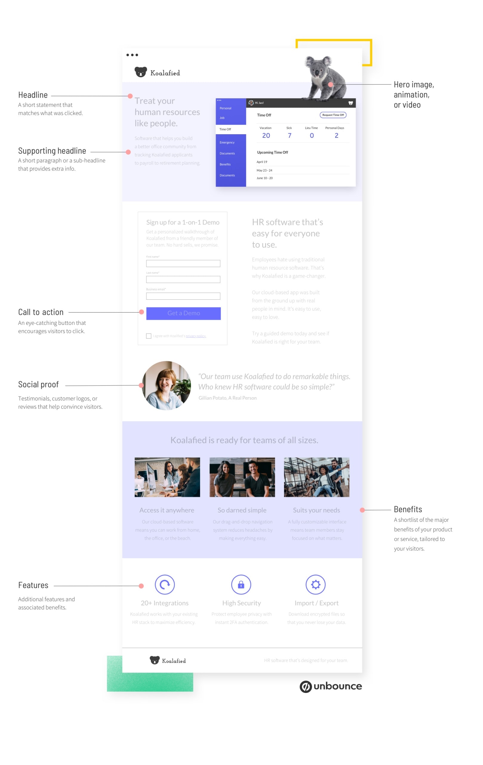
Remember: your page should only have one conversion goal. Your conversion goal is what you want to get out of your landing page—leads, clicks, sales, whatever. Before creating a landing page and plotting technical elements like headlines, hero images, and buttons, be sure to identify the one thing you’re hoping to get from your visitors.
One landing page means one conversion goal. Always.
1. Your Unique Selling Proposition (USP)
What makes you different from your competitors? Why should someone choose you over another brand?
Your unique selling proposition (USP) sets clear expectations for your customers and pinpoints why you are the company of their dreams. It’s not about elaborate features, but rather your one-of-a-kind brand promise to your customer.
A helpful analogy to consider is The Bachelor, or The Bachelorette. (Yep, we’re going there.)
A room of hopeful singles line up to steal the heart of an attractive host. Each competitor says that they love puppies, have a stable job, and are ready to settle down and start a family with “the one.” Blah, blah, blah.
The key to making it to the end of the show (the engagement ceremony) is to stand above the rest and prove the promises you’ve made. This is reality TV—if you lie, Twitter will call you out.
Back in the marketing world, you’re in a similar position, vying for the heart of eligible customers. Just being in the room isn’t enough to be noticed. To stand out from the crowd, your USP needs to clearly outline who you are and how your offer will benefit visitors.

How does this look on a landing page?
You should get to the point—and quickly—before your customer moves on. The trick of a good USP is to break down your offering to its most basic level, describing the specific benefit your customers will get by choosing your product or service.
Imagine a terrible, horrible pick-up line. Something along the lines of: “Are you an angel? ‘Cause you look like you just fell out of heaven …” (Oof, facepalm.)
What ultimately makes this opener tank is that it doesn’t set any expectations. What level of commitment is being promised or asked for? A laugh? A few minutes of polite conversation? Getting married, having a few kids, and settling down in Florida? You just don’t know.
Let’s explore the three spots you wanna be sure your USP shows up:
USP tactic #1: The main headline
Your headline is the first thing that people see. It’s critical that it describes what a visitor will get from your company and show the visitor they’re in the right place. Ideally, your headline is short, punchy, and—above everything else—clear.
A classic example of an excellent USP headline comes from Domino’s Pizza: “You get fresh, hot pizza delivered to your door in 30 minutes or less—or it’s free.”
Haven’t we all watched the minutes tick by in agony while waiting for pizza? Knowing it’ll be free if it’s late suddenly makes the time worthwhile. Heck, I almost hope it’ll be late.
Codecademy, an online coding learning platform, also delivers with their headline:

“Go from curious to confident.” Not only does Codecademy address the emotional state coding noobs have when they land on the page, but they also promise a clear outcome. In five simple words, they explain the full journey a new student will experience with them.
QUICK TIP
Your current headline might be good, but is it the best it could be? The only way to know is to test it against other options.
With Unbounce, you can run multiple headlines at once and get clear data on what resonates with your audience with our A/B testing tools. Plus, you can test images, button text, and layouts—all without needing tech help.
USP tactic #2: The supporting headline
Your headline can only say so much if it’s to remain digestible. The easiest way to keep it short and sweet is to add a supporting headline.
A supporting headline can be used in two ways:
- As a direct extension of the headline, where it follows the primary headline (like finishing a sentence).
- To extend the message by applying an additional, persuasive layer to support the primary statement.
Here’s a good example from Perfect Keto, a ketogenic snack and supplement producer, for a protein bar campaign:

Where the headline empowers the visitor with support to take on the complicated world of a high-fat-low-carb diet, the supporting headline cuts to the chase. Yes, they’re delicious. Yes, they come in different flavors. And we’ll reaffirm it one more time: they’re keto-friendly.
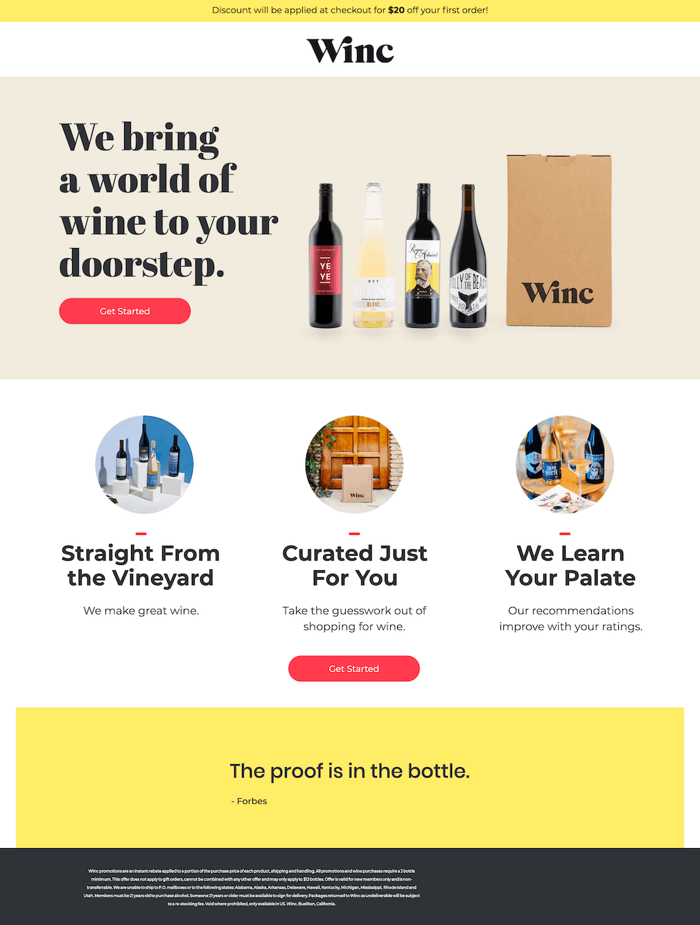
But one-size-fits-all is rarely the best approach. Different things work for different people. That’s why we love how wine subscription service Winc, experimented with headline structures in landing page variants.
The original shows a clear main headline and supporting headline:

Though the headline doesn’t quite get to the heart of their USP, it’s a beautiful landing page (click the image for the whole thing). It also gets kudos for being structurally correct.
Headline? Tick ✔.
Supporting headline? Tick ✔.
Now here’s where things get interesting in the second variant:
Click on the image to see the full landing page variant.
The original supporting headline has become the main headline without new supporting text in its place. It’s much cleaner and to the point.
Another thing that Winc does extremely well on both variants? The care they take with the other headings further down the pages. Even if you quickly skim-read, you know exactly what Winc does and what you’ll get with the service.
The lesson here is simple: Pay attention to every headline on your page, not just the big ones.
Want to learn more about how Winc experimented with their headlines? Check out this video and see how to optimize campaigns with landing page variants:
USP tactic #3: The closing argument
As your landing page comes to a close, you have one final chance to communicate the benefit of your offering. Think about it this way: before your visitor is ready to commit and live their happily-ever-after with you, they need that final assurance that they’re making the right move.
You can assuage their concerns by ending your page with some killer copywriting or a clear call to action that closes the loop of your USP narrative.
As with most things in life, keep it simple—like healthy food delivery service Daily Harvest:

Short and sweet. Boom.
2. Your Hero Shot
The adage “a picture is worth a thousand words” is especially true in the short attention span world of the landing page. Your hero shot is the visual representation of your offer and can help your visitors better understand what it is or what it looks like.
Before you’re tempted to deep-dive into the blissful world of happy stock photos, take a step back and think about what you’re selling. What does the image say about your product, offer, and USP?

Your visuals, together with the copy, need to tell a story. You need to ask yourself what is more likely to resonate with your audience. How does the visual make visitors feel? How does that feeling relate back to your solution?
– Cecilia Martinez, Interactive Design Manager, Unbounce
The idea is to get your customers to empathize and place themselves in a scenario where they’re using your product. Have a look at this example from organic baby food brand Love Child Organics:

This landing page (designed by Banan) could easily have used a visual of a savvy parent satisfied with their purchase. Instead, they shift the focus to their real customers—the picky eaters themselves. This tyke is enjoying a nutritious meal with no airplanes or “choo-choos” required. Don’t you wish that were your kid?
QUICK TIP
Here’s something to think about: Even your best-performing landing page can get better results. You just need to test new approaches.
If you’re using Unbounce, you don’t have to guess what works. You can A/B test unlimited elements—headlines, images, copy, layouts—and see exactly what resonates with your audience. Better yet, you can run multiple tests at once and let the data guide your decisions.
3. Your Features & Benefits
An effective headline and hero shot get your customer’s attention, while the features section provides a little more detail and answers any remaining questions.
When you’re introducing your features, it’s best to frame them in a way that accentuates the benefit they deliver. Remember: your features describe what your product or service does, while your benefits describe the value you’re providing. Before listing your features, try putting yourself in your customer’s shoes and answering: “How will this product or service benefit me?
Sure, you could write a novel-length landing page covering every feature, but you’ll lose your visitor’s attention quickly. You’re better off writing a brief summary of each (with a focus on value), then maybe a few bullet points for clarity. You can always circle back to remove any bloat or verbose verbiage—y’know, terms like “verbose verbiage.”
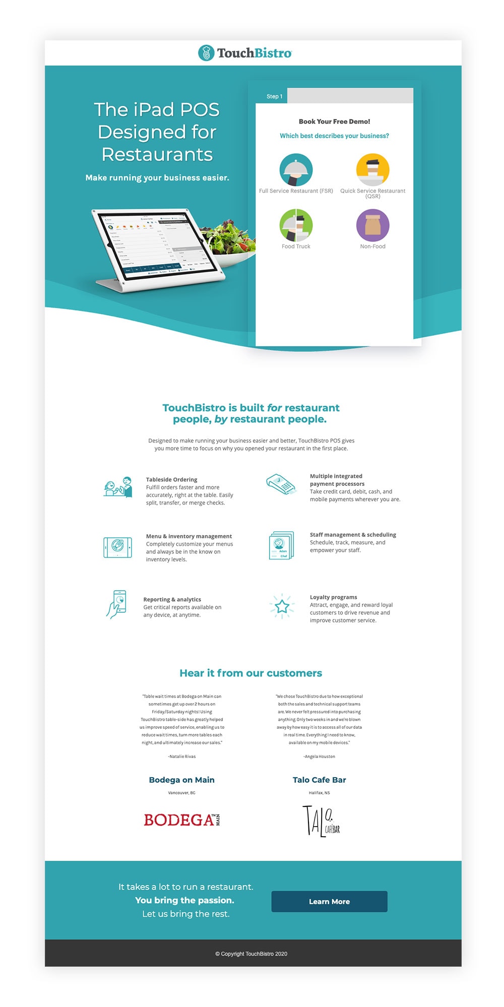
TouchBistro, a point of sale system for restaurants, cleverly turns complicated features into situational benefits. A restaurant manager will easily be able to see how using TouchBistro will make their day-to-day operations easier:
Another great example (and one that’s a little more B2C-friendly) is Western Rise’s campaign for this line of pants:

By distilling their features into clear, simple benefits, Western Rise ensures that any visitor will immediately understand why these pants beat out the rest. “My Levis aren’t stain-proof. They’re quite uncomfortable, and the hems are starting to fray. Holy cow, I need these pants!”
4. Your Social Proof
If you’ve ever bought something online (and especially if it was expensive), you’ve probably obsessively scrolled through thousands of product reviews.
That’s social proof, and it’s a powerful tool of persuasion.
Simply put, social proof is the use of social signals to illustrate that other people have bought, consumed, read, or participated in what you’re offering. The idea is that people are more likely to convert if they see that others before them have (and were glad they did).
The research doesn’t lie. Research from BrightLocal affirmed that the average consumer reads at least 10 reviews before trusting a business, often spending almost 14 minutes reading customer feedback before making a decision.
The fact is that if you don’t provide the right social cues, your would-be customers may just head down a rabbit hole of a Google search and find something irrelevant yet convincing—like these downright silly Amazon reviews.
Keep control of your brand narrative by using social proof tactics like:
- Customer reviews
- Count of how many customers you have
- Trust seals to establish the security of information
- Awards from reputable organizations
- Expert testimonials
5. Your Call to Action (CTA)
Your conversion goal is the purpose of your landing page. Your call to action (CTA) is the tactic that makes your goal a reality.
Generally, CTAs are presented as a standalone button on a click-through page or as part of a lead gen form. Poor CTAs are the standard “CLICK HERE” or “SUBMIT.” Terrible CTAs are created without thinking about the visitor journey.
What does that mean? Have a look at this social media ad from the Seattle Times:

Yes, we’re just talking about a button, but it’s the button. It’s the entire reason you spent all this time creating a landing page. A good CTA ties back to your USP and clearly articulates what a visitor will receive in exchange for their click.
When we looked at some of the best landing page examples created by Unbounce customers, they all had one thing in common—a clear (and often clever) CTA.
Branch Furniture delivers a masterclass in their CTA copy:
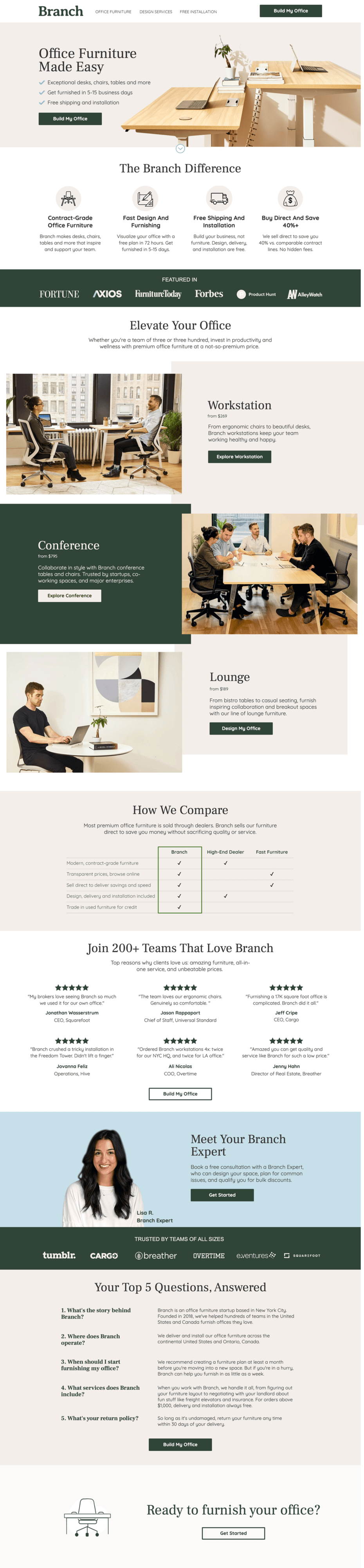
At first glance, you might be quick to point out that the landing page shows multiple buttons, each with a different CTA. And, true, having more than one conversion goal is a strict no-no—but you can use different CTAs as long as they serve the same goal.
By using CTA copy such as “Build My Office” or “Explore Workstation,” Branch crafts a virtual journey with their would-be customers in the driver’s seat.
Tip! CTA buttons are arguably the most important element on your landing page. By designing these buttons to stand out, you can dramatically increase the chances of conversions. This includes playing with color, fonts, sizing, and placement—all quick and easy fixes.
Have a look at the 7 Principles of Conversion-Centered Design to learn how to optimize CTAs to draw attention on your landing page, plus other nifty design tricks.

But the forms! What about the forms?
Many a lead-gen marketer would argue that getting someone to click on a button is easy, but forms are the real challenge. And they’re not wrong—people are extremely wary about entering their personal details.
Also, if you have to complete a form so detailed that it includes everything from your mother’s maiden name to your cousin Fred’s blood type, it’s just not worth it. That’s why we always recommend keeping forms to the bare essentials.
Have a look at this landing page for Bariatric Eating (designed by Sevah Creative):

How’s that for one field to rule them all? What’s smart here is that the visitor’s experience informs the whole process. Instead of data mining, Bariatric Eating asks for minimal input to get the downloadable in their followers’ hands.
Another example is from Vancouver-based dog boarding service JetPet:

By implementing a step-based form—also known as the breadcrumb technique—JetPet minimizes the perceived effort of completing the form.
Tip! If you have a long list of questions or input fields required for your lead-gen form, or if you’re requesting particularly personal answers, it’s a good idea to use the breadcrumb technique. People are more likely to commit to big tasks after committing to a small task—allowing you to ask more questions with the appearance of asking less, and all with a higher conversion rate. Win, win, and win!
Since it’s so important, let’s recap CTA best practices:
- Avoid generic language like “CLICK HERE.”
- Only ask what you need and keep forms short. If you can’t budge on input fields, break your questions into steps using the breadcrumb technique.
- You can use multiple CTAs as long as they serve one conversion goal.
- The visitor is your priority. Be clear how clicking on your CTA will benefit them or what they will receive in return.

Running Out of Time? Hello, Landing Page Templates!
A few thousand words in, and you’re probably getting a bit overwhelmed. “I was told this would save me time. Now I’ve gotta design something, I need to remember all the different elements to put on my landing page, I’ve gotta test what works. Unbounce—it’s just become a whole, big, thing.”
Deep breaths, you. It’s about time we talked about templates.
Templates are the ultimate time-saver when creating high-converting landing pages on a time-crunch. They’re designed for specific conversion goals and they’ve got all the essential elements—they’re just waiting for your finishing touch. Slap on a logo, update the copy and visuals, and bam! You’ve just created an effective landing page. It really is that easy.
When you can build landing pages in a jiffy, you’ve got way more time for other things. You could even squeeze in a workout—or rewatch Friends on Netflix. Hey, you do you. No judgment here.

