Whether you’re announcing your new business, creating an event page, or promoting a new product, you’re going to need more than a shiny landing page to get people to sign on the dotted line.
What you need is a landing page strategy.
Chances are, if you browse the web as often as the rest of us digital humans, you’ll click on a “Learn More” call-to-action (CTA) 26% of the time if it mentions a brand you’re aware of. When you click, you’re expecting the content to match your interests and browsing habits.
It’s a marketer’s job to make sure you’re not disappointed.
Thinking like the consumer is the first step for marketers designing landing pages to achieve a single, focused goal. With only seconds to hold a visitor’s attention, creating a high converting landing page is both an art and a science.
Table of Contents
What Is a Landing Page?
A landing page is a standalone web page created specifically for a marketing or advertising campaign.
Whenever a consumer clicks on a link in an email or an ad on Google, YouTube, Facebook, or similar places on the web, they’re redirected to “land” on a specific page that provides more depth to the headline. This makes for a much better user experience than landing on the home page and being expected to figure out where the information referenced in the ad can be found.
But for a page like this to do its job, you gotta know the purpose of that landing page.
Do you want to:
- Verify customer demographics?
- Get new subscribers for your newsletter?
- Encourage visitors to share on social media?
- Lead visitors to a new offer?
- Invite people to an event?
- Do something else entirely?
The options are endless, but your marketing strategy should determine which choice is most relevant.
Let’s take a look at three different types of landing pages you can use to make the most out of your page visits.
1. The lead capture page
The most common use of a landing page is to capture information about your leads.
A lead is someone who is already consuming your content and could potentially become a customer. They could be following you on social media, attending your events, or even be engaged members of your email list and never missing a message (thanks for the open rates, fam—we see you). But they’re yet to pay for a product of yours. You want to design the forms for these people because they already have a relationship with your brand.
An effective lead capture page requires a list of elements we refer to as “the six-point punch.”
- A headline with a strong message match
- Conversion-centered design
- Appropriate media choice
- Intro with bullet points
- Urgency factors
- Trust factors
This lead capture form by ActiveCampaign makes it simple for the visitor to get what they came for.
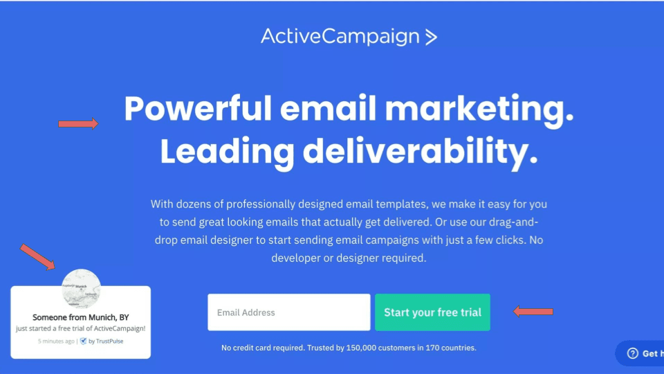
They use a 1:1 attention ratio, which provides a single-centered focus on the CTA. An eye-tracking study in 2006 showed that users often read web pages in an F-shaped pattern: two horizontal swipes followed by one vertical swipe down the page. The left-hand side of this page is used to build trust by showing real-time updates from people who just signed up for the same plan that’s being marketed to you. They also leverage the vertical format by adding one, single form field and reassuring the visitor with another trust element representing the high volume and global reach of their customers.
Well done, ActiveCampaign. 👏
But there’s always room for improvement! This page is still missing some key points from the six-point punch formula, such as the use of bullet points and relevant media.
2. The click-through page
Mediators, insurance brokers, and real estate agents all share one common attribute: they serve as the middleman. It’s their job to warm you up to the product (or outcome) before making the hard sell. Click-through pages serve the same purpose.
Think about it like giving a pitch presentation to a potential investor.
Before making the ask, you start with a big yet simple statement that communicates the value of your product or service.
You position your business as an opportunity instead of a risk. You show the successes, stories, and proof of customer satisfaction.
You share your startup story.
Then, you make the ask.
In this example, Shopify’s headline alone is convincing enough to click-through using the “Let’s talk” button.
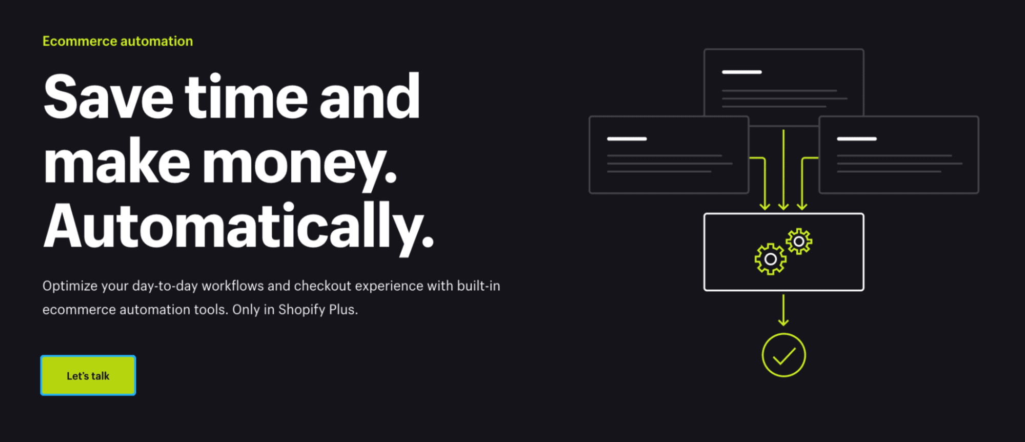
But as you scroll down the page, that bold statement is reinforced with:
- Named benefits further communicate the concept of “getting more done, for less.”
- Not one but TWO free and quick product demos
- Success metrics from past customers
- Ready-made templates
- Success stories
These pages reassure customers about the benefits and product experiences they can expect to get when they sign up. (You’ll notice the big difference here is that there are no form fields.)
Use these pages to walk your talk.
3. The splash page
While not technically a landing page, a splash page can serve the same purpose for visitors before they’re able to access the rest of your website. It’s an opportunity to:
- Communicate important information such as language, region, and cookies
- Verify a visitor’s age
- Promote a new product
- Advertise a discount
- Offer inspiration
When contactless delivery was introduced as restaurants pivoted to find a new way to do business, many would have used splash pages similar to the example below to communicate their new methods and provide more information about their safe procedures.
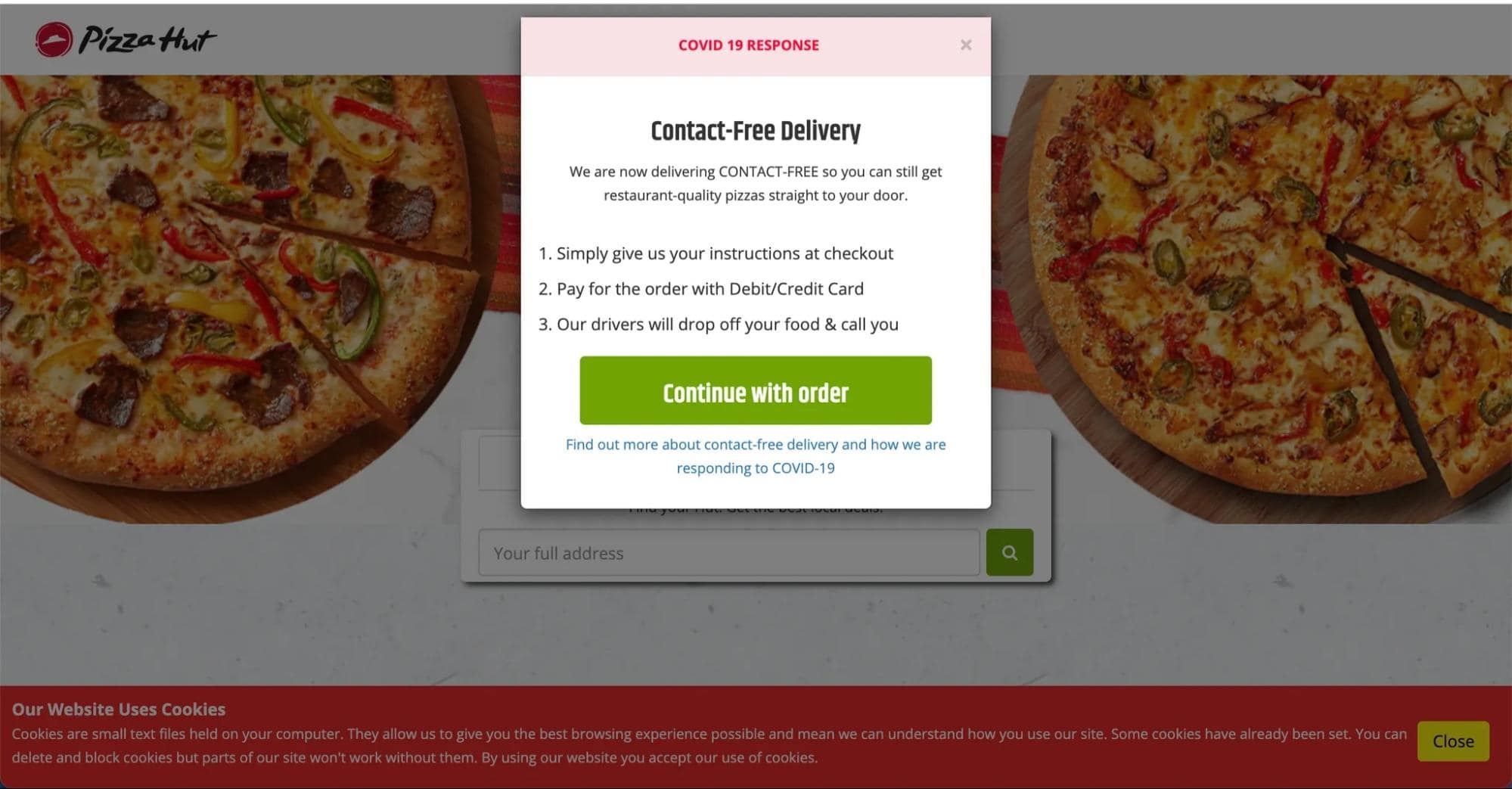
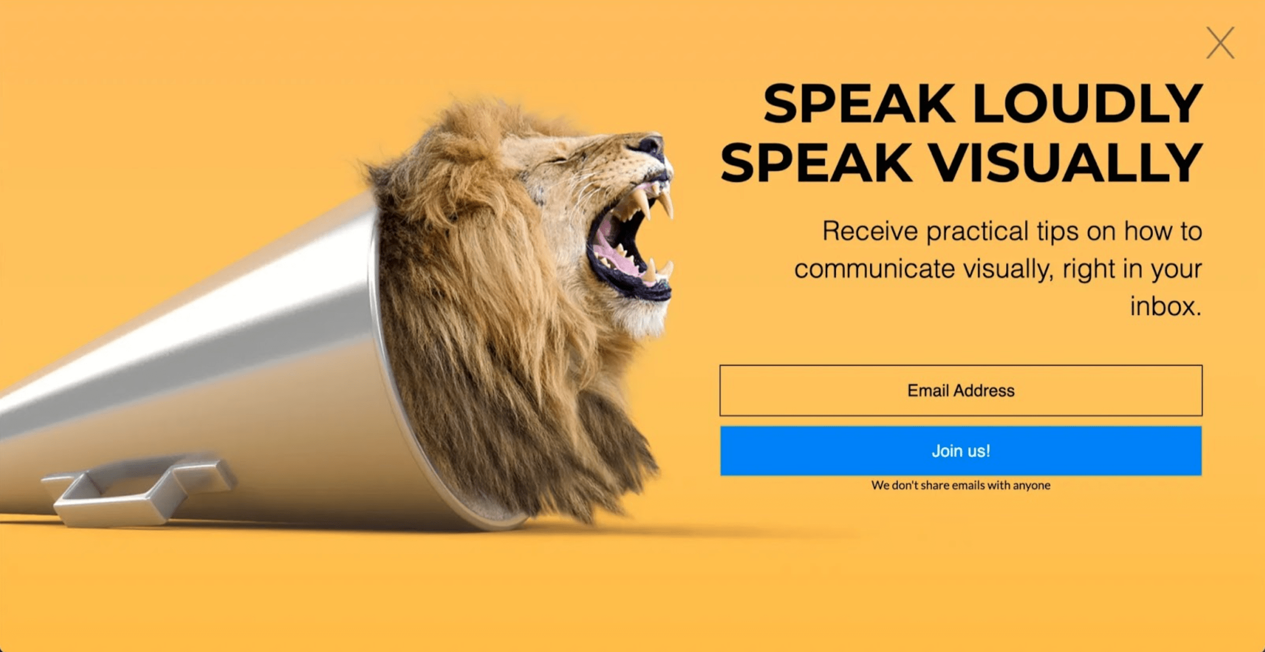
Another common use of splash pages is prompting users to join your email list with big and bold single-focus CTA. You can build popups like this one using Unbounce to turn any high-traffic page on your website into a lead-generating engine.
Customizing Your Pages by Audience
Okay, time to take it to the next level.
Another core aspect of landing page strategy? Tailoring your pages for your audience.
Attracting new leads will require an understanding of the language they use, the trends they’re tapped into, their industry culture, and more. The better you can pinpoint a lead’s place in the buyer journey, the more effectively you’ll be able to nurture their process from interest to post-purchase.
You might ask, “But how can I keep them engaged throughout the whole journey? What if their preferences for content change? How can I account for that?”
Those are the right questions to be asking. Because it’s tough to maintain lead engagement and account for all the different attributes of your audience—especially when they’re changing over time. It’s almost like you need a machine that combines user preferences to automatically adjust content and send page variants to their most relevant leads.
Wait a minute—there is! Smart Traffic is an AI-powered algorithm that matches visitors to the page variant where they’re most likely to convert.
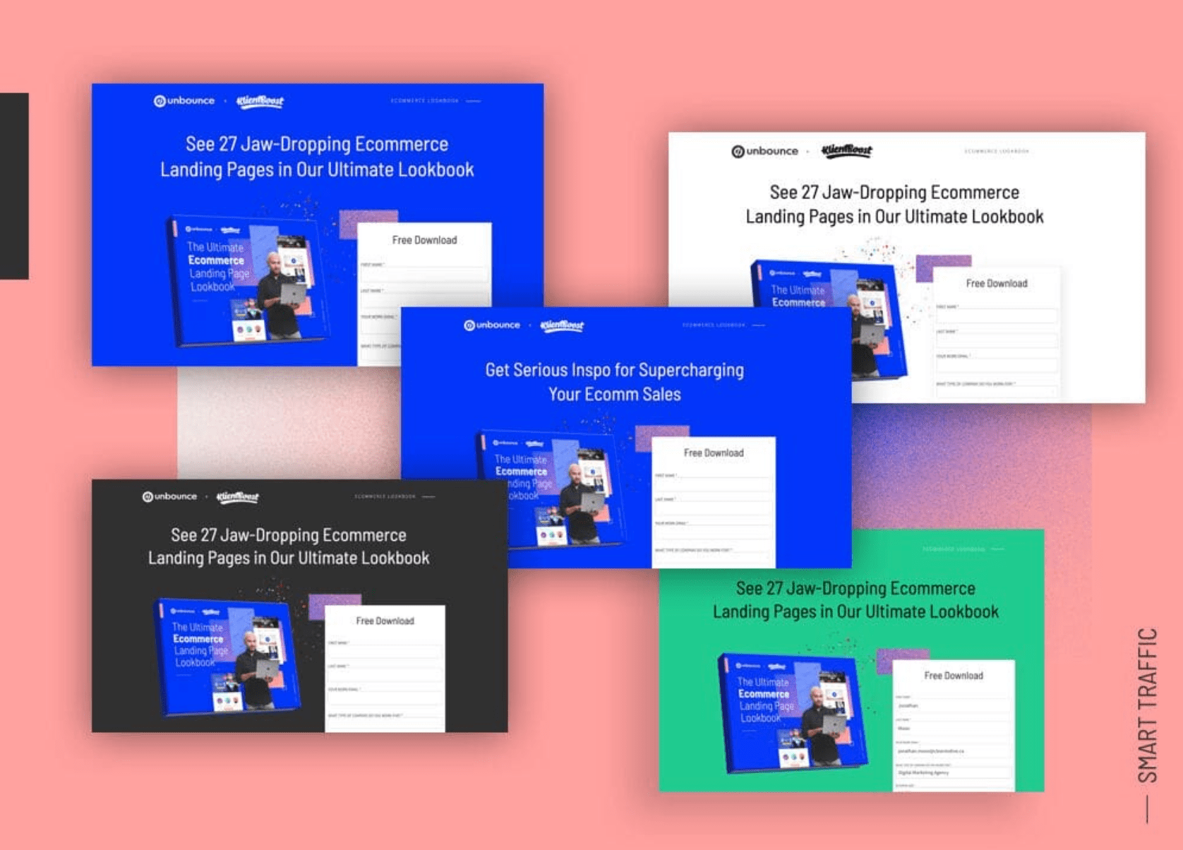
The magic of marketing is making your customers feel like you tailored your message for them throughout their journey.
You want them to read it and think, “How’d they know I was thinking that?!”
While A/B testing creates two buckets for your leads to land into, Smart Traffic creates multiple buckets.
After only 50 overall visits, Smart Traffic begins optimizing your page variants tailored to different prospects, devices, and traffic sources as a way to match people to the page that those similar to them have converted on in the past.
I know, right?
Segmentation allows marketing messages to combine buyer intent with demographics to create a personalized feel of communication.
Incorporating personalization into your marketing strategy can cut your customer acquisition costs in half. Visitors are more engaged when messaging is more specific and relevant to them. And the last thing we want is to waste time and money on targeted campaigns that don’t convert.
Writing Landing Page Copy
If you’ve ever heard that the money is in the headline, you better believe it.
We saw some great examples above:
Shopify — “Save Time and Money.”
ActiveCampaign — “Powerful Email Marketing.”
Unbounce — “Landing Page Strategy: The Complete Guide” (see what we did there?)
Each one of these statements is speaking to a specific customer need. Now that’s what you call a value prop.

While crafting an attention-grabbing headline is an accomplishment, it’s not the only important piece of copy on your landing page.
Marketers compete for attention with millions of other companies trying to entice page visitors to stay and convert. The best action you can take to help yourself win over your viewers is to explain the transformation of your product in concise and persuasive sentences.
A jaw-dropping 2018 study showed that 29.5% of landing pages in the business services sector had over 500 words of copy. That’s a lot to read! But if these businesses had lowered their word count to fewer than 100, they could join the pages converting 50% higher.
If each landing page is one piece of a larger puzzle, then the copy needs to play a similar role.
Here’s a step-by-step process you can follow to create high-performing and persuasive landing page copy:
Step 1: Identify Your Value Proposition — What is the goal of this page?
Step 2: Plan Your Information Hierarchy — What information is most important?
Step 3: Write Attention-Grabbing Headlines — How can you communicate your value prop as clearly as possible?
Step 4: Craft Persuasive Body Copy — How can you use psychology to create audience-centric copy?
Step 5: Find Social Proof that Resonates — What benefits, influencers, or companies you’ve engaged with would make page visitors go from skeptics to believers?
Step 6: Convert with a Call to Action — Where’s the best placement for your CTA, and how can you make it action-oriented?
Need a hand polishing your landing page copy? Unbounce’s AI copywriting assistant can rewrite, expand, or summarize what you’ve already written—so you can go from first draft to launch-ready copy, fast.
Designing Your Landing Pages
Although persuasive copy increases your chances of converting page visitors, we all know what the people really want.
COLOR.
Well, OK, that’s not all they want. But a study showed that over 94% of the first impressions formed on a page can be attributed to design.
Your headline might have prompted a consumer to click, but before they read another word, it’s your layout, color, contrast, and readability that will make them stay (or bounce).
This is when you wanna use the visual hierarchy format to structure your content.
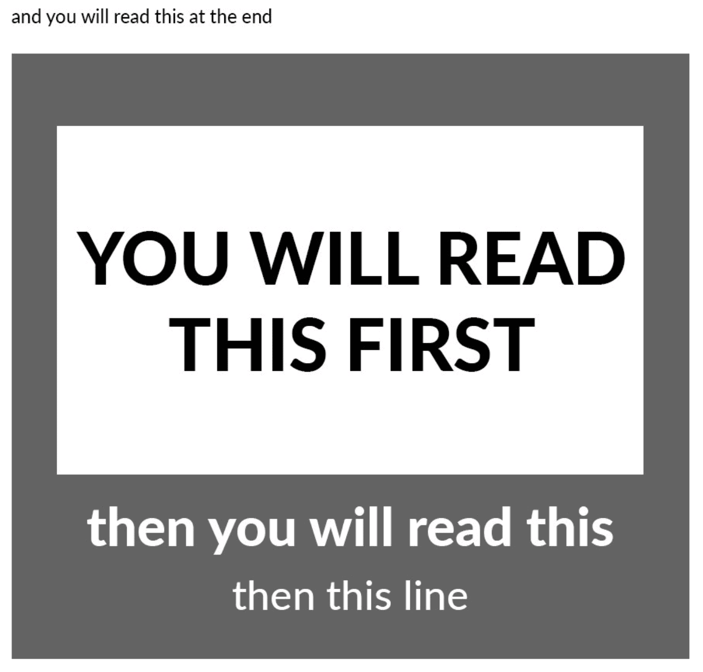
You can design page elements that interact with one another to signal importance by following the principles of visual hierarchy.
Let’s use an example. Look at Stripe’s homepage and take a few seconds to list the elements you notice in the order that you see them.
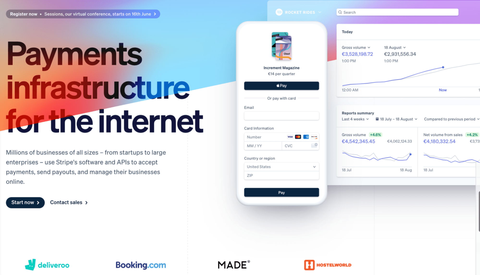
How many elements did you look at before reading the short paragraph under the headline?
Rather than going with a vertical layout, Stripe leverages the predictable F-pattern to optimize their page according to how our brains naturally scan for information.
First horizontal swipe
The most critical data, in this case, is the headline. If left-aligned or placed at the top left of the page, it will be the first element visitors are likely to zero in on. Without even reading the words, the bold font and large size communicate, “YOU NEED TO KNOW THIS.”
The images to the right side of the page provide two more data points to boost consumers’ confidence in the product: sample client results and a sample payment process.
Their purpose is to give you and your customers an idea of how the platform works.
Check this out, though: Stripe has a host of pages under their Stripe Docs library that can walk leads from creating a product on their platform to learning how to generate revenue reports—before they even sign up.
What you see on the right-hand side can be thought of as a “mini-demo,” which assists 69% of consumers in making a purchase decision.
Second horizontal swipe
Did you read the description paragraph when you scanned left-to-right the second time?
Wouldn’t blame ya if you didn’t.
Though, this time around, the CTA is more pronounced.
The CTA has one specific request and stands out due to the color contrast between the gray button and white text. They’ve also gone ahead with a multi-focus approach and added a second CTA in case page visitors feel like they still need to talk it over with a sales rep before signing up.
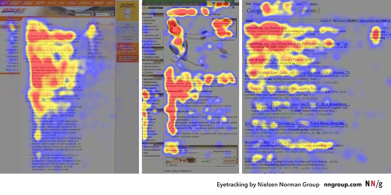
The diagram above shows heatmaps from user eye-tracking studies of three websites. This is a powerful representation of data that analyses where users click, how far they scroll, and what they look at or ignore on your page. The red areas depict the highest activity, yellow indicates fewer clicks and views, while blue represents the fewest of the two.
A heatmap (or heat map) is a graphical representation of data where values are depicted by color. Heatmaps make it easy to visualize complex data and understand it at a glance:
Final vertical swipe
The last look at the page gives you a birds-eye view of how all the elements fit together. At the bottom of the Stripe page, they’ve laid out the logos of a few trusted clients to demonstrate their authority and credibility.
But you can go beyond logos to provide other types of social proof, too.
Testimonials, reviews, and case studies have a massive impact on your conversion rate because about 97% of consumers use that information to govern their purchase decisions. It functions more like a personal suggestion from a customer lens rather than “sales jargon” from the company itself.
If you think of your social proof as a recommendation from a trusted friend, there are myriad creative ways to turn your customers into advocates with User-Generated Content (UGC).
UGC is any form of content generated by customers of your brand. It can be product review videos, blog posts, or even online discussion groups. The main thing UGC delivers is an inside look at how a product enhances customers’ day-to-day lives.
According to a study, 75% of consumers will publicly share a positive experience with a brand. This is your opportunity to participate in the community you’ve built, and kindly ask to repurpose that content.
You can integrate a widget at the bottom of your page that shows UGC content from your social media feed and links out to specific posts.
Keep in mind that you should craft your landing page design to elicit emotions that build trust and excitement for your consumer. Write down how you intend to accomplish that and plan accordingly.
Landing Page Optimization
Landing Page Analytics
Ever heard the quote, “If you can’t measure it, you can’t improve it?”
Well, if you don’t want all your hard work to go to waste, you’ll need to identify which key metrics carry the most weight for your landing page before you start creating it.
It’s easy to say, “Duh, conversions mean the most, obv.”
But it takes a much more intentional effort to know how to optimize related metrics to fuel the high conversion rate you’re looking for.
Here are five key areas you can gather feedback from and optimize to create an enjoyable customer experience for visitors landing on your landing page (oops, I caught myself in a “punny” situation there).
1. Unique pageviews: Pageviews are the first metrics that will soar. Similar to likes on Instagram and Twitter, it feels nice, but there’s little insight into who these viewers are or where they’re coming from (i.e., social, paid, or organic traffic).
On the other hand, “unique views” represent the number of people who have viewed your pages, no matter how many pages they viewed. This means if you had one new visitor that visited three pages, that would increase your unique views by one and your page views by three.
Use this helpful metric to understand daily patterns and promotions that trigger a spike in traffic.
2. Sessions by source: THIS is where optimization becomes a targeted effort. After setting up your landing page, you’ll need to get into distribution mode using paid advertising strategies and organic content to drive traffic to your page. As customers begin to notice your promotions, you’ll want to identify which marketing channels are creating the most sessions for your landing page.
If your paid search ad conversions are through the roof but your social display ads aren’t doing so well? Well, that’s when you’ll want to transfer your ad spend to the method generating the most results.
This metric teaches you that it’s better to be in one channel with high-yielding pageviews than it is to be everywhere at once.
3. Average session duration: You need to use your best judgment regarding the amount of time spent on your page warrants an update for optimization.
Keep in mind that it takes under 10 seconds for a visitor to develop an impression of your landing page. A shorter time doesn’t necessarily mean that the content or layout is bad.
However, if you’re explaining a new product feature and the average session duration is still under 10 seconds, then it’s time to sound the alarm. This generally indicates that some portions of your page are confusing, and visitors want to grasp the concept right away. Otherwise, the solution isn’t for them.
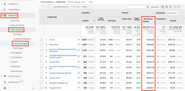
Here are a few updates you can make if the average time spent on your landing page is low:
- Add new resources.
- Add new images.
- Update copy.
4. Bounce rates: Although this metric makes everyone shiver, it’s helpful for the same reason as session duration. Bounce rate measures the percentage of sessions in which someone leaves your site without interacting on your page or visiting other pages.
To put your mind at ease, a reasonable bounce rate for ecommerce and professional services sites is around 40-60%. If your bounce rate is higher than that, one of the following areas need your attention:
- User search intent
- Page structure
- Page load time
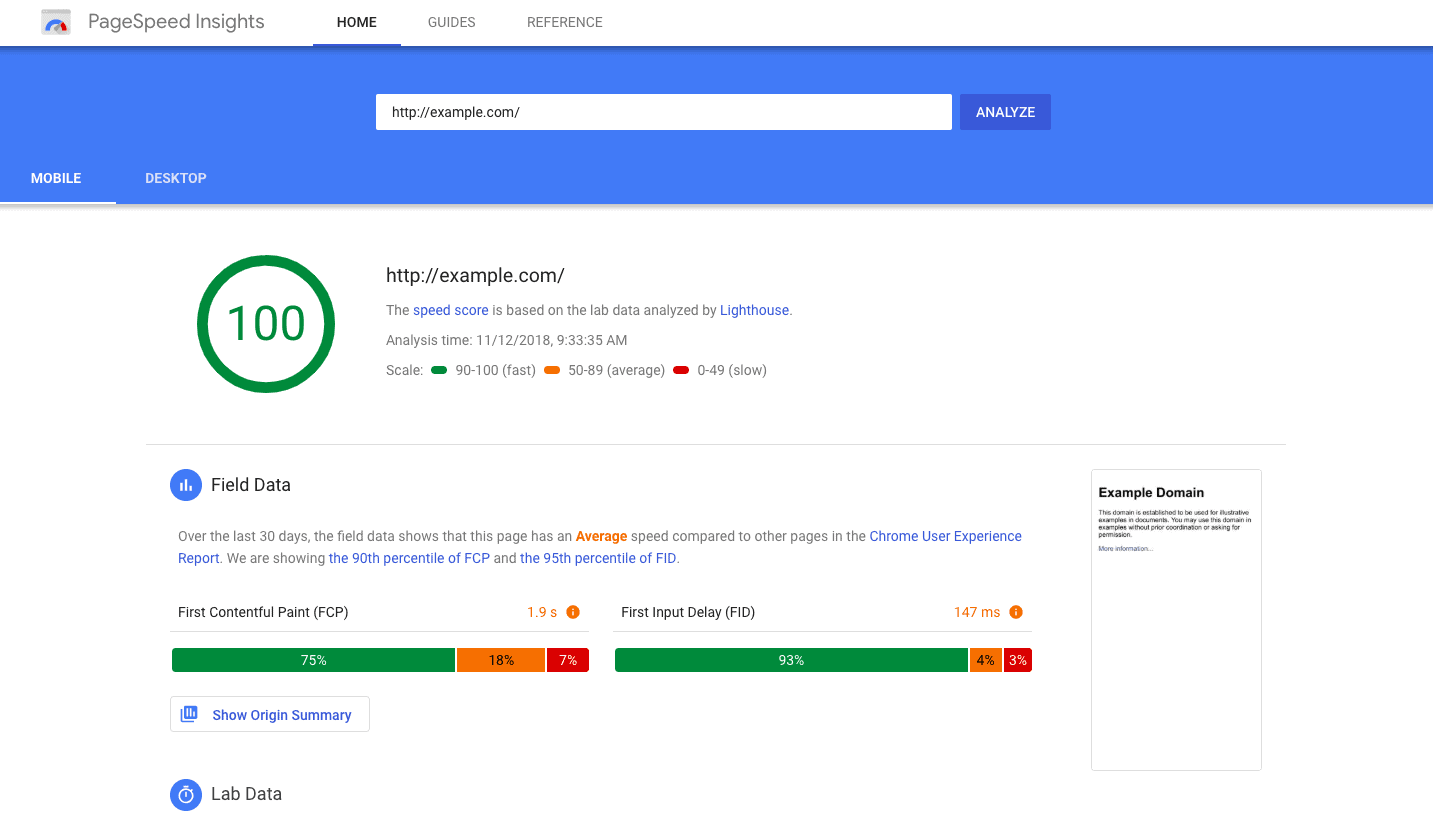
5. Page speed: Your page design could be the most beautiful content you’ve ever created, but it’s not going to have the intended impact if it takes too long to load. Did you know that 83% of visitors expect your page to load in three seconds or less?
Broken images and buffering symbols are the silent killers of landing pages. While you may want to fill your page with large images, links, and plugins, those same elements could be the culprit to a slow load time that exceeds a visitor’s patience.
Here are a few actions to take to cut back on load times:
- Limit redirects.
- Cache your web pages.
- Limit plugins and visitor ID scripts.
- Compress high-quality images to be below 1MB.
- Place Javascript and CSS elements in external files.
If you need help measuring your page speed as it is, check out Google’s PageSpeed Insights.
Driving More Traffic to Your Page
Now that you’ve created your landing page using the six-point punch formula, it’s time to enter the second leg of the marathon: distribution.
And no, not just sharing a link on Facebook or LinkedIn like you’re posting your kids’ artwork on the fridge.
Content distribution is where you want to budget your time and narrow down the channels for optimization, as the number of pageviews reveals the highest sources of traffic.
Here are a few tactics you’ll want to experiment with:
SEO
Use primary and secondary keywords to account for what your prospective customers are searching for.
Here’s an example:
Primary keyword → “House slippers”
Secondary keywords → “fluffy house slippers,” “best house slippers,” “memory foam house slippers”
Another SEO strategy focuses on building backlinks—this is when you reach out to writers and publications in your field, asking to link from a page on their website to a page on yours.
A high number of backlinks helps build a high domain rate (DR), which places your landing page higher in organic search rankings. In layman’s terms: how often do you make it to page #3 when you’re searching on Google?
Regardless of the search engine, the fact is that if your answer isn’t on the first page, you’re much more likely to adjust your search entry than you are to continue clicking through pages.
Paid campaigns
Using keywords to position your landing page in the correct category is one thing. Leveraging user search phrases to build efficient search ads is another ball game.
A study conducted in 2019 showed that 50% of visitors brought in through PPC traffic are more likely to purchase than organic visitors.
This. Is. HUGE!
Your general SEO strategy sets up a strong foundation for you to be noticed by your customers without any paid distribution efforts. But it’s competing with MILLIONS of websites paying to be at the top of the page.
You need to get in the game. You can use the exact keywords on your landing page and in your meta tags to craft compelling copy that guarantees your ads are seen.
Here’s a list of some other paid strategies to reach your target audience and capture more conversions:
Build awareness with Display Ads: Reference your buyer personas to understand your customers’ browsing habits and what image/copy mix resonates with their demographic attributes. This way, you can create a campaign that reaches them with the right message at the right time. Google’s Display Ad Network reaches over 90% of internet users. Grabbing a slice of that pie is a low lift and boosts your visibility.
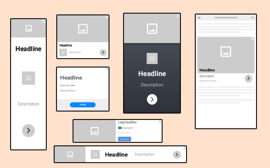
Offer rich experiences with social ads: Social media platforms are hyper-focused on giving users an inside look at lifestyles worldwide. People buy into experiences, so give them one where they can see themselves using your product.
Visitors would love to experience your product before jumping in. They begin researching your brand online before subscribing to a newsletter, downloading a free resource, or paying for a product, and 87% of their purchase decisions are based on what they find on their own.
Make sure you create content that tells a story so that they’re already in consideration mode when they come across your social ad.
Retargeting ads
You know that hot tub you were looking at two months ago that always seems to pop up on the side of websites you’re browsing or smack dab in the middle of your Facebook feed?
That’s a retargeting ad at work.
Retargeting leans on tracking technology to identify individuals who have previously engaged with your brand and re-engage them with paid ads across different platforms.
This means that you can stay on the radar of someone that visited your landing page but didn’t convert. Think of the reminder emails you get when your online shopping cart is still full.
You can even take this a step further by creating lookalike audiences to find new visitors that are likely to be interested in your business because of their demographic or behavioral similarities to your existing customers.
Want to see how retargeting can boost your ROI? See ad examples from brands like AirBnB and Nespresso to inspire your next campaign.
Build. Optimize. Convert.
With the six-point punch formula, the visual hierarchy, and the strategic metrics for analytics and optimization, you’re ready to craft a landing page strategy that creates more conversion than you could imagine.
Smart Traffic can help you design multiple page variants and optimize for audience segments at the same time. To accelerate your go-to-market launch and the learning you experience post-launch—you need this tool in your tech stack.
Make sure you use this guide as a blueprint whenever you need a new landing page because, as we all know by now, it’s not just about the page itself—it’s about the strategy that builds it.

![[Build – TOFU] Conversion Centered Design – V1 – 2024](https://unbounce.com/photos/7-principles-of-conversion-centered-design-cta-scaled.jpg)
![[Optimize – MOFU] AI Optimization Product Page – V3 – 2024](https://unbounce.com/photos/smart-traffic-blog-visual-cta.jpg)
